In last month’s members’ report on Sydney housing, we argued that Sydney’s housing market is built upon relatively sound fundamentals, including tight supply, solid rental yields, and above-average jobs growth.
In this month’s report, we turn our focus to the Melbourne housing market, which is built upon far shakier foundations and remains at risk of a significant price correction once the latest interest rate-cutting cycle ends and/or macroeconomic conditions deteriorate.
Current state-of-play:
The evolution of Melbourne’s housing market is illustrated by the next chart, which tracks detached house prices, as reported by the four main housing data providers: the Australian Bureau of Statistics (ABS); Australian Property Monitors (APM); RP Data-Rismark; and Residex, as well as a composite measure, which is the average of these indices. Residex has the longest running house price series for Melbourne, dating back to the mid-1970s, whereas APM’s is relatively new. Despite minor variations, all four series have tracked each other fairly closely (refer to our first August Members’ Report for an explanation of how each house price series is constructed).
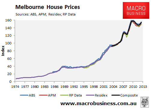
The June quarter price results for Melbourne showed the housing market growing at a reasonable pace. The ABS (3.3%), APM (6.1%), RP Data (3.3%) and Residex (4.8%) all recorded growth in excess of inflation in the year to June 2013, with prices now also 4.4% above their 2012 trough when averaged out across the four data providers.
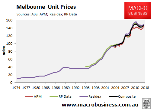
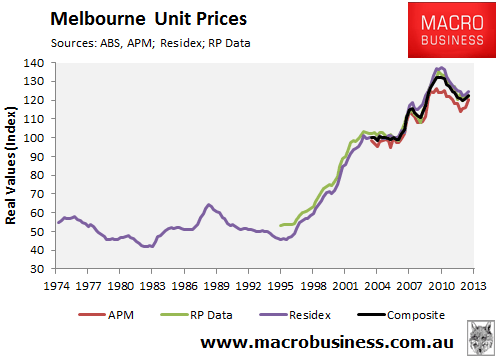
The recent price performance of Melbourne units has also been reasonable, with APM (4.2%), RP Data (4.0%) and Residex (1.9%) recording similar growth to houses in the year to June 2013, with prices also 3.4% above their 2012 trough when averaged out across the four data providers (see next chart).
The next chart plots Melbourne house prices in real inflation-adjusted terms. According to this chart, Melbourne has experienced two distinct booms in house prices since 1975. The first, which ran from early 1983 to early 1989, saw Melbourne house prices increase by 75% in real terms before retracing roughly 20% over the next six and a half years. The second and by far the greatest boom is the most recent episode, which ran from the mid-1990s to mid-2010, and saw house prices increase by around 185% in real terms, before retracing by around 12% peak-to-trough. Following the latest price upswing, Melbourne house prices in real terms were 8.9% below their mid-2010 peak as at June 2013, when averaged out across the four main data providers (see next chart).
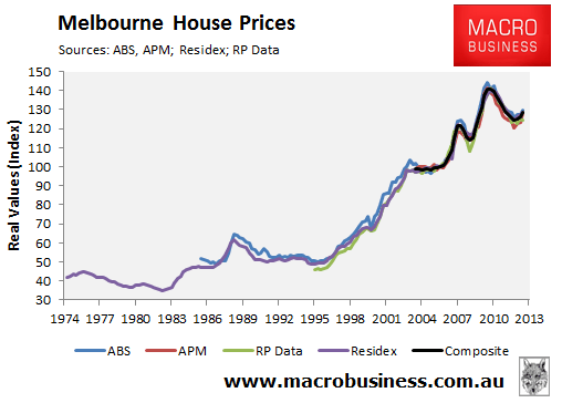
Melbourne unit prices have held their value a little better in real inflation-adjusted terms, with prices down 7.2% since their mid-2010 peak as at June 2013, when averaged out across the four main data providers (see next chart).
Melbourne housing remains expensive:
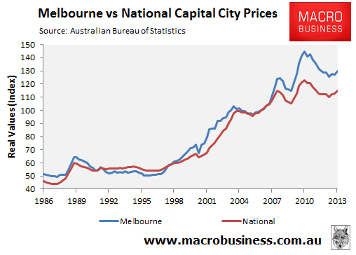
Melbourne’s strong house price growth over the most recent boom made it a star performer, particularly over the second half of the 2000s, where it clearly outperformed the national average (see next chart).
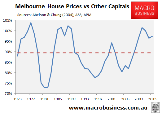
The out-performance of Melbourne housing saw its median house price relative to the other capital cities rise to a level not seen since the late-1980s. Despite the significant price correction experienced over the past three years, Melbourne housing remains relatively expensive, with its value relative to the other capitals still well above the long-run average (see next chart).
Melbourne is relatively well supplied and rental returns are poor:
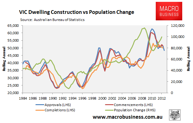
Melbourne’s poor housing fundamentals are also reflected on the supply-side, where a construction boom has combined with elevated for sale listings and rental vacancies.
The construction of dwellings rose sharply over the past four years as population growth moderated. And while population growth again looks to be on the rise, the Melbourne housing market still looks to be well supplied, even though the rate of construction has slowed more recently (see next chart).
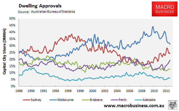
In fact, Melbourne has easily led the nation in dwelling construction, averaging 38% of capital city approvals since the beginning of 2009 – well in excess of its 28% share of capital city households (see next chart).
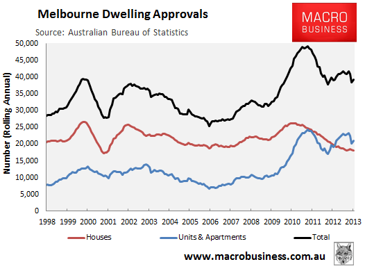
That said, most of Melbourne’s construction surge has been in the apartment segment, where approvals are running ahead of detached houses for the first time on record (see next chart).
For sale listings are also elevated. Despite comprising 28% of the nation’s capital city households, Melbourne accounted for 31% of homes for sale in Australia’s capital cities in August 2013, suggesting a relative oversupply (see next chart).
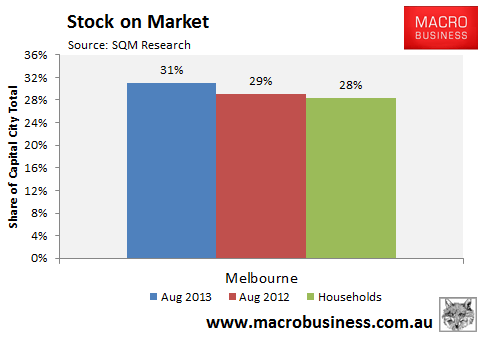
However, the number of for sale listings in Melbourne did fall by 2.0% in the year to August 2013, although this was below the 8.5% fall in overall capital city listings. Moreover, the number of homes for sale in Melbourne was 78% higher than Sydney, despite its smaller population.
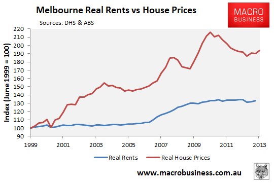
The housing construction boom in Melbourne has also eased pressure on rents which, after strong growth between 2006 and 2009, have flat-lined in real inflation-adjusted terms (see next chart).
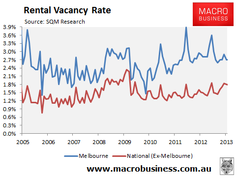
The easing of pressures in the rental market is also reflected in rental vacancy rates, which have typically been well above the national average, despite moderating recently (see next chart).
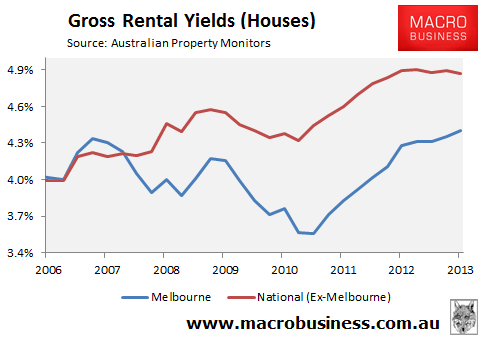
Melbourne’s stronger house price appreciation and sluggish rental growth has, therefore, combined to provide Melbourne housing with the lowest rental yields in the nation. Melbourne’s gross rental yields of 4.4% (houses) and 4.7% (units) are well below the other capitals (4.9% and 5.3% respectively), making Melbourne housing a poor investment proposition from an income perspective (see next chart).
Melbourne’s economy remains laclustre:
Victorian state final demand – a proxy for gross state product – grew by only 0.1% in the year to June 2013, well below the national Gross State Final Demand growth rate of 0.6% over the same period.
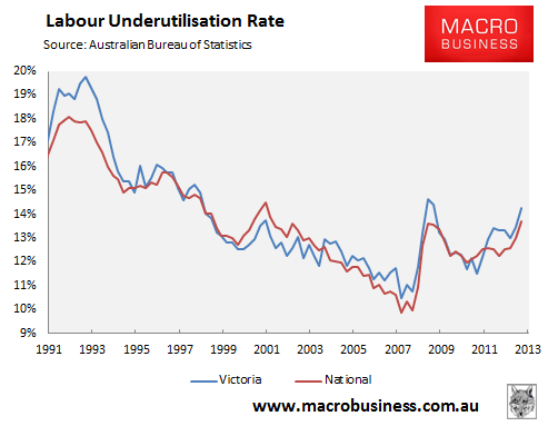
At this point in time, this weakness in economic activity is not fully reflected in the aggregate employment statistics. Victoria’s headline unempl0yment rate is tracking in line with the national average, as is the aggregate number of hours worked (see below charts).
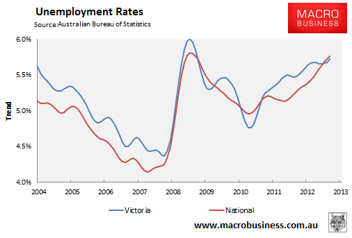
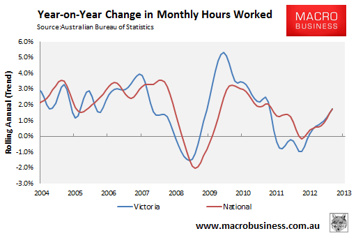
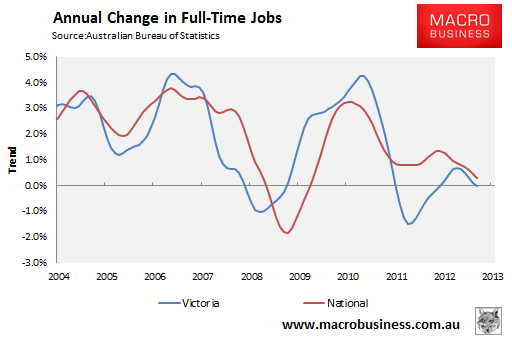
Looking under the surface, however, shows greater weakness in the Victorian labour market, with no growth in full-time jobs in the year to August 2013, and underemployment above the national average and rising (see below charts).
Perhaps more concerning from a employment perspective is that the lion’s share of employment growth in Victoria in the year to August was in construction, most of which relates to housing (see next chart).
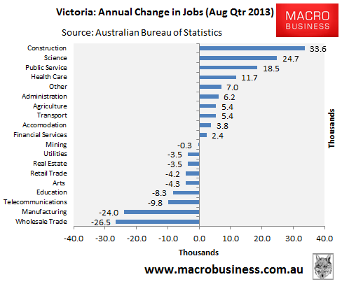
Looking ahead, Melbourne’s economy and employment market are likely to face stiff headwinds as the high Australian dollar continues to pressure trade exposed sectors such as manufacturing (the state’s third largest employer overall and the biggest source of full-time jobs) and education (the sixth biggest employer overall). Further, as the housing construction boom unwinds, the construction sector – the state’s fifth biggest employer overall and second largest source of full-time jobs – will also come under increasing pressure.
However, mortgage demand is improving:
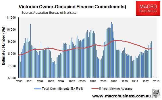
Mortgage demand has pick-up significantly in Victoria, with the total number of owner-occupied housing finance commitments (excluding refinancings) increasing by a seasonally-adjusted 11% in the year to August 2013 to be tracking 7% above the five-year moving average (see next chart).
The ABS unfortunately does not break-out investor finance commitments by state. However, these have risen strongly, up by 26% nationally over the past year, with some of this activity likely to have been in Melbourne.
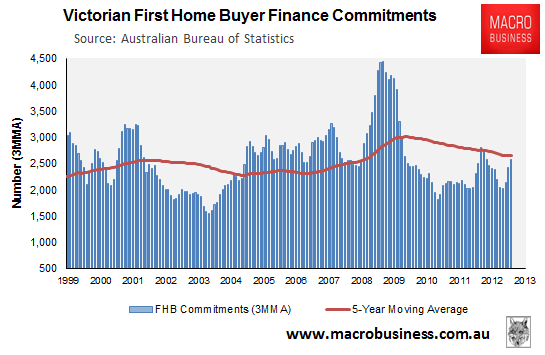
One potential roadblock for Melbourne’s housing market was the decision by the state government to remove the First Home Buyers (FHB) Grant on pre-existing dwellings from 1 July 2013. While this has yet to show up in the official housing finance data (see next chart), there is the strong likelihood that Victoria will experience a sharp drop-off in mortgage demand from FHBs, as occured in New South Wales and Queensland following the removal of their FHB Grants in October 2012, potentially taking some heat out of the Melbourne market.
The Australian Bureau of Statistics (ABS) data on housing finance commitments is also contradicted somewhat by statistics from the Victorian State Government, which shows only a modest bounce in both the number of mortgage lodgements (i.e. new mortgages) and housing transfers (see next chart).
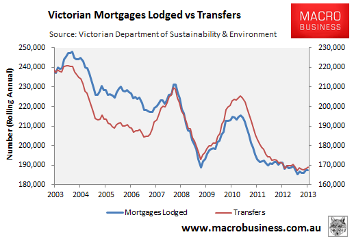
We are unsure why the ABS and Victorian Government data is showing such a strong divergence. It could possibly relate to timing differences, with the above charts suggesting that the Victorian Government records mortgage lodgements many months after the ABS records mortgage commitments. If this is the case, the recent acceleration in ABS mortgage commitments will soon be reflected in the Victorian Government mortgage lodgement data.
Bottom Line:
Whereas Sydney’s housing fundamentals are strong, underpinned by a prolonged period of price weakness, extremely tight supply both in terms of new dwelling construction and for sale listings, and above average employment growth, Melbourne’s fundamentals are weak by comparison.
Melbourne house price growth has significantly outperformed the national capital city average since the mid-2000s, stretching valuations relative to the other capitals to levels not seen since the late-1980s, after which Melbourne housing underwent a significant price correction, retracing roughly 20% over the next six and a half years in real inflation-adjusted terms.
Housing supply is also relatively abundant in Melbourne, with construction booming over the past four years and the number of for sale listings 78% higher than Sydney’s, despite its smaller population.
Reflecting the greater rate of dwelling construction, Melbourne rental growth has been poor since 2009, driven by the highest capital city vacancy rate in the nation. The relatively strong house price growth and weaker rental growth have also combined to make Melbourne rental yields the lowest in the nation, making Melbourne housing a relatively poor investment proposition from an income perspective.
Finally, the Melbourne economy and employment market looks to be built on shaky foundations. The industry that has driven the lion’s share of jobs growth – the construction sector – is inextricably linked to the rate of dwelling construction. As dwelling construction falls from current elevated levels, so too will jobs growth in both the construction sector and related industries. Trade exposed sectors such as manufacturing and education – both major employers – may also retrench on the back of the high Australian dollar, with the former seemingly in terminal decline.
While Melbourne’s housing fundamentals are poor, there does appear to be some price momentum, which should see values rising over the next year. In particular, mortgage demand appears to be growing solidly in Melbourne on the back of record low mortgage rates, although there is likely to be a slump in FHB demand as recently implemented changes to the FHB Grant begin to bite.
On the other hand, investors may pick-up the slack left by retreating FHBs – as they have done in Sydney – as low interest rates make even Melbourne’s poor rental yields look somewhat attractive. However, the predomination of investment flows driving price gains means the current price rises could turn more quickly than past cycles when conditions shift.
Overall, Melbourne’s poorer fundamentals makes it a relatively risky proposition from an investment perspective. While a rising tide of cheap credit is likely to lift most markets in the short-term, there is the risk of a significant price correction in Melbourne once the latest interest rate-cutting cycle ceases and/or broader macroeconomic conditions deteriorate. Buyer beware!
——————————————————————————–
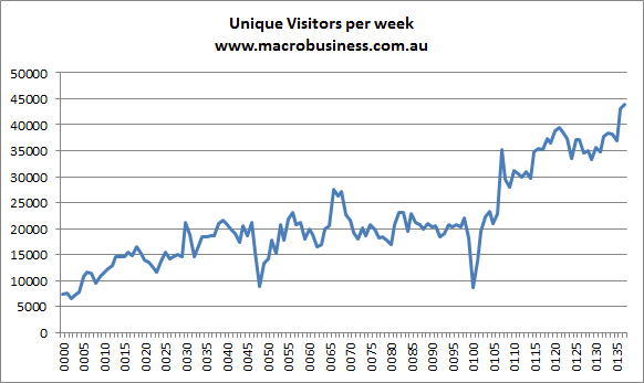
Finally, find below the September update for MB traffic, which is giving Sydney a run for its money: