

By Chris Becker
Here’s my roundup of what happened in major macro markets in the last week and what could happen in the weeks ahead as the world’s central bankers continue to apply the “milkie wilkies” of easing, liquidity, and low/zero interest rates. This week has seen 3 key events and several ancillary ones (including the usual saber rattling by toothless dictators) that has made me reach for my “bear” hat – but not quite put it on:
- a very disappointing non-farm payrolls report last night (the actual report doesn’t matter, its the markets perception thereof)
- key breakdowns in price in industrial commodities namely oil and copper
- Japanese central bank goes all-in on the river – more on this later….
Remember, the following views are my own, do not constitute advice and are for information purposes only. I may have positions in any or all of the below and their associated markets both long and short, on an intra-day, daily and weekly basis for my own account. Please seek advice from a licensed adviser before making any investment decisions.
Currencies and Gold
The first method of gauging currency strength is through the US Dollar Index (DXY), made up of a basket of major currency pairs against the USD. Since the GFC it has been the major “risk on/risk off” indicator, with a lower USD usually meaning higher risk as US stock markets rise and push other risk assets higher, such as our own share market. But there has been a shift, as witnessed by the decline in the “undollar” currency, gold, which I’ll cover shortly.
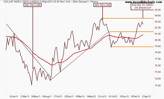
On the weekly chart you can see that in comparison with QE2, where the DXY declined some 12%, QE3 – if measured by USD weakness – has not been successful at all as the currency wars continue. The DXY is still above resistance at 81.5 points but has been unable to break through the interim pre-QE3 84 point target, setting itself up for a reversal, which would normally be good for “undollar” assets:
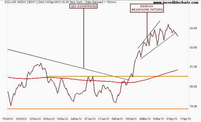
Before Easter I highlighted a bearish megaphone pattern forming on the daily chart, with bearish divergence forming on secondary indicators. This week we’ve seen a tentative failure of this pattern which could lead to a fall back to the 200 day moving average (the red line in all charts):
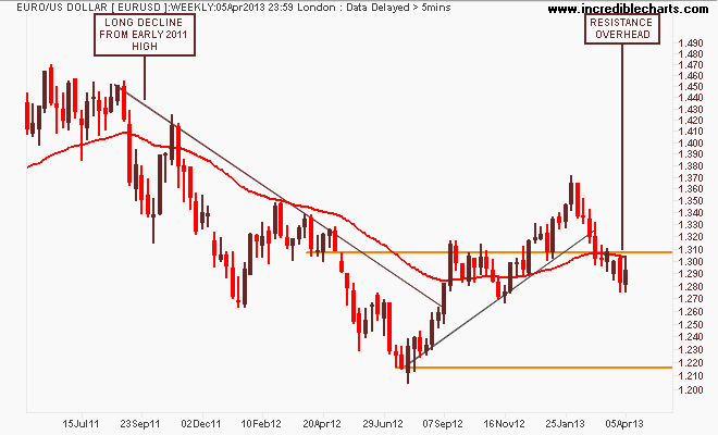
Looking at the composite “undollar” assets, the first general opposite of the DXY is the euro (EUR/USD). After its break of the year plus down trend in August last year, the euro had broken out above resistance (former support) at the 1.31 level before becoming overbought and correcting. We’ve seen consolidation below resistance at 1.31 and while price remains below the 200 DMA, tentative support is forming at around 1.28:
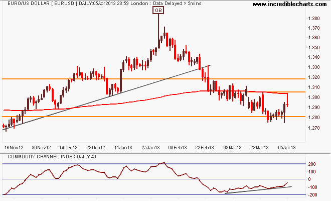
Here’s the shorter term picture with an obvious channel between resistance at 1.31 to 1.32 and support at 1.28. Again, before the Easter break I suggested that my preferred momentum oscillator (CCI) showed a reversion to mean in the trend, indicating a possible bullish reversal in the weeks ahead but for this to be confirmed requires a break of short term resistance at 1.305:
With the RBA continuing its hands off – and in my opinion, dropping the ball – approach, the Aussie “battler” (AUDUSD) continues to consolidate its strength on foreign safe harbor buying. However, I keep cautioning that unlike market economists, you must step back and look at the long term context, in chart form.
Even an anti-technical analyst can see what is happening below on the weekly chart: lower highs, an inability to break resistance at 1.06 (no buyers above that level):
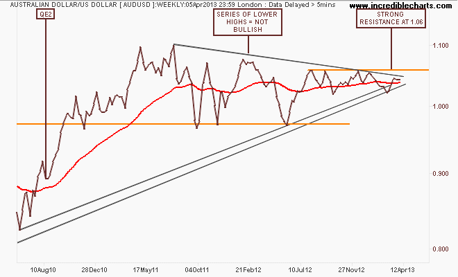
I said before Easter that “buying puts (i.e insurance) on the AUD as it approaches 1.06 on cyclical strength (and USD weakness) could be a big payoff if other institutions sell the AUD at those overbought levels” – particularly if a risk-off mood takes hold in the coming weeks and months.
Its the right time of year for it!
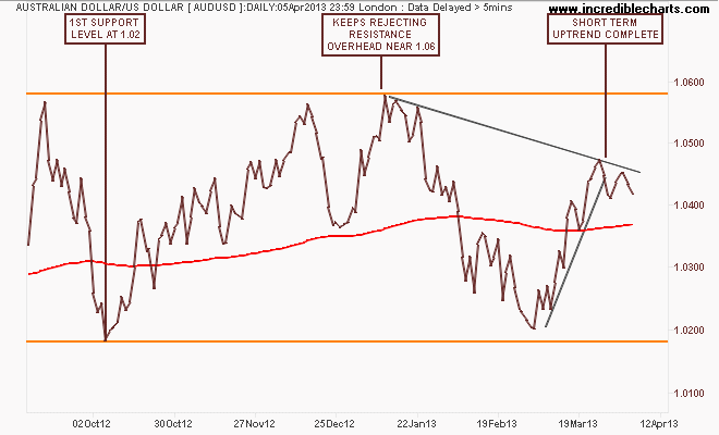
The daily chart below shows how the recent rally from 1.02 to 1.045 or so has completed, with the AUD under pressure in the short term but still within its trend channel. A look at other crosses against the Aussie (except Yen) shows a similar weakness forming:
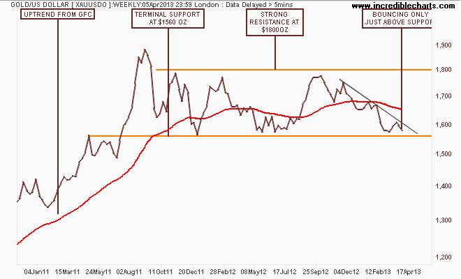
I’ll finish the currency section with the undollar currency, gold (USD), which is getting a lot of press and misdirection from the usual cynics/sceptics and economists.
Here’s the weekly chart showing a sideways consolidation, where price has recently bounced off nearly 2 year support level at $1560 per ounce. The first deflating (sic) problem calling gold a bubble, is that when bubbles end, they don’t go sideways for 2 years…They go down and they keep going down.
And that’s the key question with gold – is it going down? In the medium term, absolutely – it’s had a nice correction from $1800 to just below $1600:
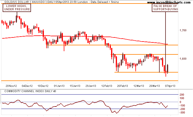
As I said previously, a short term view can paint many different pictures, depending on your point of view. Coming into Easter I was bullish short term but only on a swing trade, not a new trend or breakout (similar to the AUD swing previously).
I’m still looking for a break of $1620-30 region for a medium term long position and with the US dollar falling reacting to the NFP on Friday night, gold surged – look at that bullish engulfing candle. One day does not make a new trend, but the amount of buying support (or attempts to sell short) is impressive:
Commodities
For Australian investors particularly, there’s three major commodities to watch: crude oil, copper and iron ore. I’ll leave the last to Houses and Holes with his excellent daily updates (although it’s non tradeable for retail/private investors – Fortescue Metals (FMG) and Atlas Iron (AGO) are excellent proxies, both of which I trade regularly), but crude oil and copper are great barometers displaying both real demand and US dollar strength/weakness.
Here is where I much prefer technical analysis to fundamental analysis – the charts cannot lie about the forces of supply and demand. If everyone is “printing money” and economic growth is strong worldwide – according to the “funnymentals” – why isn’t there higher oil prices and copper prices – the two key commodities in the industrialised world?
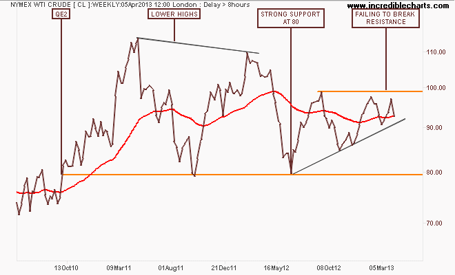
First, lets take a quick look at the WTI Crude marker, which at first glance looks rather bullish with an ascending triangle pattern that could break out to the upside if the USD breaks down. Here’s the weekly chart for context with $100 (nice round number) the key level to break:
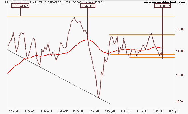
ICE Brent Crude paints a markedly different picture, with the weekly chart of the spot price showing a break below support after bouncing off it last week. This is repeated in futures (May/Jun/Jul) contracts as well – there is a distinct lack of demand:
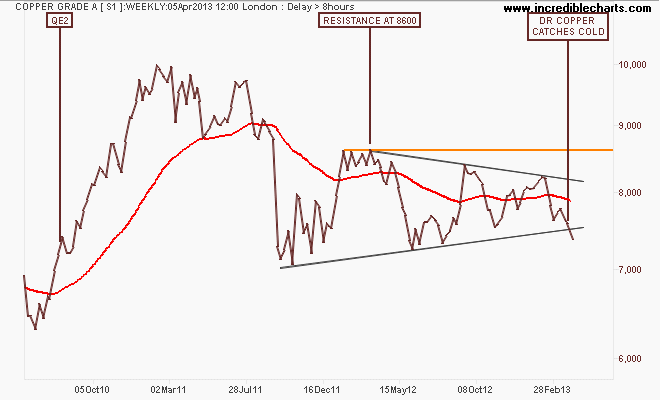
I asked before Easter if the picture is changing for Copper? My favourite image is a big Monty Python foot called the USD pushing it down as the weekly pattern morphedsinto a symmetrical triangle, but with a definite bearish bias. This week – even with the USD falling – we’ve seen a breakdown in Dr.Copper – not good. A full risk-off situation would be confirmed if it drops below terminal support at 7000:
Equity Markets
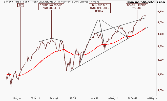
Before I get to the Aussie market, let’s look at the US S&P500 starting with the monthly chart showing a possible end to the US secular bear market, going on 13 years from the tech bubble high in 2000:
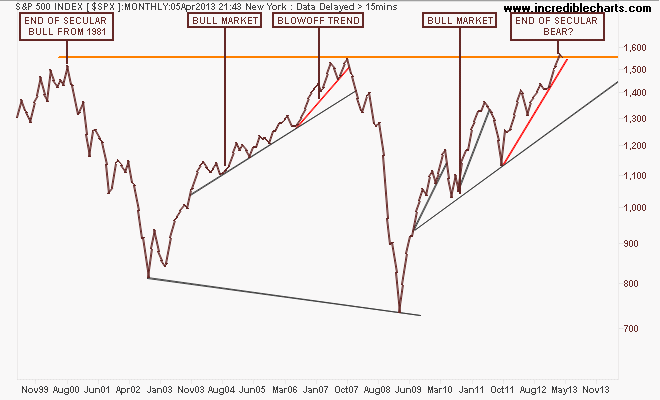
Note how the index before the GFC almost broke that high after a blowoff trend (marked in red) that accelerated in 2006 from the main trend. Note also that this pattern has been repeated – albeit with a lot more volatility and acceleration due to continued bouts of QE – with an accelerated uptrend from the August 2011 low. Not the same, but very similar.
It’s an important truth to realise that equity markets are not a reflection of fundamentals – they are a reflection of liquidity and therefore, support of the banking sector, where most of the gains have been made.
The weekly chart below shows this blowoff in greater detail, with a series of higher highs that is smaller on each up cycle. This is a rally based on fear, fear of missing out on returns:
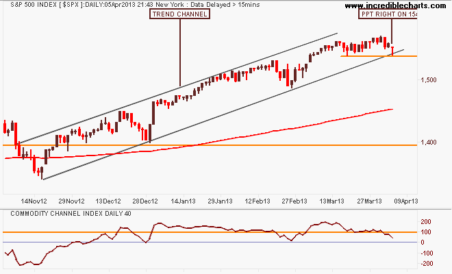
Looking at the short term point of view, this market remains technically bullish, with the 200 day moving average moving smoothly up left to right. I said before Easter that “the sideways move of the last 2 weeks is likely to see buying support at the bottom of the trend channel or below tentative support at 1540 points, with the continuation of the uptrend confirmed by a breakout above the recent high”.
We’ve seen the buying support – on Friday night the Dow was off 170 points but only lost 40 in the end (with a similar pattern repeated on the S&P) look at the candle, right on support and the edge of the trend channel!
Will this turn out to be nothing more than another opportunity to buy the dip?
I contend that our own share market, the S&P/ASX200 index is only halfway through its own secular bear market and mainly on the back of the banking sector, which is completely dependent on an easing cycle in interest rates AND continued increases in national income AND access to wholesale credit markets at cheap prices.
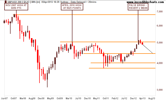
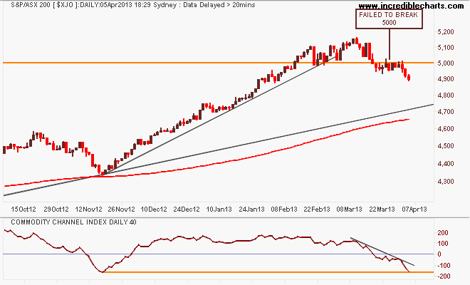
Note these important levels: the key levels at 3800-4000 (strong support), 4400 (intermediate resistance and the outer edge of the index’s real value), 4900-5000 (strong resistance) and 6850 (the former high of the 2003-2007 bubble).
Before we go further, check how the above chart matches this chart from a Morgan Stanley study from late 2009 that shows how our current market is going almost exactly according to historical guidelines – and how many may confuse this trading range as a new “grand bull market” not just a continuation of a secular bear market until circa 2017-2018:

I have been warning of a correction for some time now and we’ve certainly had a dip (-5%), but are we on the way to a meaningful correction (classified as -20%)? A sustainable trend would follow the trajectory of the first uptick in the August 2012 lows, and we’d be at or around 4600-4700 points:
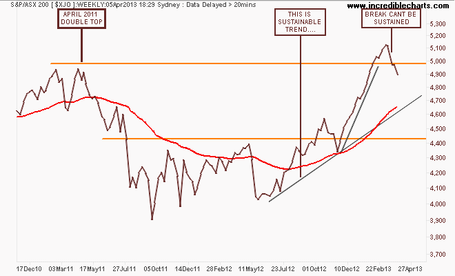
Here’s the short term technical view, where before Easter I said I would only see a confirmation of the trend break and bearish divergence in secondary indicators if the market broke through 5000 points. We’ve had that break and more, and the main reason is the banks are selling off:
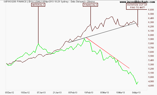
Are we seeing a rotation here from overbought banks to oversold miners? BHP now has a similar yield to CBA believe it or not! Remember, this has been a financial led rally, dependent upon easing by the RBA. If the economy is perceived as being strong enough to not need further rate cuts, this sends a signal to the market, and it is listening. It’s perverse but true. Further, if Chinese markets do not rally soon, any uptick in the mining sector could be short lived.
That’s all for now, remember to manage your risk first and the returns will come thereafter. See you next week and stay safe.