

By Chris Becker
Another fascinating week on macro markets – for some late-to-the-party gold bugs, a time for reflection, for the non-position holding gold hating economists, some smugness at dinner parties, and for those of us who have opinions, but trade positions, time to shop for a new car or boat….
Remember, the following views are my own, do not constitute advice and are for information purposes only. I may have positions in any or all of the below and their associated markets both long and short, on an intra-day, daily and weekly basis for my own account. Please seek advice from a licensed adviser before making any investment decisions.
Commodities
Again, I’m going to look at commodities first this week as we’ve seen a overly strong bearish attitude (even reflected here at MB) turn into a possible bounce in commodity stocks and indices, if not underlying markets.
For Australian investors particularly, there’s three major commodities to watch: crude oil, copper and iron ore. I’ll leave the last to Houses and Holes with his excellent daily updates (although it’s non tradeable for retail/private investors – Fortescue Metals (FMG) and Atlas Iron (AGO) both of which I trade regularly as proxies).
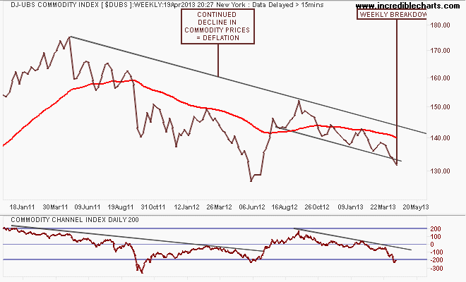
The short term and medium term view in commodity prices is summed up in the DJ-UBS Commodity Index, a basket of commodity future prices. The trend is pretty clear, from the mid-2011 high, with a weekly breakdown (mainly due to crude and copper, as we’ll see, whereas natural gas and some other minor markets are rebounding):
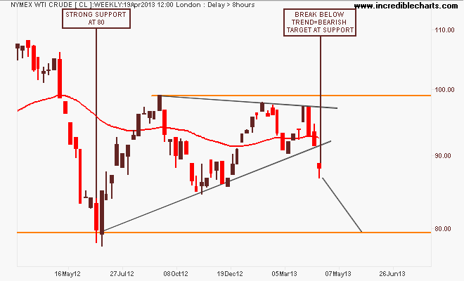
Looking at the main components, the most closely watched component – WTI Crude – has broken down out of its ascending triangle pattern. As I warned last week, this nominally bullish pattern had each successive high lower than the last and with is it a defiantly strong USD amidst the currency wars, or does this reflect weakening industrial/consumption demand?
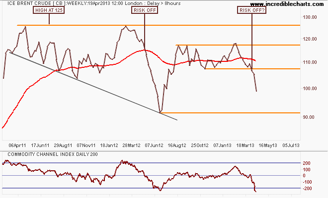
I asked last week if we are going to repeat last year’s risk-off move in ICE Brent Crude – a marker of European demand – and price action this week is certainly pointing to it as it fell below $100 per barrel sharply. These pattern breaks are starting to mount up for a bearish 2nd quarter:
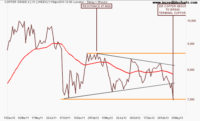
Finally, Dr Copper (so called because its the only “real” economic expert out there) diagnosis is looking even more bleak. Using the weekly chart of the London spot price, the symmetrical triangle pattern – an indication of a stalemate between bulls and bears – has broken to the downside. Last week I asked if the breakdown in gold (more of a speculative commodity than copper) a harbinger of more to follow? I still contend that a full risk-off situation would be confirmed if it drops below terminal support at 7000:
While gold (which we’ll see in the next section) has rebounded some from its crash in the last few days, and the best proxy for commodities – Chinese equity markets (and hence ASX200 Materials) may have also found some light at the end of a dark tunnel, commodity prices themselves remain quite bearish.
Currencies and Gold
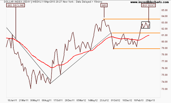
The US Dollar Index (DXY), made up of a basket of major currency pairs against the USD is a good way of measuring the so-called “risk on/risk off” meme prevalent in asset markets, with a lower USD usually meaning higher risk as US stock markets rise and push other risk assets higher, such as our own share market.
On the weekly chart you can see that in comparison with QE2, where the DXY declined some 12%, QE3 – if measured by USD weakness – has not been successful at all as the currency wars continue. The DXY remains above resistance at 81.5 points and although it has been unable to break through the interim pre-QE3 84 point target, a “buy box” is forming which could morph into a breakout, signalling lower AUD, EUR and other crosses, and of course commodity prices:
The first general opposite of the DXY is the euro (EUR/USD). After its break of the year plus down trend in August last year, which was followed by a blowoff as it tried to reach 1.37 on the back of QE3, the euro has retraced and consolidated below resistance at 1.31, which remains a key level:
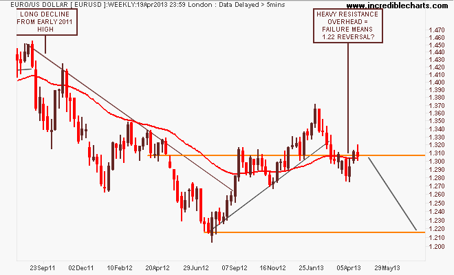
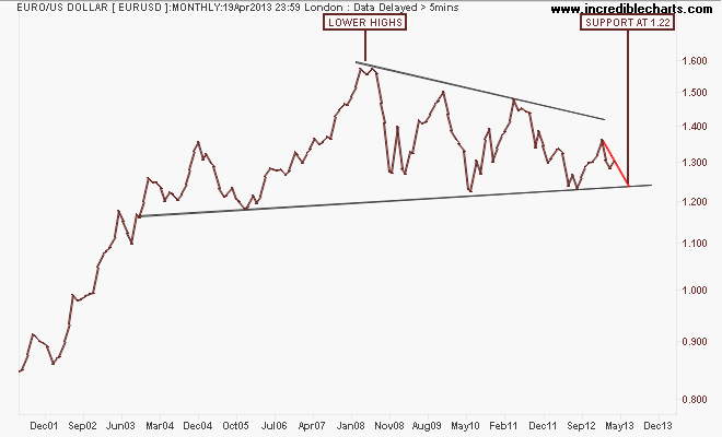
I would contend that failure to breakout above this key level will see the euro retrace back to support at 1.22: here’s the longer term picture using monthly charts. The pattern is quite obvious, with a series of lower highs since the GFC and a strong support zone around 1.20 to 1.22 formed since inception.
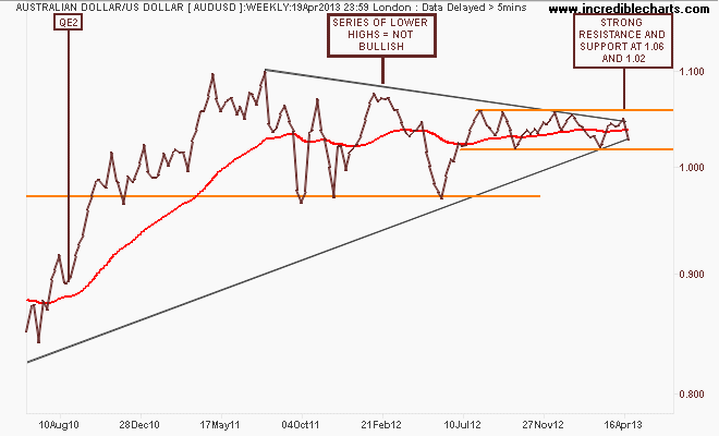
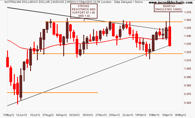
Given the Aussie “battler” (AUDUSD) is the premier commodity proxy, why it hasn’t fallen further since the commodity complex has broken down is very interesting. More safe harbour buying? The weekly chart remains a fascinating picture, giving an insight into how this is playing out. The key takeaway in the medium term is that clear, strong channel between support and resistance at 1.02 and 1.06 respectively since mid 2012:
The closer 1 year weekly chart below is very illustrative in my opinion, with a bearish engulfing candle this week:
Here’s the daily chart for even more context, with my favoured MACDH setting below. The candles show a lot of intraday selling pressure as the battler is getting pushed down to support at 1.02, where it is likely to be bought up again.
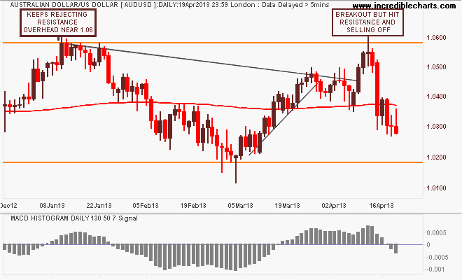
One of the best ways to trade the AUD in recent months has been selling resistance and buying at support – but an accelerated risk off mood in commodity prices, coupled with the end of the mining investment boom (i.e less net currency inflows) should mean a lower AUD in coming months. Add the RBA probably waking up (eventually) that lower rates are required to keep the economy on an even keel (even though the keelwood is rotten) and my personal bias, opinion and position is to short AUD and add to those shorts on a break below 1.02.
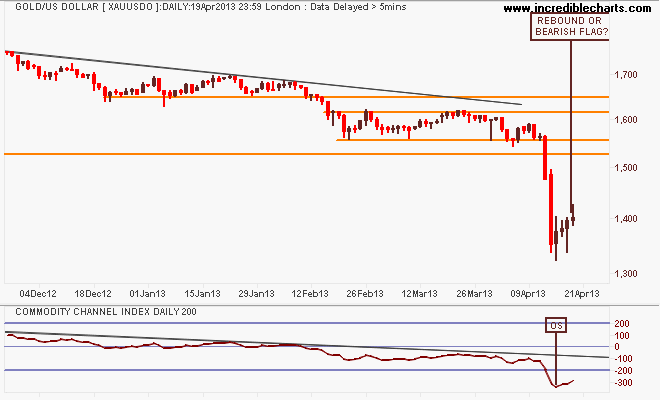
I’ll finish the currency section with the undollar currency of the moment, gold (USD).
Read last week’s review for my indepth look at gold for context. Today I just present the weekly and daily charts:
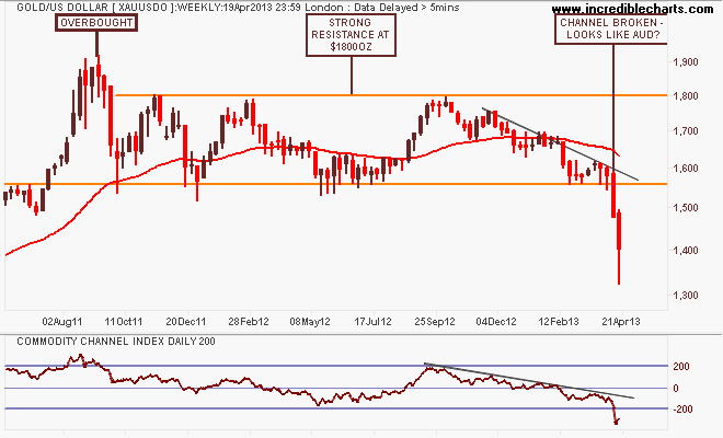
The only comment to make is after the epic breakdown, is this week’s weak rebound (with a lot of noise about a lot of physical buying at these “bargain” prices) just a pause in the sell down or the real thing? My bullish breakout level, based on average true range, is above $1443 per ounce:
Equity Markets
Before I get to the Aussie market, let’s look at the US S&P500 starting with the monthly chart showing a possible end to the US secular bear market, going on 13 years from the tech bubble high in 2000:
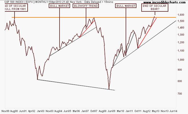
Note how the index before the GFC almost broke that high after a blowoff trend (marked in red) that accelerated in 2006 from the main trend. Note also that this pattern has been repeated – albeit with a lot more volatility and acceleration due to continued bouts of QE – with an accelerated uptrend from the August 2011 low. Not the same, but very similar.
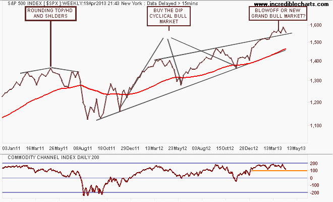
The weekly chart below shows this blowoff in greater detail, with a series of higher highs that is smaller on each up cycle. But the market remains on trend with the weekly price staying above the upper trend line, as reflected in its overbought status according to CCI:
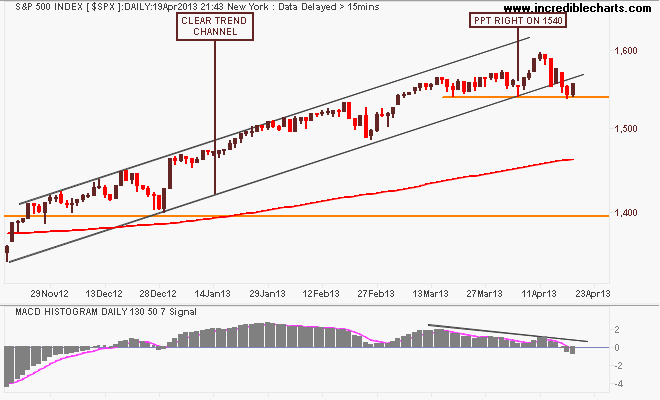
Looking at the short term point of view, the key level of support at 1540 points (now touched four times in the last few weeks) remains crucial. My MACDH setting is indicating an end to the trend with a view to start an “exploratory” short before this key level is breached. Although Friday’s session saw a good bid – and in Europe as the DAX and FTSE are under much stronger selling pressure – we are now moving into the repetitive “Sell in May” period of the year as the risk rises that consumer spending from Xmas will not follow through….w
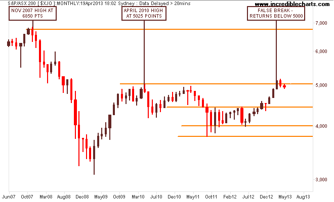
I contend that our own share market, the S&P/ASX200 index is only halfway through its own secular bear market – mainly on the back of the banking sector, which is completely dependent on an easing cycle in interest rates AND continued increases in national income AND access to wholesale credit markets at cheap prices.
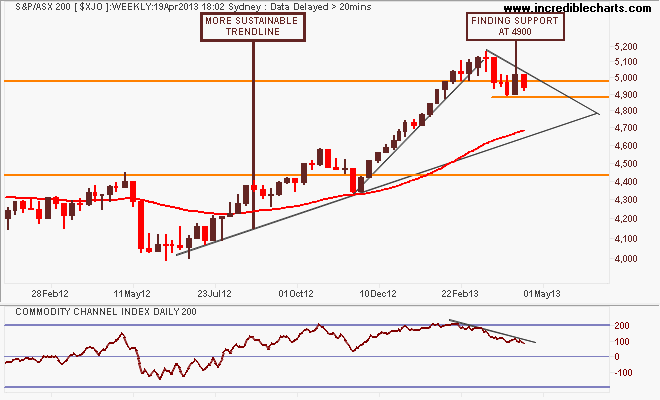
Note these important levels: the key levels at 3800-4000 (strong support), 4400 (intermediate resistance and the outer edge of the index’s real value), 4900-5000 (strong resistance) and 6850 (the former high of the 2003-2007 bubble).
My medium term view is that the recent rally has been unsustainable – and completely carried by the financials sector as the RBA eased rates to re-inflate the housing sector. That the materials sector has corrected sharply during this time as commodity prices came off the boil as Chinese authorities try to transition their economy added to the risk of a correction and back to the trajectory from the first uptick in the August 2012 lows, around 4600-4700 points.
On the weekly chart, the market is finding support at 4900 points and must maintain that or falls back to 4600-4700 will likely follow:
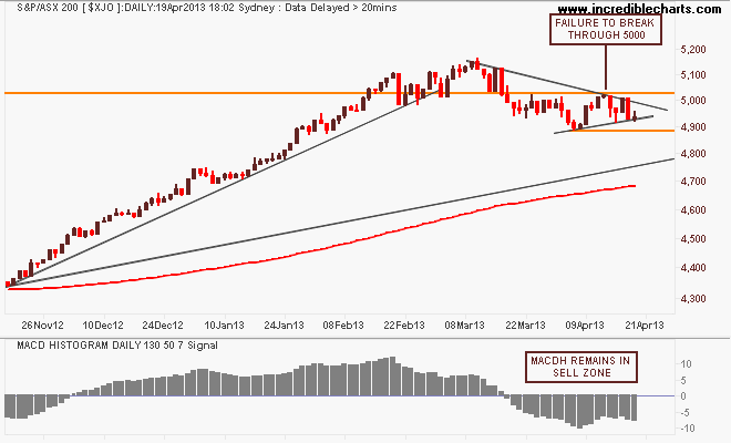
On the daily chart, my MACD remains in the sell zone, with a reversal required above 5000 points. This is a high risk time, because the market – i.e the banks – has to wait til early May for another cut in the cash rate to get moving again (current probability is around 40%). A rally in the materials could help here, with iron ore possibly showing the way – or another dead cat bounce:
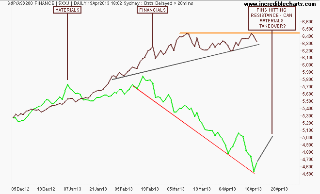
Here’s the financials annd materials (green) sector daily charts to put this into perspective. A pair trade of shorting financials and going long materials might be something to consider in the weeks ahead…
That’s all for now, remember to manage your risk first and the returns will come thereafter. See you next week and stay safe.