


By Chris Becker
Here’s my roundup of what happened in major macro markets in the last week and what could happen in the weeks ahead as the world’s central bankers continue to apply the “milkie wilkies” of easing, liquidity, and low/zero interest rates.
Remember, the following views are my own, do not constitute advice and are for information purposes only. I may have positions in any or all of the below and their associated markets both long and short, on an intra-day, daily and weekly basis for my own account. Please seek advice from a licensed adviser before making any investment decisions.
Currencies and Gold
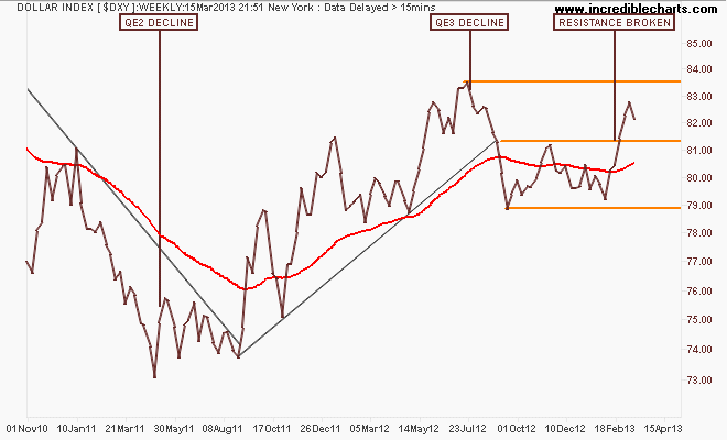
The best way to measure or gauge currencies is through the US Dollar Index (DXY) which is made up of a basket of major currency pairs against the USD. Since the GFC (Great Recession) it has been the major “risk on/risk off” indicator, with a lower USD usually meaning higher risk as US stock markets rise and push other risk assets higher, such as our own share market. But there has been a shift, as witnessed by the decline in the “undollar” currency, gold, which I’ll cover shortly.
On the weekly chart you can see that in comparison with QE2, where the DXY declined some 12%, QE3 – if measured by USD weaknesss – has not been successful at all as the currency wars continue. This past week has seen the DXY still above resistance at 81.5 points but unable to reach the interim 84 point target, reversing its current course:
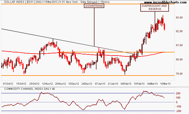
This week’s reversal is clear on the daily chart, where the DXY has reverted from its overbought path (see the bottom indicator). Whether this will be sustained or just a pullback is unclear:
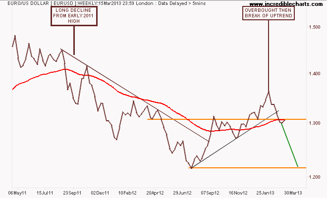
Because of its composition, the general opposite of the DXY is the euro (EUR/USD). Some context before looking at the most recent move: After its break of the year plus down trend in August last year, the euro had broken out above resistance (former support) at the 1.31 level before becoming overbought and correcting. In previous weeks we’ve seen a consolidation below 1.32 and now a possible bounce as it settles around its 200 day moving average (the red line in all charts):
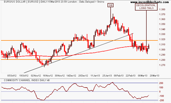
Here’s the shorter term picture with an obvious channel between resistance at 1.32 and support at 1.28. Note this past week has seen continued deceleration, with long tails under the daily candles (indicating intraday buying support at lows). I still contend the path for the euro is down, but we could see a retest of the overbought 1.37 high if the US dollar weakens further in the short term:
This week has seen some good (or bad, depending on your point of view) volatility in the Aussie “battler” (AUDUSD) as reaction to economic data has seen bids return. I posited previously that the battler was close to breaking its 3 year uptrend from the pre-QE2 low where the weekly chart below shows a deflating series of lower highs from the mid-2011 highs. Price has rebounded from support:
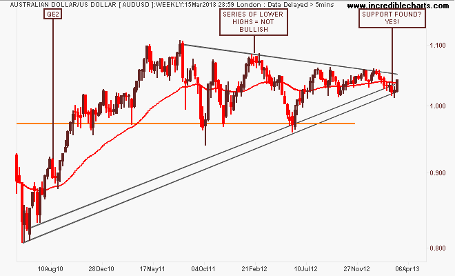
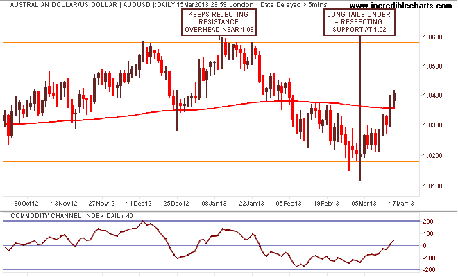
I said last week that “it’s a big stretch to call this a bottom. As the current easing cycle remains in limbo, and the USD remains strong, the most likely outcome is rangebound between 1.02 and 1.04. In other words, still time to do online shopping until 3Q and 4Q when I contend we will no longer quote AUD with a 1 in front of it…”
And I still hold that opinion, even though I’m wrong in the short term, with the battler rallying off the support level indicated on the daily chart – a 200 pip profit on a swing trade (which I’m starting to come around to as a trading strategy for currencies!):
I’ll finish the currency section with the undollar currency, gold (USD) which I’m sure a lot of you are interested in hearing about!
The main precious metal (I also trade silver, palladium and platinum) continues to confound the gold bugs and bears alike, but USD strength is weighing against. Here’s the weekly chart which paints a very clear picture, where price remains right on the nearly 2 year support level at $1560 per ounce. But is this consolidation, ready for the next leg up or a distribution period before the final sell off?
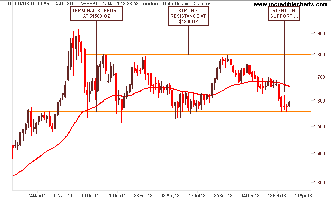
My thoughts remain that if gold is in a bubble, it would need an August 2011 repeat (ie massive parabolic surge) before a final sell off – the support has been too strong, with intraweek candlesticks pointing to huge amounts of buying at lows whenever it approaches $1550 or so.
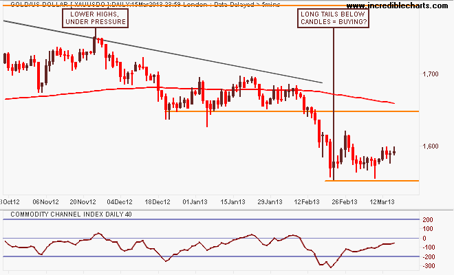
As I said last week, the daily chart paints many different pictures, depending on your point of view. It is notionally bullish, coming off an oversold low, but is not triggering any sort of trend following signals….at least on daily intervals. I suspect that the breach of the $1600 psychological key level could see a rally up to resistance at $1650:
Commodities
For Australian investors particularly, there’s three major commodities to watch: crude oil, copper and iron ore. I’ll leave the last to Houses and Holes with his excellent daily updates (although it’s non tradeable for retail/private investors – Fortescue Metals (FMG) and Atlas Iron (AGO) are excellent proxies, both of which I trade regularly – and FWIW, turning March into a very profitable month!), but crude oil and copper are great barometers displaying both real demand and US dollar strength/weakness.
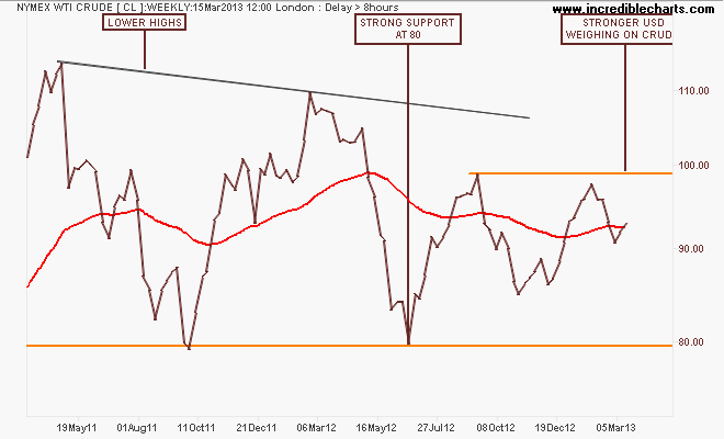
First, lets take a quick look at the WTI Crude marker, which finally had a good week on USD weakness, albeit only up about $3 per barrel. Here’s the weekly chart for context:
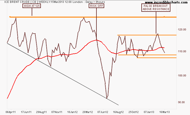
Then, ICE Brent Crude, with the weekly chart of the spot price showing a false breakout above resistance at $117 per barrel which has continued its retracement to the bottom of its channel. This is similar to WTI Crude, although more volatile (hence why I prefer trading it) and may show a lack of demand? A break below $107-108 is very bearish:
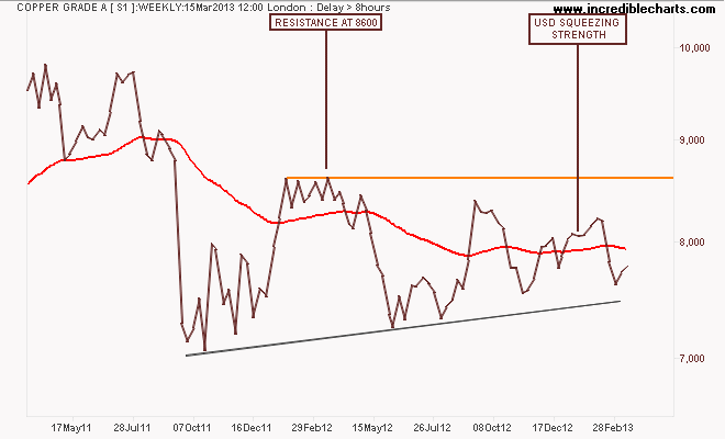
Is the picture changing for Copper? The key industrial metal is slowly eking out gains off its lows in the past week on temporary USD weakness, but the”big Monty Python foot called the USD pushing down” as I said last week continues. IF we get a breakout above $8600 per ton, you have to say that Gerard’s Minacks view of a new upcycle has been confirmed:
Equity Markets
Now to stocks, actually first the VIX, now below the pre GFC “everything is fine” levels!
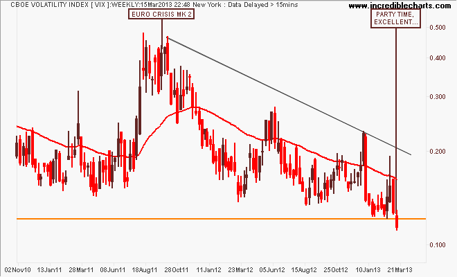
There’s no need for a daily chart (which I view each night/morning as part of my routine as it effects my position sizes and contingency plan) just look at that red weekly candle! Party on Wayne, party on Garth…
I recently saw a local advisory firm tell its clients to sell VIX puts (i.e you profit on VIX continue to stay low) alongside buying SP500, ASX200. That is, double long risk…
Houses and Holes earlier this week asked “where too for the US S&P500?” and last night the market almost closed at a record high – 1563 points. Using the monthly charts, does this mean the end of the secular bear market, going on 13 years from the tech bubble high in 2000?
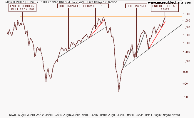
Note how the index, before the GFC almost broke that high after a blowoff trend (marked in red) that accelerated in 2006 from the main trend. Note also that this pattern has been repeated – albeit with a lot more volatility due to bouts of QE – with an accelerated uptrend from the August 2011 low.
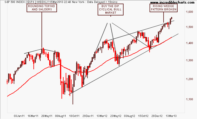
The weekly chart below shows this blowoff in greater detail, with a series of higher highs that is smaller on each up cycle but has now blown a nominally bearish rising wedge pattern (where the higher highs are not same magnitude of the higher lows).
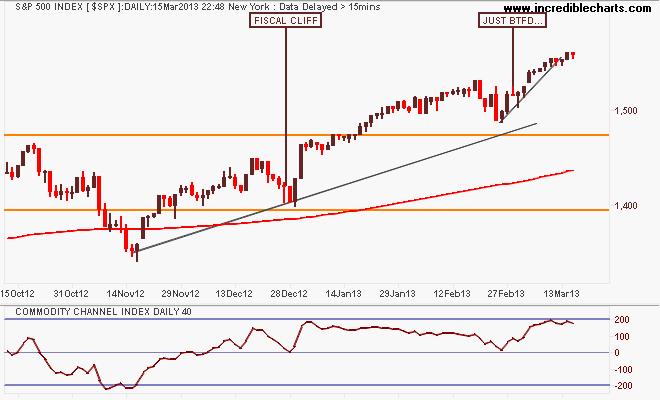
Looking at the short term technical point of view, this market remains bullish, with the 200 day moving average moving smoothly up left to right, breaking through resistance levels and bouncing off support in classic “buy the dip” fashion. But note that it remains in an overbought condition, according to the oscillator below (CCI).
I’m looking at just below 1490 points and the below 1470 points as a short entry point. But on the flipside, as I said last week, the risk/reward calculation at this point in time suggests only a small long position:
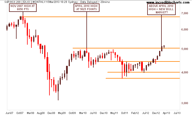
The local S&P/ASX200 index is halfway through its own secular bear market in my opinion, and mainly on the back of the banking sector. While it is now obviously in a cyclical bull market, there are several things to note in the monthly chart below.
First, the key levels at 3800-4000 (strong support), 4400 (intermediate resistance and the outer edge of the index’s real value), 4900-5000 (strong resistance) and 6850 (the former high of the 2003-2007 bubble).
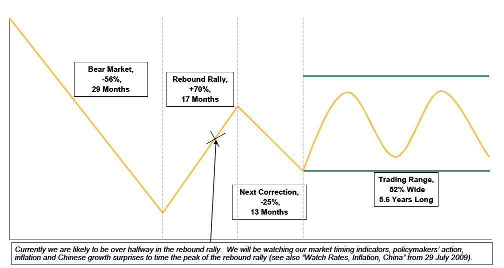
Secondly, note how the current reflation rally looks almost identical to the March 2009 low in its speed and trajectory:
Before we go further, check how the above chart matches this chart from a Morgan Stanley study that shows how our current market is going right according to historical guidelines. We’ve had the rebound rally, a major correction (2011), and now we are in a trading range with cyclical rallies and corrections. My opinion is we are likely to have a similar triple top pattern to the end of 2009 (a series of small corrections and counter rallies) throughout 2013 as this cycle has been far too quick:
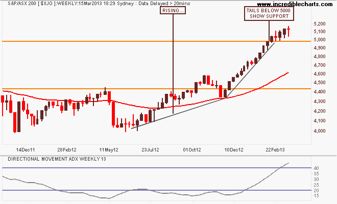
The weekly chart remains in the clear definition of overbought. You do not have 13 plus straight weeks in a row without a correction of some nature. Unfortunately, market participants expect more of the same when the same has been good with plenty of support at 5000 points – but that weekly ADX indicator cannot be ignored:
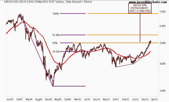
I previously suggested that a sizeable correction back to 4600 points would provide greater strength for a rally to break through 5000 points and further this year. Here is my technical target, based on a Fibonacci retracement of the GFC top and bottom. The 5000 point level is the 50% retracement, with the 61.8% giving an overhead target of 5400 points.
It’s fairly obvious that to achieve this target (or even higher) requires a slightly more sedate trajectory, which means we will have a correction in the coming weeks and months. The question remains is that a good time to take profit, or load up again?
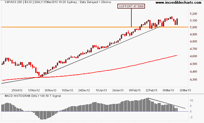
Here’s the short term view, where the MACDH indicator is showing a bearish divergence, which would only be confirmed on a break below 5000 points. However, as much as this view might be considered bearish (I can even see a small head and shoulders pattern forming), on top of my bias that the financials – which make up almost half the index – are extremely overbought and ready to correct, there is no such thing as impossible in markets. Look at the Nikkei 225 – up in almost a straight line – anything can happen. The only certainty in life is uncertainty:
That’s all, remember to manage your risk first and the returns will come thereafter. See you next week and stay safe.