By Chris Becker
Apologies for missing last week’s missive, but I was helping friends and family cleaning up from the torrent of rain here in Queensland – some Sunshine State!
So here’s this weeks roundup of what happened in major macro markets. Remember, the following views are my own, do not constitute advice and are for information purposes only. I may have positions in any or all of the below and their associated markets both long and short, on an intra-day, daily and weekly basis for my own account. Please seek advice from a licensed adviser before making any investment decisions.
Currencies and Gold
The best way to measure or gauge currencies is through the US Dollar Index (DXY) which is made up of a basket of major currency pairs against the USD. Since the GFC (Great Recession) it has been the major “risk on/risk off” indicator, with a lower USD usually meaning higher risk as US stock markets rise and push other risk assets higher, such as our own share market. But there has been a shift, as witnessed by the decline in the “undollar” currency, gold, which I’ll cover shortly.
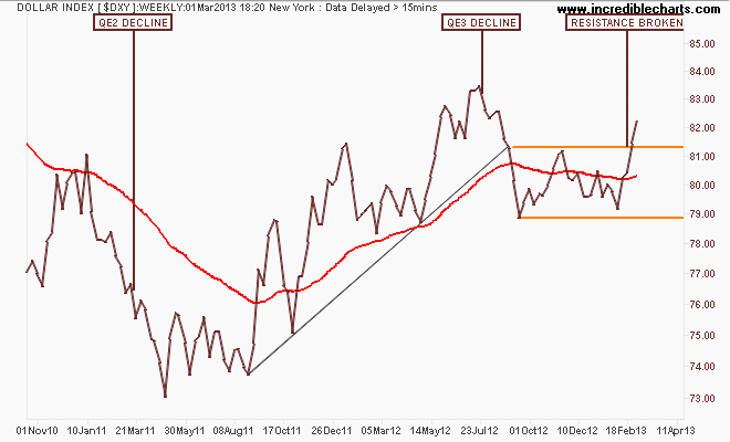
Starting with the weekly chart you can see that in comparison with QE2, where the DXY declined some 12%, QE3 has not been as “successful” as the USD slowly “loses” the currency wars, maintaining strength. The DXY has now clearly broken out above resistance at 81.5 points and well above its 200 day moving average (the red line in all charts):
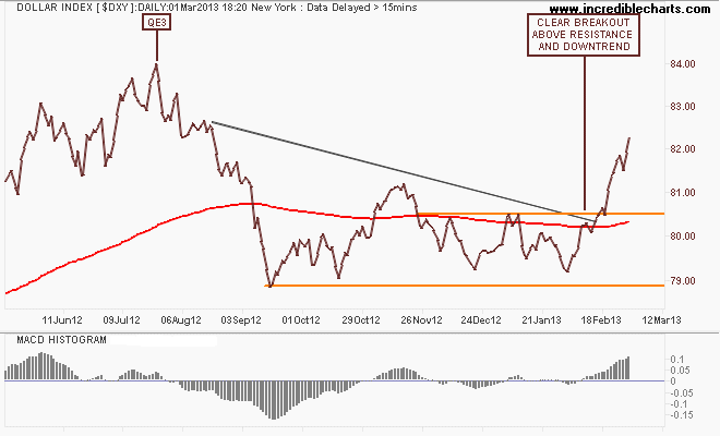
On the daily chart, this past two weeks have seen the USD strengthen considerably (or more appropriately the other currencies weakening), and its downtrend since QE3 – supposed to weaken king dollar – completely broken. The target here is around 84 points, even higher if the US Congress doesn’t get its act together, or the EU for that matter:
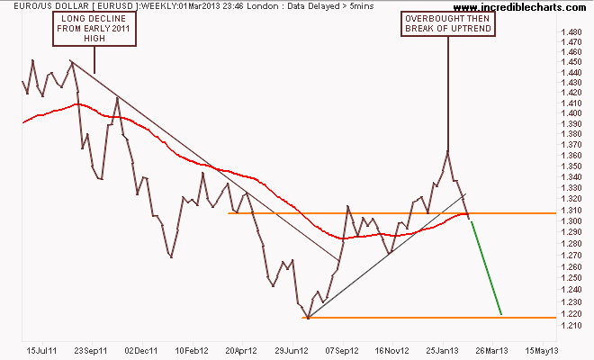
Because of its composition, the general opposite of the DXY is the euro (EUR/USD). After its break of the year plus down trend in August last year, the euro had broken out above resistance (former support) at the 1.31 level on the weekly chart. It continued this trend, before becoming overbought as noted in my last Trading Week, but still staying on trend. Until this reversal, which depending on USD strength could see the euro falling considerably:
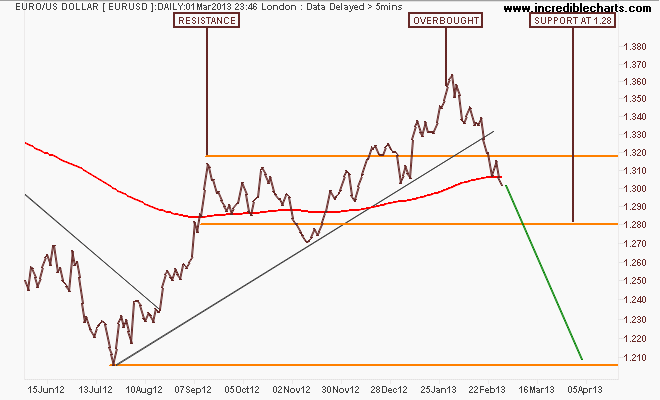
I thought a pullback to support at 1.32 was likely on the overbought condition, but the euro fell through. As I said “This is the key level to watch as it would break the uptrend from the July 2012 lows and possibly send the euro back to 1.28“: which is the first target area for this correction, with the potential if it breaks through to go all the way to 1.22 or even lower:
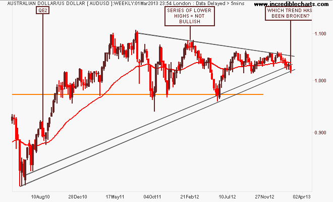
Has the Aussie “battler” (AUDUSD) finally broken its 3 year uptrend from the pre-QE2 low as the USD strengthens? The weekly chart below shows a deflating series of lower highs from the mid-2011 highs,. The problem is are we right on the trend line from the August 2010 lows, or below? Going by candlesticks, which shows intra-week extremes, the trend is just intact. Using weekly closing prices, it is not:
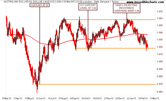
On the daily chart its fairly obvious there is tremendous selling pressure from above (or lack of buying pressure) with the battler retracing to the 1.02 level and well below its 200 day moving average. If the battler closes below that support level, its probably a jagged ride down to 97 cents as intraday volatility is rising (measured by average true range). If not now, then later in the quarter, in my opinion, against the USD. Have you done your online shopping for the year yet?
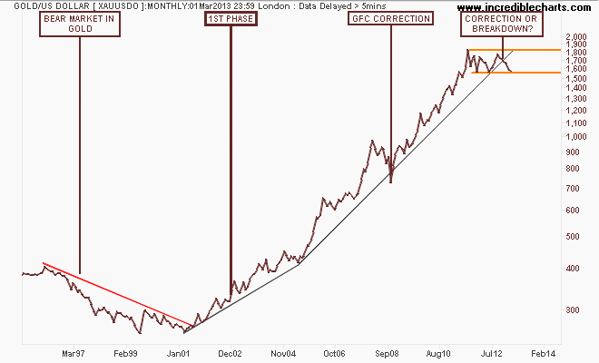
I’ll finish the currency section with the undollar currency, gold (USD). The main precious metal (I also trade silver, palladium and platinum) continues to confound the gold bugs and bears alike. First, here’s some context, with the long term monthly chart (this is a semi-log chart by the way, not linear – is this the end of the gold secular bull market or just a correction?
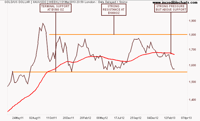
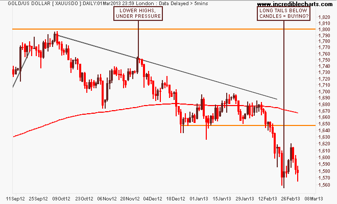
The medium term frustration can be seen on the weekly chart, with a sideways move for nearly 18 months with resistance at $1800 and support at $1560 per ounce providing the boundaries. My contention previously that a slowly rising trend of higher lows could be bullish was wrong. There is too much pressure here, mainly from speculative positions being wound back:
I did say a couple weeks ago that “short term, this is oversold (I remain short, but with a tighter stop), but it’s very hard to gauge if this is just a speculative unwinding and moving into stocks on the recovery meme, or something else”, and we had a small rebound rally up to $1620 before another sell off back to tentative support. Note the long tails underneath the daily candles, which could mean buying support.
However, until we see some USD weakness, “undollar” gold will remain weak. The main danger is a correction below that strong support level which will see most algos/CTAs/hedgies and the like unwinding their gold positions and heading straight to USD.
Commodities
For Australian investors particularly, there’s three major commodities to watch: crude oil, copper and iron ore. I’ll leave the last to Houses and Holes with his excellent daily updates (although it’s non tradeable for retail/private investors – Fortescue Metals (FMG) and Atlas Iron (AGO) are excellent proxies, both of which I trade regularly now), but crude oil and copper are great barometers displaying both real demand and US dollar weakness.
And there’s reason to be concerned that the enthusiasm in equity markets is not being matched by the commodity complex.
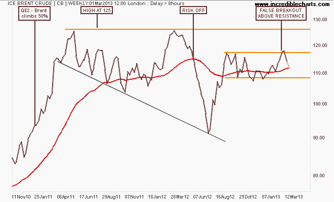
First, here’s ICE Brent Crude, with the weekly chart of the spot price showing a false breakout above resistance at $117 per barrel which has retraced to the middle of its channel. This is similar to AUDUSD, although not as bearish:
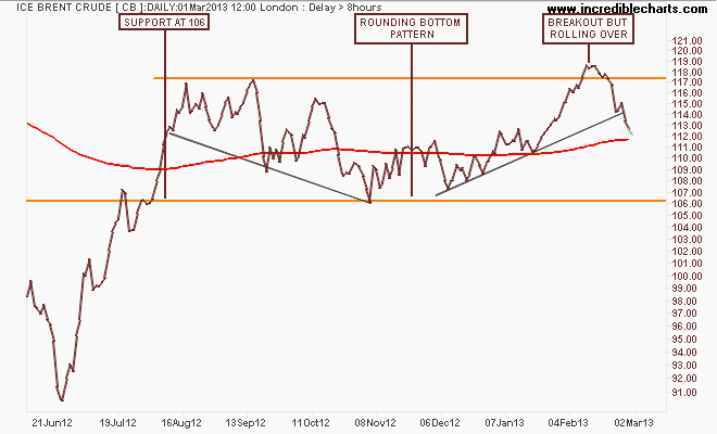
I was long Brent on my weekly system (a paltry 1R win, nothing to write home about) but no longer. I said before that “I have my doubts about Brent because resistance above at $125 does not bode for high risk/reward trades.” And this has played out as seen on the daily chart, although price is still above the 200 day moving average, it looks like Brent is stuck in its channel, with support at $106 the key level.
Copper is the other significant market that is facing more resistance over head than Brent and indeed looks very weak here on the weekly chart:
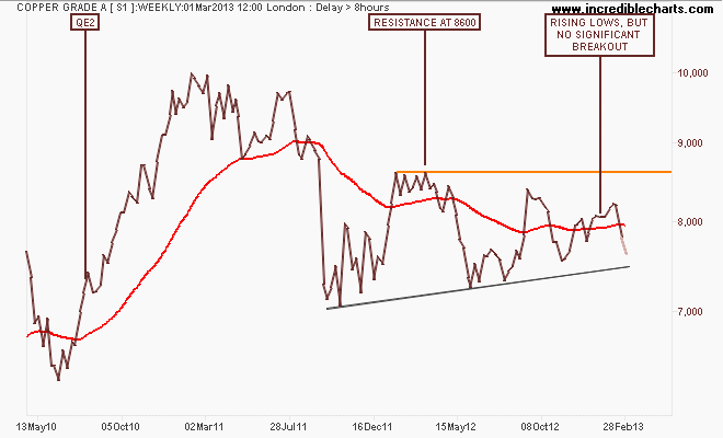
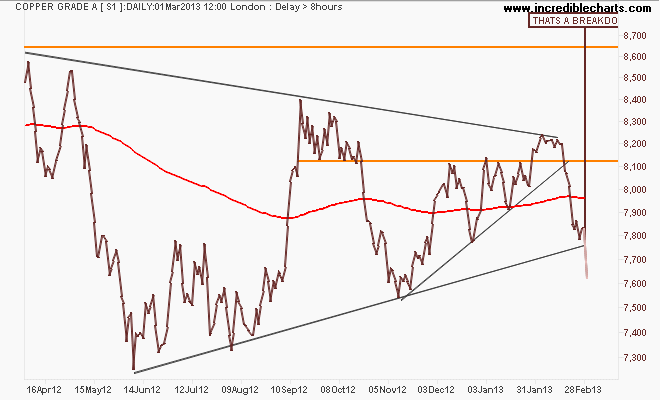
On a shorter time frame this key industrial metal was in a small uptrend, but could not breakout higher above its medium term downtrend from April last year. This past week we’ve seen a capitulation in LME copper as it closed below the rising support/trendline from the June 2012 lows. This does not bode well for risk, in my opinion:
Risk and Volatility
Now to stocks, actually first the VIX, now almost at pre GFC levels, approaching the so-called danger zone: “cheap, cheap, cheap” as I said last time, buying some options….
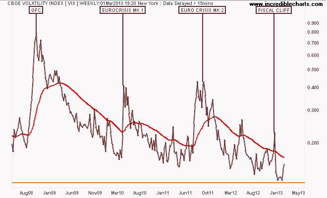
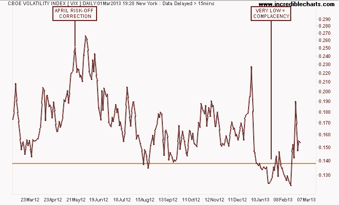
As you can see on the daily chart (which I view each night/morning as part of my routine as it effects my position sizes and contingency plan) the break below the 14 point level showed a huge amount of complacency, which paid off with a large spike recently. But this has not followed through:
The US S&P500 index still has the historic pre-GFC high at 1550 points in its sights, which has always been my target. I’m still concerned that this represents a similar mood to the blowoff rally in 2007, with an increased likelihood of a pull-back or correction to the lower trend line down to 1400 points or so. Here’s the monthly chart of the 13 year long secular bear market in US stocks:
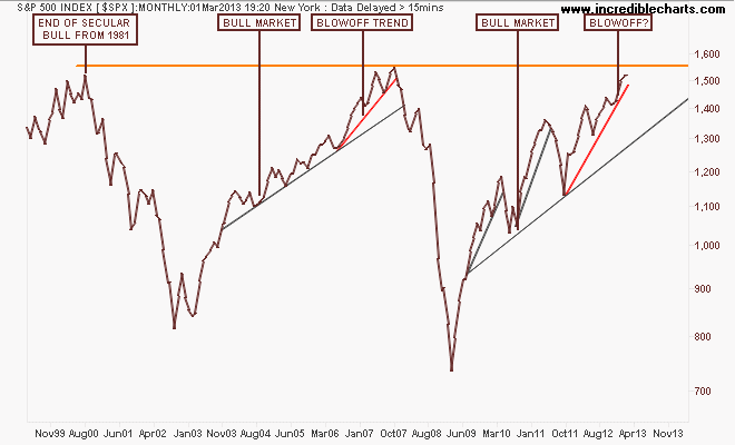
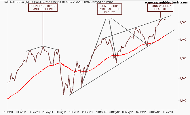
The weekly chart below shows how the series of higher highs is smaller on each up cycle and again is forming a rising wedge pattern (where the higher highs are not same magnitude of the higher lows), which is very bearish. Further, there has been three “cross” weekly candles in a row, showing a lot of hesitation in moving further. Yes, I’m now short here, tentatively:
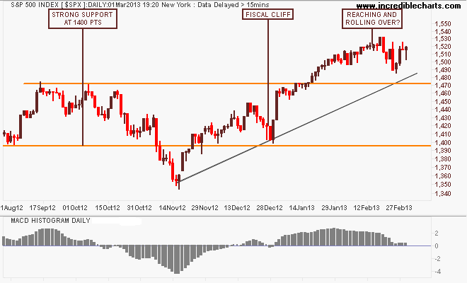
You can see this hesitation in the daily charts. Note my previous note where I thought the SPX could be reaching and rolling over. I initiated a short earlier this week, reversing my long position (I run a reversal system for the SPX, I always have a position), and I’ll add to the short on a break below support at 1470 points, a very obvious key level. Note also that the MACDH is still positive, but declining, similar to the rejection of resistance in the move in October last year:
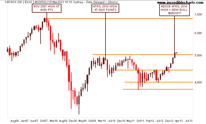
Whilst US markets have had 13 years in a secular bear market (defined as a market that fails to break its previous historic high), the local S&P/ASX200 index is halfway through in my opinion. While it is now obviously in a cyclical bull market, there are several things to note in the monthly chart below.
First, the key levels at 3800-4000 (strong support), 4400 (intermediate resistance and the outer edge of the index’s real value), 4900-5000 (strong resistance) and 6850 (the former high of the 2003-2007 bubble):
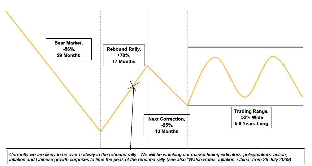
Before we go further, check our the above chart matches this chart from a Morgan Stanley study that shows how our current market is going right according to historical guidelines. We’ve had the rebound rally, a major correction (2011), and now we are in a trading range with cyclical rallies and corrections. My opinion is we are likely to have a similar triple top pattern to the end of 2009 (a series of small corrections and counter rallies) throughout 2013 as this cycle has been far too quick:
The weekly chart is the clear definition of overbought. You do not have 13 plus straight weeks in a row without a correction of some nature. This is no “permanently high plateau”, with those tails below the last couple of weeks of action keeping the market above 5000 points:
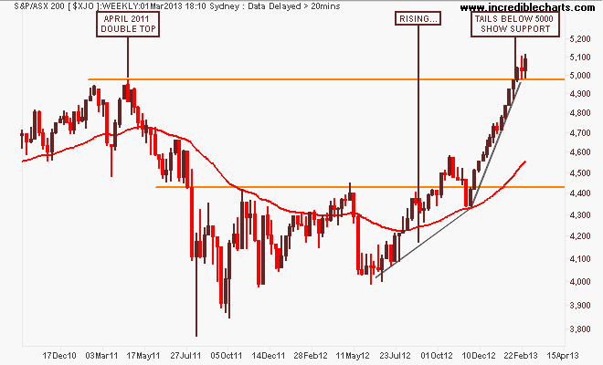
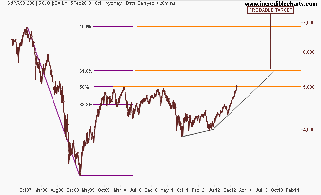
I previously suggested that a sizeable correction back to 4600 points would provide greater strength for a rally to break through 5000 points and further this year. Here is my technical target, based on a Fibonacci retracement of the GFC top and bottom. The 5000 point level is the 50% retracement, with the 61.8% giving an overhead target of 5400 points.
It’s fairly obvious that to achieve this target (or even higher) requires a slightly more sedate trajectory, which means we will have a correction in the coming weeks and months:
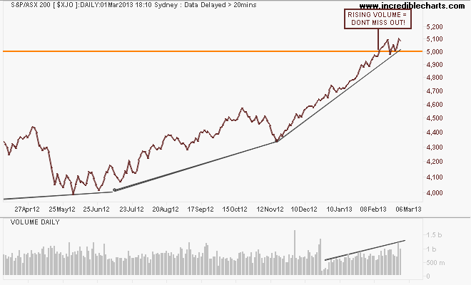
And finally the daily chart and look at the rising volume. I don’t use volume as an indicator per se, but I am concerned at the recent bout of increasing volume in the last few weeks. Is this a sign of the dumb money coming into the market or the key sign that we have a new grand bull market on our hands?
That’s all, remember to manage your risk first and the returns will come thereafter. See you next week and stay safe.
