


By Chris Becker
Australia Day marks the return of Trading Week – formerly Technicals at MacroInvestor – my end of week technical review of major macro markets that I use as part of my investment and risk management process as a proprietary trader.
There are four sections: currencies including gold, debt markets (bonds, credit and housing) then commodities and finally stocks, finishing up with the Australian share market.
Remember, the following views are my own, do not constitute advice and are for information purposes only. I may have positions in any or all of the below and their associated markets both long and short, on an intra-day, daily and weekly basis for my own account.
Currencies and Gold
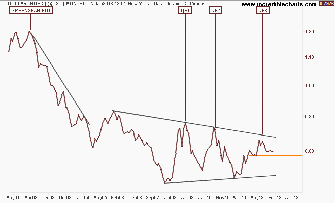
I always start my review with the clearest barometer of risk, the US Dollar Index (DXY). This index is made up of a basket of major currency pairs against the USD, but mainly the euro. For a while now it has been the major “risk on/risk off” indicator, with a lower USD usually meaning higher risk as US stock markets rise and push other risk assets higher – like our own share market.
I take a fractal view when looking at markets, starting with a very long term picture and then drilling down. Here’s the monthly chart going back 12 years showing each iteration of easing – both interest rate and quantitative or “QE” and how the latest round has not been as effective in weakening the USD as in the past:
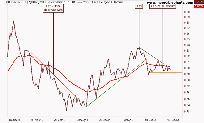
Switching to the weekly chart you can see that in comparison with QE2, where the DXY declined some 12%, QE3 has been mildly successful as the USD battles against the other so-called “printers” in the euro and Yen. While on a weekly basis, the DXY is below its 200 day moving average (the red line in all charts) it is finding very strong support at the 79 level. However, the series of lower highs and a medium term “head and shoulders” bearish pattern forming from December 2012 are good signs for risk and bad signs for the DXY.
Nevertheless, I have a small long position here on my weekly system, mainly as a hedge:
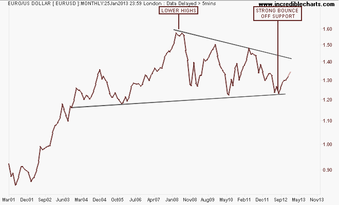
The two other main currencies to look at are the euro and the Yen (both against the USD). Because of its composition, the general opposite of the DXY is the euro (EUR/USD). The long term monthly chart since inception of the union currency shows its overwhelming strength, although a series of lower highs since the GFC continues to find strong support at the 1.20 level against the USD.
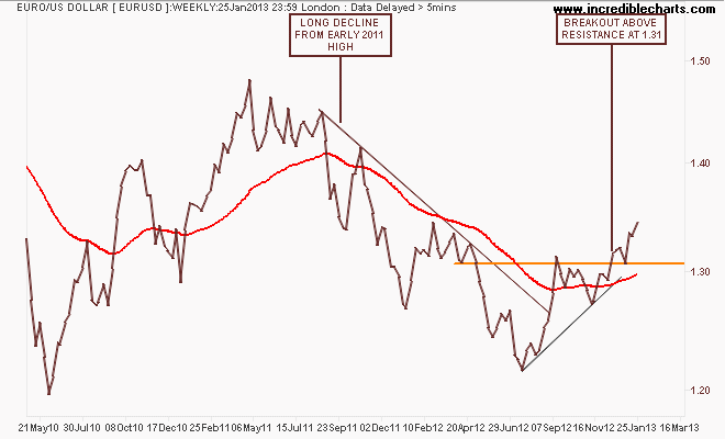
In my last Technicals report, I noted that after its break of the year plus downtrend in August this year, the euro had broken out above resistance (former support) at the 1.31 level on the weekly chart. It has continued this trend, albeit after a hiccup during the US fiscal cliff saga, providing opportunities to add to longs both short and medium term, but going by the longer term chart the 1.40 level and the inability of the DXY to capitulate should provide heavy resistance overhead:
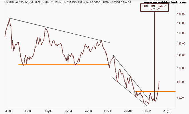
The Yen is monstering ahead (Yen is usually quoted from the short side as the USD/JPY pair – a lower quote means the Yen is strengthening and vice versa) due to a variety of factors. Deus Forex Machina and I separately called the recent breakout last year and I suggested as such late last year before my break (a big move always happens when I go on holidays…), as seen on this monthly chart with my original caption:
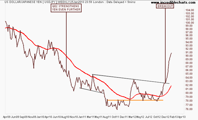
On the weekly chart, the breakout is clearer with the pattern confirmed shortly before Christmas, sending the pair up to 91 Yen, now in a classic blowoff stage quantitatively and within the major support/resistance zone during the GFC. The future direction is always unsure when a government instructs its central bank to “create” inflation, but this looks priced in for now:
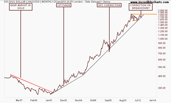
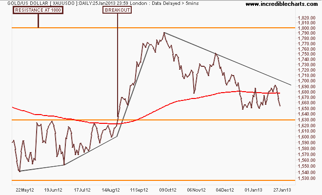
I’ll finish the currency section with the undollar currency, gold (USD), and leave the Aussie “battler” to another day. The main precious metal (I also trade palladium and platinum since the correlations are not as close, comparative to the gold/silver nexus) continues to confound the gold bugs and bears alike. The current move could either be a correction like during the GFC, with the tremendous monetary response thereafter emboldening the buggy spirit, or it’s a sign of a rollover in the 12 year plus secular bull market in gold:
The medium term frustration can be seen on the weekly chart, with a sideways move for nearly 18 months with resistance at $1800 and support at $1560 per ounce providing the boundaries amongs some big daily and weekly moves:
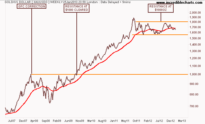
But the short term position is bearish with August’s breakout nearly reversed as a series of lower highs and an inability to translate monetary fear into reality. I said last year that: “this bearish compression from above could see gold head much lower in 2013 – if $90 billion a month in new USD – for at least 2 years or even ad infintum can’t get gold moving, what can?” Indeed. A short-term move above $1695 an ounce may excite some, but for now, I’m short:
Bonds, Credit Markets and Housing
After currencies, the next market to watch is debt, which includes both credit markets and housing. This week I’ll only look at the 10-year US Treasury note (TNX) but I will update my technical charts on Australian house prices soon.
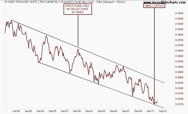
It must be remembered that T-notes are in a secular bull market (lower yields mean higher bond prices), but move with the cycles of risk, just like the US Dollar Index:
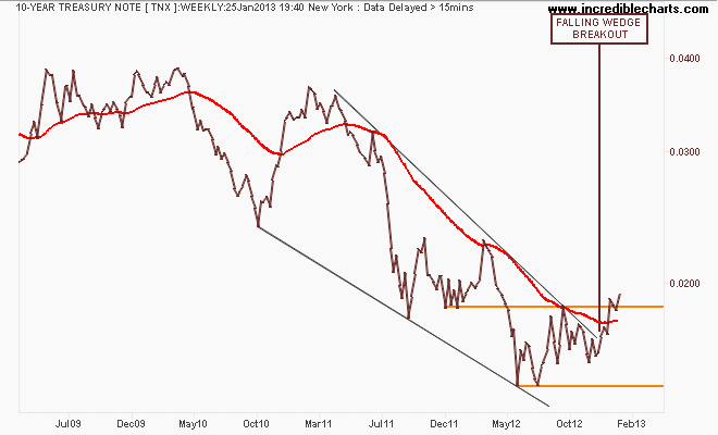
But is now the time for the bond bears to get excited? Last year I noted that the medium term weekly chart indicated a possible large scale reversal under way in T-notes, with a bullish falling wedge pattern which has now completed in the affirmative with a breakout above resistance at 1.84:
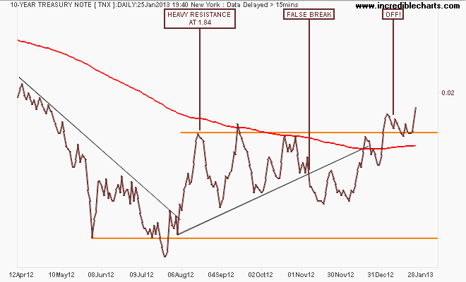
Looking closely at the volatile daily chart (I only trade this from weekly charts and I’m short T-notes, building a larger position), the stiff resistance overhead at the 1.84 key level and the 200 day moving average has been cleared with the target overhead at 2.4% – is this one of the major moves in 2013?
Commodities
For newcomers, there’s three major commodities to watch – crude oil, copper and iron ore. I’ll leave the last to Houses and Holes (and its non tradeable for retail/private investors anyhow), but crude oil is a great barometer displaying both demand and US Dollar weakness. There are two markers in crude – Brend and WTI. This week I’ll look at ICE Brent Crude, with the five year weekly chart of the spot price providing some key context:
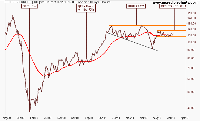
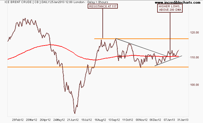
Although confused by European monetary entanglement and Middle East chaos, prices refuse to inch higher on the weekly chart, but the daily chart may show some hope with a series of higher lows and spot price now above the 200 day moving average. I’m long here on my weekly system, but resistance overhead at $117 USD per barrel does not shape up for a high risk/reward:
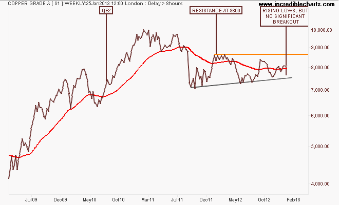
Copper is the other significant marker that is facing more resistance from overhead than Brent. Indeed WTI Crude has a more similar pattern to copper than its heavier brother. Dr Copper is behaving quite weak overall compared to the significant move during QE2, but a series of higher lows with rising support from June last year is mirrored with lower highs, showing an equilibrium of sorts in the medium term:
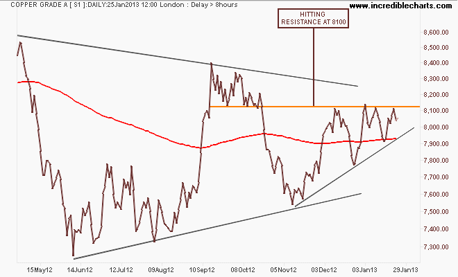
On a shorter timeframe the metal remains volatile as seen on the daily chart, where the reversal of the August breakout last year has been completed but there is another attempt to break above the 8100 key level. I have no position here (copper is one of my less successful securities to trade!) but am watching closely:
Stocks
I’m going to look at three stock markets this week – the Japanese Nikkei 225, the US S&P500 and our own, the ASX200:
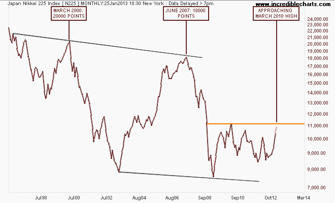
To say its been a bumpy ride on the Nikkei 225 these last 20 years is an understatement, and puts the nail in the coffin in the “buy and hold” mantra. The longer term monthly chart shows the bourse moving back to its March 2010 high after this recent bout of Yen weakness, but still way off the 18000 and 20000 points highs (let alone the 37000 point high in 1989):
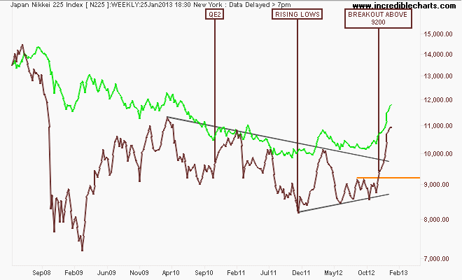
I’ve included the USD/JPY pair (in green) on the weekly chart for comparison, where the correlation – even in patterns is obvious – as the trendline from the series of lower highs was broken after moving beyond the 9200 medium term resistance level:
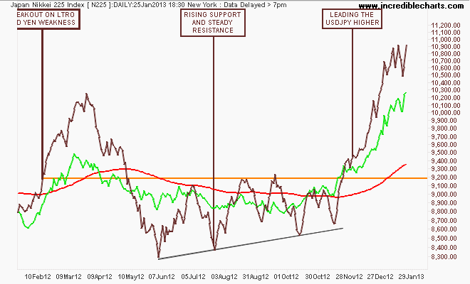
On the daily chart, the bourse actually led the Yen higher first before moving together. The massive move is starting to get a bit wobbly, with intra-week volatility rising substantially in the last couple of weeks, with a tight zone between 10450 and 10900 points. Will we see some profit taking causing a dip, a full blown correction or a higher plateau?
No one knows and risk management is key. I’m not going long here due to the huge average true range and would rather use the Yen pairs (like AUD/JPY and EUR/JPY) to take positions:
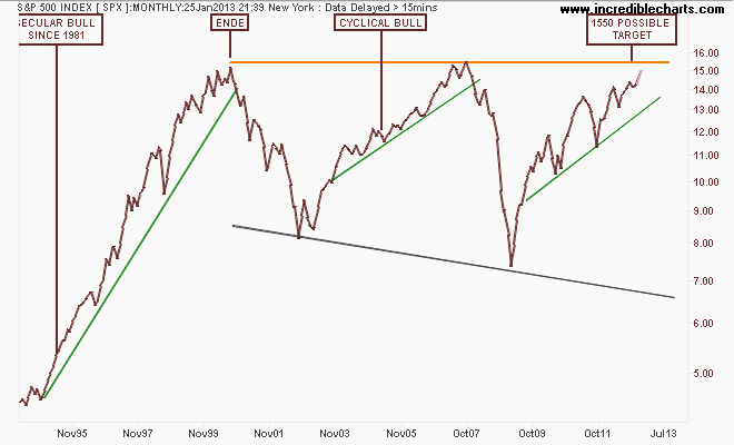
I’ll leave the folly in buying and holding Apple to others, but in US stocks another favourite chart to study is the monthly chart of the S&P500 index since The Great Recession. Each uptick in prices has laregley been because of monetary intervention, with QE3 finally pushing it above pre-Lehman crisis levels. The historic pre-GFC high at 1550 points has always been my target, but I’ve been surprised – post fiscal cliff nonsense – with the moves in the new year.
Pays to always leave your biases at the door when trading markets:
The weekly chart shows how the series of higher highs is smaller on each up cycle and a bearish rising wedge pattern (similar to pre-GFC) continues to form, but each fall has been a dip exciting the bears and enticing the bulls to take prices higher – can this continue?
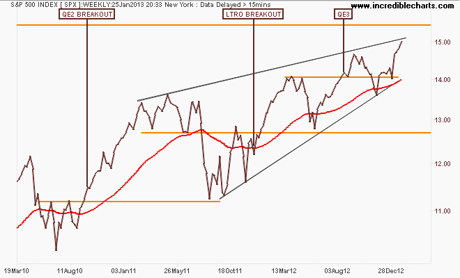
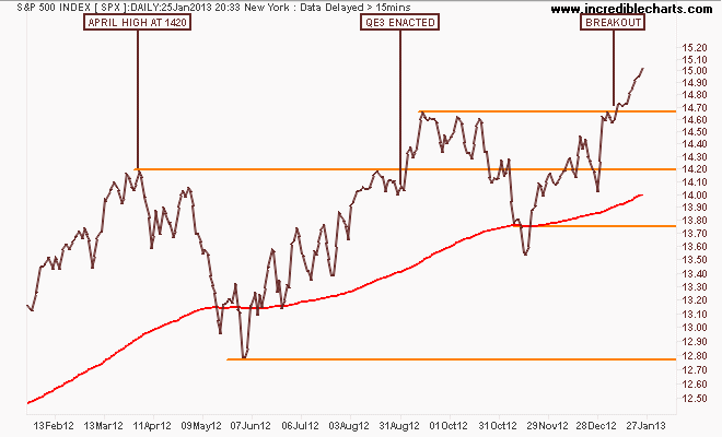
Another dip is likely to take prices to the 1465 point level and then possibly down to 1420 points (the April 2012 high) but any further is unlikely at this stage. I say that being long on my short term system, but prices are overbought. For now – risk on:
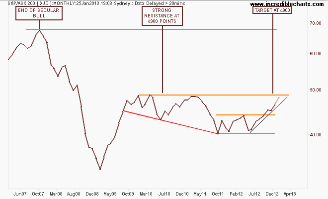
We finally get to the S&P/ASX200 index where it remains in a secular bear market, but now in a cyclical bull market and faces its biggest test as it approaches my original target of 4900 points on the monthly chart. Note these key levels carefully at 3900-4000 (strong support), 4400 (intermediate resistance and the outer edge of the index’s real value), 4900-5000 (strong resistance) and 6900 (the former high of the 2003-2007 bubble).
There’s a lot to look at in the weekly chart – but most important how this has been a financials led rally – i.e Megabank (in green – over 40% of the ASX200) which is nearly at its 2009 highs (before a premature rate tightening took the winds out its sails in 2010). The RBA rate cuts, a Chinese rally and the weakening Yen (note the correlation between AUD/JPY and the ASX200) have all helped pushed the bourse up, but in my mind, too far too fast:
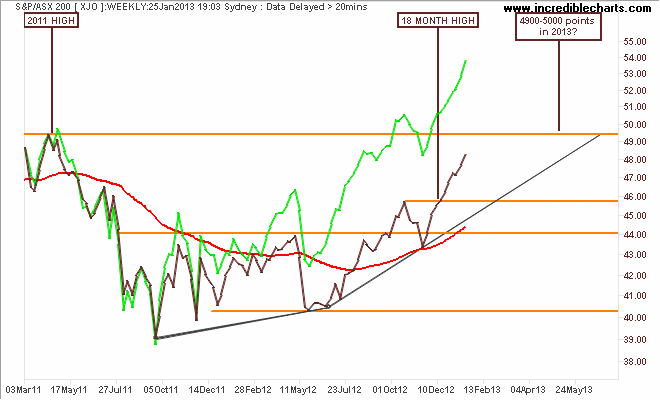
The rally from the June 2012 lows has now accelerated (note the rising angles of the trend lines) as the financials exert their strength on the bourse. A correction back to 4600 points would provide greater strength for a rally up to 5000 points and further this year, but as I said last year, it will take the materials sector to provide that push.
In the short term, materials (i.e mainly BHP and RIO) are moving sideways (I have no position), while financials look like forming a classic blowoff top (I’m long, but tight on my daily system) going into mid-year reporting season. February and March are going to be fascinating for the local bourse!
That’s all, see you next week.