Trading Week

So where have the markets gone this week? Past the daily noise and headlines, this weekly chart heavy post will examine the major markets (debt, commodities and currencies) with the Australian investor in mind.
T’was a wild night on risk markets last night, with a disappointing set of macro data coming out, which validated Houses and Holes US slowdown hypothesis. Let’s put last night’s move into context for what happened over the week and what is likely to happen in coming weeks. The key takeaway is that the next few weeks are likely to be either a wash, or another repeat of the crazy days in August last year, mainly because we have the US Fed meeting on June 20, where a new round of stimulus is almost certain.
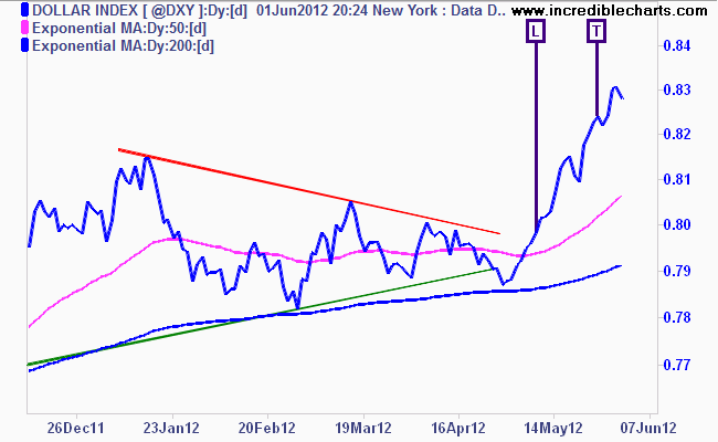
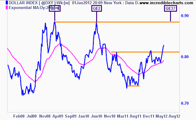
Reserve currency of the world, the US Dollar Index (DXY) in the very short term looks like pausing or topping, even though it is the “unrisk” security. This is due to its WAY overbought status on the daily charts (and the moving averages have stacked, another indicator) and as I’ve said before any sustainable rally requires healthy corrections from time to time.
I still contend it’s going to 88-89 points level before a third (or fourth, if you consider Operation Twist as QE) trigger of monetary easing is pulled, although I will hedge that and say even an intermediate zone around 84 to 86 points maybe enough to get the presses going:
Now to the Euro (EUR/USD) – my recent call that a break below 1.30 would elicit a selloff still holds, but we’ve seen some recent strength on the daily chart, bouncing off support at 1.23 against the USD.
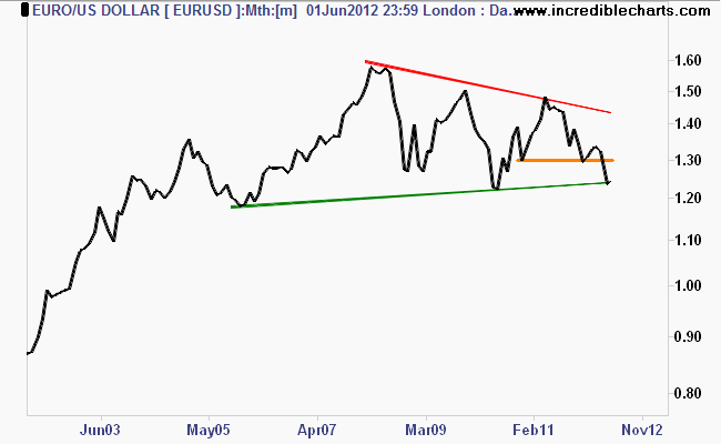
Definitely oversold in the short term (my system has tightened its stop), could we see a bounce here as bond markets continue to “tap-tap-tap” Angela Merkel on the holder that a resolution to the ongoing European crisis needs to happen sooner rather that later? Perhaps.
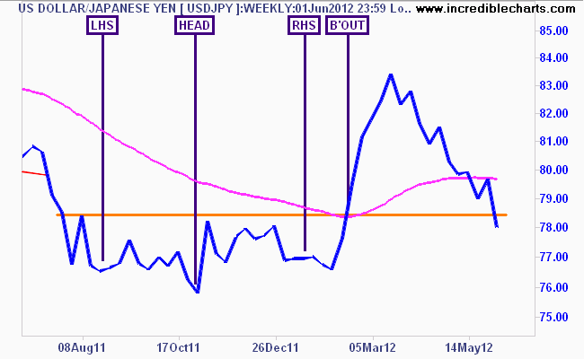
Bear markets come and go but it seems the Japanese secular bear continues. This is reflected in the Yen – USD/JPY which after its recent rally, which Deus Forex Machina and I suggested (as marked on the chart below) beforehand, has now clearly broken support and heading back to the pre-breakout price level:
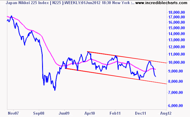
Equities follow currencies (usually), which is why I cover them in this fashion – here is the Nikkei 225 in the same time period as the Yen chart above:
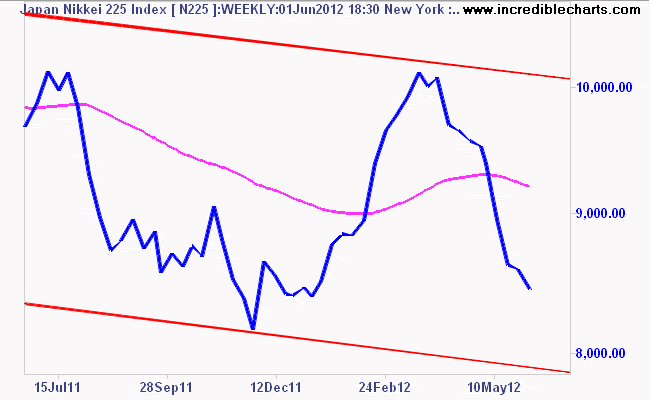 Really needs to be put into context doesnt it? See those two red lines above – here they are in a longer timeframe, classic bear market:
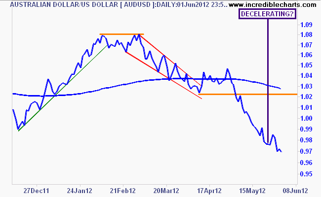
 Greg McKenna (Deus Forex Machina) was on ABC Radio talking about the Aussie (AUD/USD) this morning (MP3) saying the dollar is likely on its way to 80 cents, which I agree with, although I think the route will not be straight down. In the short term we could see a bounce, as its WAY oversold and decelerating:
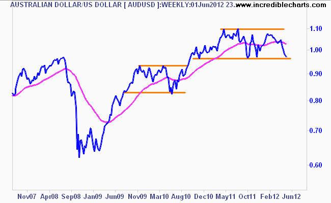
In the medium term however, the macro forces against our currency weigh too much. The economy is slowing, further easing from the RBA is inevitable with a June 0.25% cut certain, and a 0.5% cut shouldn’t be ruled out. The OCR will likely be at or below 3% by the end of this year, IMO. Technically, this looks like a repeat of the pre-QE2 event in 2010 – with a possible false breakout below the lower range of the rectangle pattern followed by a resurgence in risk as the commodity proxy lifts off again on stimulus. Not a good time to be a currency forecaster!
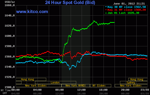
So what happened with Gold (USD) last night? Here’s the intraday chart from Kitco.com:
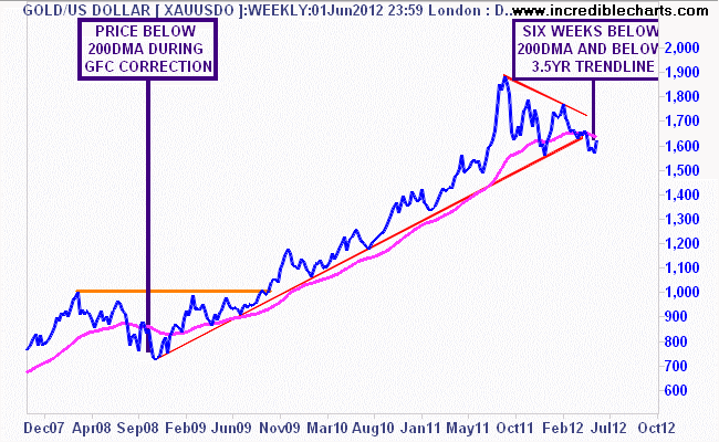
At the last MB phone hookup (we have faces for radio) we discussed the use of candlestick charts on the blog, and I made the case that yes, I use them, but don’t post them (much), because I think they are harder to read than line charts. But it was candlestick analysis that had me thinking the previous week’s weakness was actually finding a bottom at or around $1530-1550USD per ounce:
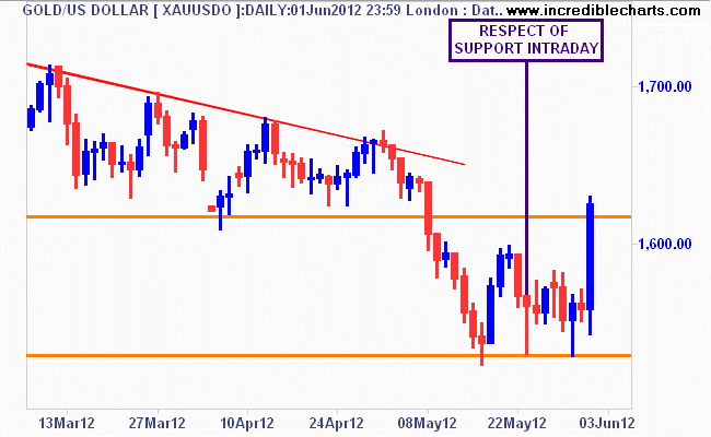
Confusing me however is the nearly 4 year trendline from the GFC bottom has been broken, and as I said last week “prices looks eerily similar to the GFC work-out, where gold breached the lower half of its secular trend channel from 2001. Are we just repeating history here with another round of QE (QE3 or LTRO) to boost asset prices, yet again?” I personally think the gold speculators are getting ahead of themselves and pre-empting the pre-emption of a new round of stimulus. If the bazooka is a fizzer (like Twist), and the Euro crisis is not resolved with a MASSIVE round of money printing (which is what is required, or a continental wide Jubilee, for a structural solution) gold at $1300 or even $1000 per ounce is a probability
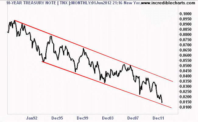
US 10 year T-Notes (TNX) – continued to be a pretty self explanatory trade as it hits new historic lows (1.46%) . Here’s the monthly chart to view the secular trend – need I say more, apart from, it could go a lot, lot lower:
Now to commodities with the CRB Index. I previously stated that the CRB was another market set for a bigger move, with the medium term picture on the weekly chart turning bearish indeed, breaking the 295-300 point key level. Heres another fairly simple indicator of Aussie stock market performance (All Ords marked in green) – remember, we are way overconcentrated in mining stocks on our local bourse, a bad use of asset allocation if there ever was:
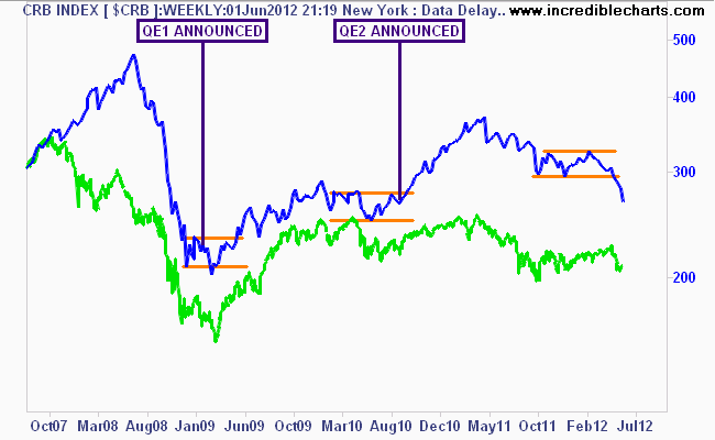
Tremendously oversold is the short term picture, having fallen from over 10% since my recent short call, I would not be surprised to see a bounce in the short term, particularly on QE rumors. But can the junkie again take another hit of stimulus as the entire world economy is slowing down? Lower commodity prices – contrary to mining PR bots – are a good thing for the world economy (lower input costs, higher industrial margins, more profits, more dividends, more spending etc)
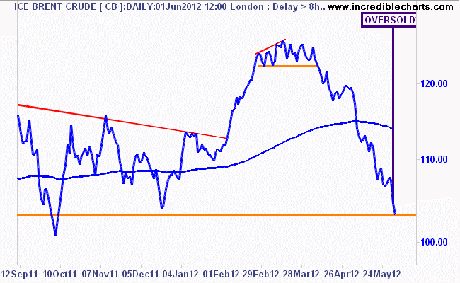
I’m also not surprised at the speed which ICE Brent Crude has fallen as the speculative, liquidity driven, commodity complex unravelled, but it could be too fast. The weekly chart below suggests that Brent is just on its trendline from the post GFC low (reflecting the secular trend within oil prices), with the Coppock Indicator below also hovering on a “no-bull market” negative.
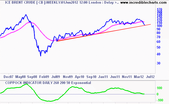
With the current signal from my position trading system, which had entered an initial short on crude before my recent holiday (the Perfect Indicator!), it does appear that crude is oversold and could settle as it approaches the bottom of the previous structure (note lower orange line).
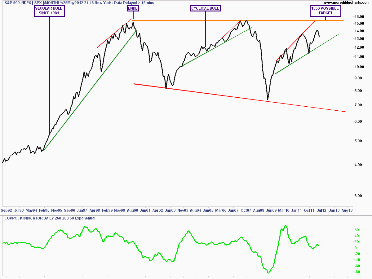
I have stated before that the S&P500 has been in a cyclical bull market since March 2009 – check my podcast here for the full monthly/secular explanation or my post here on labelling markets. Here is the monthly chart explaining those moves since the end of the secular bull market in 2000 – its full size, so click on to expand and see my notes:
Now that the US economy is slowing down (with lower profits a given), and possibly moving into outright recession, is the cyclical bull market over? I’ll leave the macro analysis to the rest of the team on this one, but my technical picture says the bull remains, unless we breach the trendline from the post-GFC low, touched during Greece Crisis Mk 1 and 2:
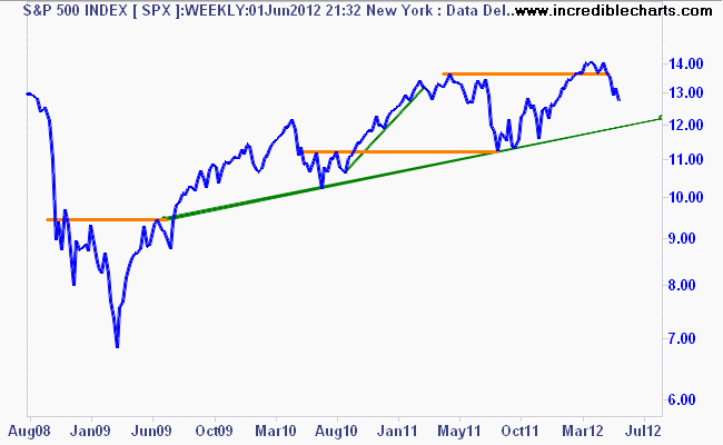
The 1200 points key level is also the highest low experienced during the volatile ranging period before the LTRO induced rally before Xmas. Before I go on, check out the daily chart below, where I’ve marked my system entry and exit points (its a non discretionary system) on both the long and short side:
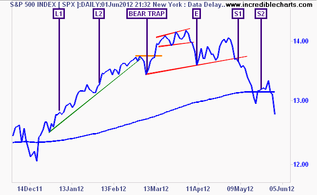 Note the bear trap – admittedly very short term – but this could be the same trap expanded if the market falls further and the Fed rushes in. Last week, after suggesting that the previous little upside blip looked like the proverbial dead cat bounce, I said:
 There remains a staggering array of catalysts here that could see the market move up or down by 10-20% in the coming weeks (next Greek election, new Eurobonds, QE3, LTRO2, conflict with Iran, etc ad nauseam).
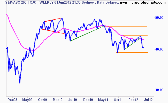
This cautiousness should extend to our local bourse, the S&P/ASX200 (XJO) which is suffering under the weight of all this “doom and gloom” stress. The longer term weekly chart, back to the GFC, shows that the Xmas rally – called by some – has pretty much been extinguished as the market remains in the red for 2012.
Note the key levels:
- highest resistance at 4700 points, the level at which, if the market rallies, most will sell and get out IMO
- resistance at 4400 points – the previous high of the rally and the level the market must breach to turn a short term rally into a sustained bear market rally
- support at 3900-4000 points – the previous low of the correction.
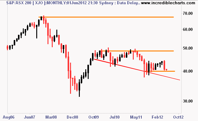
The monthly chart is still dancing the jig of a secular bear market, moving in accordance with historical percentage and time. If the last key level is breached the trajectory is likely to be the trendline from the previous monthly lows:
Disclaimer: The content on this blog should not be taken as investment advice. All site content, including advertisements, shall not be construed as a recommendation, no matter how much it seems to make sense, to buy or sell any security or financial instrument, or to participate in any particular trading or investment strategy. The authors have no position in any company or advertiser reference unless explicitly specified. Any action that you take as a result of information, analysis, or advertisement on this site is ultimately your responsibility. Consult someone who claims to have a qualification before making any investment decisions.
