So where have the markets gone this week? Past the daily noise and headlines, this weekly chart heavy post will examine the major markets (debt, commodities and currencies) with the Australian investor in mind.
It’s been awhile since my last Trading Week, with a holiday in between and Deus Forex Machina penning last week’s column (thanks Greg!). Looking back, the calls and KEY LEVELS that I identified were, well, if I can be modest, worth a little more than you just providing an email address to have a read…might have to do something about that.
On that note, I’m going to use the same charts from that last analysis, without updated levels or comments, just prices, so you can see what I was talking about.
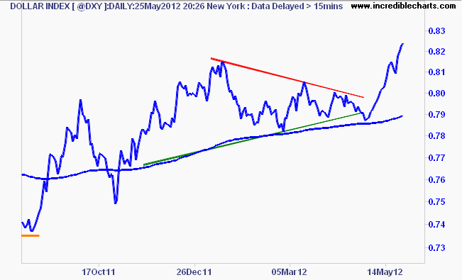
Let’s start as always with the US Dollar Index (DXY) – since this remains the reserve currency and the first barometer of risk, with a completion of the symmetrical triangle, given there was a dominant bullish trend bias:
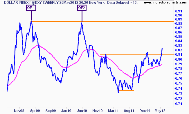
Where’s it going? The weekly chart suggests the 88-89 points level before a third (or fourth, if you consider Operation Twist as QE) trigger of monetary easing is pulled:
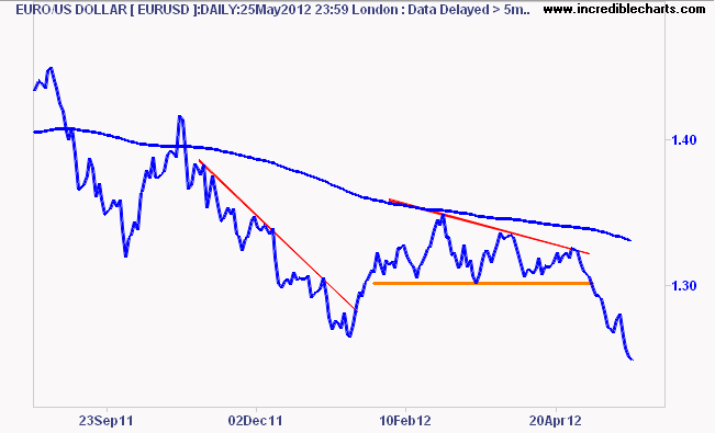
Euro (EUR/USD) – I said “elections this weekend in France and Greece could put some additional pressure on the Euro, which could be the catalyst to get things moving….the Euro has a bearish bias, because recent price action is below its 200 day moving average …..a break below 1.30 for the Euro would signify that, in spades.” There it goes:
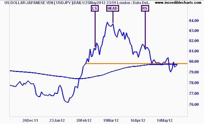
The Yen – USD/JPY: I said “The secular bear market in the USD/Yen pair continues, which is not good for the Nikkei 225, which tracks the strength of its domestic currency…short term support (orange line below) at 80 or so Yen on the daily chart, just above the 200 day moving average”:
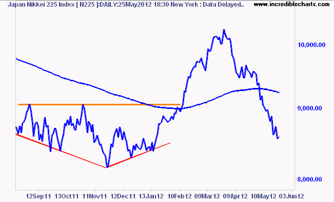
And the Nikkei 225:
Aussie (AUD/USD) – I said “On the weekly charts, the uptrend from the November low and the 200 day moving average has been clearly broken, thus the AUD/USD is now well in a bearish bias. Coupled with the poor macro data coming through, this sell off by risk markets will mount continued pressure and I expect to see a fall down to the lower edge of the ranging rectangle base (with expected rebounds back above parity too)”:
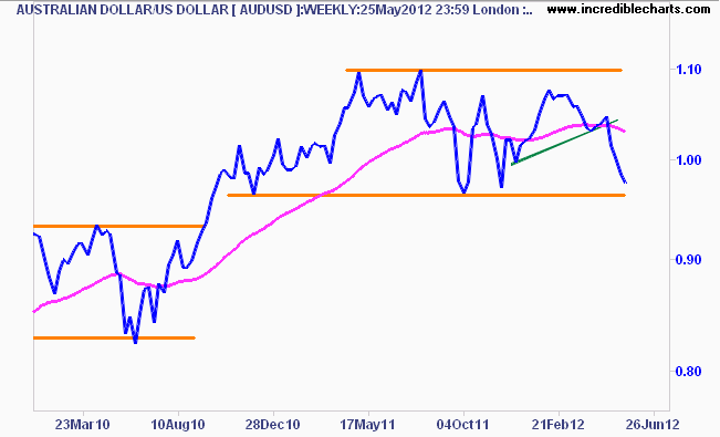
If the AUD/USD breaks below 96.5 level, which I expect it do so with any further easing from the RBA (June 0.25% cut is almost certain, the OCR will likely be at or below 3% by the end of this year, IMO), the probable target is the 83 to 93 cent range over the next few months.
Gold (USD) – I said “the current technical picture for this “currency”, shows my proposed right hand shoulder of a bullish inverse head and shoulder pattern, still holding, but only just” – this pattern identification was WRONG. This is normal – I use patterns to create a narrative, not for actionable analysis, as I find them unreliable and subjective, and I prefer objective quantifiable signals, including basic support/resistance key levels. Read on after the chart to see where I apply these:
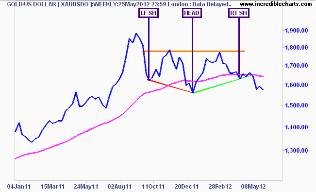
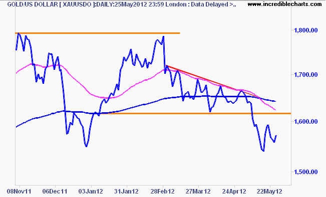
At my last analysis I said: “Gold has been pushed under its 200 day moving average for the last six weeks or so, which indicates a bearish bias, but within its … secular bull market. I still contend that this is a potential short term bottom, but the continued strength in the USD and the (short) signals I’m getting from my position system has me effectively sitting on the sidelines with this one, for now. The key level to watch is $1610 – a break below that or $1600 would signify a risk-off mood in my opinion” – which was right:
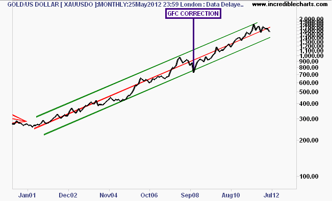
And to confuse you further, my short term bottom contention still holds, given the great amount of buying support in recent weeks at the $1550 level. What worries me is that the current move in gold prices looks eerily similar to the GFC work-out, where gold breached the lower half of its secular trend channel from 2001. Are we just repeating history here with another round of QE (QE3 or LTRO) to boost asset prices, yet again?
Gold is a great barometer for this.
US 10 year T-Notes (TNX) – I said “the weekly chart is pretty self explanatory – a break on the downside (a lower or similar low to the September 2011 and January 2012 lows) would normally be very bearish for risk assets” :
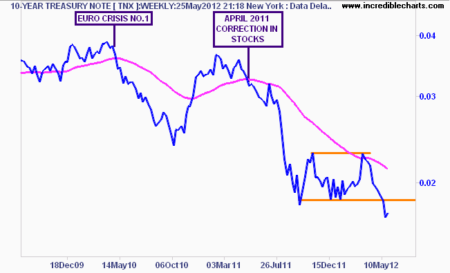
Indeed.
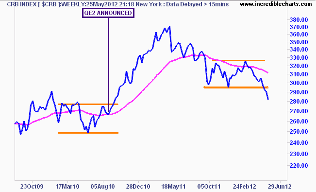
CRB Index – I said: “the commodities index, another market that appears set for a bigger move….. the medium term picture on the weekly chart, which is becoming quite bearish indeed – a break of support below 295 points (lower line on chart below) or so could see commodities move sharply to there pre-QE2 levels, which would be disastrous for Australian mining stocks“:
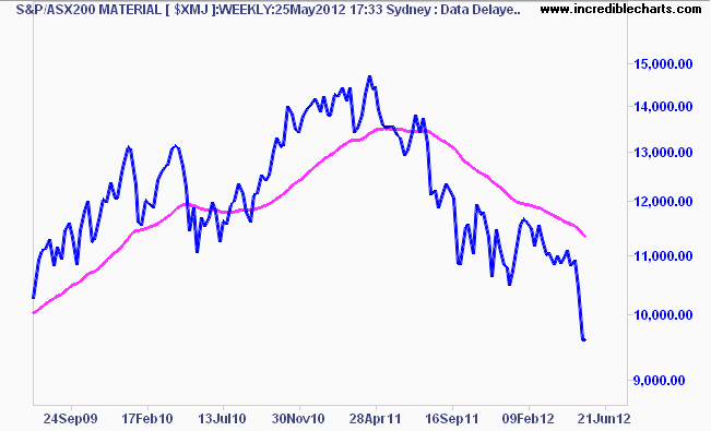
As for mining stocks, well, that looks like a tremendously bearish head and shoulders pattern:
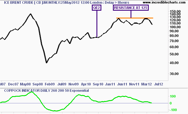
Crude– I said: ” this (monthly chart) shows that ICE Brent crude…continues to reject resistance at $125USD a barrel, the same level before the April 2011 correction in risk assets”. I’ve added the Coppock Indicator here to show, where I suggested an “end to the medium term bull cycle, and a reversion back to the controlling price set up throughout 2011 of $103-$110USD a barrel”:
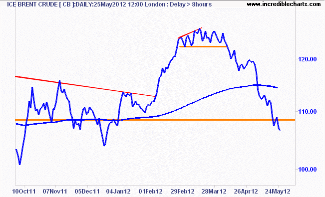
I also noted that in the short term, where I had previously stated my trading system had entered an initial short position on crude, although I was sceptical about such a trade, given the overwhelming bullish bias, I was considering a larger position for a substantial portfolio hedge. Thankfully, I entered such a position before my holiday (note I always close my long/short direct positions, e.g CFD or warrant or shares when going on a “proper” holiday, which is what I needed):
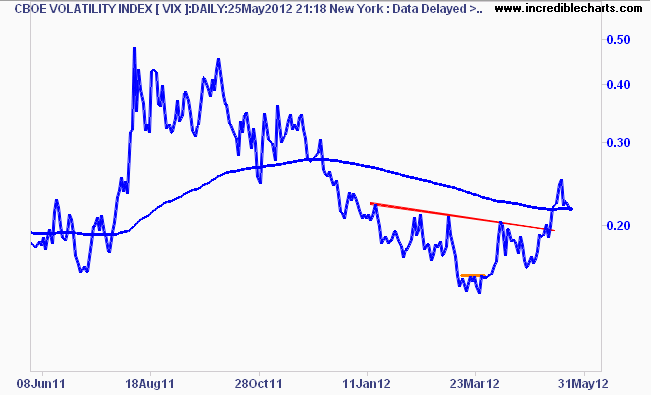
Volatility (VIX) – I was being cheeky in this analysis, that “volatility is being volatile” – but I’ve been surprised at the lack of movement in the VIX.
I did say it “could break the overhead resistance at 20 point and its 200 day moving average thereafter – and swiftly – in any risk off move”, which transpired, but not as far as I thought, this looks relatively weak so far:
S&P500 – So after all that hubris and gloating above – ap0logies – let’s move finally to stocks (you need to understand the above first, before looking at stocks or you have 1 eye closed…)
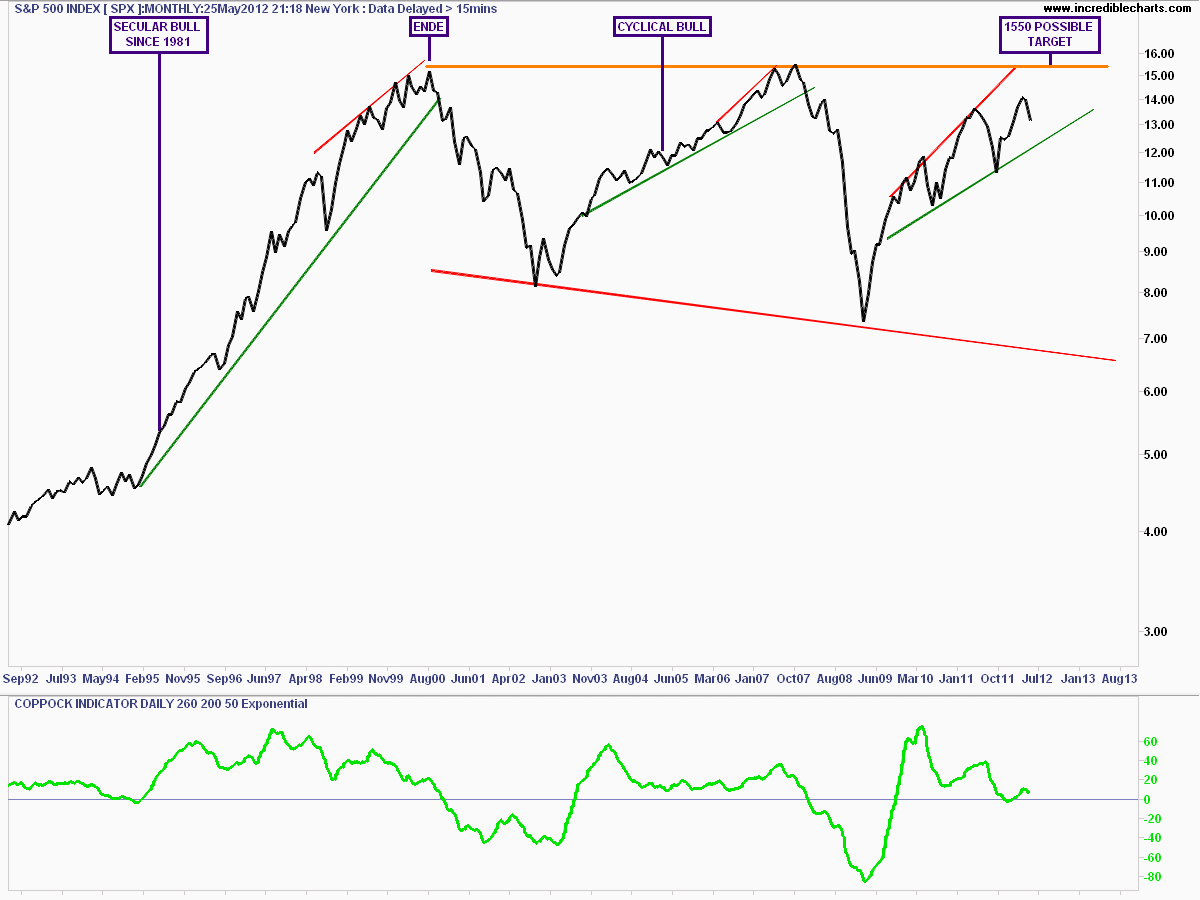
As I keep saying, and some still confuse the situation, mainly the permabears and the permabulls, the former missing out on opportunities, the latter leaving themselves open to portfolio wipeouts (e.g like listening to a certain group of commentators since December), the S&P500 has been in a cyclical bull market since March 2009 – check my podcast here for the monthly/secular explanation.
Actually here is the monthly chart explaining those moves since the end of the secular bull market in 2000 – its full size, so click on to expand and see my notes:
I actually started with the weekly chart previously, noting the stall and subsequent dip before Greece Crisis Mk 2 found support at the previous April 2011 high and was cautious about calling a top here, although the pattern formed was bearish, and nearly identical to the one in August 2011:
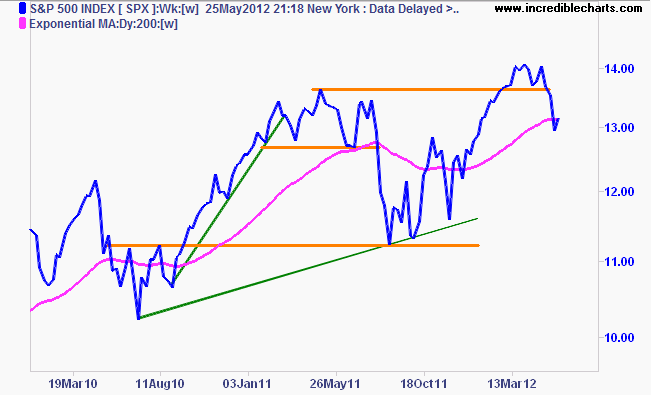
I said: ” any break of 1360 points (highest orange line on the original chart) will likely begin another 5-8% dip, down to the 200 day moving average around 1300 points, which is also the support level before the 20% correction of last year…..Next week could prove interesting indeed.”
Which is what happened.
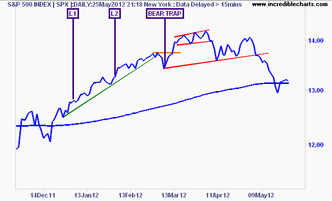
Where’s it going now? This looks like the proverbial dead cat bounce, at least in the short term. There remains a staggering array of catalysts here that could see the market move up or down by 10-20% in the coming weeks (next Greek election, new Eurobonds, QE3, LTRO2, conflict with Iran, etc ad nauseam).
Want to go long or short here? Risk management is key.
S&P/ASX200 (XJO) – finally to our local bourse, well what can I say? My proprietary KC Signal, which I covered here clanged shortly before I went on my working holiday with the KEY LEVEL broken shortly thereafter.
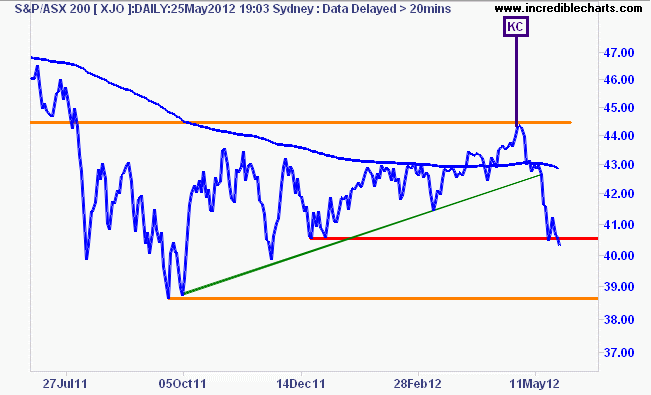
I did warn that the ASX200 was “not a bull market yet, just a bear market rally”, and as I’ve tried to explain, volatility is to be expected during this sort of market activity.
I.e. these sort of moves should not be “surprising”, they are “Tom Jones” corrections and rallies.
I still hold the idea that any subsequent rebound in Australian share prices would mean a probable termination at around 4700 points – “except for a correction on risk markets elsewhere, which we follow to the hilt.” The rationale for this level still remains – a reversion to the previous average price level of last year, but more and more, the macroeconomic indicators are pointing to lower valuations in the year(s?) ahead, and through the volatility, the market is properly discounting them, as shown on the monthly chart below:
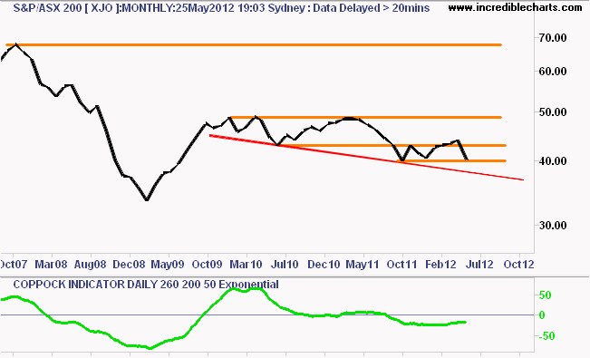
The key takeaway here is that the ASX200 remains in a secular bear market – now in its 5th year. My version of the Coppock Indicator in the chart above, still says no for either a secular or cyclical bull market.
In the medium term I previously suggested that a probability of a higher trading range had increased, as prices increased over the last few months back to the 4300 point area. I think that probability has now swung the other way, with the instigation of the RBA emergency rate cuts, a slowing economy (with various leading and other macroeconomic factors retreating) and superannuation holders looking at a fourth year in a row of negative or adjusted for inflation zero returns on their “savings”.
Thanks for reading.
Disclaimer: The content on this blog should not be taken as investment advice. All site content, including advertisements, shall not be construed as a recommendation, no matter how much it seems to make sense, to buy or sell any security or financial instrument, or to participate in any particular trading or investment strategy. The authors have no position in any company or advertiser reference unless explicitly specified. Any action that you take as a result of information, analysis, or advertisement on this site is ultimately your responsibility. Consult someone who claims to have a qualification before making any investment decisions.
