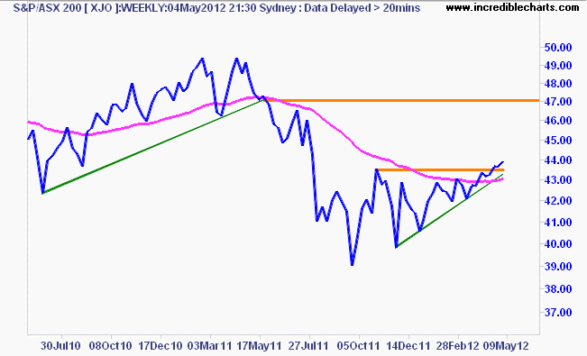
So where have the markets gone this week? Past the daily noise and headlines, this weekly chart heavy post will examine the major markets (debt, commodities and currencies) with the Australian investor in mind.
Another very interesting week on macro markets has passed, and no matter how the permabulls (or outright deluded like those at the ECB) frame the flow of data releases, it has not been an affirmation of a continued bull market in risk.
I’ll give a wrap of last night’s (Friday) data and what happened as a result in Macro Morning on Monday but let’s take a longer term view now.
Let’s start as always with the US Dollar Index (DXY) – since this remains the reserve currency and the first barometer of risk.
I has previously warned that the daily DXY chart was nudging towards the completion of a symmetrical triangle, which seemed to go against my bullish breakout theory with a breakdown in USD strength, but this is where it pays to not just watch a daily chart in isolation:
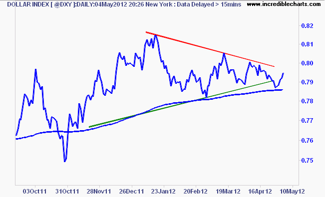 As you can see, there was a false breakdown last week, which has now reversed back onto the dominant bullish trend, which I also warned about looking at the weekly chart and one of my risk management tools, the Coppock indicator:
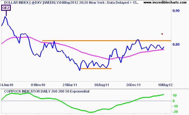 This is telling me that USD strength is still here to stay, which as we’ll see shortly, effects almost all macro markets.
Euro (EUR/USD) – the gold standard currency remains in a bearish downtrend in the medium term, approaching its 1.30 support level again this week, as poor macro data continue to weigh on this failed currency union. Elections this weekend in France and Greece could put some additional pressure on the Euro, which could be the catalyst to get things moving.
I’ve been saying that the Euro has a bearish bias, because recent price action is below its 200 day moving average (almost the opposite of the DXY Index, which has a 57% weighting to the Euro). This week we saw a short term rejection of resistance at 1.32 overhead and an easing back to just below 1.31:
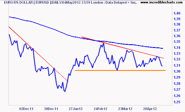 Again, I think there’s a big move afoot here soon – a break below 1.30 for the Euro would signify that, in spades.
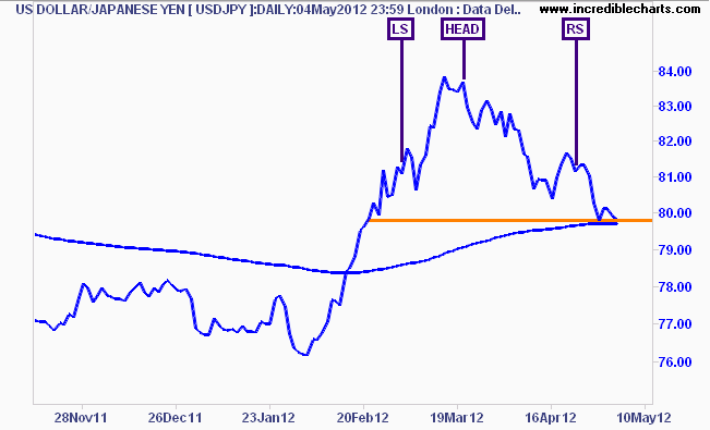
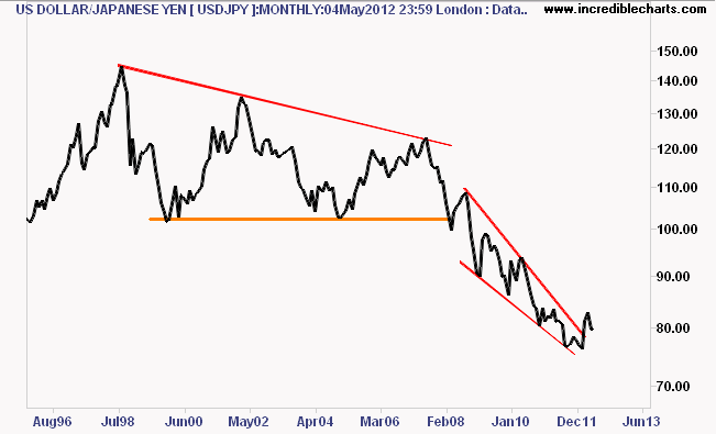
The Yen – USD/JPY: The secular bear market in the USD/Yen pair continues, which is not good for the Nikkei 225, which as I showed earlier in the week, tracks the strength of its domestic currency:
This week we’ve seen some short term support at 80 or so Yen on the daily chart, just above the 200 day moving average. Again, this is another market on the edge of a catalyst making move – with a possibly head and shoulders pattern forming on the daily chart:
It’s also hard to go against history, with the secular bear market still in place:
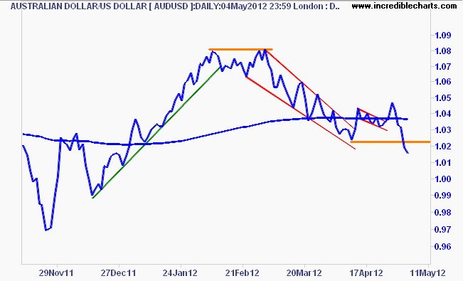
Aussie (AUD/USD) – to say the least, the Aussie dollar had another interesting week, as very poor macro data flows in and a panic rate cut was made by the RBA. Last night we had a price move that I think has broken the back of what should be a rapidly weakening currency, but carried (literally) by risk markets up until now.
Last week it seemed we were on the verge of another breakout, but this proved to be very false, with the AUD dropping from nearly 1.05 to be below 1.02 last night- in a week!
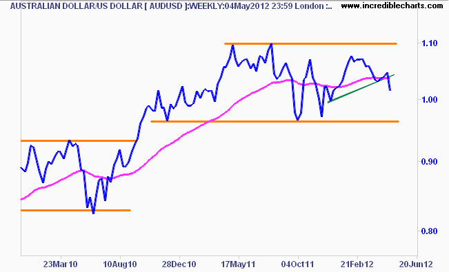
On the weekly charts, the uptrend from the November low and the 200 day moving average has been clearly broken, thus the AUD/USD is now well in a bearish bias. Coupled with the poor macro data coming through, this sell off by risk markets will mount continued pressure and I expect to see a fall down to the lower edge of the ranging rectangle base (with expected rebounds back above parity too):
Gold (USD) – the current technical picture for this “currency”, shows my proposed right hand shoulder of a bullish inverse head and shoulder pattern, still holding, but only just:
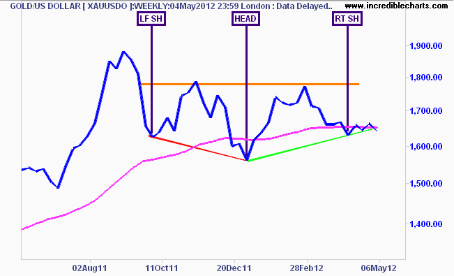
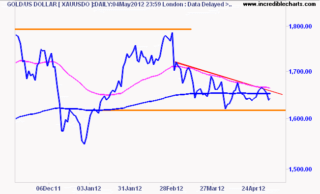
Gold has been pushed under its 200 day moving average for the last six weeks or so, which indicates a bearish bias, but within its continuining its secular bull market. I still contend that this is a potential short term bottom, but the continued strength in the USD and the signals I’m getting from my position system (which is short, but on very small amount of capital at risk, and has been cut in size by half already by a time stop) has me effectively sitting on the sidelines with this one, for now.
The key level to watch is $1610 – a break below that or $1600 would signify a risk-off mood in my opinion:
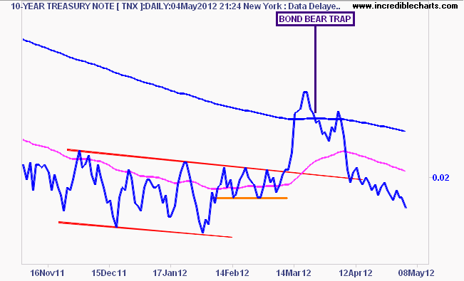
US 10 year T-Notes (TNX) – T-notes continue to be bid up (remember yields fall when bond prices rise and vice versa) a clear sign that risk is definitely getting weary and the bond permabears have egg on their face:
The weekly chart is pretty self explanatory – a break on the downside (a lower or similar low to the September 2011 and January 2012 lows) would normally be very bearish for risk assets:
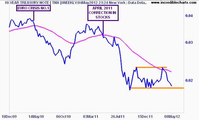
For those of you who can’t believe US yields will stay below 2% and even go down to 1%, I give you Germany and Japan as exhibits A and B, and a gentle reminder that Australian bond yields were over 5% not that long ago, and seem to be heading for 3% or lower before the year is out.
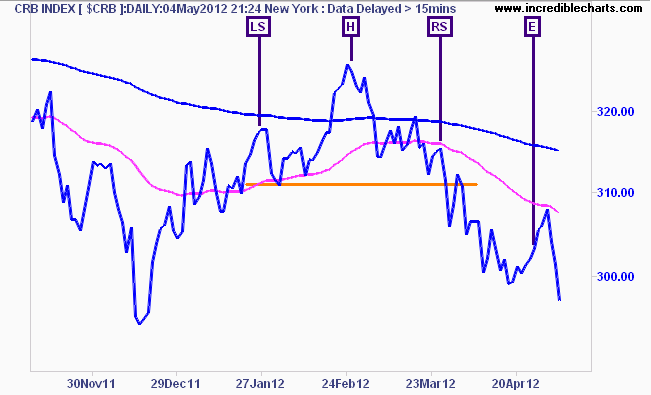
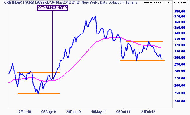
CRB Index – the commodities index, another market that appears set for a bigger move. In fact, this is the one to watch for a gauge of the probability of a 3rd round of QE from the Federal Reserve.
Again, another false breakout gave permabulls hope (with one loudly clamouring “buy AUDUSD” “buy oil” “buy Italian bonds!”) and showed that my recent short term trading idea was right, but the exit was wrong (even though I made a nice 30% nominal return). Here’s the daily chart showing my thesis and exit last week:
And the medium term picture on the weekly chart, which is becoming quite bearish indeed – a break of support below 295 points or so could see commodities move sharply to there pre-QE2 levels, which would be disastrous for Australian mining stocks:
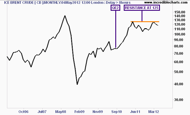
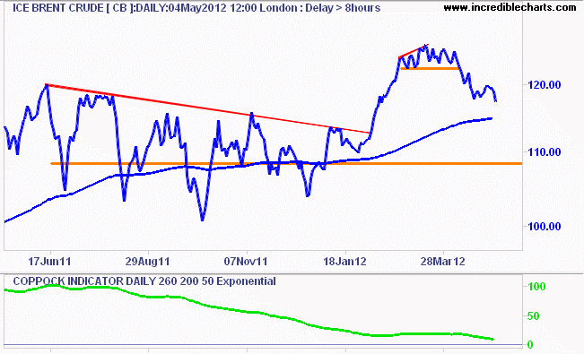
Crude– again the long term charts are illustrative, as this shows that ICE Brent crude, which fell sharply last night, continues to reject resistance at $125USD a barrel, the same level before the April 2011 correction in risk assets:
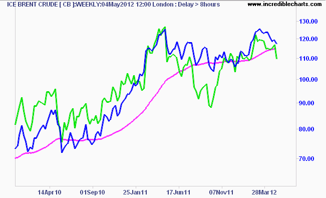
Here’s the medium term view, but with WTI crude overlaid in green and moving sharply below the 200 day moving average. WTI Crude is not as reliable an indicator of oil as Brent, but this still shows the short term direction clearly:
And finally the short term, where I had previously stated my trading system had entered an initial short position on crude, and remains open. I explained I was sceptical about such a trade, given the overwhelming bullish bias, but I’m now considering a larger position for a substantial portfolio hedge.
Apart from the pattern breakdown that I warned about previously, the Coppock Indicator is suggesting an end to the medium term bull cycle, and a reversion back to the controlling price set up throughout 2011 of $103-$110USD a barrel:
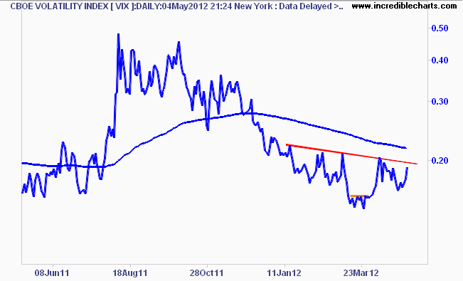
Volatility (VIX) – Volatility is being volatile…..no I’m not being cheeky – the index is pippin up and as I warned previously, I am wary of dismissing the VIX pricing at such low ranges, and had bought some more cheap protection at low prices. The VIX was up nearly 10% last night and could break the overhead resistance at 20 point and its 200 day moving average thereafter – and swiftly – in any risk off move. Oh how I wish Aussie investors had an ETF for VIX they could easily buy!
S&P500 – finally to stocks (you need to understand the above first, before looking at stocks or you have 1 eye closed…) The S&P500 has been in a cyclical bull market since March 2009, another repeat of unsustainable deficit spending, liquidity and monetary easing to increase wealth assets. By the way, I think this kind of grand oscillation – the Great Volatility – is coming down under as we move ever closer to ZIRP because our political class refuses to deal with an unsustainable private debt problem…
I’m going to start at the weekly chart, (check last week’s note or my podcast here for the monthly/secular explanation and for what the levels below mean) note how the recent dip of the last few weeks found support at the previous April 2011 high and has now come back:
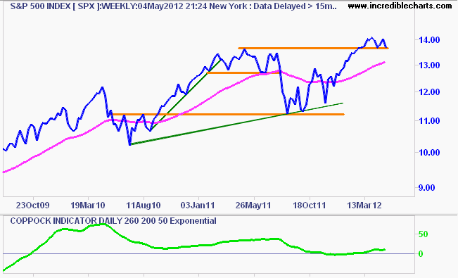
I’m cautious about calling a top here, but this to me looks like a possible bearish head and shoulders pattern – the exact pattern that presaged the broad sell off in August last year. In the very short term, any break of 1360 points will likely begin another 5-8% dip, down to the 200 day moving average around 1300 points, which is also the support level before the 20% correction of last year.
As it stands, my position system is neither long or short at this moment, but I did close a small long trade earlier in the week, and my position system is teetering on a short (at quarter level of capital at risk, for those keeping score). Next week could prove interesting indeed.
S&P/ASX200 (XJO) – finally to our local bourse, where the last couple of weeks has had the bulls dancing a jig, the bears hibernating and the foxes scratching their heads and saying “frak it” and joining in on the fun.
As I’ve been saying for awhile now, the market had been oscillating around its 200 day moving average and moving more and more to a bullish bias, but its not a bull market yet, just a bear market rally (click here for my full explanation of rallies/corrections etc).
Through the week it went above 4400 points – but did so with firing off one of a technical signal of my own design that continues to work well:
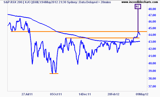 Interestingly, note on the chart above the level of resistance the ASX200 has hit is the exact same level of support before the August 2011 slump..
 My idea still holds that the next target is around 4700 points and becomes more likely – except for a correction on risk markets elsewhere, which we follow to the hilt – with the recent slashing of the RBA cash rate, which also includes Megabank not passing it on in full to protect their profits. The rationale for this level is a reversion to the previous average price level of last year, as shown on the weekly chart below:
On my monthly chart study, whilst the ASX200 remains in a secular bear market – now in its 5th year, it wants to have a cyclical bull market, recently finishing the quarter and month above 4300, with a 4th month underway, albeit slightly. Coppock says – not yet buddy – remaining below zero, but rising slowly.
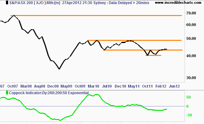
The probability of a trading range – confused by market economists as a “new rally in stocks” in the 4300 to 5000 points – has increased as participants and non-participants alike become more comfortable with higher prices on the bourse.
But as you’ll see in my Australian Share Market Report, coming out soon, almost no indicators exist for the resumption of a secular bull market in Australian stocks. Confusing the two – a normal or abnormal liquidity led cycle and a secular trend – and using the wrong asset allocation techniques, will have you “performing” the same as your super fund.
Thanks for reading.
Disclaimer: The content on this blog should not be taken as investment advice. All site content, including advertisements, shall not be construed as a recommendation, no matter how much it seems to make sense, to buy or sell any security or financial instrument, or to participate in any particular trading or investment strategy. The authors have no position in any company or advertiser reference unless explicitly specified. Any action that you take as a result of information, analysis, or advertisement on this site is ultimately your responsibility. Consult someone who claims to have a qualification before making any investment decisions.

