
Risk markets look like completing their “dip” overnight, with the US markets up slightly (NASDAQ up 0.6%), Euro markets up strong from 0.36% (Italian) to over 1% (German DAX) and our own market up 0.25% through to the Hang Seng (HK) up 0.66%.
As I mentioned in a recent post, dips occur within rallies, and then usually turn into a correction as exuberance takes the market a little too far. What was unusual about this recent dip is its shallowness and speed of recovery.
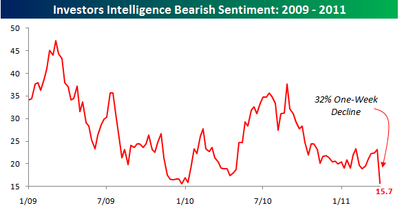
It got me thinking about an indicator used to measure the underlying behaviour of the market: bullish/bearish sentiment. I’ll use the US data – as the Aussie market follows its US cousin in lockstep – and because they have more depth with regard to covering this indicator.
Recently, the latest Investors Intelligence survey, as mentioned by Bespoke Investments, was released showing:
In the latest weekly survey of investment advisor sentiment from Investors Intelligence, bears declined by 32% from 23.1% down to 15.7%. Going back to 1975, there have now been just 16 other periods where bearish sentiment declined by more than 30% in a single week.
This chart is illustrative:
As Zero Hedge rightly points out:
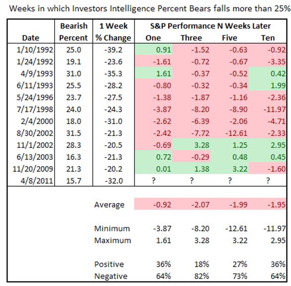
This is the most bullish since late 2009. Empirically speaking, this is bad news for the market, as there are virtually no contrarians left and everyone is on the same side of the boat. As John Lohman demonstrates, the returns 1, 3, 5 and 10 weeks following a more than 25% drop in bearish sentiment are as follows: -0.92%, -2.07%, -1.99%, and -1.95%, respectively.
Yet of all these, only the drop in November 2009 was actually executed in an environment of central planning such as the one that continues through today: and in that one the market actually rose 0.01%, 1.38% and 3.22% in the 1, 3, and 5 weeks following (and dropped 1.6% ten weeks later).
How does this sentiment reading compare to recent history? During the lows of August 2010, the bullish sentiment was as low as 29.4%, suggesting a time to buy. At the October 2007 top the bulls were 62.0% (and therefore bears at 38%)
The Elliot Wave Theorist also reports that a “bullish consensus has crystallized among a wide range of investors and financial professionals”:
Newsletter advisors (I.I. poll 20-week average)—most bullish in seven years
Futures traders (trade-futures.com poll)—most bullish in four years
Mutual fund managers (% cash)—most bullish ever
Hedge fund managers (BoAML survey)—most bullish ever
Economists (news-org polls)—unanimously bullish
Top global strategists (three national year-ahead panels)—unanimously bullish
Even most ‘bears’ on the economy are bullish on stocks because of inflation!
As the US market moves into a new earnings season (they report quarterly, our market six-monthly) it also bears (sic) thinking about the current Price/Earnings ratio of the US market. I put zero faith in forward P/E ratios and am firmly in the camp of using the CAPE – the cyclically adjusted 10 year average P/E ratio, first used by legendary investor Ben Graham and then revived by Robert Shiller (author of Irrational Exuberance).
According to Shiller, the current CAPE is 23.5 or 43% higher than the long term average. According to Marketwatch, the four previous occasions over the last 100 years where the CAPE was as high include:
- The late 1920s, right before the 1929 stock market crash
- The mid-1960s, prior to the 16-year period in which the Dow went nowhere in nominal terms and was decimated in inflation-adjusted terms
- The late 1990s, just prior to the popping of the internet bubble
- The period leading up to the October 2007 stock market high, just prior to the Great Recession and associated credit crunch
A case in point however, is the CAPE went to as high as 40 during the tech bubble (and over 30 during the 1929 bubble) so a bull market can be more irrationally exuberant longer.
What can we draw from this? Investors need to be wary of buying in at what could be the top or mid-top of the exuberant cycle. This great analysis and chart from DShort shows the current CAPE in the 4th highest quintile of measurements: not a place for investors to add to their positions, but nimble traders carry on.
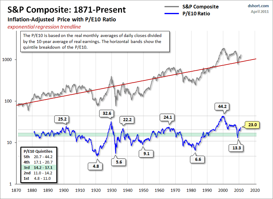
click to enlarge
As the ASX200 shrugs off this recent dip and marches towards the “magical” 5000 mark again, it bodes thinking what happens if it fails to reach that mark. All eyes are on the forthcoming US earnings results and the end of QE2 – although another $97 billion is about to hit the markets in the next four weeks.