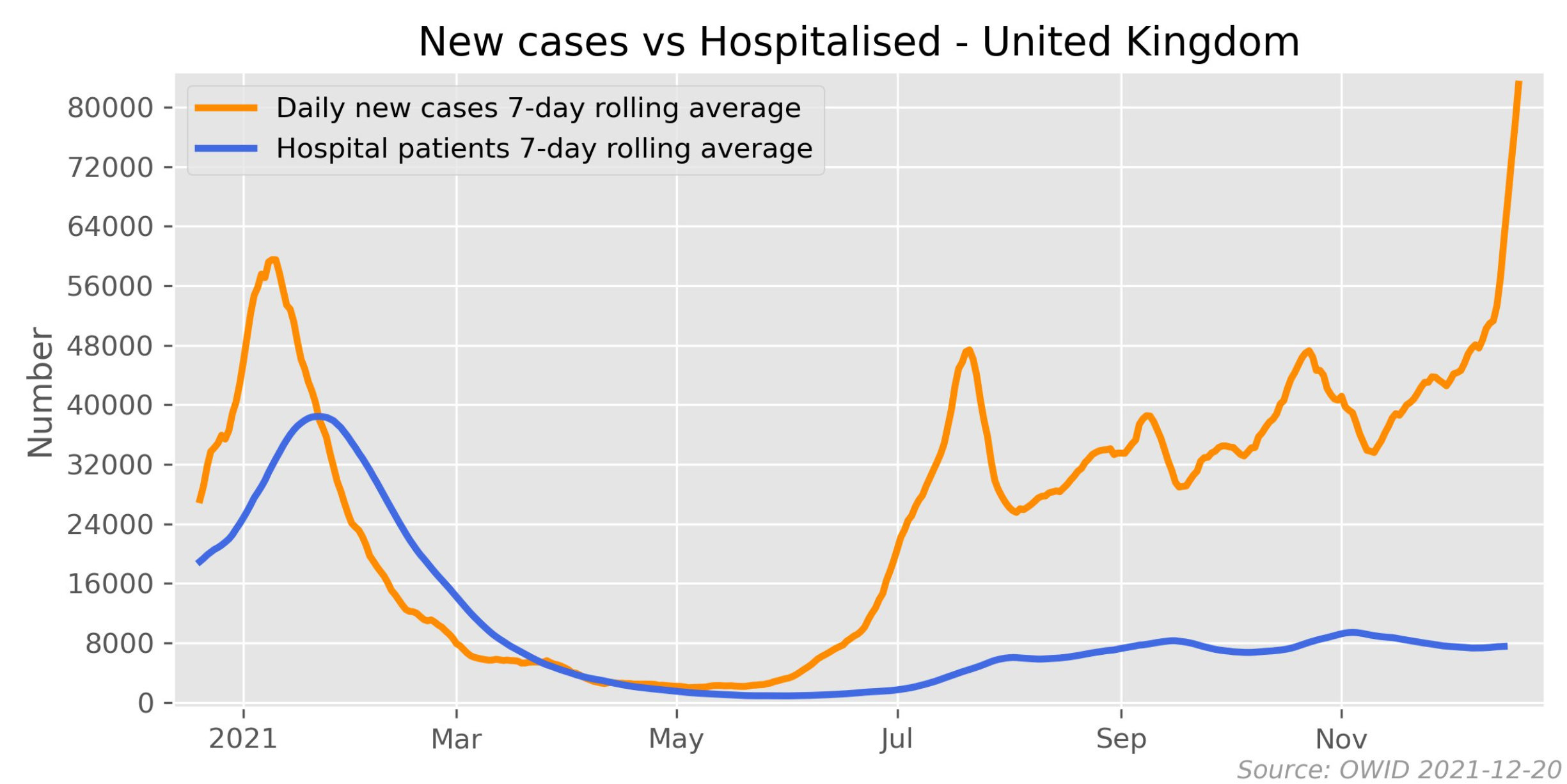
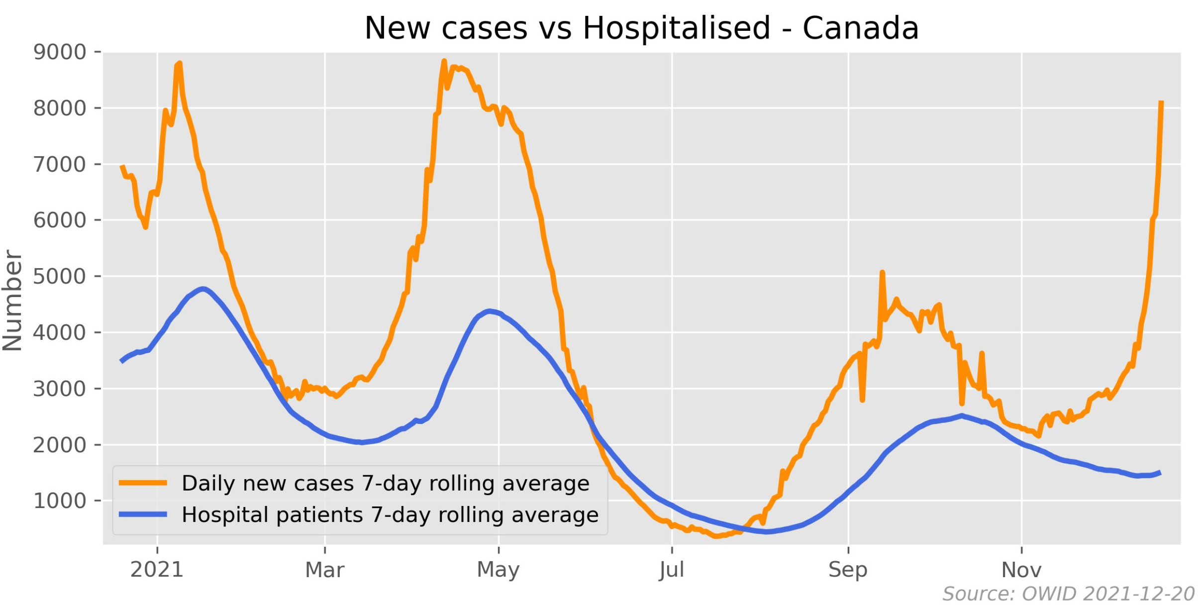
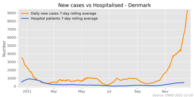
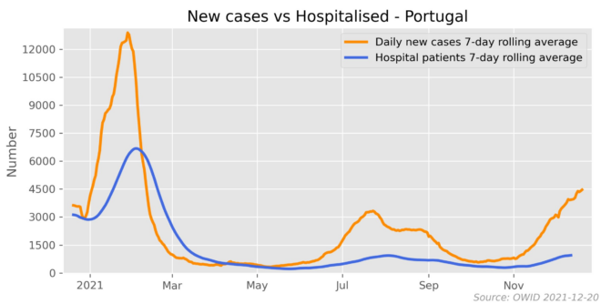
Mark The Graph has posted several charts on Twitter showing how the Omicron strain of COVID is yet to fill up the world’s hospitals.
Below are key international charts:
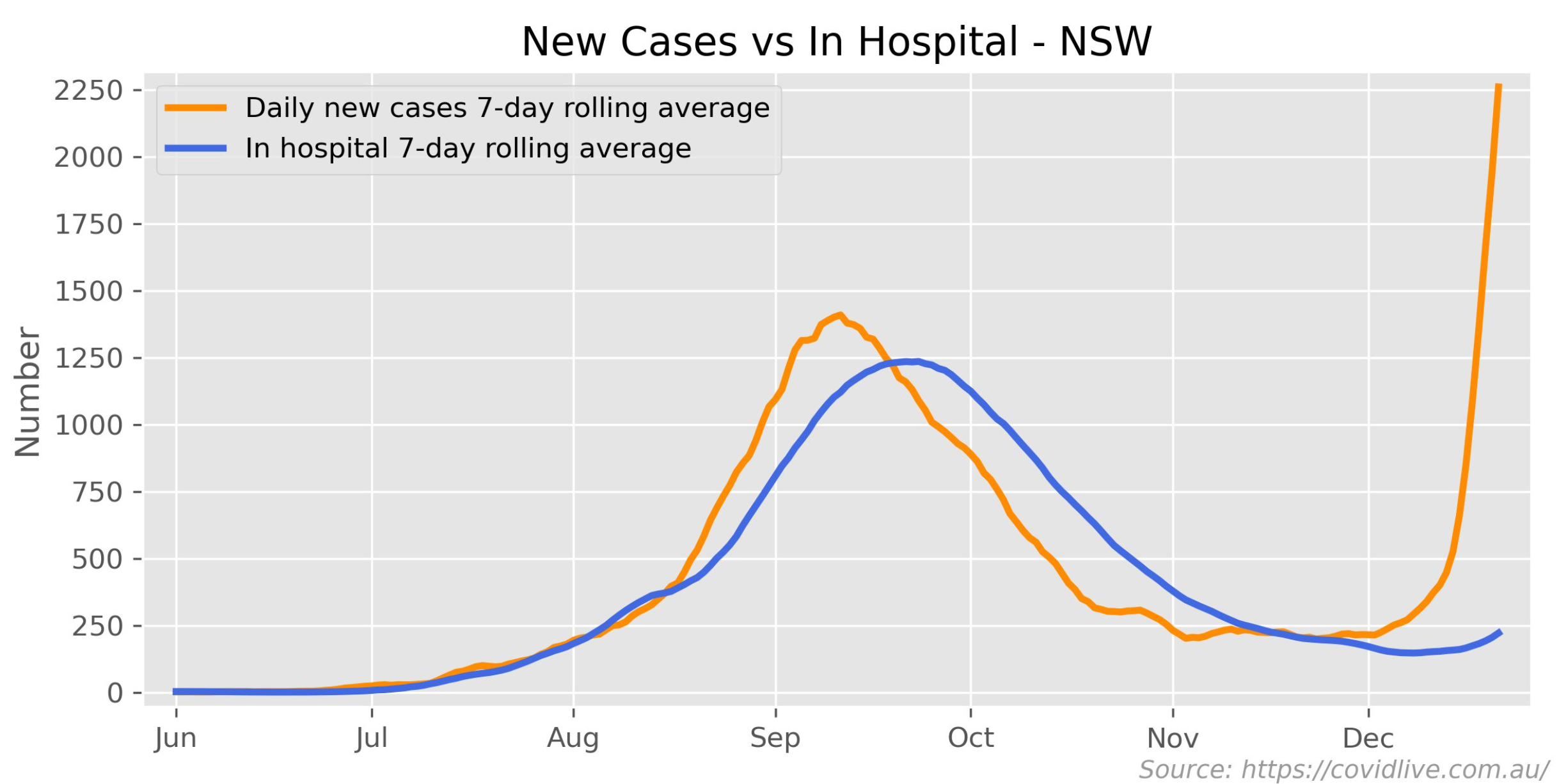
Below is the all important chart for NSW:
Advertisement
Mark The Graph has posted several charts on Twitter showing how the Omicron strain of COVID is yet to fill up the world’s hospitals.
Below are key international charts:
Below is the all important chart for NSW:
The full text of this article is available to MacroBusiness subscribers