
By Gareth Aird, Senior Economist at CBA:
Key Points:
- Strong population growth continues to boost Australia’s aggregate growth rates which paint a more positive picture on the economy than what most households are experiencing.
- Per capita measures on the economy, particularly those relating to income, suggest that there hasn’t been a lot of joy for households since the end of the mining boom.
- Local policymakers should focus more on per capita measures on the economy and less on headline growth rates if they are to deliver policy reform that raises living standards in an all-inclusive way.
Overview:
In October last year we published a note looking at the Australian economy on a per capita basis. Our intention was to better understand how economic developments were affecting household living standards. At the time we felt that policymakers were placing too much emphasis on aggregate growth rates and not enough on per capita measures. When we drilled down to the household level we found that the news was more sobering than the headline growth numbers implied.
As we discussed at the time, most economic commentary in Australia focuses on aggregate growth rates which are heavily influenced by population growth – more people means more spending. But if we want to measure changes in living standards, which ultimately matters most to households, then we need to look at how the economy is going on a per capita basis rather than just reporting and focusing on measures of aggregate demand.
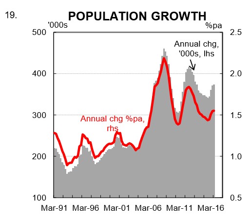
Australia’s population growth rate is significantly higher than most other OECD countries (chart 1).
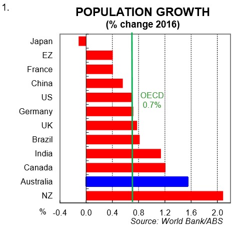
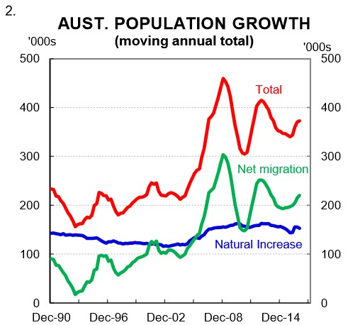
Australia’s population grew by a strong 1.55% (i.e. 373k) in 2016. Net overseas migration accounted for 56% of that increase (chart 2). A high population growth rate means that making comparisons of economic performance between Australia and other OECD countries using aggregate growth rates like GDP can be misleading. As Governor Philip Lowe recently said, “our strong population growth has flattered our headline growth figures.”
In this note we update and expand on our previous work looking at the Australian economy on a per capita basis. The evidence continues to suggest that policymakers should focus on reforms that boost productivity and raise living standards rather than measures designed to simply raise headline GDP. We think that better outcomes will be achieved for households if a greater emphasis is placed on measures of living standards rather than aggregate growth rates. This note discusses a few of the measures that we consider to be important.
GDP per capita
If GDP is the pie then GDP per capita is the size of each slice. For households, it is the individual slice that matters rather than changes in the size of the pie itself. In Australia, GDP growth per capita has slowed over the past year. The latest national accounts put GDP per capita growth at just 0.2% in the year to QI 2017 (chart 3). This is weak and is the slowest pace of annual growth since the Global Financial Crisis (GFC). To be fair, weather has adversely impacted on economic activity more than usual over the past year. But even accounting for this, output growth per person would have slowed primarily because of a soft labour market (characterised by rising part-time employment relative to full-time work).
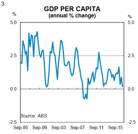
On our forecasts, GDP growth is likely be low again in Q2 2017 (+0.3% q/q) which would see annual growth in GDP per capita flat over the year. A lift is expected beyond that, but it does highlight that it’s been a very weak period for the Australian economy in terms of output per person.
Real net national disposable income per capita
While the news on GDP per capita has not been good over the past year, there has been a marked improvement in real net national disposable income (RNNDI) per capita (chart 4). In the year to QI 2017, RNNDI per capita rose by a solid 4.0%. This is a significant lift, albeit that the level of RNNDI per person it is still below its Q2 2012 peak. Notwithstanding, it’s a strong and welcome result. But it’s also a little misleading when thinking about what’s been happening recently at the household level.
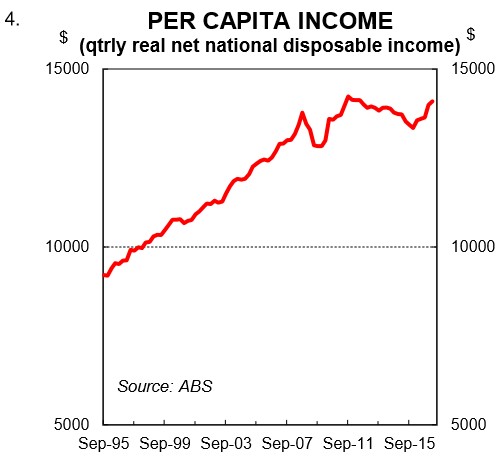
Generally speaking, RNNDI per capita is a good indicator for measuring changes in the living standards of households. As the ABS states, “it is an indicator of Australians’ capacity to purchase goods and services for consumption”. However, like all measures, it has its limitations and these have become particularly apparent more recently.
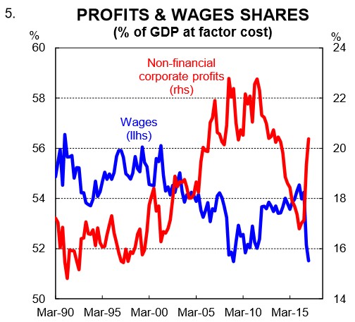
Over the past year the increase in aggregate real national income has largely been confined to the corporate sector and not employee wages and salaries (chart 5). Usually a lift in RNNDI per capita would show up in higher wages growth as well as company profits. But this time around, the strong growth in national income in Australia over the past year has not found its way into employee salaries (see section below on wages). As a result, RNNDI per capita is painting a better picture of recent income growth than what households have experienced.
The drivers of real per capita income are (i) productivity, (ii) the employment to population ratio (i.e. participation), (iii) the terms of trade; and (iv) net foreign income. It has been the strong rise in the terms of trade that has driven real per capita income growth over the past year. But as the terms of trade trends lower over 2017, RNNDI per capita growth will slow sharply, all else equal. On our forecasts, it will post a decline in Q2 2017 when the national accounts are published.
Unemployment rate
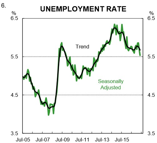
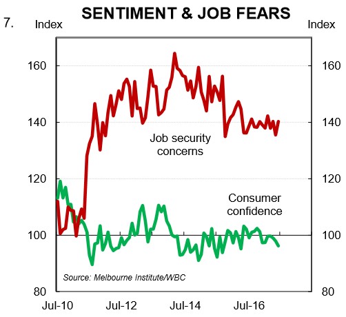
The unemployment rate remains higher than is desirable. The trend unemployment rate, which smooths out monthly volatility, has basically flat-lined over the past year at 5¾%. It’s not a historically high rate. But it is above the non-accelerating inflation rate of unemployment (NAIRU) which the RBA recently estimated to be 5%. It suggests that there is a lot more work to be done to take the economy back to the level we associate with full employment. Job security fears tend to move in line with the unemployment rate. They remain stuck at a stubbornly high level because the trend unemployment rate has been moving sideways rather than down. This has weighed on consumer confidence (chart 7).
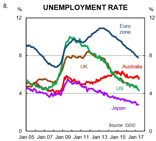
There’s been a fair bit of noise made recently about Australia’s record breaking recession-free run. What hasn’t had a lot of air play is that Australia’s jobless rate has been stuck above the equivalent rate in the US, Japan and the UK, to name a few, since mid-2014 (chart 8). In fact, the spread has widened. So while Australia’s track record on economic growth looks pretty good, there is a greater proportion of the population unemployed than there is in some other developed nations that don’t match our “growth record”. In other words, there is a better match in those countries between the supply of labour and the demand for workers.
Underemployment and underutilisation rates
The news on underemployment rate continues to be undesirable. In May, the underemployment rate was 8.8% – just 0.1ppt off its record high. To recap, people who are underemployed have a job but want to work more and can’t find the work. The number of additional hours of work wanted by underemployed workers has been stable at around two days (or a little under 15hrs) per week since the mid-2000s. This compares with unemployed people who are on average looking for 33 hours of work per week.
The sum of the unemployment rate and the underemployment rate produces the underutilisation rate which is the broadest measure of spare capacity in the labour market – it is currently 14.4%, close to its highest point since the late 1990s (chart 9). This means that the economy is operating below its capacity and there is an output gap. This has had implications for wages growth.
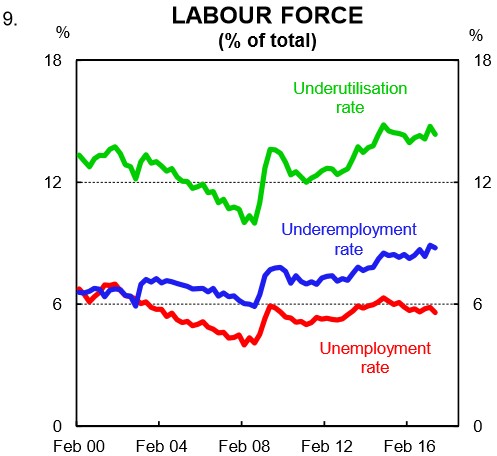
Labour market underutilisation is high in Australia because the supply of labour has exceeded the demand for workers. Given the policy decision to grow the population at a faster rate than most developed nations, around 200k jobs a year (which is a sizeable 1½% of the workforce) need to be ‘created’ to absorb the new entrants into the labour market. If the economy is not generating enough jobs to cover the lift in the population then labour market slack will increase which keeps a lid on wages growth regardless of the rate of productivity growth. This has been the case in Australia since the mining boom ended.
Wages
Measures of wages like Average Weekly Earnings (AWE) and the Wage Price Index (WPI) are per capita measures. Unfortunately, the news is not good. The lift in the underutilisation and associated increase in spare capacity in the labour market has contributed to a slowdown in wages growth (both real and nominal). Since mid-2010, wages growth has eased and is currently running at its lowest annual rate since the 1990s recession.
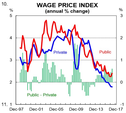
The decline in wages growth has been broad-based across the private and public sectors, though the public sector slowdown has not been as pronounced. The spread between annual public and private sector wages growth was a solid 0.6% in QI 2017. In fact, public sector wages have been growing faster than those in the private sector since QI 2014. And more generally, over the past 20 years public sector wages growth has significantly outperformed the private sector (chart 10). At a time when the Commonwealth Budget is stuck in a structural deficit it is surprising that the spotlight hasn’t shone more on the growth in public servant salaries.
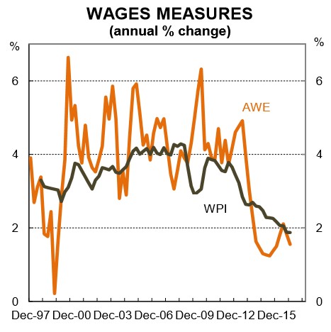
Most industries have experienced a slowdown in wages growth and the WPI was growing at a flaccid 1.9%pa in QI 2017. The picture appears even softer when looking at AWEs which are running at just 1.6%pa (chart 11). The WPI measures changes in wages across a range of industries (just like the CPI picks up price changes for a basket of goods). But it doesn’t pick up compositional changes in the labour market. AWEs, however, do. Growth in AWEs has declined by more than growth in the WPI because of the shift in jobs away from higher paying mining-related jobs towards lower paid services sector jobs.
Adjusting both the WPI and AWE for inflation shows that real wages growth is now negative. This adds to the financial pressures that households face. The negative real wages story is unlikely to change over the near term and may even further worsen when a sharp lift in electricity prices finds its way into the headline CPI.
RBA Governor Philip Lowe recently suggested that job security fears are weighing on wages growth and that workers would be best served by making the case to their employers for higher wages. The Governor said, “workers feel like there are more competitors out there, they’re worried about the foreigners and the robots.” Now with all due respect to Dr Lowe, while wages growth is on the soft side globally, wages outcomes in Australia are what we would largely expect given how much slack there is in our labour market. It is much harder for workers to negotiate pay increases when spare capacity in the labour market is elevated.
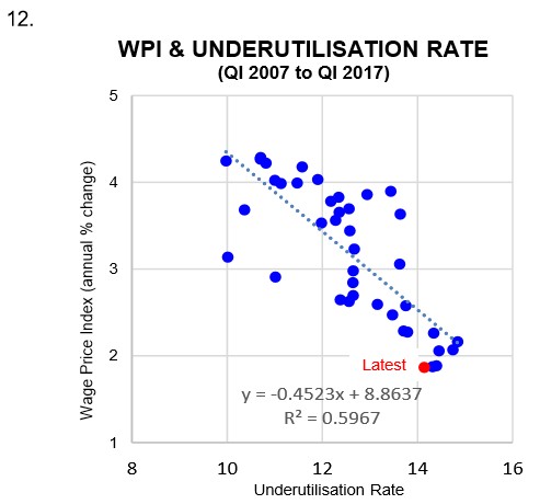
While the traditional Philips Curve (i.e. the relationship between the unemployment rate and inflation) may have broken down, the relationship between labour market slack and wages growth is very much intact (chart 12). As we have previously argued, if policymakers focus too much on the unemployment rate and not enough on underemployment and underutilisation then they will be overstating the strength of the labour market. As a result, they will likely overestimate the future path of wages growth.
In our view, labour market slack must recede further for wages growth to lift. To put it bluntly, the demand for labour must exceed growth in its supply. This should be tackled from a policy perspective from both the supply and demand side. It is too simplistic to assume that timidness from employees in asking for pay rises is holding wages growth back.
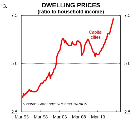
Dwelling price to income ratio
As we argued back in October, the dwelling price-to-income ratio is an interesting measure to look at when thinking about living standards. Dwelling price growth has run well ahead of income growth since late 2012 (chart 13).
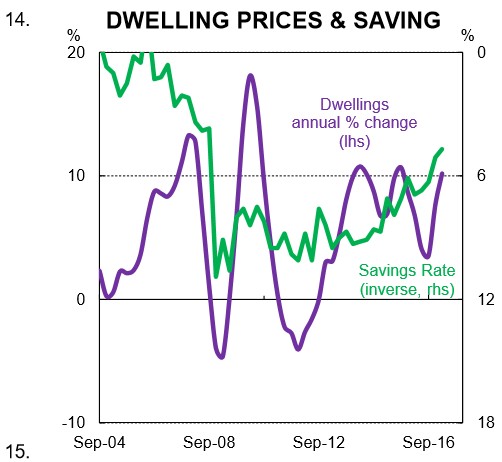
For the owners of property, this is basically a windfall. It has supported a fall in the national savings rate which has propped up consumer spending in the face of weak wages growth. In QI 2017, the savings rate moved down to 5.2%, a post-GFC low.
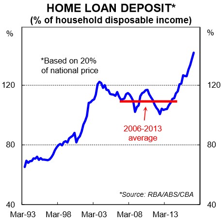
But in many ways, a rising dwelling price-to-income ratio is a zero sum game – the winners are those who own property and the losers are those who aspire to own property. The latter are generally younger in age and are now faced with the task of needing to save a much greater share of their income for a deposit – generally considered the first hurdle to overcome in purchasing a property (chart 15). In addition, having to save a higher deposit is effectively a handbrake on spending to aspirational property owners. This is an undesirable consequence of dwelling prices rising faster than incomes.
The high dwelling price to income ratio is reflecting the combination of low interest rates and strong population growth, which have fuelled dwelling prices, coupled with weak household income growth. So there is both a numerator and denominator effect at work. As the Australian Productivity Commission noted in April 2016, “high rates of immigration put upward pressure on land and housing prices in Australia’s largest cities. Upward pressures are exacerbated by the persistent failure of successive state, territory and local governments to implem ent sound urban planning and zoning policies.”
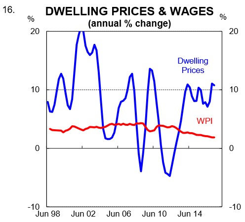
Rapid dwelling price growth relative to income growth has had consequences for the distribution of wealth across the economy. This tends to be overlooked by policymakers who focus almost exclusively on income distribution. As we pointed out in April, younger people, who are less likely to have purchased a dwelling but have been saving to do so, have faced a greater deterioration in real wages than is implied by deflating nominal wages by the CPI. This is because the single biggest purchase they are yet to make is not included in the CPI. And it has, of course, been rising much, much quicker than the CPI itself (chart 16).
Household debt to income ratio
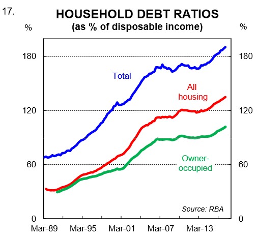
There has been an increasing focus on household debt levels in Australia since Dr Lowe took over as head of the RBA. Debt to income is effectively a per capita measure and since mid-2012, it has risen from around 148% to a recent record high of 190% in March 2017 (chart 17). That puts Australia in the top tier of household indebtedness globally. This measure includes all households regardless of whether they actually have a mortgage. For households that have a mortgage, that figure is closer to 300%. It has increased steadily as interest rates have come down despite lower rates making it easier to repay debt. That is because households can borrow more for a given level of income. And there has also been a big increase in lending to investors.
A high debt burden relative to income is constraining household consumption growth. Basically, an increase in debt relative to income means households have borrowed from the future to consume in the present. If debt is to fall as a share of income then households will need to reduce consumption as a share of income in the future. This can have major economic consequences if/when the long term debt cycle unwinds.
Public investment per capita
There has been a much needed lift in public investment spending per capita (chart 18). But more work needs to be done. As we have argued previously, the policy decision to run a relatively high immigration intake should be accompanied by commensurate growth in public investment. If not, in addition to the capital stock ageing, the existing stock of public infrastructure gets diluted which ultimately lowers living standards, all else equal.
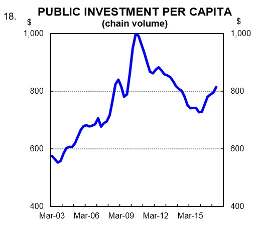
As a basic rule of thumb, public investment should at least be sufficient in size to both replenish the capital stock and match the lift in population. If the population is growing rapidly then underinvestment in the number of schools and hospitals, as well as public transport and a host of other vital public facilities, leaves households worse off. We covered traffic congestion, for example, back in October and the evidence showed that there had been a significant increase in average travel times for commuters on roads in Sydney and Melbourne – the two cities with the strongest population growth. Urban congestion costs the economy dearly and is a handbrake on both productivity growth and living standards.
Policy implications
Australia is one of the most desirable places in the world to live, work, holiday, retire and raise a family. The major cities of Australia are almost always near the top of the various lists that rank cities by “quality of life” metrics. Australia usually scores very well on measures that relate to the political and social environment, economy, healthcare, education, public services and climate. In addition, Australia is blessed with an endowment of natural resources that is second to none. It is indeed the lucky country.
More recently, however, per capita measures of the economy suggest that growth in living standards has stagnated and for some sections of the resident population, in particular younger people, it has gone backwards.
Strong population growth is boosting aggregate demand and therefore output and employment growth. It has helped to keep Australia’s recession-free run intact. But in our view, the per capita measures of the economy suggest that not enough emphasis is being placed on household living standards in the policy debate. The issues raised in this note point to the need for a comprehensive and open discussion around the policy direction Australia is taking.