Mid-Year Special Report: Sydney vs Melbourne battle of the bubbles redux
The Sydney-Melbourne rivalry has been a century in the making.
In the 26 years after Australia’s Federation in 1901, the Commonwealth Government was temporarily housed in Melbourne. But after intense competition between the two cities for national-capital status, Canberra had to be built as a compromise to quell both cities.
Since then, snide barbs have been traded between both cities’ residents. Sydneysiders often decry Melbourne’s cold and grey weather and hail its spectacular harbour, bridge and Opera House, whereas Melbournians cling to the fact that their city is often adjudged “world’s most livable city”, despite it being a rather meaningless award, as well as its much-hyped “culture” and being the “sporting capital”.
In this half-year member’s special report, we revisit this rivalry as it pertains to the housing market – specifically seeking to determine which city wins this year’s award of having the biggest housing bubble?
Last year, it was a close fought race, with Melbourne narrowly edging Sydney to win this dubious award. However, a lot has happened over the past 12 months, which might shift the title north to Sydney.
Like last year, this year’s title is judged on various metrics, including:
- House price growth;
- Values relative to incomes;
- Values relative to rents;
- Values relative to the other Australian markets and history;
- Dwelling construction relative to fundamental demand;
- Rental vacancy rates; and
- Economic strength.
Why Sydney and Melbourne?
Why we have focused exclusively on Sydney’s and Melbourne’s housing markets is summarised neatly in the below charts.
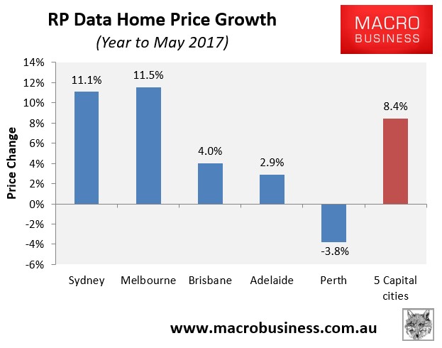
Both markets experienced by far the strongest value growth in the year to May 2017:
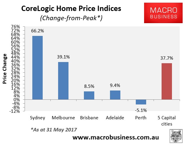
They have also experienced by far the strongest growth since their previous respective peaks:
While all housing markets in Australia are expensive, Australia’s housing bubble is undoubtedly concentrated in the main cities of Sydney and Melbourne.
If one viewed the second chart above in isolation, it would be easy to conclude that Sydney wins the award of having Australia’s biggest housing bubble. However, the longer-termed price data is far less conclusive, and may even suggest that Melbourne has the bigger bubble.
To illustrate, below are Sydney’s and Melbourne’s house price indices from 1970 to March 2016 – the longest time series that I could make. The data consists of median house prices from Abelson & Chung (1970 to 2003) and APM (2004 to 2017):
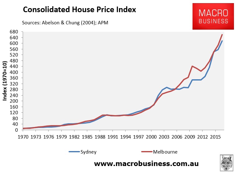
As you can see, according to long-term house price growth alone, Melbourne has just pipped Sydney as the bigger bubble, and only recently.
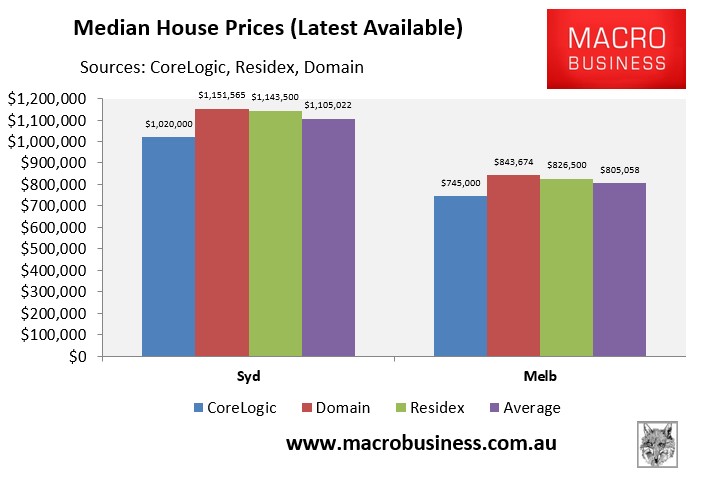
In actual dollar value terms, however, Sydney house prices easily eclipse Melbourne’s, clocking in at just over $1,100,000 versus just over $800,000 for Melbourne, when averaged across the three major private housing data providers (i.e. CoreLogic, Domain, and Residex):
However, house price growth and levels alone do not make a bubble. Instead, we also need to take into account fundamentals, such as incomes and rents, to determine the degree of over-valuation.
House Prices relative to incomes:
The most commonly used and simplest measure to gauge whether a housing market is over-valued is the “Median Multiple”, which measures the median house price as a multiple of median household disposable income.
The below chart plots the situation across Australia, with house prices derived by averaging the latest available results from the three major private housing data providers against the Australian Bureau of Statistics’ (ABS) median household disposable income data for 2013-14, scaled-up by wages growth since then:
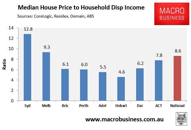
Clearly, Sydney housing is most over-valued by this measure, followed by Melbourne. Both markets’ Median Multiples have also expanded significantly from a year ago, with Melbourne up from 8.3 last year and Sydney up from 11.6 last year.
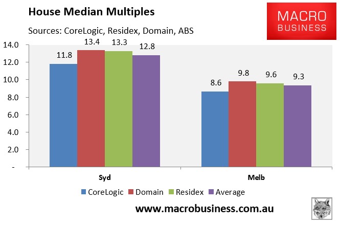
The next chart zooms in on just Sydney and Melbourne and shows the median multiples under each of the three major private housing data providers. Again, Sydney wins hands-down:
Another proxy measure of prices versus income is to compare the total value of the dwelling stock against the size of the economy, as measured by GSP/GDP:
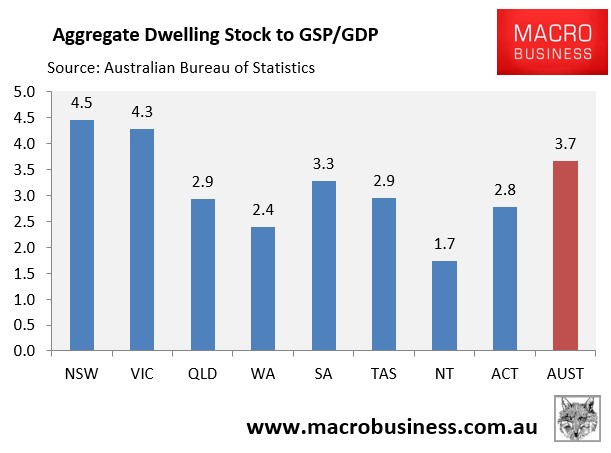
As shown above, Sydney is again the clear leader nationally, with Melbourne running a close second.
So just like last year, Sydney without doubt wins in the housing over-valuation stakes when measured against incomes.
Running tally: Sydney 1; Melbourne 0.
House Prices relative to rents:
Another way of measuring potential over-valuation is to compare house prices against their earning capacity, as measured by gross rents, to determine the price-to-rent ratio. This is much like the price-to-earnings ratio applied to shares.
The below chart plots the situation across Australia’s major housing markets, calculated as the inverse of the rental yields averaged-out across Australia’s three major data providers:
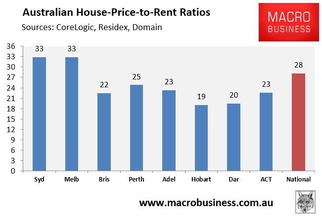
As shown above, Sydney and Melbourne have identical price-to-rent ratios. Both have also increased markedly from one year ago, with Sydney’s up from 31 and Melbourne’s up from 30 at the same time last year.
The below chart tracks the difference across each data provider, with housing appearing most overvalued under CoreLogic and least overvalued under Domain:
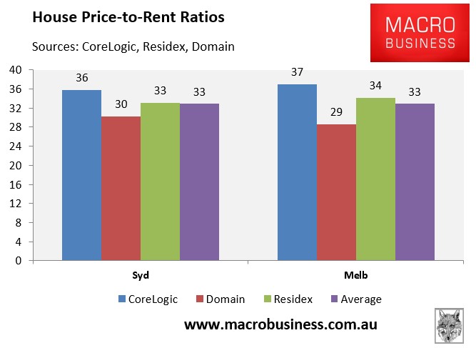
On the price-to-rents measure, it’s a dead heat between Sydney and Melbourne.
Running tally: Sydney 1.5; Melbourne 0.5.
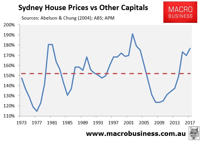
Relative values (deviation from historical average):
The below charts measure the relative values of Sydney and Melbourne houses against the weighted average of the other capital cities. The data, which dates back to 1973, comes from Abelson & Chung (1973 to 2003) and APM (2004 to 2017).
First, below is the chart for Sydney, which shows that the median Sydney house is 177% times the value of the other capitals, which is above the 152% average but below the peaks of 191% recorded in 2002 and 181% in 1981:
Next, Melbourne’s median house is valued at 105% of the other capitals (which are inflated because of Sydney), which is an all-time high surpassing the previous peak of 104% reached in 1977:
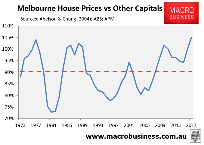
I give this round to Melbourne, given its relative valuation is the highest on record.
Running tally: Sydney 1.5; Melbourne 1.5.
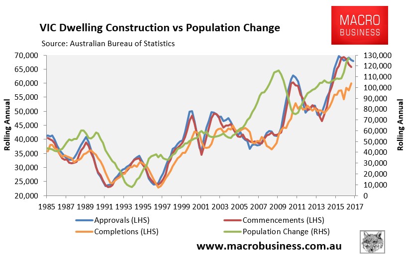
Dwelling construction vs fundamental demand:
Next, let’s examine the level of construction (dwelling supply) relative to fundamental demand (population growth).
An examination of the state-wide data shows that Victoria is running well ahead on dwelling supply relative to New South Wales, although the latter is catching-up.
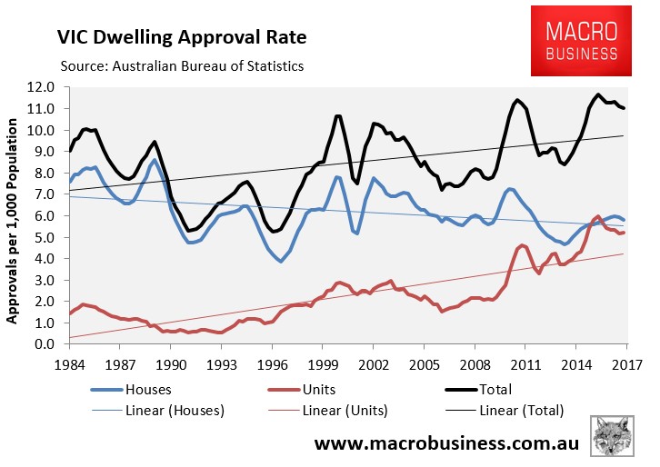
As shown in the next chart, Victoria has experienced a near seven-year dwelling construction boom; albeit amid unprecedented population growth:
This has seen Victoria’s dwelling approvals per 1,000 residents at 11.0 as at March 2017, which is close to the highest level in more than 30-years:
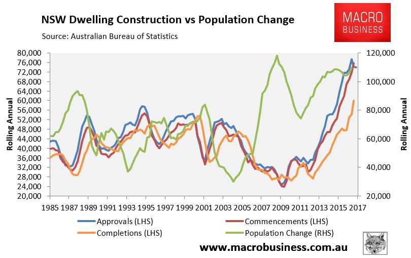
The dwelling construction boom in New South Wales, by comparison, has arrived much later and follows a prolonged period of under-building:
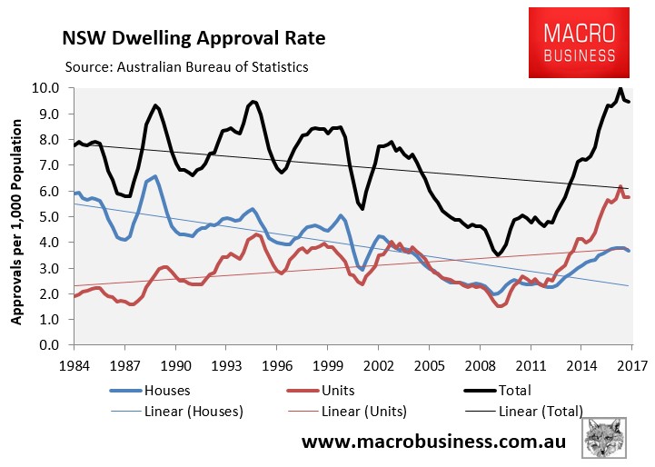
New South Wales’ dwelling approvals per 1,000 residents was also 9.5 as at March 2017, well below Victoria’s:
While there is less data available at the capital city level, what does exist paints a different picture.
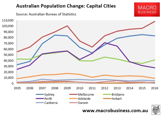
While Melbourne has experienced the stronger population growth over the past 12 years:
Melbourne’s dwelling construction has recently fallen slightly below Sydney’s:
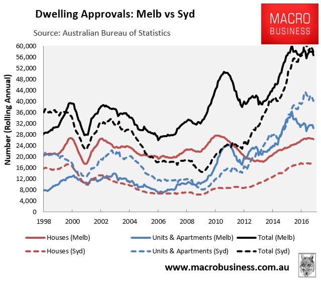
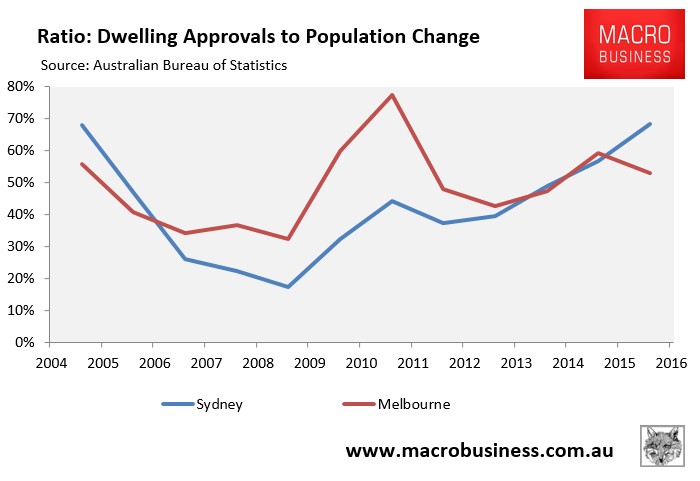
Accordingly, the ratio of dwelling approvals versus population in Melbourne has recently fallen below Sydney’s, although it has been much higher over the past decade:
That said, Sydney’s dwelling supply is far more concentrated in apartments, which tend to be capable of housing fewer occupants than detached houses, thus leaving Sydney with less latent housing capacity than Melbourne (others things equal).
Still, rental vacancy data from SQM Research shows that Melbourne’s rental vacancy rate had consistently tracked above Sydney’s for more than a decade, but has recently fallen below (i.e. 1.5% in Melbourne versus 1.8% in Sydney):
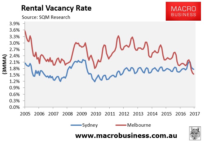
SQM Research’s calculations of vacancies are based on online rental listings that have been advertised for three weeks or more compared to the total number of established rental properties. Therefore, SQM does not count the potentially large number of properties withheld from the rental market, such as homes left vacant by foreign owners or used for short-term letting on Airbnb.
Regardless, when it comes to dwelling construction vs fundamental demand, it’s now hard to split between Melbourne and Sydney, given Melbourne has tightened significantly over past year.
Therefore, I am this year declaring this measure a draw.
Running tally: Sydney 2; Melbourne 2.
Economic strength:
With scores tied we head into the final round in our bubble battle: the relative strength of each economy.
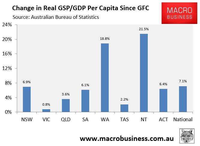
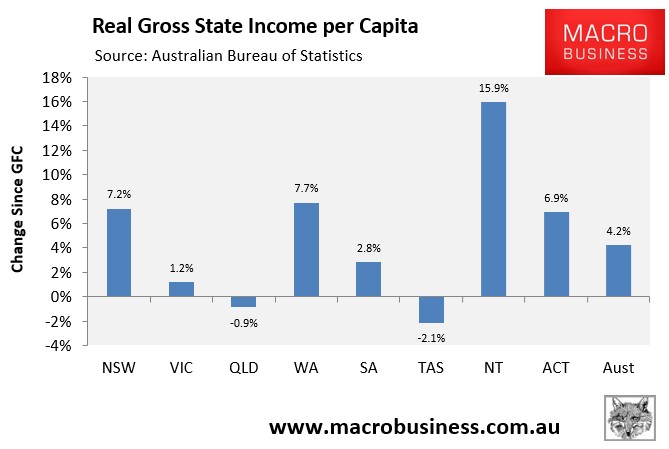
The annual state accounts provide the most detailed perspective; although they are only current to June 2016. Still, by these measures, New South Wales (a proxy for Sydney) has exhibited the stronger economic performance over recent years, with gross state product (GSP) per capita growing by 6.9% since the Global Financial Crisis (GFC), versus an increase of only 0.8% in GSP per capita in Victoria (a proxy for Melbourne):
New South Wales has also easily out performed Victoria on income growth in recent years, with per capita gross state income (GSI) growing by 7.2% since the GFC, versus just 1.2% growth in Victoria:
However, the most recent measures of economic momentum have shifted in Victoria’s (Melbourne’s) favour.
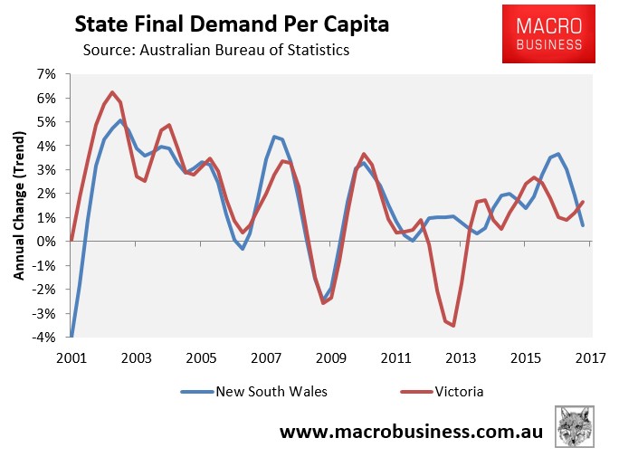
As shown in the next chart, New South Wales’ per capita state final demand (SFD) grew at 0.7% in the year to March 2017, well below Victoria’s 1.6%. New South Wales’ growth is also trending downwards, whereas Victoria’s is trending up:
Labour market indicators also tend to favour Victoria (Melbourne).
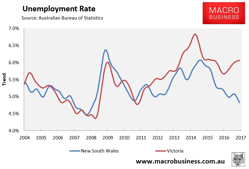
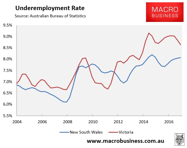
While New South Wales has much lower unemployment and underemployment than Victoria:
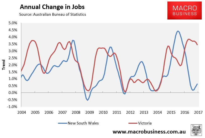
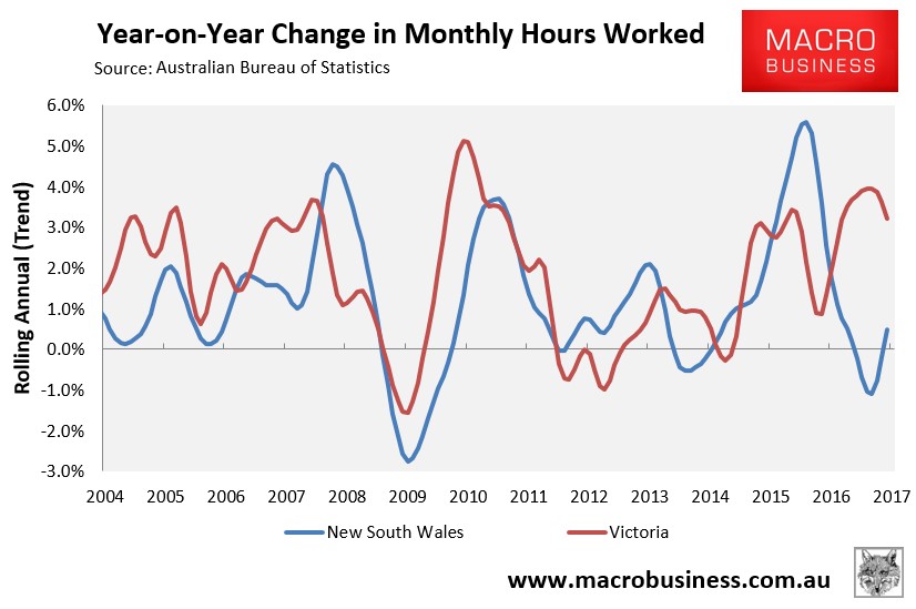
Victoria is experiencing much higher jobs growth and stronger growth in aggregate hours worked:
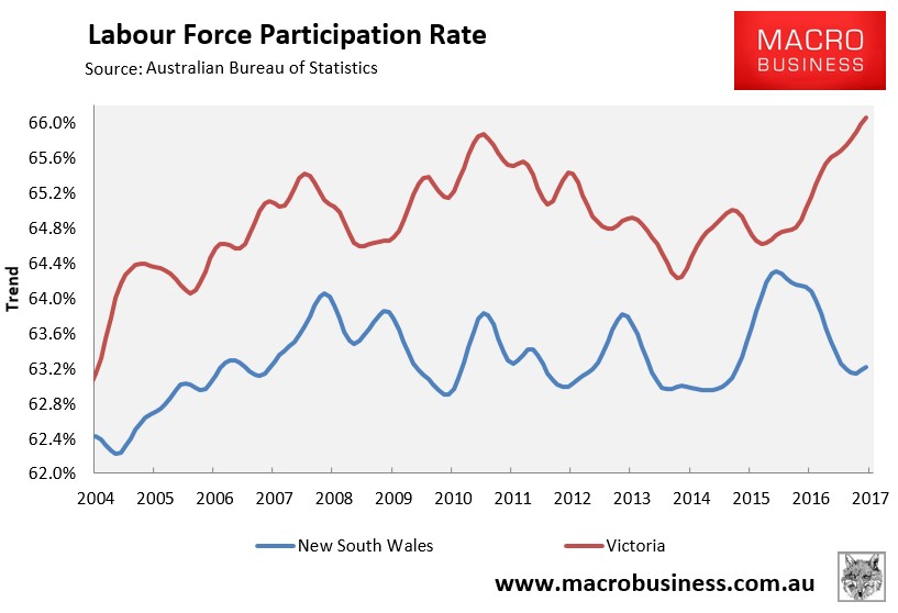
Moreover, the much lower unemployment and underemployment rate in New South Wales appears to have been driven, to a large extent, by a big fall in labour force participation, whereas Victoria’s has risen considerably:
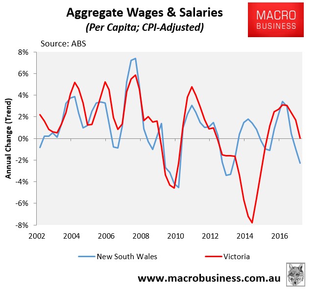
The growth in real per capita wages and salaries is also tracking higher in Victoria currently (0.0%) than New South Wales (-2.3%):
Weighing-up the various broad measures suggests that the New South Wales’ economy is currently tracking behind Victoria’s, arguably making it the more “bubbly” market, other things equal.
Final tally: Sydney 3; Melbourne 2.
Sydney wins the bubble battle by a whisker:
So based on the measures outlined above, Melbourne has turned the table on Sydney and has narrowly won this year’s crown of Australia’s biggest housing bubble in a close fought and highly subjective race – basically a coin toss.
While both markets are massively overvalued and now have a similar balance between dwelling construction and fundamental demand, Melbourne’s economy is currently tracking a bit stronger than Sydney’s.
But both markets are heavily exposed to a downturn:
Both Sydney and Melbourne are highly exposed to any housing correction. Both are “parasite” economies that are the epicentres of big finance, most notably the big four banks that manage the nation’s mortgage debt as well as the funds management industries that manages the nation’s superannuation.
Any housing correction would, therefore, adversely impact the banks’ mortgage books, thereby impacting Sydney and Melbourne the most via their deep ties to the financial sector.
A housing correction would also lead to a decline in dwelling construction, which has underpinned both markets, as well as lead to a negative “wealth effect”, which would damage consumer-facing sectors like retail.
Arguably, Melbourne’s economy is more exposed than Sydney’s to a downturn. The below chart shows the composition of employment across Victoria (read Melbourne) based on the latest ABS quarterly data:
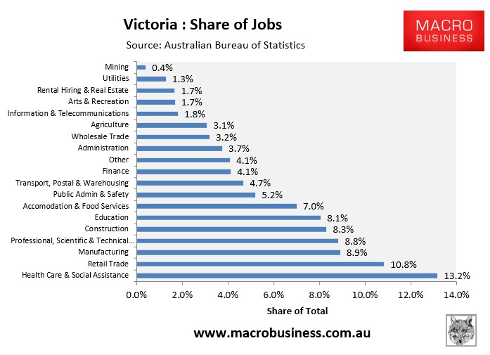
As you can see, Victoria’s second, third and fifth biggest employers are retail trade (10.8%), Manufacturing (8.9%) and construction (8.3%) respectively.
Retail trade and construction are directly tied to the housing market – the former via the ‘wealth effect’ and the latter via dwelling construction – whereas the manufacturing sector is partially exposed to dwelling construction (e.g. building supplies manufacturing) and is also facing retrenchment as the local car assembly industry shutters for good at year’s end.
New South Wales’ (read Sydney’s) employment composition appears slightly less troublesome:
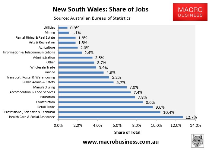
The retail sector in New South Wales employs significantly less people (9.6%) than Victoria, as does the manufacturing sector (7.0%), with the latter also less exposed to the closure of the car industry. By contrast, the construction sector (8.6%) employs slightly more people in New South Wales.
Finance and rental hiring & real estate services employ relatively more people in New South Wales, but these are small employers overall, mitigating any employment shock in the event of a significant housing correction.
So overall, it would appear that New South Wales’ economy is less precariously placed than Victoria’s to a downturn, although we are talking about a matter of degrees here rather than anything too significant.
