Here it is thanks to Macquarie:
The same chart could drawn for iron ore only worse. A modest gain in underlying demand but an huge surge in restocking and hoarding (apparent consumption).
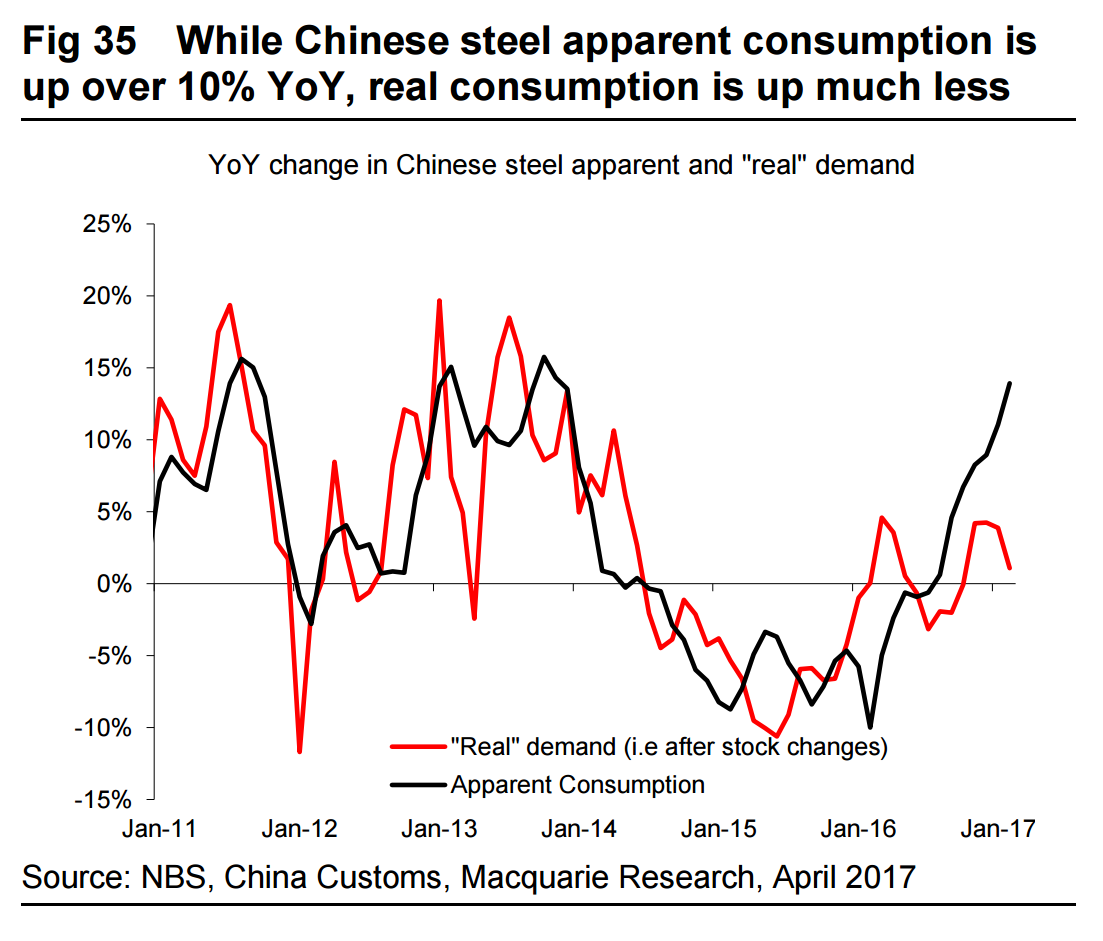
The iron ore bubble in a chart.

Here it is thanks to Macquarie:
The same chart could drawn for iron ore only worse. A modest gain in underlying demand but an huge surge in restocking and hoarding (apparent consumption).
The iron ore bubble in a chart.