Yesterday’s post on the slightly improved outlook for 2017 Australian growth prompted some criticism from readers, as well as some soul searching. Many seemed to think that I had “capitulated” on my view that Australia was at risk of major bust in the not-too-distant future. Nothing could be further from the truth! Let’s revisit the argument. The fist charts showed Australia’s segments of domestic demand:
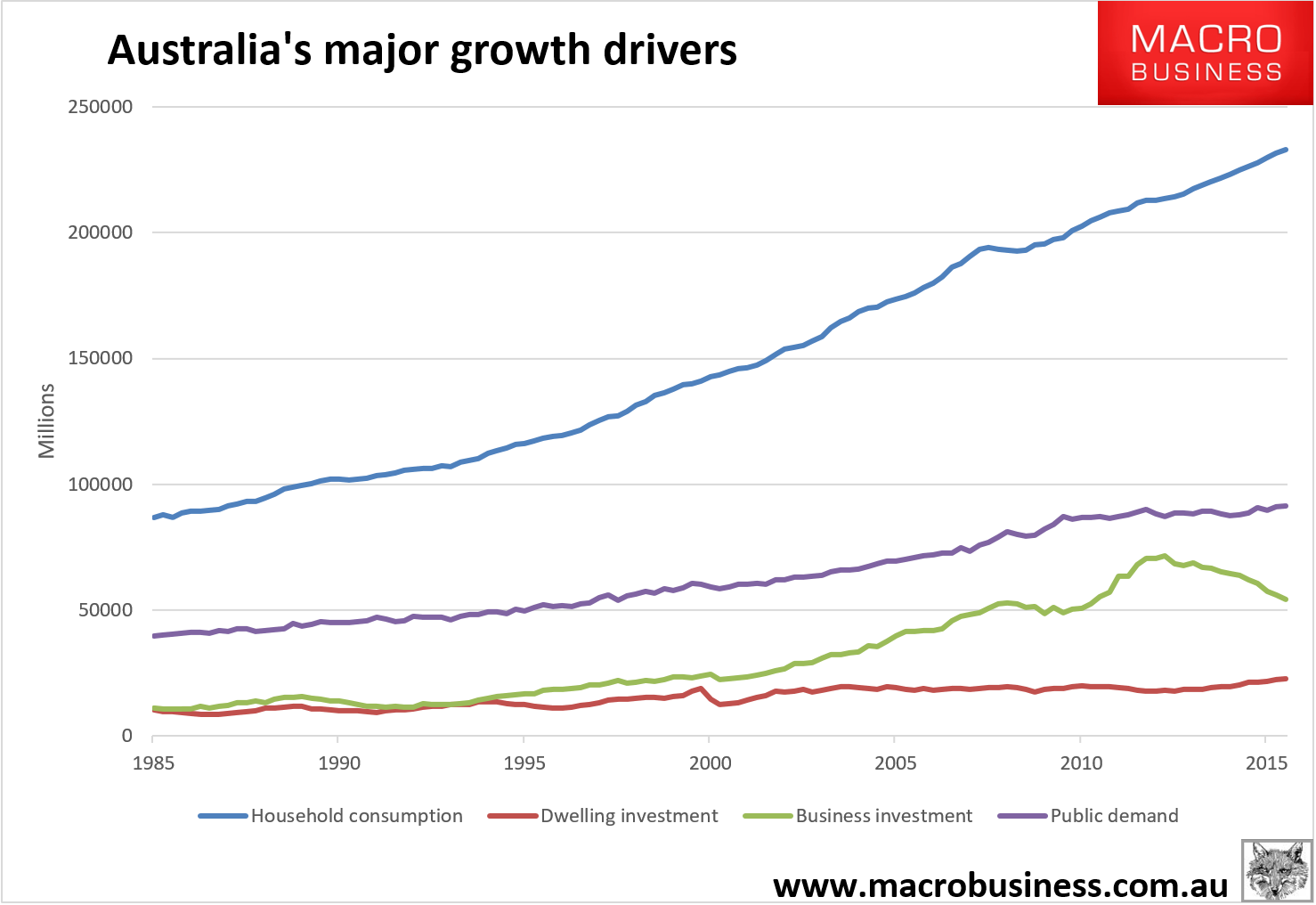
The chart is stunning in terms of the green line. Note what the fall in business investment in 1990 looked like, plunging Australia into deep recession as a consequence, versus the much large fall in the past three years. The RBA and Treasury would look at this chart and give themselves a big pat on the back for pulling enough levers to keep Australia growing through this gigantic investment draw down.
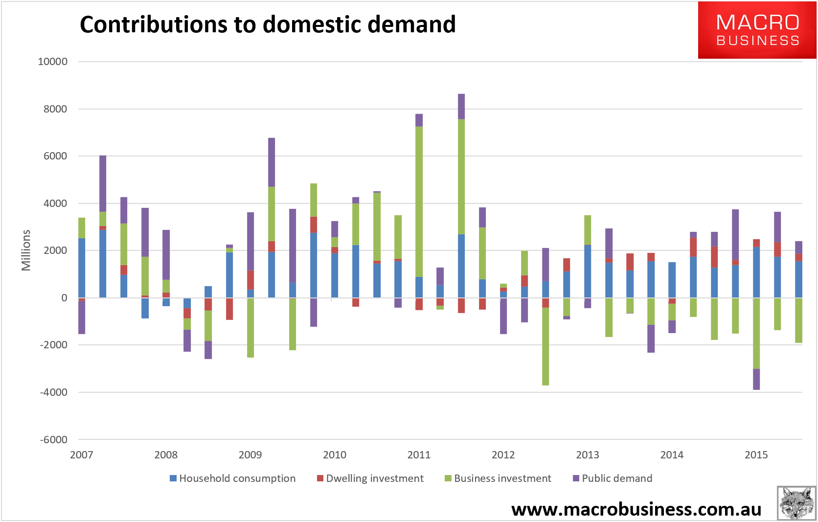
But, they’d be wrong, and the second chart shows us why, the breakdown of each segment’s contribution to growth since the GFC: