
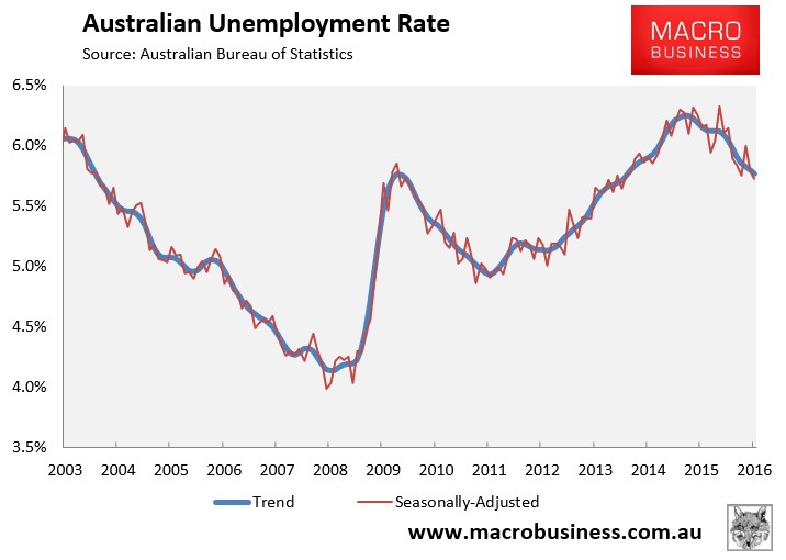
As summarised earlier, the Australian Bureau of Statistics (ABS) has today released its labour force report for March, which registered a 26,100 rise in total employment and a 0.1% decline in the headline unemployment rate to 5.7%.
The fall in the unemployment rate beat analysts expectations of a 0.1% increase to 5.9% and jobs growth of 17,000.
In trend terms, the unemployment rate fell ever so slightly from 5.80% to 5.77%:
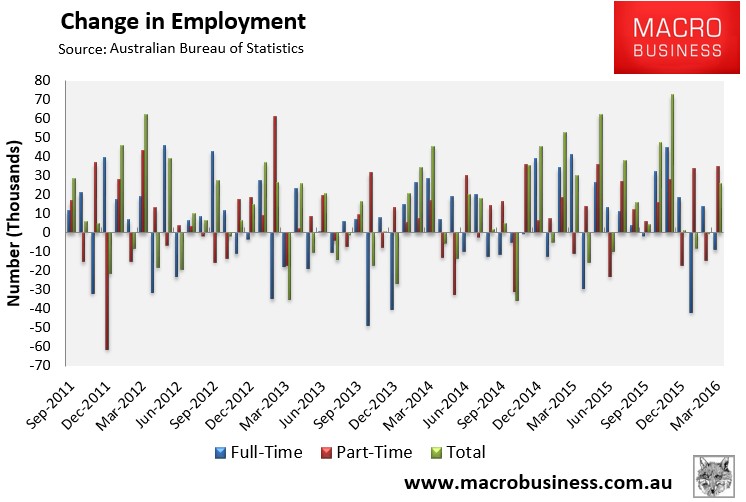
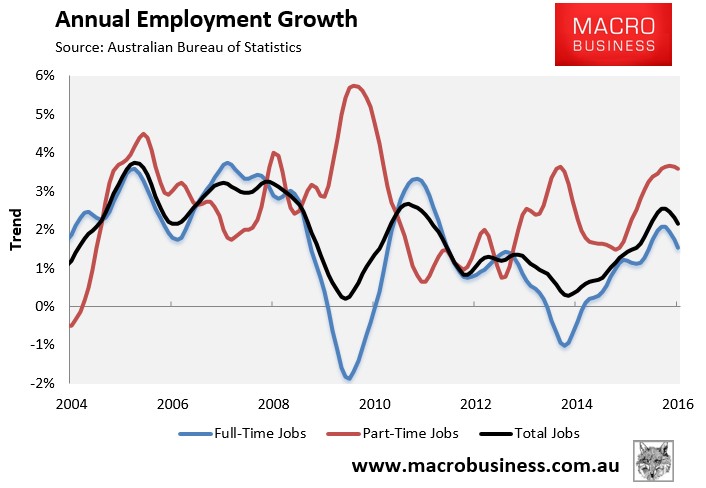
Again, total employment rose a seasonally adjusted 26,100 to 11,909,600. However, this was driven entirely by part-time jobs, which jumped by 34,900 to 3,729,200. By contrast, full-time jobs fell by 8,800 to 8,180,400:
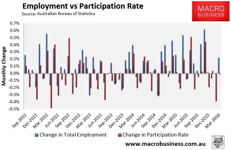
The participation rate also fell ever so slightly:
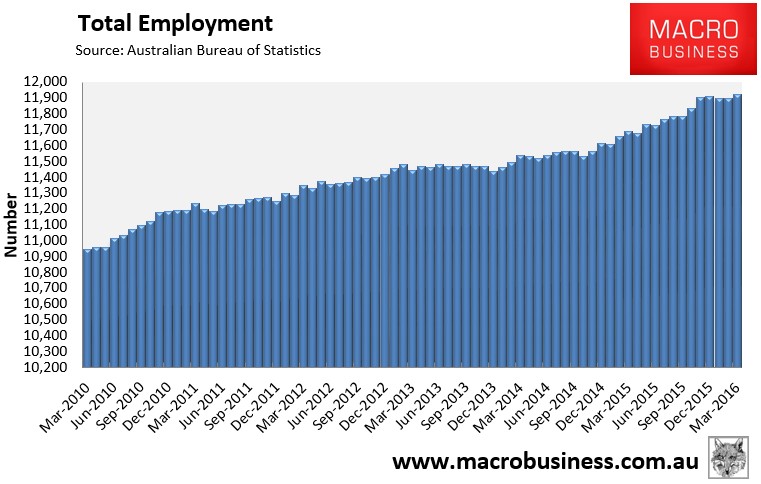
The trend in total employment also continues to flatline after October’s and November’s numberwang:
Annual employment growth continues to weaken and is being driven primarily by part-time employment:
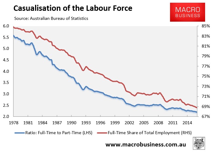
The proportion of the population in full-time work has also hit a record low:
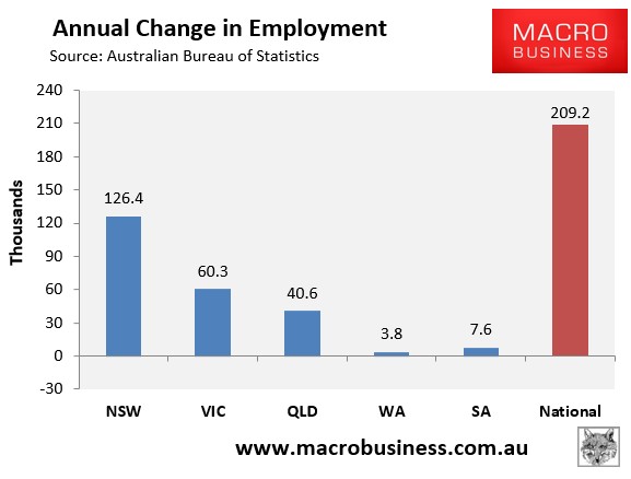
The housing bubble epicentres of New South Wales (Sydney) and Victoria (Melbourne) continue to drive jobs growth, accounting for 60% and 19% respectively of total new jobs nationally over the past year in seasonally adjusted terms:
And South Australia and Tasmania continue to have the highest seasonally adjusted unemployment, whereas New South Wales (Sydney) is again leading the nation (see next chart).
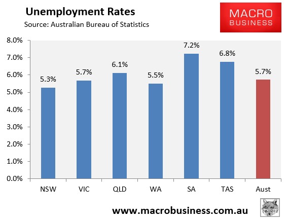
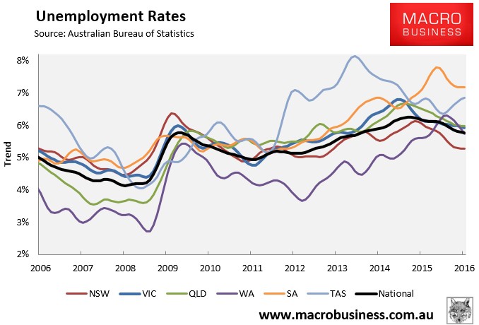
The state seasonally-adjusted figures are notoriously volatile and subject to a big margin of error. As such, the below chart shows the ABS’ trend unemployment rates, which again shows the bubble epicentre of New South Wales with by far the lowest unemployment, South Australia and Tasmania with the highest, Western Australia with average unemployment, and Victoria and Queensland with above-average unemployment:
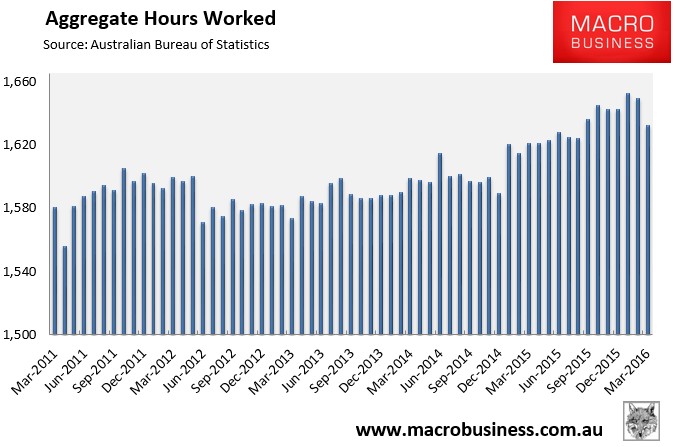
The aggregate number of hours worked fell heavily in seasonally adjusted terms in March (down 17.5 million hours or 1.06%). However, hours worked have risen by 0.7% over the past year, which is well below the growth in the population:
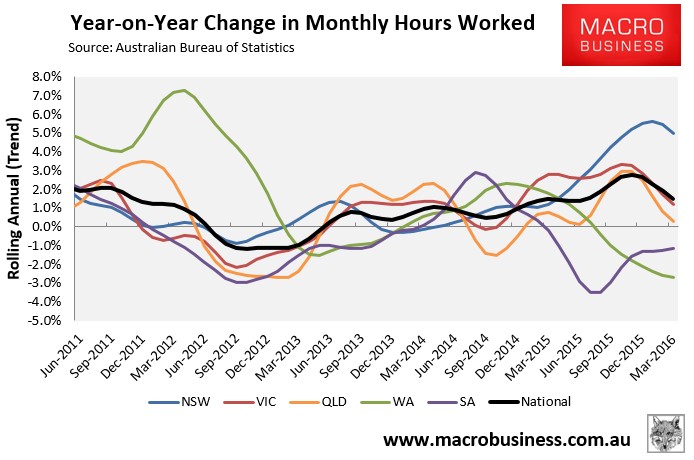
The below chart, which tracks the changes in hours worked on a trend basis, again shows that New South Wales (Sydney) has driven the lion’s share of this growth, with Victoria and Queensland also experiencing positive growth. By contrast, South Australia and Western Australia remain in the gutter, but with diverging trends. Nationally, hours worked is also trending down heavily:
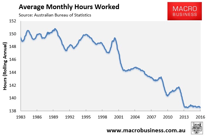
Average hours worked also hit a record low:
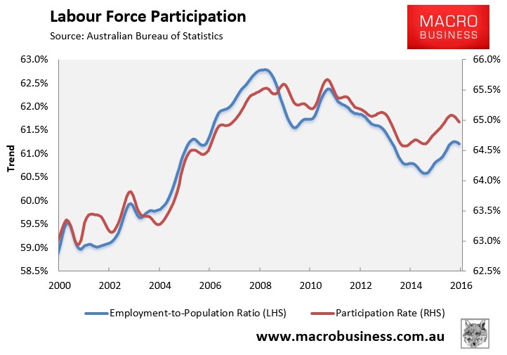
After rebounding, workforce participation has also begun to trend down:
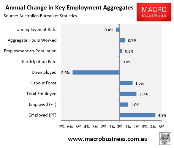
Finally, to round things out, the next chart summarises the annual change in the key employment aggregates on a seasonally-adjusted basis, which shows the solid improvement over the year in some areas by weakness in others:
Nothing has changed to the outlook following this release.
Despite the positive headline results there is weakness under the hood, with the lion’s share of the jobs growth part-time, growth in aggregate hours worked weak, and 89% of the employment growth in the two bubble epicentres of New South Wales and Victoria.
We still expect the housing-induced boom in employment to reverse in the second half as dwelling construction and prices begin to fall, coinciding with the ongoing contraction of mining investment and the closure of the car industry from late in the year.
