

by Chris Becker
Today I want to have a big picture look at commodities but through the lens of technical analysis, looking at some major miners like BHP-Billiton (BHP), broader commodity price indices and the specific commodities themselves.
First, let’s start with the DJ-UBS Commodity Price Index, which tracks 22 commodities traded as futures (except aluminium, nickel and zinc), so this gives a very broad gauge of prices. Here’s a long term monthly chart:
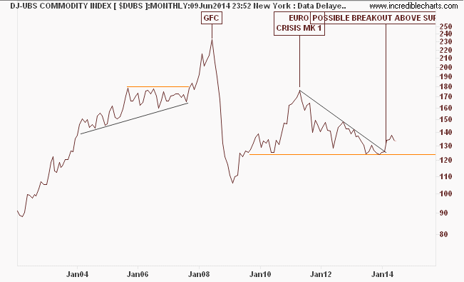
Things to note: this is a semi-log chart, so a price rise from 100 to 200 is the same as 50 to 100. Its obvious that prior to the GFC, where commodity demand was juiced by China and a lot of credit running wildfire (which makes its way into speculative commodity markets), things were – to put it mildly – ‘good’.
The collapse in commodity prices following the GFC was then juiced by successive series of cheap credit again to boost aggregate demand, namely the series of QE – quantative easing – until we got to the European crisis in mid 2011 and prices have dived ever since, even in the face of more credit, more acronymic solutions and more economists saying “everything is fine”.
Let’s look at the weekly chart with an added twist – in green is the Australian dollar:
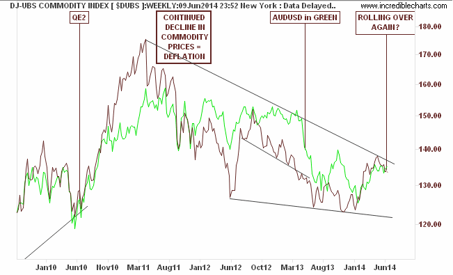
I think its been said often enough, but the Aussie (AUDUSD) is indeed the No.1 proxy for the commodity complex, which makes sense even though from a risk point of view is a nonsensical way to construct your economy.
The “decline=deflation” note on the chart has been there for awhile, and it still rings true, although there is a potential for a breakout here, the attempts by Chinese authorities to re-regulate and re-define their economy may make this a false break.
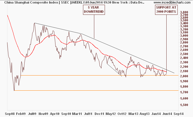
As for Chinese stock markets, does this chart of the Shanghai Composite look familiar?
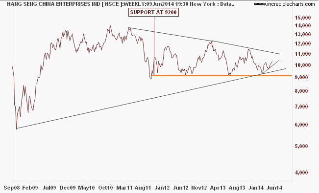
The bear case for the Hang Seng China Enterprises Index (which tracks H-shares) is not as solid, but still that’s nothing to go home about:
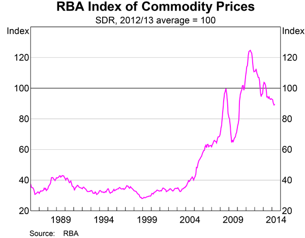
And from the recent RBA Chart Pack, a great chart showing the very long term run of commodity prices:
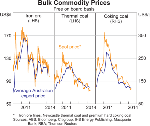
And a short term look at the recent falls in bulk commodity prices:
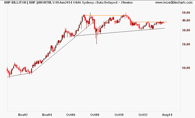
Given this backdrop of commodity price weakness that seems structural and ongoing as the “hyper-cycle” commodity boom keeps moving through its bust stage – why is the share price of the worlds No.1 commodity supplier so elevated? Heres the long term monthly chart:
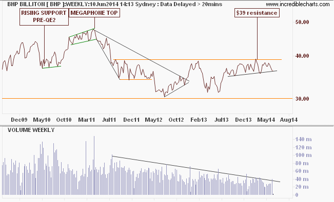
The weekly chart shows the most recent nadir at $30 per share – not quite a GFC low but thereabouts. A recent breakout has paused at the obvious $39 resistance level, now 3 years old and probably only supported by recent spikes in oil prices (juiced by successive rounds of QE?)
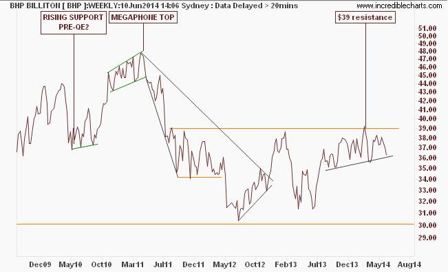
Going back to the weekly BHP chart, there is a potential for a large breakout as an inverse head and shoulders pattern is forming on the “big-not-owned-by-Australians”. Such an oversold condition maybe reinforced by two recent discoveries: first volume is drying up:
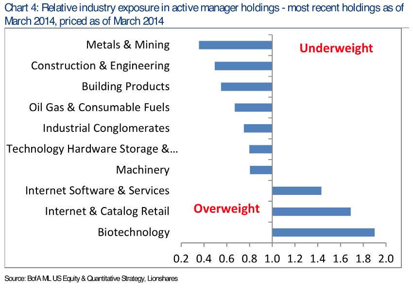
And secondly, according to BoA/ML (courtesy ShortSideofLong), hedge funds note metals and mining stocks as there lowest underweight category (i.e they don’t want them):
Before we finish, let’s look quickly at some specific commodities:
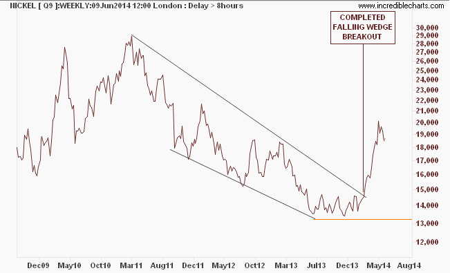
Nickel recently completed a great breakout from a bullish falling wedge pattern, but as Assad Tannous of Asenna Wealth recently noted, this could be over very shortly:
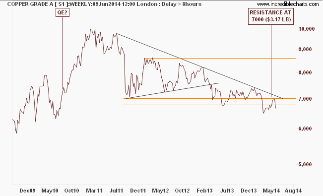
Copper does not look good at all – keep an eye on this one because of all industrial metals, “Dr Copper” is the bellwether:
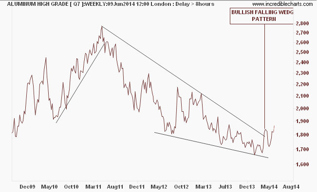
Aluminium seems to be following Nickel but hasn’t falling broken out yet:
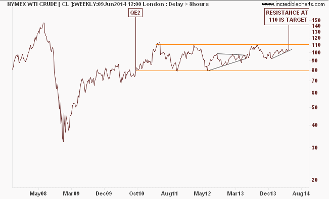
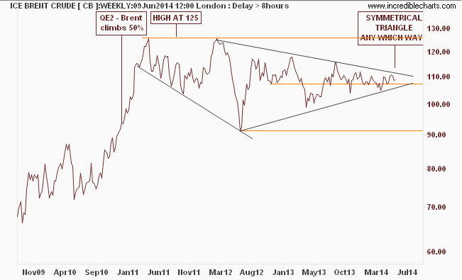
Whilst WTI crude is doing well, the European used ICE Brent is forming a long symmetrical triangle as supply/demand factors balance for now:
The takeaway here is that commodities remain in a bear market, but may experience extremes, including significant rallies on the back of stimulus, or even promised stimulus. Whilst BHP’s share price doesn’t fully reflect the falls, especially in iron ore (which I’ll get to tomorrow!) it is still way off its highs, and with short term breakouts possible, it does not have the buying support of institutions or other investors.
Those who say that commodities are cheap maybe right – but markets can fall much further than even the pessimists think possible especially on a run to safe harbors. Long term holders of Australian dollar may learn this lesson the hard way.