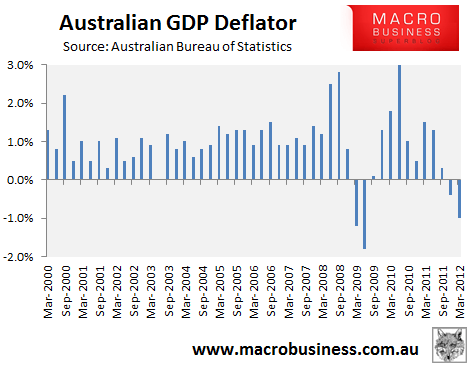
To highlight the effect of the Implicit Price Deflator (“GDP Deflator”) on Australia’s GDP, consider the below charts. The first shows quarterly inflation, as measured by the GDP Deflator, since March 2000:
As you can see, the GDP Deflator fell by -0.4% and -1.0% respectively in the December and March quarters, suggesting that the Australian economy experienced deflation (falling prices) over this period. You can also see from the above chart that price deflation is a very rare event in Australia. The only other time over the past 12 years that Australia has experienced deflation was in the March and June quarters of 2009, during the Global Financial Crisis.
The effect of this negative growth in the GDP Deflator on Australia’s headline (“real”) GDP is illustrated in the below chart:
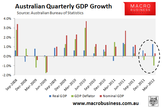
As shown above (and by Mark the Graph yesterday), Australia’s “nominal” (non-inflation adjusted) GDP growth was actually very weak in both the December and March quarters, registering growth of only 0.3% in both quarters. It’s only because of the addition of the negative GDP Deflator in both quarters – 0.4% and 1.0% respectively – that Australia’s headline (“real”) GDP (0.6% and 1.3% respectively) was so strong.
In short, the recent price deflation across the Australian economy may well be exaggerating underlying growth momentum. It is interesting to note too that the same factor saved us from a technical recession in 2009.
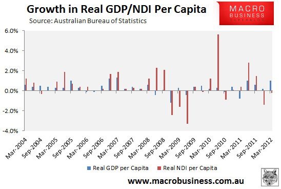
As always, the devil is in the detail. Which is also where we find another key vulnerability in yesterday’s strong headline number. The 1.3% real growth in the March quarter masked the second consecutive quarterly fall in real per capita disposable incomes, which fell by -0.2% and -1.4% respectively in the March and December quarters.
The relationship between real GDP per capita and real national disposable income (NDI) per capita is shown in the below chart:
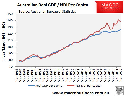
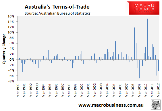
As you can see, both series tracked each other closely until 2003, when real NDI per capita surged ahead. The reason for the stronger growth in per capita NDI was the China-led commodities boom, which caused a sharp increase in Australia’s terms-of-trade:
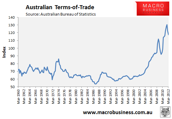
Essentially, the sharp rise in the value of Australia’s export commodities – in particular iron ore and coal – meant that Australia, as a nation, received a pay rise. Where once a tonne of iron ore bought, say, 10 televisions from China, we could now buy 20 televisions, making us materially richer than justified by the rise in our output (GDP).
However, with commodity prices having fallen for around 6 months, and the growth in Australia’s terms-of-trade turning negative over the past two quarters, the purchasing power of Australia’s exports is now declining, meaning that Australian real incomes have fallen despite real per capita GDP rising over this period (see below charts).
The above results highlight just how important the boom in commodity prices has been for Australia, as well as the significant risks that lie ahead. While the commodity (terms-of-trade) boom has, to date, acted to boost Australian incomes, in turn supporting employment, asset prices and government revenues, any protracted downturn in commodity prices would have an equally adverse effect on the economy.
Yesterday was a stellar result but sustainability is the key.

