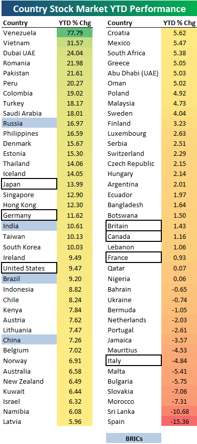
Today’s chart comes from Bespoke Investments and tracks the current year to date (YTD) performance of nearly 80 equity markets around the world, in a heat map fashion. The so-called BRICS are highlighted in blue, whilst G-7 nations are boxed:

A word of caution. These figures are not adjusted for inflation – check out the “leader” Venezuela – up nearly 80% for the year!

Advertisement
Of course, when you have official inflation averaging 27% a year for the last 5 years it does put things into perspective:

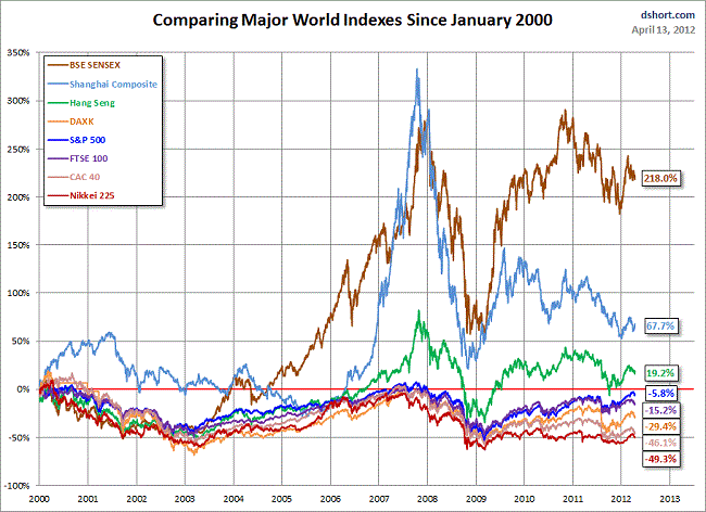
As always I prefer the longer term view when comparing equity performance, so here’s a chart from DShort since January 2000 of the major bourses, to put these moves into perspective:
Advertisement
