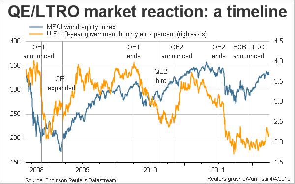
Today’s chart is timely, given the wreck in risk assets in the lead up to the Easter break. We’ve pointed this out before, as the correlation is fairly – well, its bloody obvious really. It is Quantitative Easing (QE) and the Long term refinancing operations (LTRO) – fancy terms for what is really about injecting liquidity, but more importantly, confidence and higher expectations into asset markets.
Here’s Scotty Barber from Reuters chart, which tracks the MSCI world equity index and the US 10 year government bond yield – the two sides of the risk on/risk off coin, against the central bank fiddling:
 And you think Australian retailers and property developers (and market economists who should know better) wail loudly because our central bank isn’t “doing enough”?
If this dip turns into a correction, the wails from market makers, financial institutions and other “squids” will be heard around the world. QE3, LTRO2 etc – its not over.