Here’s a selection of charts I’ve found around the web this week that I think are interesting:
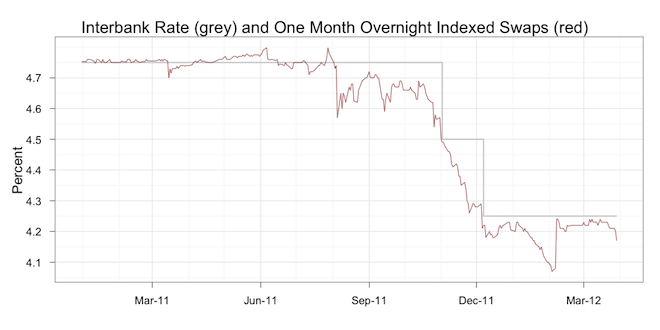
First, from Mark Graph’s blog on interest rates, showing the OCR/Interbank rate and the swaps that traders/insto’s used to bet on direction of future interest rates. Note how wrong they got it last month – will this repeat again?
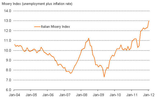
The Italian Misery Index (unemployment plus CPI) from Markit Economics:
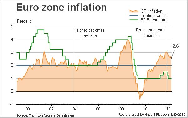
Inflation in the Eurozone is WAY above target:
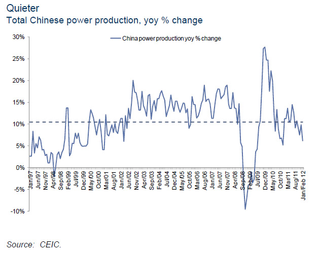
Chinese electricity power production – seems subdued (from ZeroHedge):
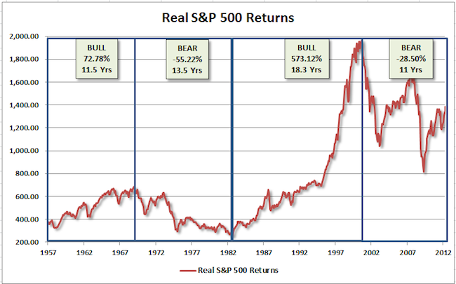
Great chart of S&P500 secular market returns in response to a permabull analysis (from Pragmatic Capitalism):
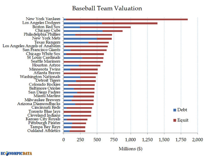
A bubble in baseball? Check this out from Econompic:
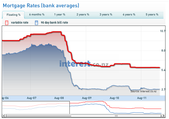
Lastly, why watching NZ is worthwhile to contemplate trends in OZ – variable rates trajectory for us too? Courtesy of Interest.co.nz please check them out.
