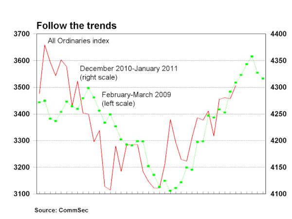
The implication is that the current period is analagous to the Feb-Mar 2009 bottom, which then preceded to “crack-up” by almost 50%, due to enormous worldwide co-ordinated stimulus (with Australia’s main saviour, China, providing the most ammunition, alongside emergency rate cuts):
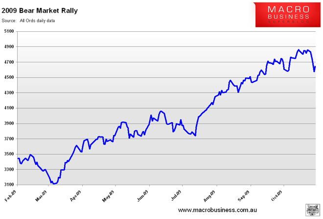
Analog charts on their own make for interesting and thought provoking comparison studies (here is my analog study of the 2001-2003 bear market) but are not a substitute for analysis. Furthermore, torturous charts and ones that ignore other comparisons cloud the issue.
For example, what if we compare the Feb-Mar 2009 period to mid February to early April 2008?
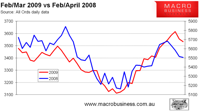
Again, a nice match, a good analogy whereby a market has corrected, has seemingly found a bottom and has rallied. In this case, to keep the analogy daily period correct, I have left off the next month through to mid-May 2008, where the All Ords continued to rally to just over 6000 points, some 16% above its low, and reinforcing the implication of another bottom picked rally.
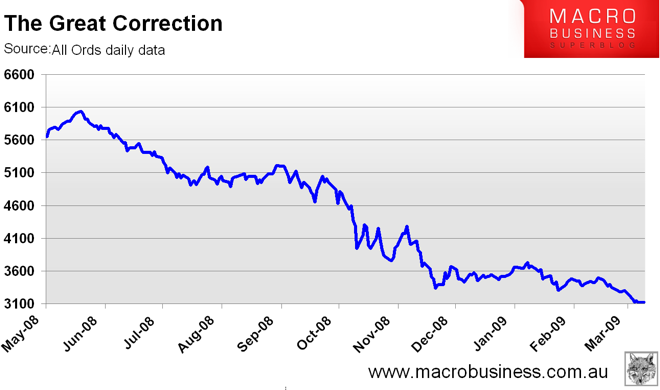
Unfortunately, most of us (who look back to study history to gauge the foggy future), remember the aftermath:
In my Friday Trading Day post, I neglected to include the weekly chart of the ASX200, so let’s have a look at both: (I usually post the weekly chart on the weekend, after digesting the Friday US/Euro sessions, but was very busy this weekend!)
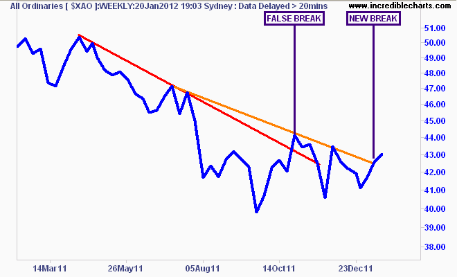
The technical analysis of the All Ords weekly chart shows a false break of the 1st downtrend line (marked in red) in late October, whereby the market then fell back almost to its recent low. However a bullish case resumed as higher lows were made in subsequent retracements, but none have passed above the 2nd downtrend line (marked in orange, from the 3 lower highs in mid July, late October and mid December 2011), until the most recent weekly close.
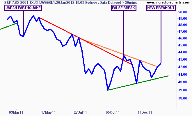
Here is the ASX200 for comparison:
A similar situation (no surprise given the concentration of the ASX8 – the top four miners and banks by capitalisation in each index), with a false break in late October, followed by the recent breakout, all presaged by bullish higher lows (marked in green).
To include some behavioral analysis, both indicies are currently forming symmetrical triangle patterns (ascending on the daily charts), and given the preceding price action are medium term bearish in nature.
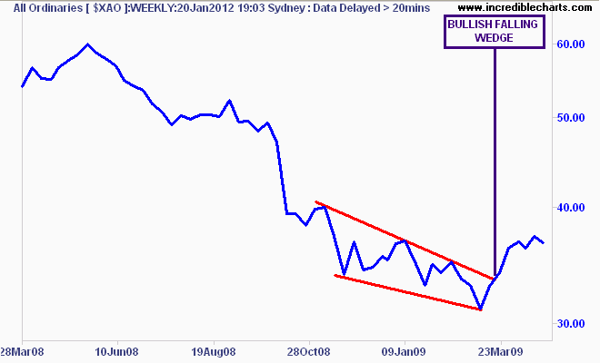
This is in stark contrast to the Feb-Mar 2009 period, where a medium term reversal falling wedge pattern formed (from late October 2008 to its success in March 2009), which eventually became an extremely bullish inverse head and shoulder pattern by June 2009:
Why are these patterns so different?
A falling wedge implies the end of a downtrend, as frustrated owners dwindle in size and selling exhaustion sets in. In a significant downtrend (i.e more than 20% in magnitude), it is almost always bullish, and if followed by a catalyst (e.g QE 1.5, half a trillion USD in Chinese stimulus?) sets the stage for a very large bullish reversal.
A symmetrical triangle or “coil” on the other hand implies an equal battle between the bulls and the bears – those ephemeral creatures of the market (with the “pigs” or retail stockholders in the middle). This pattern is formed as ebullient bulls bid up any lows, whilst vulture like bears short any highs, usually balancing each other out and distributing price over a few months:
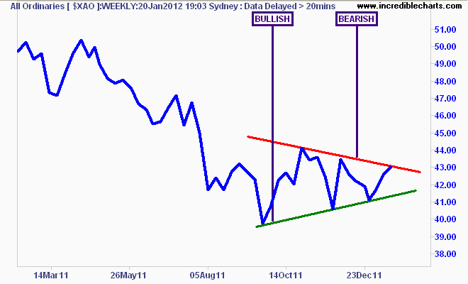
This pattern occurs in both a downtrend and uptrend, and in approx. 3/4 of historical cases, ends up continuining the previous trend. To complete the pattern (and thereby indicating future price movement) requires a break either side of the triangle.
There is no doubt that the current situation is bullish, and we could see this current “spring” in the coil continue, and breakout for a medium term rally (breakout above 4250 on the ASX200, with a target of 4600-4700 for the rally)
As I’ve explained before, fundamentals (which will be further clarified in the upcoming earnings season in February), demographics, the ongoing secular bear market and both global and local macro conditions weigh heavily against a new bull market in stocks.
In conclusion, let’s put the Commsec analogy period into context, with the last 10 years of daily prices for the All Ords, (encompassing the GFC, the 2003-2007 bubble and the current bear market, with bottoms marked) with the period under investigation marked by the two vertical lines:
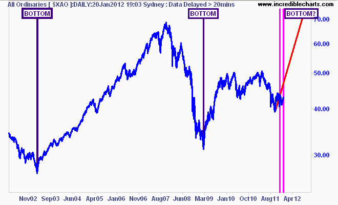
Sometimes a chart doesn’t tell you anything, but just reinforces your hope or fear. Investors should always look beyond simple analogies.
