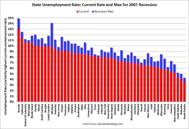
Today’s chart comes from Calculated Risk again and on the back of last nights excellent housing starts number which has ignited the long awaited Santa Rally, examines the current US unemployment rate, vs. the recession high:

Obviously there has been aggregate improvement in the number, although this is the underreported U-3 measure, not the realistic U6 measure. I would also point out that the states on the left (sic) with the highest unemployment rates also seem to match The Unconventional Economists theory on where the greatest land bubbles have been in the continental United States.
Its well to remember that the US, like Europe cannot be lumped together as one entity and nor can both be measured by total strength.
Advertisement