
Today’s chart comes from Doug Short, and visualises the US Dept of Transportation figures on traffic volume. Like electricity usage, the number of kilometres (or miles for the US) driven per capita is a good indication of economic strength that cannot be filtered through the murky lens of GDP composition and hedonic reductionism.
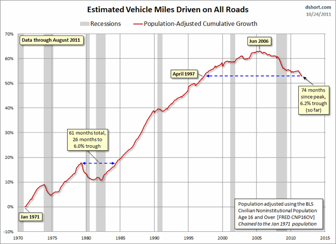
Clearly, when we adjust for population growth, the Miles-Driven metric takes on a darker look. The nominal 39-month dip that began in May 1979 grows to 61 months, slightly more than five years. The trough was a 6% decline from the previous peak.
The population-adjusted all-time high dates from June 2005. That’s 74 months — over six years. And since the latest data is the lowest reading since the all-time high, the best we can hope for is that August “might” have been the trough. Our per-capita miles driven based on the age 16-and-older population is about where we were as a nation in April 1997.