Today’s chart comes from Goldman Sachs’ new report released yesterday (h/t Zero Hedge) titled “From the ‘Great Recession’ (Prince: what the rest of the world calls the GFC) to the ‘Great Stagnation'”.
This is a historical report, although it does include a probability analyis of where developed economies are heading, but a particular chart stood out:
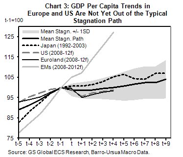
This chart illustrates the trends in GDP per capita growth, using current forecasts and historical trends from previous stagnations. Notably, one of the longest in magnitude was Australia’s in the 1970s:
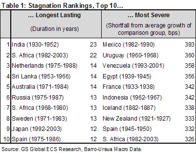
Here are some of the findings of the historical data (emphasis added), and effectively the definition of stagnation, versus the “conventional” paradigm of benign inflation and sustained growth (above 2% real):
Per capita GDP growth during these episodes hovers steadily below 1% (at 0.5% on average). CPI inflation tends to be low and steady, signalling aggregate demand pullbacks. Unemployment is high and sticky. Housing prices tend to fall, especially in comparison to their pre-stagnation dynamism, while stock-market returns are far weaker than their historical averages.
These events tend to be correlated with, if not preceded by, financial crises, especially stock-market crashes. Put simply, the probability of stagnation is much higher after financial crises.
Although the Japanese experience of the late 1990s has received a lot of attention, we find about 20 more episodes of that kind under a range of definitions, mostly in the post-war developed world. Japan may or may not be a paradigm but it is certainly not unique.
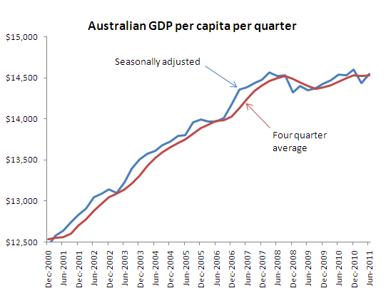
What concerns me for Australia is the current trend in GDP per capita growth, as highlighted by Leigh Harkness’ chart (this is quarterly, not annually):