
Today’s chart is the TED spread, mentioned in today’s links by House and Holes here.
And no its not the TED forum of talks, presentation and ideas (a favourite), but the difference between the 3 month interest of US Treasury bills (T-Bills) and the 3 month London Interbank Offered Rate (LIBOR). The LIBOR is the rate at which banks will lend unsecured funds to each other (amongst other rules and exchanges). The spread between the 3 month T-Bill and LIBOR, is a measure of liquidity and risk taking (the former being notionally “risk free”, the latter reflecting the risk in commercial banking).
This is last night’s screenshot from Bloomberg:
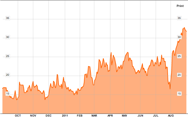
1 year chart of the TED spread
The TED has shot out of a very low trading range, indicating a possible drying up of liquidity, and/or a flight away from risk. The latter can be supported by a reduction in bids on risk markets – i.e stocks, commodities, non-USD currencies. The rebound from the correction lows has been very slow indeed.
But as “Constantly Revolving Avatar” (AKA Walt’s Frozen Head, real avatar Wildebeest) pointed out, this needs to be taken into context. Here is the 5 year graph, encompassing the liquidity crisis of 2007-2008 and last year’s Greek Crisis Mk1:
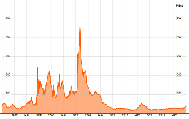
5 year chart of TED spread - note the small bump in 2010 - that's Greece Mk1
And for greater context, a 10 year plus chart. Note how the 2000-2003 global recession correlated with a TED spread that spiked regularly over 100 basis points (or 1%).
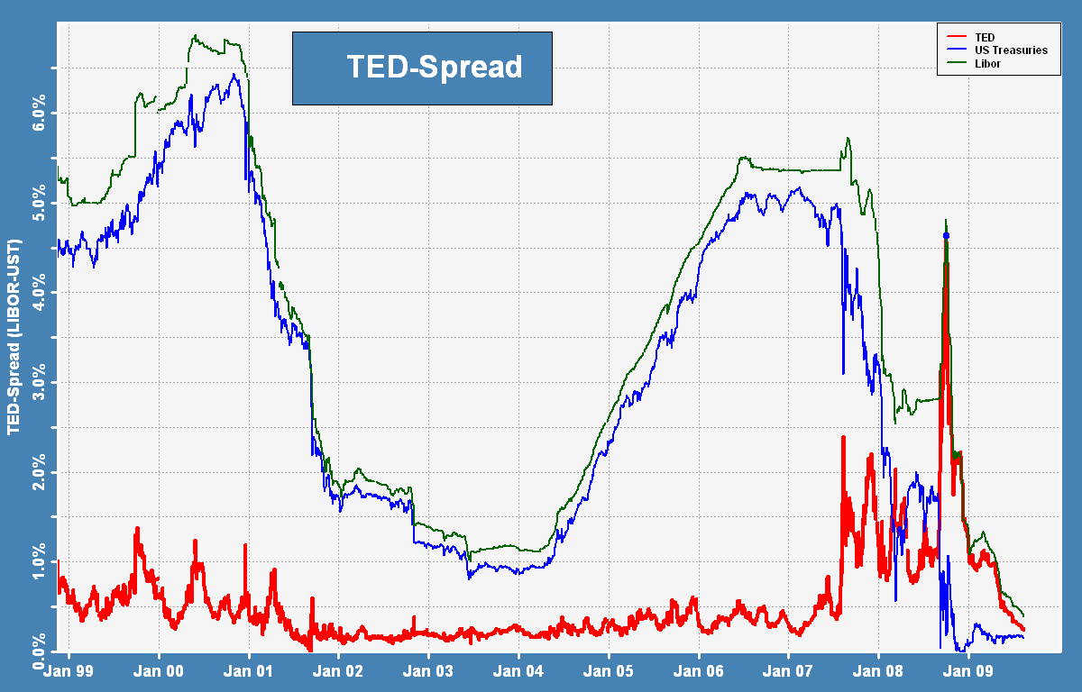
10 year chart of TED spread - click to enlarge full size
I’d recommend savvy investors add the TED spread to the CBOE Vix as possible early warning tools for your portfolio.