
The RBA has released its monthly Chart Pack and like last month’s release, I’m going to have a look at this impressive data set for MacroBusiness readers. A warning, its chart heavy (obviously).
The Chart Pack is divided into 16 categories, including international data, but this month I want to concentrate on domestic data, but first a look at the saviours of the Aussie economy.
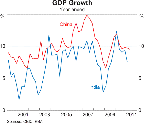
China (in red) is now below the 10% annualised growth figure (which implies a doubling of the economy every 7 years), with the momentum of growth (i.e the rising annualised growth) of the last decade reversing. India is decelerating faster, alhough still impressive at approx. 7%.
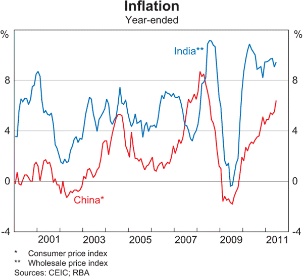
The FutureBoom proponents point to China and India’s exciting growth, but inflation is a major concern. The situation in China is heading back to pre-GFC levels, whilst the Indian authorities are struggling with enormous volalitity. The question to answer is: has the lasting effect of the stupendous credit bubbles in both countries (and here) that postponed the GFC tapered out yet?
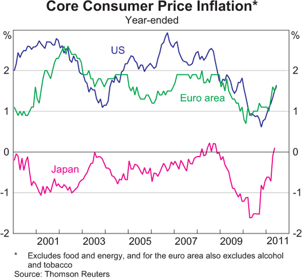
Whilst in “advanced” economies, Core CPI also seems to be accelerating, with Japan having positive inflation since 2008 and the US and Euro area also spiking. Credit growth is obviously not a problem there, so where are the price pressures coming from?
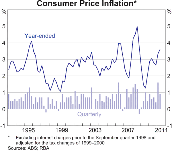
The volatility of Australian CPI is clearly evident (wider ranges, higher highs, lower lows) and has averaged well above the target band of 2-3% although is nowhere near the highs of the last “boom”. Still a concern? Perhaps not – read on.
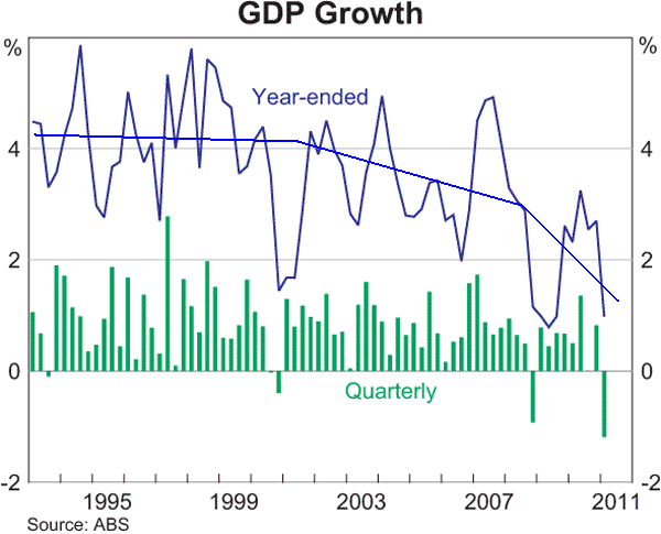
The overall GDP growth profile of the Australian economy is slowing down, moving from a secular bull to a sideways/stagnation.
Let’s move on to: Households
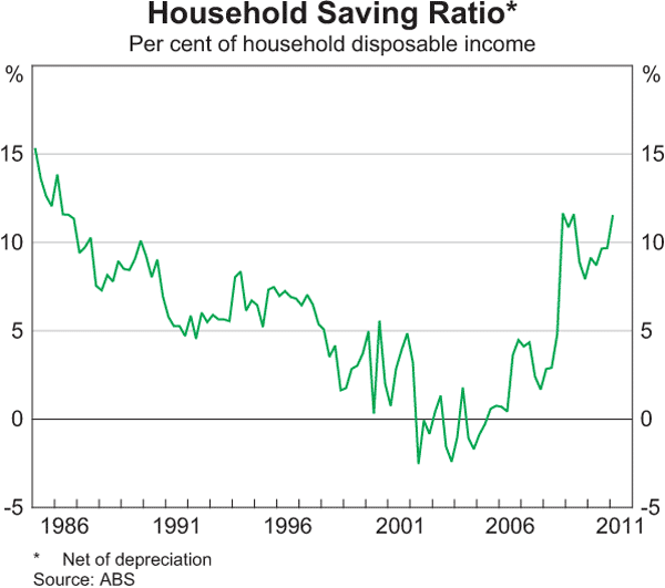
Back above 10% again – but remember most of this “saving” is paying off debt. The structural change from the profligate spending of the 1990’s and 2000’s (encouraged by poor Federal government economics) has reversed.
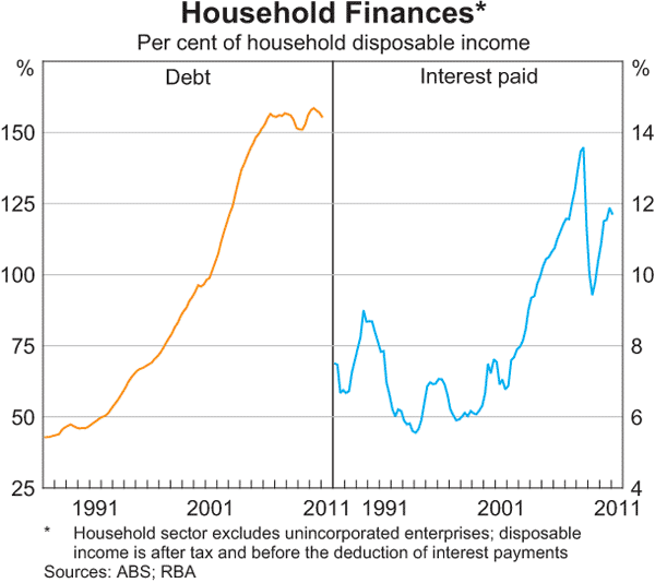 Household debt looks like it has peaked, as the law of diminishing marginal returns take affect across the broader economy. Note that interest payable is rapidly approaching GFC highs at 12% of income.
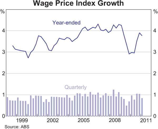
Lets put the “wage-spiral” in context and shoot down the bullhawks. Wage growth is just below 4% and should be encouraged, not discouraged. The best way to reduce household debt and repair balance sheets is to increase wages to pay off the debt and leave a buffer of savings. The profligate consumer is not coming back.
Let’s move to Business:
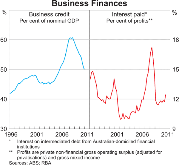
First, what sort of shape are our nation’s businesses in? The outright develeraging (left hand side) is clearly evident, whilst interest as a proportion of profits continues to rise.
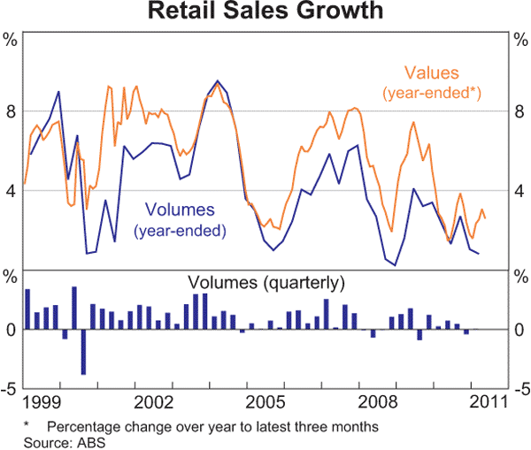
Retail sales are weakening, and out of cycle too (note bottoms in 2000, 2005 and 2008).
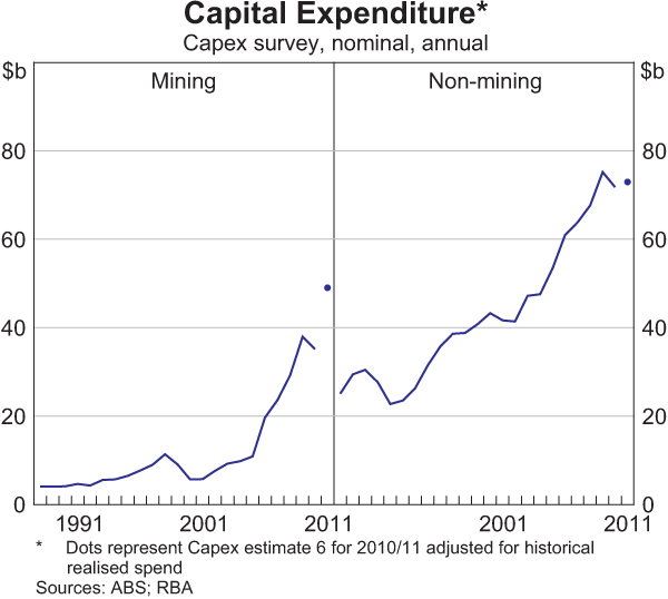
Capital expenditure has stalled, even though carbon price has passed. Mining is taking a small dip, possibly on the back of restructure and repair costs from the floods earlier this year.
Finally, the real driver of our economy: Credit
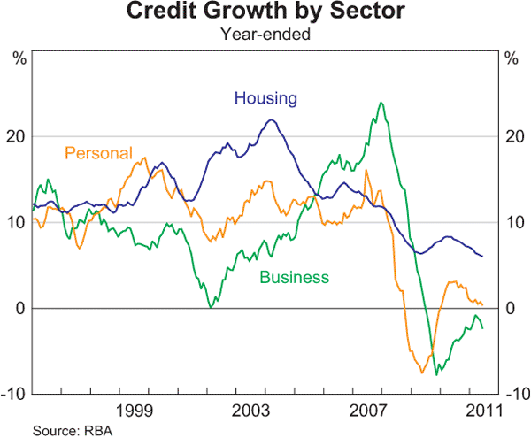
This graph should be pegged up on the side of the bullhawk eyrie. Housing growth is clearly decelerating, whilst business credit has turned negative again and personal credit is not far behind.
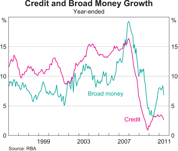
Credit growth looks extremely limp here – barely above 3% annualised. Broad money growth – perhaps the real indicator of inflationary pressure – has also turned a corner and is slumping fast.
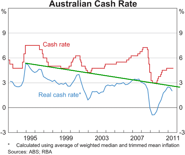
Finally, my “favourite” graph. The much ballyhooed RBA cash rate needs to be adjusted for inflation – the actual cost of borrowing. Forgive my straight line analysis, but the trend is very clear – the real cash rate is in a structural downward trend. The RBA has cyclically raised rates and at each subsequent peak in those cycles, the maximum real rate is lower than before.
When the political-housing complex froths at the mouth at the spectre of an 0.25% increase and the nominal rate is far from onerous, you know something is wrong.