
Today’s chart comes from a commentary on Charles Hugh Smith’s blog, Of Two Minds, which compares the GFC market activity of the Dow Jones Industrial Average (DJIA) overlaid with the “Rich Man’s Panic of 1907”.
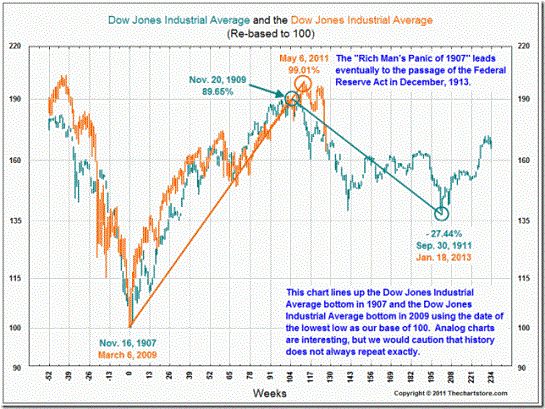
A curious graph – and originally from The Chart Store – which carefully notes one needs to be careful in comparing analog charts from a century ago.
The thrust of the matter is that the impetus behind monetary stimulus may not necessarily be about creating a wealth effect for the majority, but those whose capital wealth is mainly in risk markets. The average Australian does have a lot of “wealth” (read: super) tied up in the stock market (probably too much), but in the USA, the concentration of wealth is even more pronounced.
Advertisement