
The mainstream media (MSM) have repeated verbatim their headlines of drastic downturns in stockmarkets, but what’s really going on around the world? In this post I want to illustrate the anatomy behind worldwide market ructions, placing them in context to the 2007/08 crash using some macro charts, and how its not just stock markets “suffering”.
First, the CBOE VIX, or volatility index.
The VIX is a “key measure of market expectations of near-term volatility using S&P500 stock index option prices.” Effectively, it measures the cost of protecting a portfolio to manage risk. The usual pattern of benign, calm periods in the markets create lower prices to manage this risk, but then “suddenly” things go pear shaped option prices rise, hence a higher VIX.
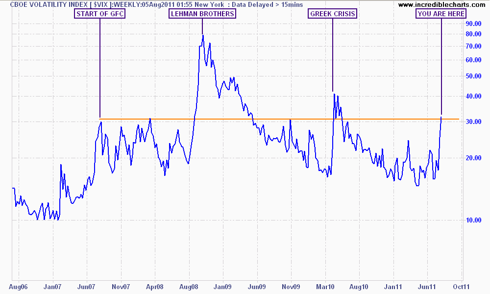
This 5 year weekly chart of the VIX shows the huge spike this week has eclipsed the volatility from the Japanese earthquake and is on par with the 2010 Greek crisis. However, it now exceeds the range experienced throughout 2007 before the collapse of Lehman Brothers. This chart highlights the strong vibrations being felt across world markets.
Next, the very important CRB Index.
The CRB Index is a basket of 19 commodities, quoted across differing exchanges, and largely captures the major energies, metals and soft commodities traded around the world. Following the end of the first QE program, the combined fiscal stimulus around the world and the Greek crisis in May 2010, the CRB fell from 280 to 240 points.
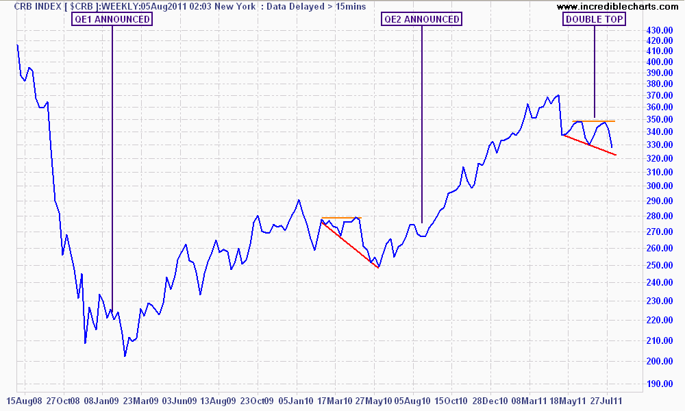
The index then rose to over 370 during the QE2 program (a 50% rise), but has subsequently corrected, forming a double top and a similar chart pattern to that in May last year.
This provides a crucial set up for a battle between the commodity bulls and bears – will a QE3 re-ignite the CRB Index, thus proving the thesis that and large corrections should be viewed solely as buying periods? Or should investors, and those exposed to purely commodity plays (e.g AUD, ASX200, Brazil etc) step aside as the CRB Index continues to correct, fixing an out of kilter supply/demand balance as it did in 2008?
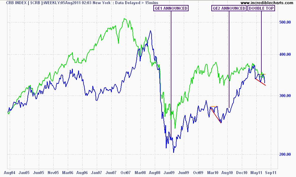
For comparison purposes, note how the ASX200 (marked in green) is somewhat correlated to the CRB Index, although has a tendency to get ahead of itself.
A crucial commodity to look at and mentioned by Houses and Holes earlier today, is WTI Crude.
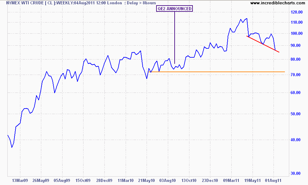
Oil literally drives the world’s economy, and a lower price reduces the impact of consumer inflation. It also provides a barometer of economic growth as more oil demanded should equal a growing economy. However, it is also a prism with which to view the meta-money that accelerates through a largely unregulated system.
After stabilising in a range of $60 to $80 USD a barrel throughout most of 2009 and early 2010, crude took off again during the QE2 culminating in a high above $110 in May this year. The black gold has now corrected ever since and fell almost 6% overnight.
The target in this correction continuing is the pre-QE2 price of ca. $70 USD per barrel. This volatility is good for econonomies, fundamentally, but is interpreted as a clear warning sign for markets that risk is not on.
Now we come to the Dow Global Index, which tracks global equity markets.
Regular readers would note that I posted on the Dow Global (DJWO) recently, as it had formed a classic “head and shoulders” pattern, which signifies a downtrend. This pattern failed and markets took off again (except Australia), but the DJWO has now collapsed and is back to November 2010 lows.
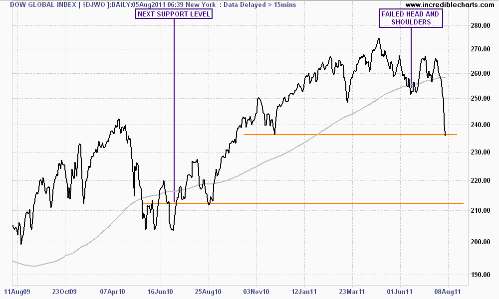
The next support level for the DJWO is approx. 212 points, or approx. 10% from the current (845pm AEST) level. This is a very achievable target, which is likely to have a rebound rally in between.
In terms of currencies, its important to discuss the US Dollar Index (DXY).
The DXY is another basket construction and is a barometer of “hot” money moving out of USD and into other “risk” assets, e.g. stocks and commodities. Note how during large risk-booms – marked as the red arrows and trends – the dollar is sold off.
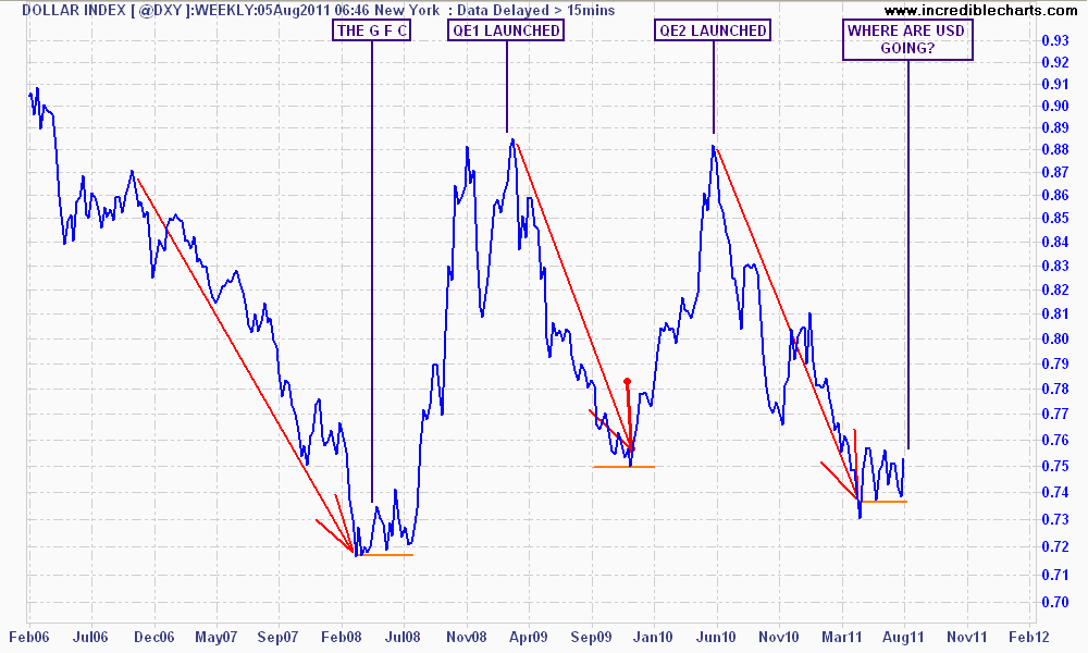
But when risk goes home to Momma, USD is also brought home as the “worthless” currency is suddenly wanted by all, usually rising to around 88 on the DXY, thus reducing the value of its constituents (namely the EUR and AUD). Will history repeat here until QE3 is announced?
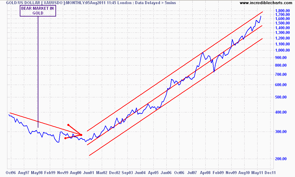
To a lesser extent, this is now happening to gold, which appears to have similar characteristics, although this maybe because of an unrelenting bull market. The very long term monthly chart below shows how the current price is reaching the upper band of its trend channel and may correct in the weeks ahead, yet the overall trend is quite clear.
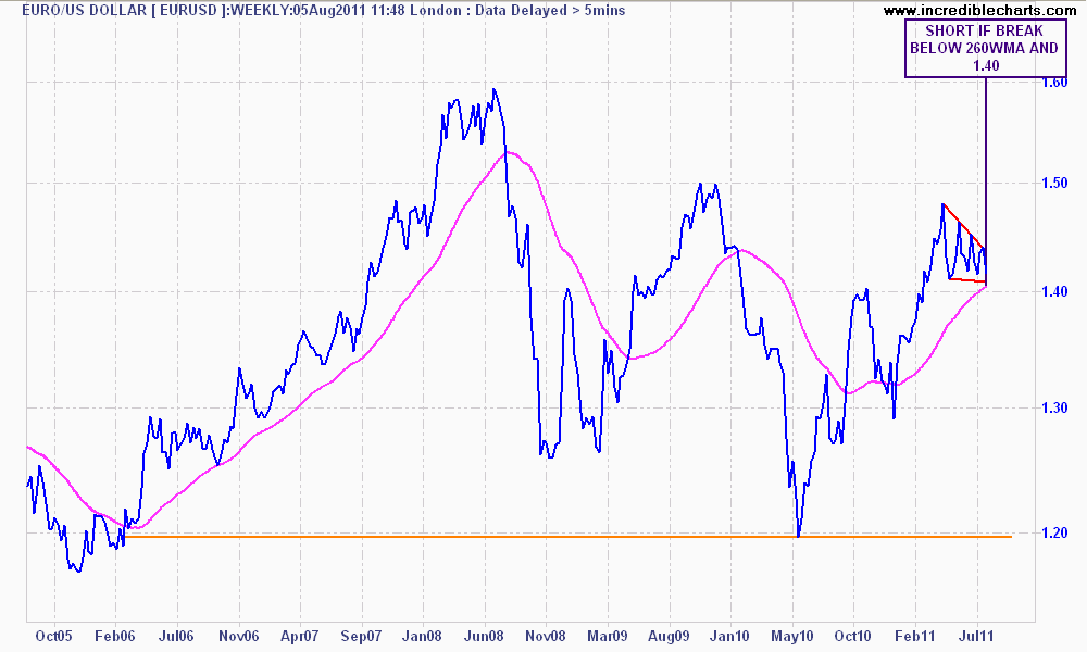
The Eurodollar FX cross is a strange beast – which would you prefer to own? You can see the similar ructions as money markets move to the USD, bidding EURO down. The triple top in EURO (August 2008, November 2009 and April 2011) is very bearish (that is, on each subsequent rally, the currency fails to make a new high – markets don’t believe in its worth). As you can see by my notes, it stands ready to fall against the USD and the target is 1.20
I hope these charts have given you a broader view of whats going on in currency, commodity and equity markets right now. There is much more to it of course, and there is the question of where will it all end, but we will have to wait and see.