Fellow econblogger, Cameron Murray, has written another fascinating post on his Blog about the best time to buy and sell real estate. Cameron’s post is re-produced below for your reading pleasure. As always, comments are welcome.
I came across the Commonwealth Bank – RP Data Home Buyers Index recently. It is designed to estimate the balance of supply and demand in a suburb to indicate whether it is currently a ‘buyers market’ or a ‘sellers market’. Their website explains:
The Commonwealth Bank – RP Data Home Buyers Index estimates effective supply levels based on the number of properties being advertised for sale within the region.
…On the demand side of the equation, Australia’s largest home loan lender, the Commonwealth Bank, provides a summary of the number of home loans that have been funded across Australia. Once we factor the Commonwealth Banks share of market into the equation, the number of home loans funded provides one of the timeliest estimates of housing demand in the market place.
This indicator may signal which direction prices are moving at any point in time, and is therefore a useful tool for market analysts. However, I was wondering if there is a rule of thumb that residential property investors could use to time their entry and exit from the market to maximise returns?
To answer that question I propose Murray’s Retrospective Indicator for Buying and Selling.
Fundamentally the returns from property are rents. Capital gains are a secondary return primarily resulting from changes in macro monetary conditions, with additional gains from changes to density and land use. So without any data at hand I would say a good rule of thumb is to buy yields and sell capital gains.
But creating a workable measure from that requires recognition of the economy wide conditions at the time, particularly regarding interest rates and the relative strength of yields in comparison.
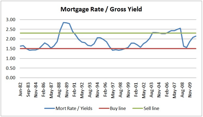
So my simple measure is the mortgage rate divided by the market gross yield. When this measure hits 1.5 it is time to buy. When it reaches 2.3, it is time to sell.
Let’s look at how you would have fared investing with this indicator since the 1980s.
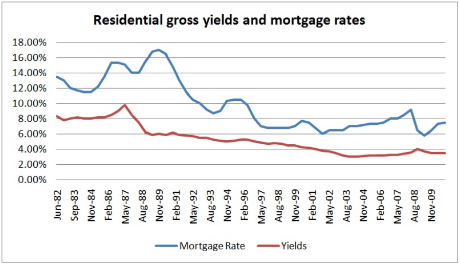
First, a graph of the mortgage rates and the market gross yields over time (from Chris Joye):

When I first saw this graph it was clear to me that the relationship between these two rates was a good indicator of the market. Put simply, when the lines are close together, yields are getting close to matching the mortgage rate. The further apart they are, the lower the yield compared to the price of money. This means that prices may have climbed beyond what is justifiable by yields, with capital gains only able to return again with a lower interest rate setting.
That translates to a ‘buy on yield’ signal when the lines are close, and a ‘sell on capital gains’ signal when the lines are further apart. So I plotted the ratio of these variables to show how the rule plays out.

As I said, the buy signal is when the mortgage rate is a lower proportion of yield (1.5x the yield) and the sell signal is when the mortgage rate is relatively high (2.3x the yield).
An investor following this rule would have had two holding periods – early 1983 to mid 1988, and late 1996 to mid 2003.
Over the whole period, the average capital gain was 7.3% according the ABS capital city established house price index (the index starts in 1986). We can compare these two periods’ returns to this average.
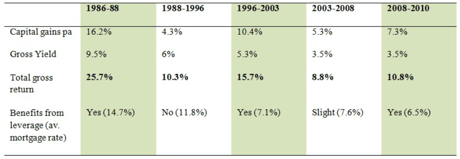
We will say that the first holding period is from mid 1986, since that is when the ABS price data is first available and where the buy line is hit for the second time, to a selling time in Sept 1988. The capital gain over this period was 16.2%pa, and the yield at purchase was 9.5%, giving a 25.7%pa gross yield over the period. Mortgage rates over this period averaged 14.7%, so leveraging would have greatly increased the return on equity.
The second period goes from Sept 1996 to Sept 2003. The capital gain over that holding period is 10.4%pa with a gross yield at purchase of 5.3%. This gives a 15.7%pa gross return over this period (again, much more with a little leverage with mortgage interest rates averaging 7.1%). Had you held off buying until the indicator left the buy signal in 1998, your capital gain over the 1998-2003 period would have been 13.1%.
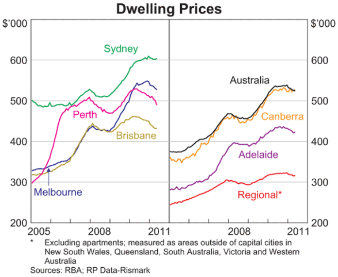
The rule might even work with the latest swing in the market. Late 2008 was by all accounts a good time to buy, and assuming the indicator hits the sell line during 2010, that would have been a great time to sell. In this period you would have made capital gains around 9%pa according to ABS figures, or 7% from Rismark figures, with yields at purchase around 4%, giving a 13% (or 11%) annual gross return (see dwelling price chart below).

Had you followed the opposite pattern, and bought on the sell indicator, and sold on the buy indicator, your returns would have been far from impressive.
In the period between 1988 and 1996 the capital gain was 4.3%pa with a purchase yield of 6%, giving a 10.3% gross return. The mortgage interest rate over the period was 11.8% on average, so gearing would have only reduced these returns.
In the period 2003 to 2008, the capital gain was 5.3%pa, and purchase yields at 3.5%, giving 8.8% gross returns. The mortgage interest rate over this period averaged 7.6%, so there were additional gains from leveraging.
The table below summarises the periods signalled by this indicator (with the green columns the buy and hold periods, with 2008-10 using the more conservative Rismark index for capital gains).

So it seem that this magic indicator would have maximised returns for property investors if we ignore the costs of buying and selling (which may offset much of the gains from short term holding periods, and lead to longer term holding periods generating better real life returns).
Ideally one should examine the effectiveness of the indicator at a city level, since the timing of property growth cycles in each city is slightly different, and the buy/sell signals will be slightly different. I would be happy for any data provider to use this indicator to do just that.
I have called it a retrospective indicator because it has only worked in the past three decades where government have been able to ratchet down interest rates in the face of crisis. Given that the scope for further serious cuts in mortgage interest rates is diminishing the closer we get to zero, and with more risk factored into lending rates, I wonder how much longer these trends can keep going.
My guess is that we are currently still sitting close to the sell signal. Yields appear to be firming as prices slide, perhaps edging the indicator down below the 2 mark. Assuming mortgage rates stay constant, and rents are flat, to get back to the buy indicator prices would need to fall by approximately 30%.
But if mortgage rates fall 2% following action by the RBA in the coming years (which would need more than a 2% drop in the cash rate), prices need only fall 6% in order for the indicator to reach the buy target (from Dec 2010 levels). So it is likely that reality will be somewhere in between.
So don’t buy yet.
*I have used the ABS capital city established house price index to estimate capital gains, except for the 2008-2010 period, where the capital gains are estimated from charts of the Rismark index (which is a better measure in my opinion). The yield data is obviously generated from another data series, so the numbers generated are indicative only at a national level. I expect the pattern to hold with consistent data use, and on a city level, although the buy/sell signals will be at slightly different ratios.

