
My day job as a trader is to evaluate charts as the visual representation in the change in prices, or as my investing partner call’s it, “tea leaf” reading.
Charting is just measurement of past prices, not a prediction of future results (I leave that to the economists) and I’ve seen many charts used by product providers, financial planners and spruikers alike that portend to say “x” by changing the parameters of the chart, which is really saying “?”
The classic one is the All Ordinaries since 1901 highlighted with all the “events” that the stock market brushes aside on its inexorable rise. Although this one by Fidelity reflects the etymology of their brand:
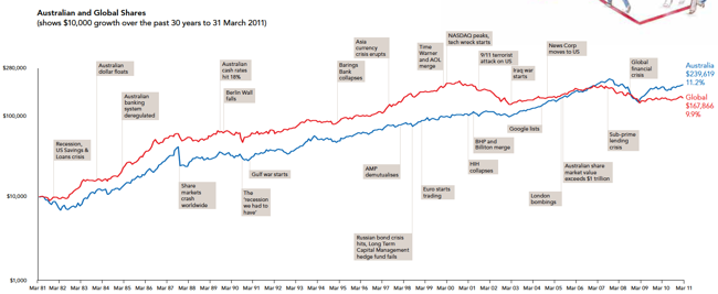
30 years of the All Ords - from Fidelity International
Here is an even better chart, constructed by Data Diary, that highlights the significant sideways periods experienced by markets.

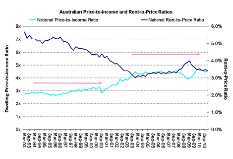
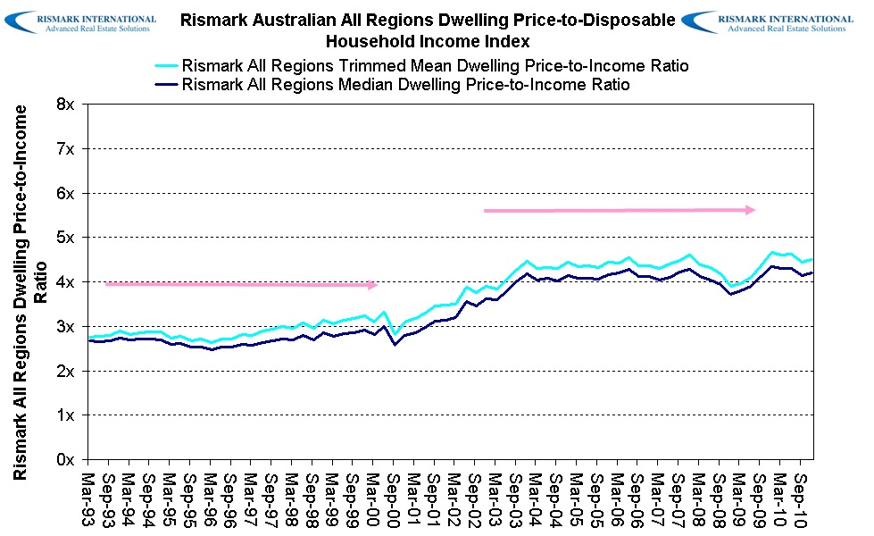
Now, there is a particular chart that has been used repeatedly by Rismark and highlighted in a recent article as justification of “popping a housing bubble fantasy”, by inferring that the dwelling price to income ratio is stable and a reflection of a “secular decline in interest rates”.
Here is the chart in question (I’ve used an earlier version because this one includes an overlaid second series of data)
There are 3 major problems here:
- The scale of the chart is linear, not semi-log, which means it is incorrectly displaying an exponential change in values (going from 2x to 3x is a 50% change in the ratio, whilst 3x to 4x is only a 33% change)
- Because the starting value is approx 3 times, the terminal Y-value of zero times is a nonsense (it should be 1 at a minimum to reflect the reality that you need some income to purchase a house)
- Combined, the use of two horizontal lines to imply a “stable” ratio implies the dataset is stable without growth, with only a structural change in the middle.
Linear and Semi-Log
A linear chart is usually used when the nominal change in underlying values does not have an exponential relationship, that is, both series are of a similar scale/size. A semi-log chart should be plotted when a large series of values (e.g a changing ratio) is plotted against a restricted series of values (e.g time).
In the chart above, the time series on the X-axis is restricted – its simply a quarterly change in time repeated. The Y-axis series however, oscillates between approx. 2.7 times and 4.5 times – or a near 100% change in an exponential ratio. This is obfuscated by using a terminal Y-value of zero, when common sense would dictate that you can’t buy a house with zero times your earnings. Further, the ratios below approx. 2x and above 5X have not occurred for the entire time series so why is the lower and upper boundary so wide as to compress the chart?
Therefore a nearly 100% change in the price-to-income ratio is displayed within only 25% of the vertical space.
A shiny example
Since the data above is restricted, I’ve found a similar time series and change in price in another market value to compare how data can be displayed.
Silver in USD per ounce from February 2004 to September 2007 nearly doubled – similarly to the price-to-income ratio in Rismark’s chart above.
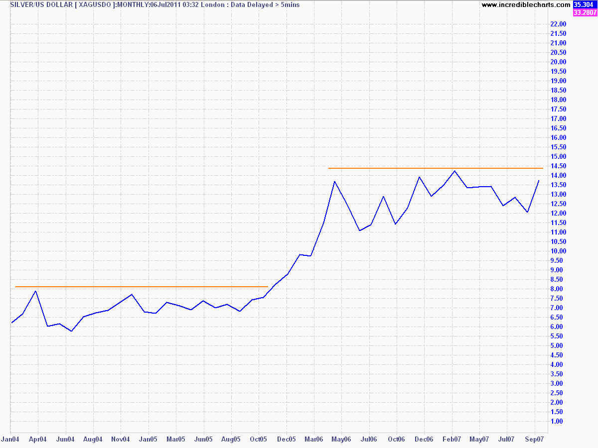
Silver in USD per ounce - linear scale - click to enlarge
Plotted using similar boundaries and on a linear scale implies nice stable prices, a small structural change in the middle and an observation that silver is not expensive at all, at $14 an ounce.
But what about in semi-log scale?
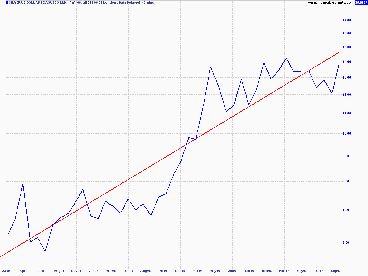
Silver in USD per ounce Jan 04 to Sep 07
A clear, exponential increase in value as silver moves from $6 an ounce to almost $14 an ounce. If silver was a currency or ratio used by a central authority to measure underlying conditions, what chart best provides an indication of stability with a structural change or a tearaway trend?
Summary
Using charts to provide observers with a visual impact of the change in underlying data is a double edged sword. On the one hand, it can provide a quick summation of an obvious trend, or a lack of trend thereof. On the other hand, it can be used to obfuscate the truth by confusing the observer, even though the data (a near doubling in income required to purchase a dwelling) is clear.