
This week its a trio from an extensive report compiled by the Australian Bureau of Statistics (ABS) – Australian Economic Indicators – link is here.
The publication contains statistics under the following headings: national accounts, international accounts, consumption and investment, production, prices, labour force and demography, incomes and labour costs, financial markets, state comparisons and international comparisons.
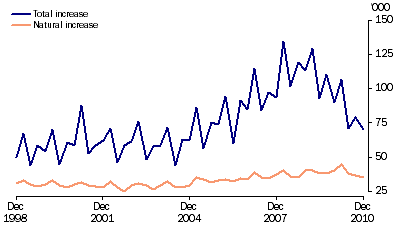
The first chart shows the nominal annual population growth since 1998, with natural increase (in orange) and total in blue. It’s quite obvious that the 2004-2007 period was an aberration and is now reverting to the mean, including natural increases (although the profligate welfare available for new parents continues unabated)
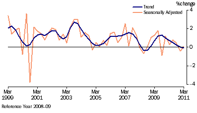
The second chart shows the change in retail trade, both in trend and seasonally adjusted. The once-off adjustment to the introduction of the GST can be seen in 2000, but the trend at the moment is quite flat indeed, confirming Cameron Murray’s recent study on per capita retail growth.
The final chart shows something that has been nagging me for ages – why is it with FutureBoom, an obvious housing bubble (that hasn’t popped, just “tapering”) and a high currency is GPD growth stagnating?
The trend is blindingly obvious – the quarterly change in GDP, over time is decelerating. As I’ve shown before, the yearly trend is down.
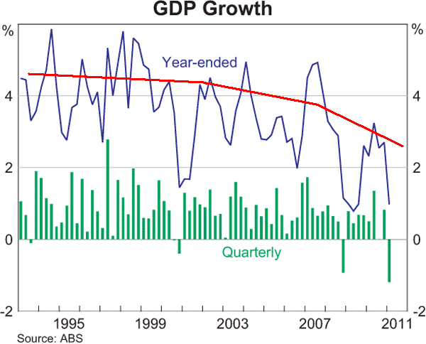
With credit growth moving slowly from disleveraging to outright deleveraging, the “Credit Impulse” theory appears to have legs.