
Following on from Bullion Baron’s chart of house prices in gold, here’s an interesting correlation (and yes, I know correlation is not necessarily causation) to ponder.
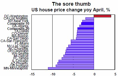
First, the change in house prices in major US cities (from the Case Shiller price index):
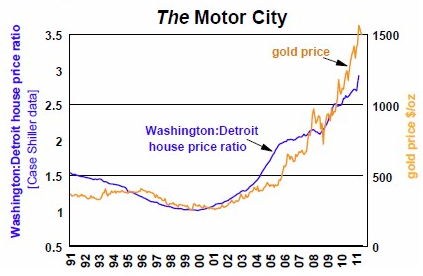
Then, the gold price plotted against the Washington DC:Detroit house price ratio:
I wonder if a similar representation can be done with Caboolture and Canberra?
Advertisement