
 Conceal me what I am, and be my aid
For such disguise as haply shall become
The form of my intent. Shakespeare
Summary
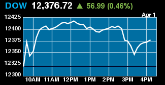
Stocks rallied hard last night on the US and European markets after – well, choose your reason and stick to it really. Jobs? Corporate profits? No new meltdown? Cow mutilations are up?
Locally, the S&P/ASX200 index closed the week 2.5 per cent higher to 4,861.8 points on Friday, continuing its strong V-shaped rebound rally. The resource sector in particularly has bounced back and is now at a new high, reflecting commodity prices.
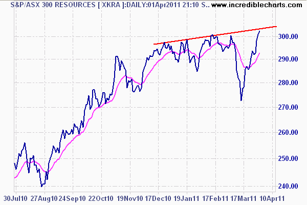
ASX300 Resources daily chart
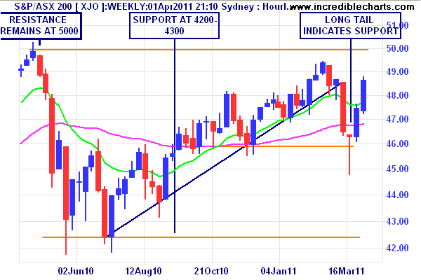
Monthly Analysis
The ASX200 is back on its monthly trend again after the Japanese/MENA correction. Long term price analysis clearly shows we are still in a bear market rally, with prices only coming up to January 2006 levels, unadjusted for inflation.
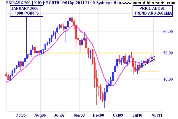
I keep banging on about it, but resistance at 5000 points is the key level. Psychologically this is very important, as the consensus crowd is anticipating strong growth in the resources and non-consumer industrials, even after admitting the Aussie consumer is spent and house prices are “tapering”.
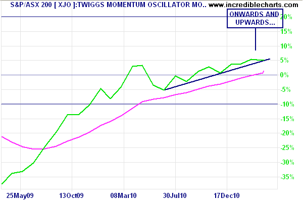
Momentum is trending up nicely reflecting the medium term trend. Other indicators support this move, but it is not a new bull market yet by any stretch. I want to see a clean weekly close above the 5000 level, plus a dip towards it confirmed by strong buying support thereafter.
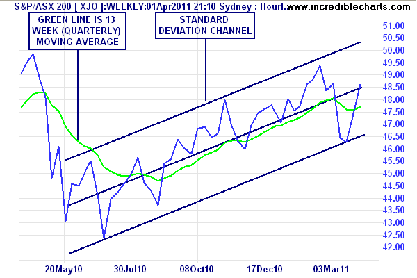
Weekly Analysis
Scaling down to the weekly charts and 1 year timeframe it is clearly evident that 4600 points is now a key support level for the broader market.
The bullish blue candle has taken up all of the loss due to last month’s correction, with price well above the quarterly (13 week or 63 day) moving average.
Using a standard deviation channel to illustrate the trend, we can see that the market remains on target to breaching 5000 points, and given Friday’s exuberance on Wall Street, could do so in the coming week, but is more likely to firmly breach (i.e rise across, dip and then bid up again) by Easter or May.
Daily Chart Analysis
Finally, to the daily charts. The V-shaped rebound is clearly evident on the short term chart, with strong support (long tails on the daily candles and long bodies on the up-days) in the 4600 points region.
The market has returned to its previous medium term trend, albeit too fast for my liking. Last week, I gave weight to the probability that the market would slow up in the first few days of the week, which it did, and I would not be surprised if a similar mid-week pause occurred again after a strong Monday open.
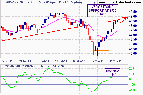
SPI Futures indicate a 4907 point opening on Monday, some 46 points or nearly 1% up on the Friday close. That’s a little too much and overbought indicators will probably reflect that coming into next week.
Overall Summary
The long term secular trend for the ASX200 (XJO) is still a bear market (defined as each successive year ending lower than the previous), but within there is a definite sideways bullish bias, with a major correction having rebounded back to this trend.
The XJO is likely to continue its rally in the week(s) ahead, although I expect a healthy dip to occur sometime soon (less than 3% total move). The 5000 resistance level is key – and many stocks show exuberance in breaking through this level – not just industrials, but the banks also (i.e the majority of the index).
Just like the artificial wealth effect that The Bernank has engineered in the US, Australian authorities and institutions want the share market to pick up the slack of the “soft” landing of the housing market. Larger superannuation balances for the Baby Boomer Power Bloc (I love capitalising) will offset some the property investors 12 months lack of capital gains, and for Darwin and Hobart unit owners, stock-market like volatility in quarterly prices. (down 10.2% and 19.8% respectively – for the quarter…..)
Before I finish – I’m experimenting with the size of the charts here – I’ve downsized them to fit across the page so you can see them better.
Incredible Charts
In case you haven’t noticed, I use Incredible Charts, by Colin Twiggs. They come in both free (delayed data with ads)) and premium versions. And no, I don’t get paid for plugging them either – the web address comes up when I make a chart! But it is an excellent program and even a free version is good for investors and other observers to compare the prices of commodities, currencies and world indices. I urge everyone to turn off the “finance” section on the nightly news, as this is just noise.
Also, Colin does a great trading diary (covering more markets than I do) published twice or more weekly – go here.
Disclosure: The Prince is a full time equities trader, running a personal account. I may have positions (long and short) in some or all of the securities mentioned above. This post is not advice or a recommendation to buy or sell. Do your own research and consult an adviser before allocating capital.