
Today’s strong uptrend in almost all risk markets is not that surprising. In trader’s parlance, this may just be a “dead cat’s bounce“.
Sorry for the awful terminology, but there it is. This broad correction offers both risks and opportunities for trader’s and investor’s alike. For the latter, it offers excellent buying opportunities in “Very Good” and “Wonderful” companies that are largely robust to the macroeconomic shenanigans that are going on this country (the ongoing disleveraging and possible debt deflation) and around the world.
For the former, it offers mainly day traders very high risk/return trades before the next set of bad news comes along.
In this post I’ll wear two hats and give a quick update on possible “Very Good” investments and a detailed look at historical DCB’s – dead cat bounces.
Investors – get that powder out!
At Empire Investing we regularly post a weekly signals list, generated by our internal software called “Valkyrie”. This matches detailed valuations of individual companies with their end of week closing price. Internally, we do this daily – because sometimes a stock will only “dip” into our preferred buy range during a 1-3 day period.
Due to the market correction, we’ve published the most recent daily signal list, reproduced below.
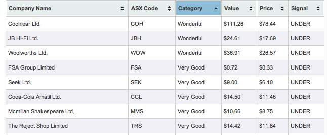
Click here for the full list.
A quick check of intra-day prices indicates other investors/bottom pickers have similar ideas. Which leads me to why short-term traders/investors need to be wary of the Dead Cat Bounce.
Historical Cats
I’m going to use 3 charts to illustrate my point that traders must be wary when going long immediately after a correction, and the concept of “scale” when looking at charts. It’s all well and good looking at the hourly or daily charts and observe a rally, but you need to scale back and look at the weekly charts to identify the real medium term trend, and then scale back and witness the monthly charts for the secular trend.
Here’s what I mean, using the so-called “Flash Crash” of May 2010:
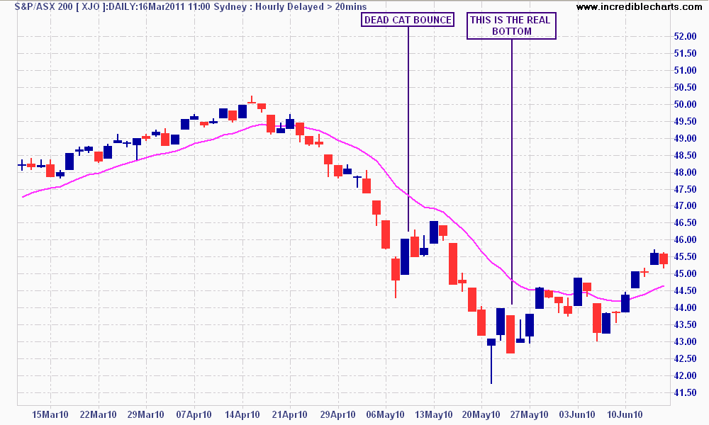
The Flash-Crash and DCB - look at the 15 day EMA
I like to use the 15 day moving average when analysing index trends (in this case the S&P/ASX200). Note how the DCB did not close above the moving average? The real bottom came in when very strong intra-day buying support (note the long tail) was succeeded by several sideways days that finally broke above the 15 day moving average.
Now look at the GFC Crash, using a weekly chart with 260 day moving average:
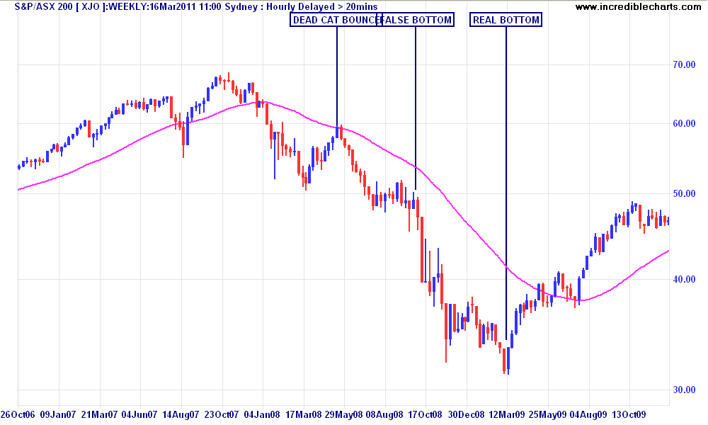
Weekly chart of the GFC Crash
A similar occurence: more optimism and bottom picking as the daily DCB turned into a semi-trend over a few weeks. But scaling the chart to weekly and using the 260 day moving average, one can see that any subsequent dip would turn behaviour to pessimism and continue the new bear market. The Lehman Brothers collapse was the final nail in that coffin.
And again, but using monthly charts with a 90 week Commodity Channel Index:
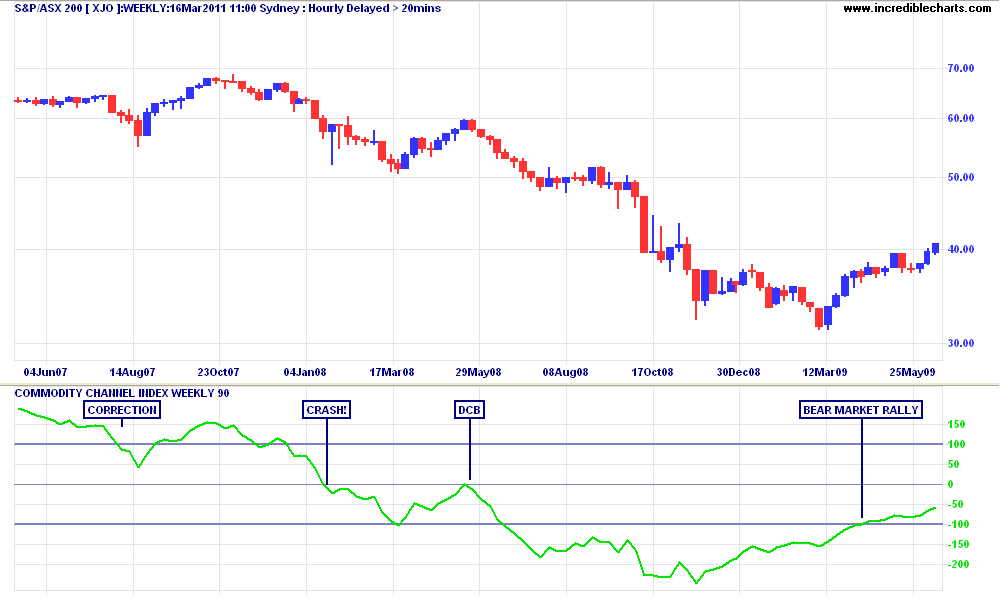
Monthly chart with 90 week CCI
Revisiting my last post on “corrections, dips and crashes“, I like to use the monthly chart to ascertain the secular trend, combined with a 90 week commodity channel index indicator. The DCB – although several weeks long – did not break the “zero line” and become a bear market rally (which may then turn into a new bull market or at least a sideways bullish phase).
Conclusion
Traders need to be wary in times like these (as I well know), and no matter what timeframe you trade or invest in, consider the longer term picture and do not be taken in by what looks like a new rally or uptrend. It may just be a cat peeing on your leg…