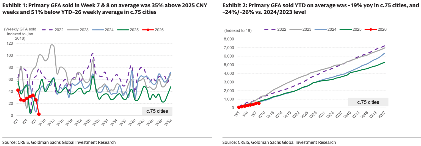
The charts look absolutely horrible, but when Goldman does a seaonal comparions it’s not as bad.
It compared the daily average volume during the 2026 CNY holidays (Feb15th-23rd) vs. 2025 holiday period (Jan 28th-Feb 4th): against an undemanding base, sampled primary markets recorded improvements with daily average volume rising +39%, while secondary markets registered more upbeat increase of 74% from prior year.
I’m trying to find the charts! I guess YTD is probably the best indicator and it is trending down markedly.
Advertisement