By Stephen Wu, Economist at CBA:
Key Points:
- Rising labour supply has met strong labour demand post-pandemic.
- Participation and employment has risen strongly for females and for younger workers.
- But the labour market has weakened since late last year and these more marginal cohorts are at a higher risk.
- We construct a composite labour market indicator, which supports the view that there is more spare capacity than the unemployment rate suggests.
Overview
There has been a very strong recovery in the labour market after the initial shock of the pandemic. This has been well-documented across the advanced economies, but arguably Australia has seen one of the most impressive labour market responses, with the employment-to-population ratio substantially higher than prior to the pandemic (chart 1).
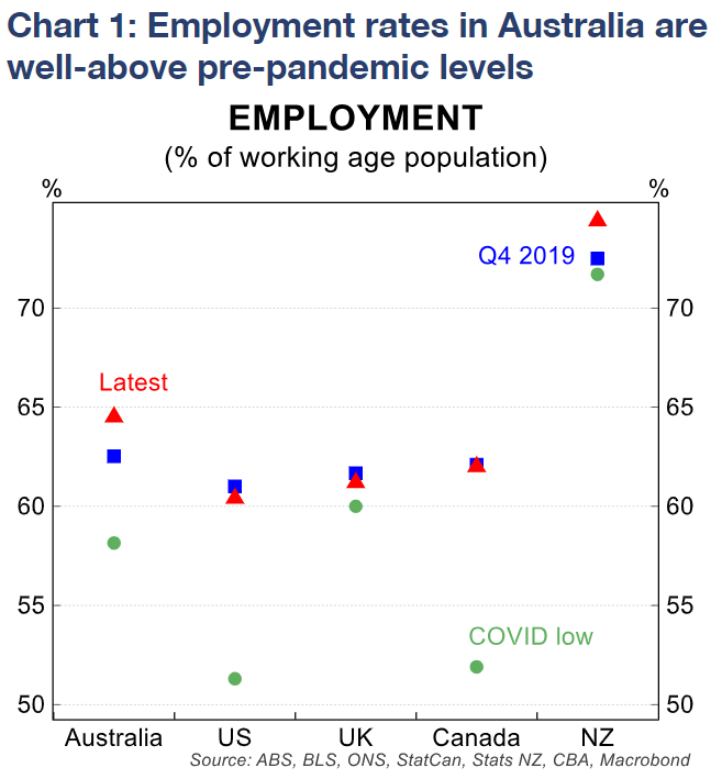
A huge part of the Australian labour market story has been the rise in the participation rate. Together with a rapid rebound in net overseas migration and an increase in average hours worked, labour supply has met the strong increase in labour demand that has occurred.
In Australia’s case, that has also contributed to wages growth not being as strong as otherwise would be expected, or when compared to peer countries.
In this note we first drill into the cohorts and demographics that have benefited most from the tight labour market.
We find, consistent with prior research, females and younger workers have seen the largest rises in participation and employment. These cohorts are more marginally attached to the labour force, and the tight labour market has encouraged higher participation.
Next, we take a broad look at a suite of labour market indicators. We find that the unemployment rate, which has tracked sideways for a year now, is likely overstating the tightness in the labour market.
Other labour market indicators have been showing a deterioration since around late last year, and suggest more spare capacity is available than before, albeit it is still limited.
For instance, the underemployment rate is rising, job ads are declining, and various survey measures of labour market conditions are softening.
To better quantify the extent of spare capacity in the labour market, we construct a composite labour market indicator. This indicator extracts the common signal from a range of labour market indicators we monitor.
Our labour market indicator shows the labour market is past its peak tightness in this economic cycle. It shows the labour market has weakened since its peak tightness in October last year.
Labour hoarding may mean the unemployment rate may take longer to increase, and may not increase by as much as previously expected or in past economic cycles.
The gains over the pandemic
The labour market by all the conventional metrics is very tight in Australia. The unemployment rate, at 3.5% in June, is near 50-year lows.
The employment-to-population ratio is at record levels, meaning more people are in jobs than ever before.
The strong labour market has increased people’s willingness to enter the workforce. This ‘encouraged worker effect’ is well documented.
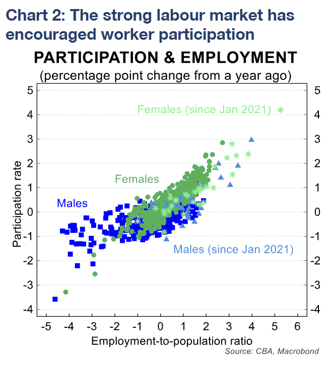
There is a clear positive relationship between employment outcomes and the participation rate. Typically, the encouraged worker effect is stronger for females.
As chart 2 shows, a tighter labour market (as evidenced by a rising employment-to-population ratio) is associated with a higher increase in participation rates for females than for males.
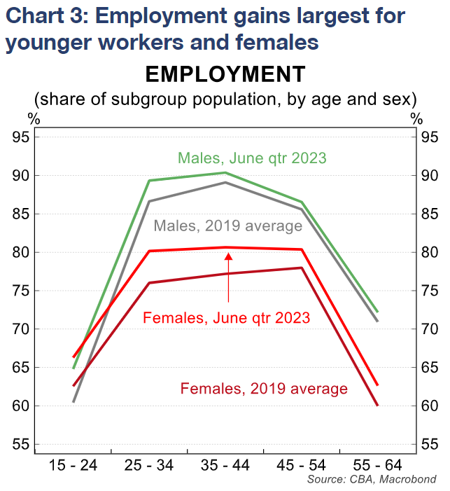
Once the initial shock of the pandemic passed, there was very strong labour demand and labour market outcomes. There have been large gains in employment, particularly for younger workers and females (chart 3).
Largely in response, the participation rate lifted to record high levels. The increase in labour force participation (i.e. the strength of the encouraged worker effect) was arguably stronger than historical relationships would suggest –particularly for males.
The improvement for males stems primarily from the younger cohort in the 15-24 age bracket, where participation rates had declined by 5-6 percentage points since the GFC and had not meaningfully recovered until the pandemic.
For females, the lift in the participation rate was more broadly based, and increased noticeably for all age brackets. The largest increase in the participation rate occurred for females in the 25-34 age bracket (chart 4).
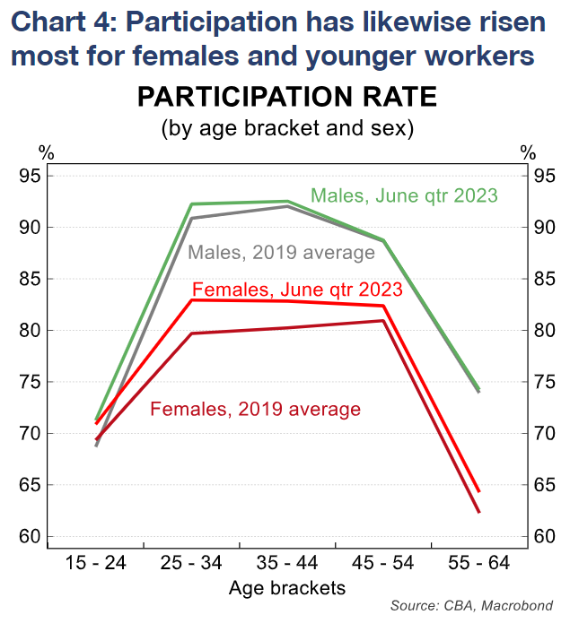
However, there was still a large increase for the younger 15-24 year old bracket. RBA research from 2018 identified that ‘younger workers, 25-54-year-old females and older males are most responsive’ to changing economic conditions. The most recent post-pandemic boom in the labour market looks to have broadly fit with the research.
The exception has been for older males, where labour force participation have been little changed from its pre-pandemic rates.
The lift in participation and the employment gains for younger workers and for females have helped absorb the strength in labour demand.
There have also been record gains in employment for the long-term unemployed. This has helped temper the impact of cost-of-living pressures for these workers.
Importantly too, employment opportunities for these workers can reduce overall structural unemployment, thereby also reducing the NAIRU.
The labour supply response has also contributed to lower-than-otherwise wages outcomes, as evidenced by Tuesday’s softer-than-expected June quarter WPI data.
Looking past the unemployment rate shows conditions are weakening
The unemployment rate is only one of many measures of labour scarcity.
While the unemployment rate has been little changed over the past year, that has not been the case for the underemployment rate (workers looking for and/or available to start work with more hours).
The underemployment rate has increased by around 0.6 percentage points since its trough late last year. In other words, more workers are wanting and available to work additional hours.
That has come despite hours worked having increased by more than employment (chart 5 shows average hours worked per employee has increased, most notably for part-time workers).
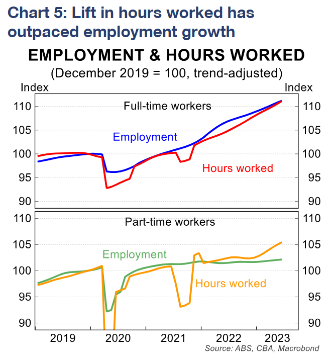
Because actual average hours worked is also rising, it suggests that it is a lift in preferred hours rather than an involuntary loss of hours of work that is driving the increase in underemployment.
Broader measures of underemployment show there have been larger increases for younger workers, part-time workers, and full-time female workers (chart 6 shows the breakdown by work status, age group and sex).
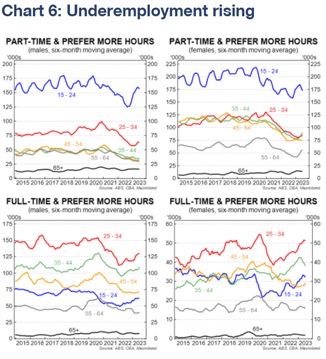
These cohorts represent additional labour supply. The rise in underemployment (and labour force participation) in these cohorts could be reflecting the cost of living pressures many Australian households are facing, with high inflation and rising rent and mortgage repayments.
Rising underemployment means more available labour supply to alleviate the labour shortages still constraining businesses (chart 7).
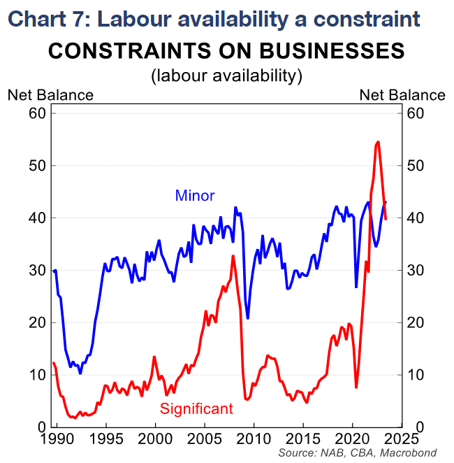
Although this constraint has eased over recent quarters, it remains much higher than before the pandemic, and is still very elevated relative to its history.
Further adding to the potential labour supply is recent government policy to increase and expand the Child Care Subsidy. Cheaper childcare arrangements increase labour force participation for primary carers.
What do the other labour market indicators show?
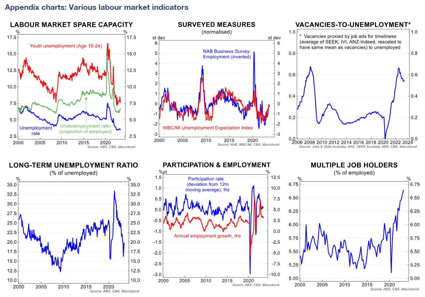
Besides measures of unemployment and underemployment, there are a suite of other labour market indicators that are closely monitored.
Job advertisements and job vacancies provide insight into how labour demand is evolving. These measures have declined over recent months and quarters, albeit they do remain elevated.
Survey measures also provide further insights. The NAB business survey’s employment index and WBC/MI’s unemployment expectations index are two long-running survey measures that are closely related and provide good signal on labour market slack.
Some measures look at other sources of available labour supply. These include the long-term unemployment ratio, which has declined sharply (as mentioned above), and the share of multiple job-holders, which has increased rapidly.
In aggregate these are showing a strong response of labour supply to the increase in labour demand has occurred.
And as labour demand has eased recently, labour supply has continued to remain elevated.
The appendix charts on page 4 provides details of these various measures.
A composite indicator of labour market conditions
To capture the key signal from the various measures of the labour market, we construct a composite labour market indicator using principal components analysis.
This follows a similar methodology to a 2018 paper by the RBA and 2016 Treasury working paper.
This technique allows us to summarise a whole range of labour market indicators into one single index.
Our constructed labour market indicator, as shown in chart 8, has closely tracked the unemployment rate since 2006.
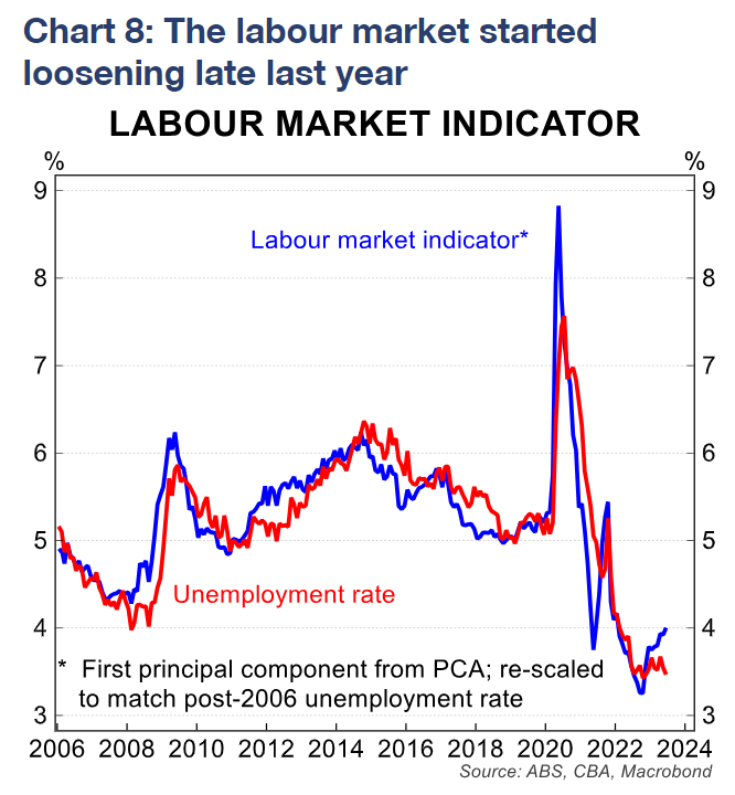
Put differently, the unemployment rate has generally been a good summary indicator of overall labour market conditions.
Recently, however, the indicator suggests that although the labour market remains tighter than pre-pandemic, there is now more labour market slack.
Our analysis suggests that the labour market has been loosening since it reached peak tightness in October last year.
That corroborates with the many other labour market series that are showing signs of weakening, as mentioned above.
It also closely mirrors the ‘cyclical’ unemployment rate – those unemployed for between 4-52 weeks – which also bottomed out in October last year and has been rising since.
The RBA has pointed to this measure of labour market spare capacity as having a close relationship with wages growth.
We forecast a faster increase in the unemployment rate than the RBA expects. We expect the unemployment rate to be 4.2% by year-end and 4.6% by June 2024.
The RBA in contrast forecast unemployment to be 3.9% by year-end and 4.2% by end 2024.
Our forecast that unemployment will be above 4% by the end of this year informs our view that rate cuts will be needed in 2024.
However, should the unemployment rate rise more slowly than we currently expect that would add to the risk that the easing cycle can begin later than we envisage. That could happen if more of the adjustment in the labour market occurs through a reduction in average hours worked rather than in headcount.
The very tight labour market, and the difficulties businesses have had over the past few years in sourcing labour, could mean that they are more reluctant to let go of workerseven as growth slows.
This increasingly lagged and more muted response of unemployment to downturns has been a feature of the Australian labour force (chart 9).
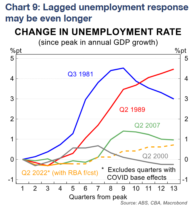
This labour hoarding as well as the RBA’s reaction function to labour market indicators enhances the risk to our view of rate cuts from Q1 24.
A sole focus on the unemployment rate could obstruct evidence of a loosening in labour market conditions.