Via Freelanceer CEO, Matt Barrie:
The “Doherty Report” is being sold as an economic & health model “created by experts” to move Australia from suppression to opening up and “living with Covid”.
On the 19th of August, Premier Gladys Berejiklian said in the NSW daily update “as the Doherty Report says once you get to 80% double doses and you have to open up”. (9 mins 40 seconds).
On the 23rd of August Prime Minister Morrison said in Parliament “The plan as we set out very clearly about…that when we reach 70%, and we reach 80%, we can move through to phase B of that plan, those marks have been set by the Doherty analysis that was undertaken Mr Speaker”.
I spent a late evening reading it.
Neither of these statements are true and the report is being misrepresented.
The report is neither an economic model nor does it set any targets.
It is a report commissioned by the National Cabinet to model health scenarios going from Phase A (where we are now- suppressing Covid) to Phase B (reducing lockdowns, ramping up flights into the country and reducing quarantine) of the National Plan with various levels of vaccination targets. Note that there is also Phase C and Phase D of opening up. The Doherty Report doesn’t look at these phases.
Specifically, based on a set of assumptions, it models what daily new infections, workplace absenteeism from sickness, occupied ward beds, occupied ICU beds and daily deaths would look like under scenarios of 50%, 60%, 70% and 80% vaccination rates, for those aged 16 and above and based on two doses of vaccination for each person. About 80% of the Australian population are aged 16 and over, so these targets are actually 40%, 48%, 56% and 64% of the total population.
It doesn’t look like anyone has actually read the report.
They only run the simulation for 180 days.

For example, looking at daily new infections, the new infections per day don’t even peak before the model cuts off at 180 days for the 80% vaccine coverage scenario:
So the model is producing garbage.
They’ve simply stopped the simulation before the effects of opening up play out.
There’s no reason I can think of to cut a model off at 180 days other than to fudge the data. Furthermore, respiratory viruses are seasonal and you’ll have different results whether the 180 days are in summer or winter.
It becomes even more ridiculous when you look at events that take time to play out (i.e. outcomes lag). For example, infections lead to occupied hospital beds, which some time later, may lead into need for an ICU bed, and some time later lead to a death.
The figures below model occupied hospital ward beds and expected daily deaths but neither model extends beyond 180 days. The simulation simply cuts the data off.
It was so bad that the Doherty modeling only provides graphs at 80% vaccination for daily new infections. For every other outcome, Doherty only shows the 50% and 70% scenarios (worker absenteeism due to sickness, ward bed occupancy, ICU occupancy & deaths) to avoid the embarrassment of showing the 80% graphs with very little actual data. It would be too obvious to even the casual observer that something was wrong with the model.
Even taking the model at face value, over half the data is cut off for the 70% and 80% scenarios.

This grossly misrepresents the higher vaccination scenarios (70% and 80%) as the totals count less than half the data! In fact, the way it has been modeled, the higher the vaccination scenario, the higher the misrepresentation with the 180 day cutoff.

Covid is not going to magically disappear in 180 days. The numbers across the board (cases, deaths etc.) will be significantly higher in all scenarios.
New infections rise to between 55,000 and~120,000 per day.
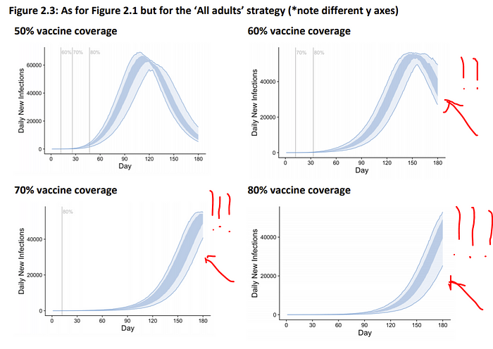
The report modeled three different vaccination strategies- vaccinating old people first, 40+ year olds first, and ‘all adults’ where vaccinations have no priority by age. The ‘all adults’ strategy was found to be the best. This strategy resulted in new infections rising to ~55,000 per day for the highest vaccination scenario of 80% (Figure 1).
Australia has been running an oldest first vaccination policy mixed with other priority groups. It is trying to go to all adults but it is still functionally closer to operating at oldest first than all adults until there is higher rates in younger groups so predictions fall somewhere between the two.
Of course, this may change over time, however the point is that under the current regime Australia is not currently implementing the best “All Adults” scenario. In the scenario of vaccinating “Oldest First”, daily new infections would rise up to about 120,000 per day (Figure 5).
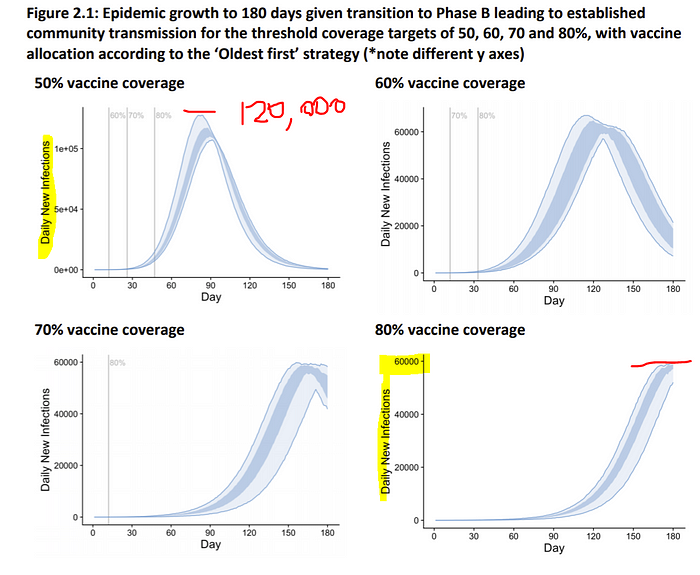
As of writing this, the most infections Australia has accrued in a day is about 900. In the best case scenario for the highest vaccination rate (80% of 16+), according to the Doherty Report, daily new infections would rise over 50x and the country would be facing over 400,000 new infections per week.

Doherty predicts “even for high coverage” “severe outcomes”.
Under a scenario where lockdowns cease once 70% of the relevant 16+ population is fully vaccinated, Doherty predicts occupied ICU beds required for Covid patients (solely) to go to about 1500 (again the data is clipped).

Looking at total ICU capacity, Doherty estimates there are 1,964 ICU beds nationally assuming 50% can be used for Covid, therefore they assume 3,928 beds in the country.

However according to the Common Operating Picture as of 23rd August, there are half that- 2,059 beds available nationally and 825 in NSW.
As of the same date, the Australian reported that “[NSW] has 844 staffed ICU beds available, and 608 of them were occupied on Monday.”
To “open up” under the Doherty modeling, even at 70%, Australia would have to double ICU capacity.
According to a recent study by the Medical Journal of Australia, “Australian ICUs could surge the number of ICU beds by an additional 4,261 (189%) if needed. At that level, however, there would be a shortage of ventilators and likely also PPE equipment. The study estimated that the surge potential of ventilators is just over 2,000, so would only partly meet the maximum surge capacity in terms of beds.
Another issue potentially restricting capacity would be the healthcare workforce needed to operate the ventilators. The modelling exercise showed that at maximum surge capacity, up to an additional 4,000 senior doctors and 42,700 registered ICU nurses could be required.”
Under the 70% scenario approximately 1,500 senior doctors and 15,000 registered ICU nurses would be required under the Doherty, in addition to paramedics, ventilators, other staff, patient transport & equipment.
Each ICU bed is manned by the equivalent of five full-time registered nurses across eight-hour shifts, 24 hours a day, seven days a week. Approximately half of these nurses need to hold a postgraduate qualification in critical care nursing.
Grattan Institute health economist Stephen Duckett has said “When we hit a trigger point of 12,000 new cases every day, then we know that we will hit ICU capacity shortly after if new cases continue to grow”.
Already 20% of Covid deaths in New South Wales this year have occurred due to outbreaks in public hospitals. At least 11 hospitals in NSW have had outbreaks or had to send patients and staff into isolation because of exposure, according to the 7:30 Report. Two hospitals- Westmead & Blacktown, as of today (25 Aug), have paused accepting patients, and the Sydney Local Health District sent out a memo this week saying they are running out of Personal Protective Equipment.
A senior healthcare professional who has actively been commenting throughout the crisis has told me “Given the crippling of our current health care system which was cracking before Covid with ambulance ramping, it will not be functional with higher numbers. Other states know this and I can not see any of them risking opening to NSW in the foreseeable future”.
Remember that Doherty modeling assumes new cases will reach at least 55,000 per day.
Of course, Doherty models that “ICU admissions [assume] unconstrained capacity, even when national thresholds are anticipated to be reached or exceeded”.
Even for a high vaccine uptake, Doherty predicts “severe outcomes” “which are likely to be concentrated [in] geographical areas”. “Unconstrained capacity” will underrepresent deaths from beds not being available for breakouts. Breakouts concentrated in within geographical areas will further create a mismatch between demands on healthcare and proximal supply.

Doherty modeling doesn’t take into account excess deaths from non-Covid patients that are unable to find an ICU bed when these beds become full.

The Doherty Report, ending at 180 days, also naturally does not consider Long Covid, where symptoms can sometimes persist for months after infection. It did not include indirect deaths as a result of morbidity from Long Covid. If only 5% of symptomatic cases develop Long Covid (a number from an extensive study in NSW), in the best case scenario modeled by Doherty of 80% vaccination (16 years and above) over 300,000 Australians could suffer from the effects of Long Covid where the virus can damage the lungs, heart and brain, increasing the risk of long-term health problems.
It does not consider the effects on children. There are an estimated 4.7 million children aged 0–14 lived in Australia, non of which are eligible for vaccination. According to the NIH, “Evidence from the first study of long covid in children suggests that more than half of children aged between 6 and 16 years old who contract the virus have at least one symptom lasting more than 120 days, with 42.6 per cent impaired by these symptoms during daily activities”.
“The study found that the mean duration of symptoms after initial infection was 8.2 months. 94.9% of the kids had at least 4 symptoms.. fatigue, headache, muscle & joint pain, rashes & heart palpitations, & mental health issues like lack of concentration & short memory problems.”
Doherty model is premised on mythical “test trace isolate & quarantine”.
Doherty “test trace isolate & quarantine” assumed in the modeling is based upon the performance of the Victorian public health response at the height of the ‘second wave’ in 2020.

These cases peaked at 700 per day. In the best case scenario in the Doherty modeling the cases peak at over 55,000 a day (up to 120,000 a day). The assumption that public testing, tracing, isolation & quarantine can perform at the levels Victoria performed at 700 cases a day is fantasy.

The herculean effort of the NSW contact tracing team (who should each be awarded Orders of Australia) failed above 200 cases per day. Above this number, cases have stopped being linked or are “under investigation” as can be seen below.

On the 21st of August, testing demand exceeded capacity in NSW LGAs of concern and 72 hour surveillance testing of workers was turned off.
Isolation and quarantine, similarly, have been challenging and will only get worse as new infections head above 50,000 per day in the Doherty modeling.
The government-managed hotel quarantine system, whose poor running is the root cause of all of Australia’s problems (the virus is not coming into the country by cargo or there would be postmen sick and wildfires everywhere), bringing in only a few thousand travelers per week has had one breach for every 67 infected.
It is reasonable to expect that breaches from self-managed isolation & quarantine managed at home with shared dwellings, shared ventilation, individual circumstances and reliance on people being capable and willing to do the right thing will have a higher failure rate.

The Doherty report also models “optimal TTIQ” as if the country had a magic wand with perfect testing, contact tracing, isolation and quarantine. These numbers should be completely discounted and appear only to be published to make the modeling look better than it is, as the results have no practical value.
Doherty modeling shows lockdowns occurring 80–273 days a year.
Even taking the assumptions and modeling used at face value, the Doherty Report says that at 50% vaccination rates we would need to go into lockdown harder than NSW is now (25 Aug) 273 days per year, 168 days per year at 60% and 80 days per year at 70%. Harder as in no household visitors, curfew and stay-at home orders.
The 60% and 70% numbers are not believable, let alone the 80% because the modeling ends at 180 days. In the case of 80%, over half the data is missing for every single outcome being modeled (new infections, workplace absentees, ward beds occupied, ICU beds, deaths).


The whole premise of the modeling is to show the path from Phase A (where we are now), to Phase B “lockdowns less likely but possible”. Under Doherty, under the most optimistic model, we would be in a hard lockdown 80 days a year in perpetuity. But remember, the 70% and 80% numbers are clipped because the simulation ends at 180 days, so I have doubt if that is anywhere close to realistic.
So much for vaccination being the “ticket to freedom”.

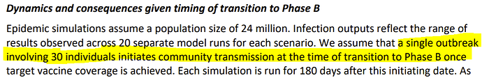
Doherty assumes total infections start at 30.
As of today, Australia has over 11,000 active infections.
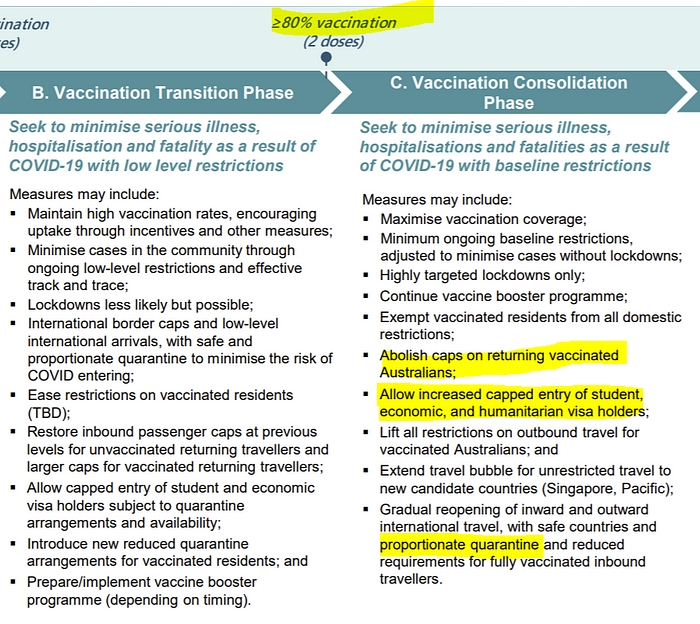
At 70%, Phase B of the National Plan assumes
- International border caps and low-level international arrivals, with safe and proportionate quarantine to minimise the risk of COVID entering;
- Restore inbound passenger caps at previous levels for unvaccinated returning travelers and larger caps for vaccinated returning travelers;
- Allow capped entry of student and economic visa holders subject to quarantine arrangements and availability;
- Introduce new reduced quarantine arrangements for vaccinated residents;
With one quarantine breach in every 67 infected travelers to date, immigration set to lift by many thousands per week and a lowering of quarantine standards under Phase B, the Doherty modeling assumptions are way off.
Phase C & D are not modelled by Doherty, but politicians are presenting it like they are. Experts who have predict 154,000 hospitalisations & 29,000 deaths.
There is still a Phase C and Phase D which Doherty does not model at all. At Phase C (80% of adults or 64% of the population), the travel caps come off in a big way and quarantine is even looser (“letting it rip”). At Phase D, everything it open. Naturally Phases C and D will lead to significant more morbidity & mortality which Doherty does not address.
Doherty assumes for Delta that R0 is 6.32 and Reff 3.6.
The basic reproduction number, R0, is defined as the number of cases that are expected to occur on average in a uniform population as a result of infection by a single individual, when the population is susceptible at the start of an epidemic, before widespread immunity starts to develop and before any attempt has been made at immunisation.
The CDC places r0 for delta between 5 and 9. Doherty models it at 6.32.
If the Doherty numbers were run at r0 = 7, 8 or 9, all the numbers would blow out as is a difference in transmissibility from x⁶ to x⁷, x⁸ or x⁹.


Reff, the effective reproduction number at a point of time, is the average number of people in a population that are being infected by each individual. Reff changes with individual immunity following infection or by vaccination, public health measures and as people die.
Doherty uses Reff = 3.6 based on “average observations in March 2021”.

Tomas Pueyo’s paper “Coronavirus: The Hammer and the Dance” provides an excellent overview of how the goal of pandemic response is to get Reff below 1. Below 1, the virus is not replicating and will diminish over time. Above 1 it continues to grow. As part of this, there is the concept of an R budget.

In the case of the Doherty modeling, here is the R budget. Note that the y scale is logarithmic which is confusing, so that unlike the R budget from “The Hammer and Dance”, the distance on the scale between 0.5 and 1 and the distance between 4 and 8 are the same.

Delta is so transmissible, the vast majority of the work to reduce the transmission potential has to come from public health safety measures, not through vaccination. If one were to replot this with a linear axis, it would look more like the following figure:

Because of the way Doherty has drawn the graph squishing the y axis, it is not immediately apparent, but despite almost all the focus on vaccination, from Doherty’s own modeling, the difference contributed by 50% vaccination to 80% vaccination bringing down the R budget below 1.0 from a start of 8.0 is about 0.7 units. The other 6.3 units come from public health measures.
Opening up prematurely at 70% would mean that we would perpetually be in a world of “low“ and “medium” public health safety measures i.e.

The elephant in the room: vaccine reduction of transmission.
The Doherty Report is being used to construct an argument that public health safety measures (restrictions on movement into the country, quarantine, lockdowns) can be dismantled because of vaccination.
At the heart of this, the Doherty Institute makes the assumption that vaccination vastly reduces transmission.
However not all vaccines are equal. Sterilising immunity is where the immune system stops the virus entering cells and replicating e.g. if you get chickenpox or a vaccine for the measles you are unlikely to catch either disease again.
As Professor Robert Clancy, Emeritus Professor of Pathology at the University of Newcastle Medical School, and member of the Australian Academy of Science’s COVID-19 Expert Database said in COVID-19: A realistic approach to community management:
“The objective of any Covid19 vaccine is to limit virus replication within the mucosal compartment of the airways. This requires specific activation of the mucosal immune system, which differs from systemic immunity, geared to protect the internal spaces of the body. Blood antibody levels characterise the systemic immune response. These antibodies are very effective at neutralising virus that passes through the blood stream in its normal course of infection, such as the measles or mumps virus. These vaccines readily induce sterilising immunity
The influenza and Covid19 viruses are different. They enter the blood stream only in late disease, when the inflammatory response to the virus has become the main cause of tissue damage, and when immune containment has become irrelevant [..] Mucosal immunological memory for corona viruses is predictably poor”
Furthermore:
- “Little protection against infection occurs, although protection against symptomatic disease is significant, but is likely to be far less than 90%.
- Re-infection in vaccinated subjects appears to occur at a similar rate as it does for community non-vaccinated controls.
- There is no realistic chance of herd immunity, given the high rate of asymptomatic infections in vaccinated individuals. This becomes more probable should the current intention of about 30% of the population (US figures) to not be vaccinated irrespective of advice given, be accurate.”
The Doherty Report, on the other hand, assumes 57% and 86% reduction in transmission for one and two doses respectively of AstraZeneca, and 62% and 92% for Pfizer. Thus Doherty is almost assuming sterilising immunity (~90% reduction in transmission) from two doses of either AstraZeneca or Pfizer.
These are very big reductions in transmission. One would think you would see the effect in the overall case numbers overseas in highly vaccinated countries. Certainly looking at US, UK and Israel, if there is a reduction in transmission it is overwhelmed by the increase in delta transmissibility.
Israel is one of the most vaccinated countries in the world with 60% of the population (or ~75% of 16+ year old adults to compare to Doherty) as of 25th August. While deaths are clearly reduced, the rate of growth of the third peak of cases, i.e. transmission, doesn’t look affected very much by vaccination. According to Doherty, that peak shouldn’t be growing anywhere near as fast, it assumes 60% of the population should be 90% less transmissible.

This goes to the very heart of the Doherty model. It makes an assumption of a massive (~90%) drop in transmissibility on double dose targets. The overall new daily infection numbers from highly vaccinated countries don’t appear to back up anywhere that level of damping.
Indeed in Israel, case rates have climbed almost as quickly among people with two doses as among the unvaccinated.


The numbers change between which “Doherty Report” you read.
I’ve based my numbers off the report I downloaded dated “12 August”. I noticed something when looking at an old tweet. Doherty has uploaded a new report and overwritten the older one without maintaining a link. Here’s an archive link:
Apparently this is explained by 70+ year being double counted.

Checking the numbers this appears to be correct but I remark out of curiosity that the difference in deaths is therefore more than double the difference in ICU admissions for 70+ year olds. I guess they are modeling a lot more 70+ year olds dying either at home or from being denied ICU than deaths from progressing through ICU.

Regardless I have worked off the newer, better numbers.
The “Addendum”.
That isn’t the only revision that has been made to the document. Prior to these latest revisions, one can already tell that Doherty was already told to go back and redo their work because at page 42 of the original report the analysis was done all over again as an “addendum”.
One senior health expert at another research institute, who has been modeling Covid, told me “advisers/consultants, even very reputable ones like the Doherty folk, can be asked to revise/redo”.
In that addendum, they were told to assume that the magic wand of “optimal trace track isolate & quarantine” had a magic wand:

Under this scenario, with 70% vaccination we get crazy error bars with somewhere between 30 and 300 new infections per day worst case, nobody ever occupies a ward bed, nobody ever goes to ICU and maybe one person dies in a given day every week or so.
If only.

Conclusion
The Doherty Report is a model of what happens after 180 days in the first step of opening up, nothing more.
The Doherty Report is not an economic model, not a plan written by health experts on how to open up the economy, nor does it derive a vaccination target for opening up.
It is a series of health models of daily new infections, workplace absentee rates, ward bed occupancy, ICU bed occupancy and deaths based on vaccination levels provided as inputs by the government, based on a set of unrealistic assumptions combined with aggressive modeling.
In the Doherty world, any trace of the pandemic disappears after 180 days, even though the numbers for daily new infections, workers absent due to sickness, ward bed occupancy, ICU bed occupancy and deaths are still climbing for the highest vaccination scenario of 80%.
The very heart of the Doherty modeling is that the pandemic is a single phase infection curve that goes to zero at some point in time due to an assumption that there is a 90% damping effect on transmissibility from a double dose of AstraZeneca or Pfizer.
If this was even remotely close, new daily infections in the US, UK and Israel would be well under control by now. They are not.
Israel- one of the most heavily vaccinated countries in the world at 60% double dose of the full population (equal to about 75% of people aged 16 years+ in the Doherty modeling) hit 51,000 new infections this week (22 August), the second highest since the pandemic begun. It is anticipated that within two weeks infections will be at an all time high.
Cases among those that are double-dose vaccinated in Israel are growing almost as fast as the unvaccinated, according to the Israeli Ministry of Health. Clearly the key assumption in the Doherty modeling- that double dose vaccination reduces transmissibility by ~90% is wrong.
Already the data is showing waning immunity and, similar to the flu shot, boosters will be needed regularly. People will be less enthusiastic to take the third, fourth or fifth shots. AstraZeneca has limited use for booster shots in the future because the immune system develops antibodies to the simian adenovirus vector used. The virus will also continue to mutate, which could lead to further antigen shift and vaccine escape.

The Doherty modeling appears to be nothing more than manufactured scientific opinion to achieve a political outcome by working the numbers backwards.
Abdication of leadership to reliance on a modelled scenario is simply a way to blame someone else if it all goes pear shaped, which the Doherty Institute appears all too happy to play along with, either because it is a captured entity or doesn’t see what is coming.
The country doesn’t have to open up based on any modelled scenario. It is simply a prediction of a range of things which might happen if we do.
Unfortunately for Australia, the arbitrary 70% and 80% 16 year+ vaccination targets, together with the 180 day modeling period appear to be more driven by the next federal election, which will be called before May 2022.
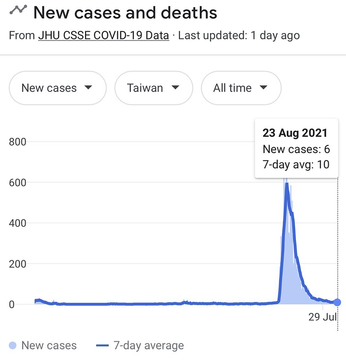
We should not be in this position. Australia has a natural advantage as an island nation in a pandemic which made us the envy of the world.
Taiwan, another island nation has crushed Delta. Today there are 6 new cases from a peak of 600:
Failure to adequately secure quarantine is the primary reason for where we are today. We ran quarantine in hotels that are not fit for purpose, with shared ventilation in the worst place possible- the dense CBD.
More than 18 months in, we have still not issued the correct personal protective equipment for all quarantine workers including drivers, medical and front line staff- police, army, public transport etc.
A paper recently published in The Lancet by researchers from institutions including the University of Oxford, the Graduate Institute of International and Development Studies in Switzerland, London School of Economics and Political Science and INSEAD entitled “SARS-CoV-2 elimination, not mitigation, creates best outcomes for health, the economy, and civil liberties” found that:
“Countries that consistently aim for elimination — ie, maximum action to control SARS-CoV-2 and stop community transmission as quickly as possible — have generally fared better than countries that opt for mitigation — ie, action increased in a stepwise, targeted way to reduce cases so as not to overwhelm health-care systems.”

Joint modeling for the “opening up” strategy has been conducted by the Western Australian Centre for Health and Ageing at University of Western Australia, the Crawford School of Public Policy at the Australian National University, the Centre of Excellence for Biosecurity Risk Analysis at the University of Melbourne and an independent modeling expert.
“If 70% of adult Australians (excluding children <16 years) were fully vaccinated, but with a 95% vaccination level for those aged ≥60 years, the AZ-mRNA strategy would eventually result in some 6.9 million symptomatic COVID-19 cases, 154,000 hospitalisations, and 29,000 fatalities.”
It concludes:
“The consequences of opening up prematurely could prove to be both irreversible and unacceptable. Australia must not squander its opportunity and capacity to devise a safe and affordable path to a ‘post-COVID-19’ era”.
