I keep sayin’ it. The curve is not flat, it is steepening. Via Imperial College:
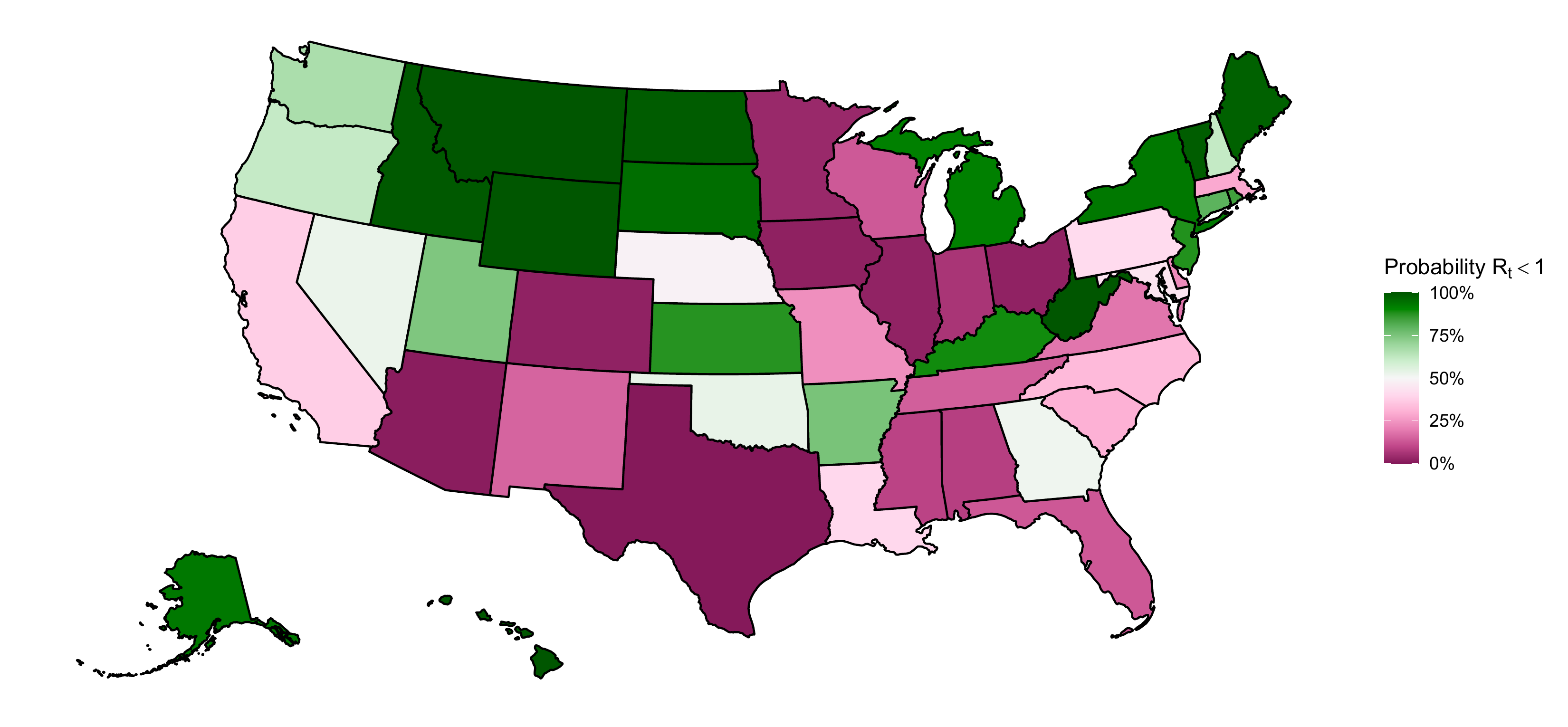
Our estimates of the probability that Rt is less than one (epidemic control) for each state. Rt, or the reproduction number, is the average number of secondary infections caused by a single infected person. Green states are those with probability that Rt is below 1 is high, and pink states are those with low probability. The closer a value is to 100%, the more certain we are that the rate of transmission is below 1 and that new infections are not increasing at present. Estimation as of the 9th of May 2020.
The regions are blasting off into a second wave as the reopening happens far too early:
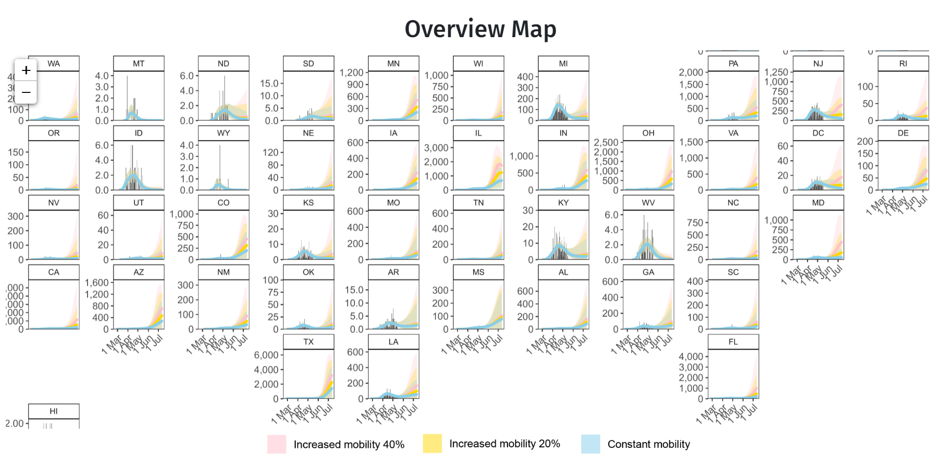
Estimates for the effective number of infectious individuals on a day and for newly infected people per day. Plotted over time and aggregated at the regions used in the model. The light purple region shows the 95% credible intervals for the effective number of infectious individuals and the dark purple region shows the 50% credible intervals. The light blue region shows the 95% credible intervals for the newly infected individuals per day and the dark blue region shows the 50% credible intervals.
Advertisement
It does not bode well:
The relationship between mobility and transmission is the principle mechanism affecting values of Rt in our model.
Therefore, we illustrate the impact of likely near-term scenarios for Rt over the next 8 weeks, under assumptions of a relaxation of interventions leading to increased mobility. We note that mobility is acting here as a proxy for the number of potentially infectious contacts. Our mobility scenarios do not account for additional interventions that may be implemented, such as testing and contact tracing, or additional behavioural modifiers, such as increased use of masks. Given these limitations, our scenarios should be considered pessimistic.
We define scenarios based on percent return to baseline mobility, which is by definition 0. As an example, say that currently mobility is 50% lower than baseline, or -50%, perhaps due to the introduction of social-distancing NPIs. Then, a 20% increase of mobility from its current level is -50% * (1 – 20%) = -40%. Similarly, if mobility in residences increased by 10% following a stay-at-home order, our 20% scenario reduces this to a 8% increase over baseline. This assumes that people have begun to resume pre-lockdown behavior, but have not yet returned to baseline mobility. We hold this 20% return to baseline constant for the duration of the 8-week scenario.
We present three scenarios (a) constant mobility (mobility remains at current levels for 8 weeks), (b) 20% return to pre-stay-at-home mobility and (c) 40% return to pre-stay-at-home mobility.
The light blue ribbon shows the 95% credible intervals for scenario (a) where mobility is kept constant at pre-lock down levels, the light yellow ribbon shows the same credible intervals for scenario (b) there is a 20% return to pre-epidemic mobility and the light red ribbon shows scenario (c) where there is a 40% return to pre-epidemic. The posterior means are shown in dark blue, dark yellow and dark red respectively.
David Llewellyn-Smith is Chief Strategist at the MB Fund and MB Super. David is the founding publisher and editor of MacroBusiness and was the founding publisher and global economy editor of The Diplomat, the Asia Pacific's leading geo-politics and economics portal.
He is also a former gold trader and economic commentator at The Sydney Morning Herald, The Age, the ABC and Business Spectator. He is the co-author of The Great Crash of 2008 with Ross Garnaut and was the editor of the second Garnaut Climate Change Review.