
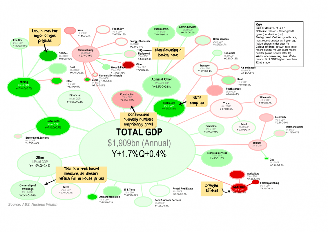
Every quarter I like to look at the changes in Australian GDP and which categories are responsible for the growth / decline. Each bubble represents a category of GDP proportionate to its size, colours represent the growth rate.
Click the charts for a large version and commentary:
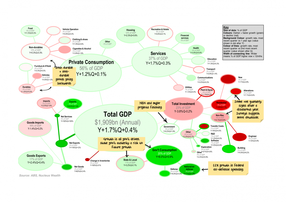
This quarter the key takeaways include:
- Federal Government spending (+11% for non-defence, 7% for defence over the year) the only thing keeping GDP above zero.
- Investment growth was not good, but I was expecting worse. Possibly there are green shoots, but capex surveys and investment forward indicators suggest there is still more downside.
- State & Local government spending has turned negative – with a low number of property transactions this is likely to remain a feature
————————————————-
Damien Klassen is Head of Investments at the Macrobusiness Fund, which is powered by Nucleus Wealth.
The information on this blog contains general information and does not take into account your personal objectives, financial situation or needs. Past performance is not an indication of future performance. Damien Klassen is an authorised representative of Nucleus Wealth Management, a Corporate Authorised Representative of Nucleus Advice Pty Ltd – AFSL 515796.