With Australia’s housing correction now dragging on for 20 months, and peak-to-trough declines totalling 10.3% at the 5-city level, it’s an opportune time to compare this correction with prior episodes.
The below chart shows the various dwelling corrections over the past 30-plus years at the 5-city level, as measured by CoreLogic:
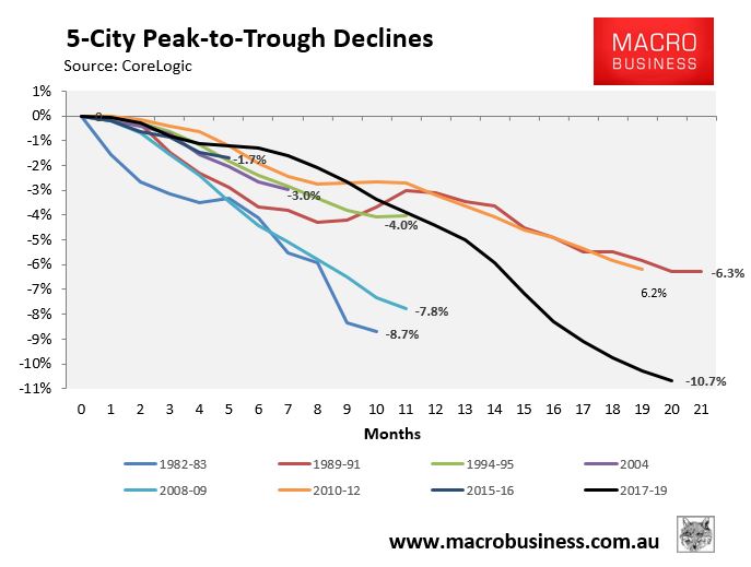
As you can see, this is the deepest bust (-10.7%) and also the second longest, trailing the 21 month decline in 1989-91.
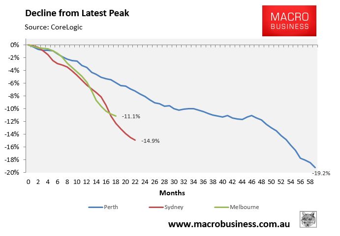
Next is Sydney, whose correction has been running for 22 consecutive months with cumulative losses of 14.9%. This is the second deepest correction versus prior episodes, as well as the third longest in terms of duration:
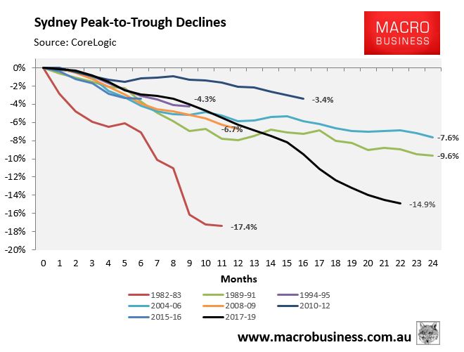
The deepest correct occurred in 1982-83 when values dived by 17.4%, whereas the longest correction was in 1989-91 and 2004-06 at 24 months.
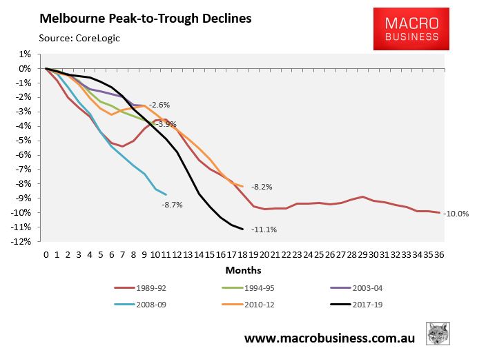
Next is Melbourne, whose correction has been running for 18 consecutive months with cumulative losses of 11.1%. This is the deepest thus far and the equal second longest in terms of duration:
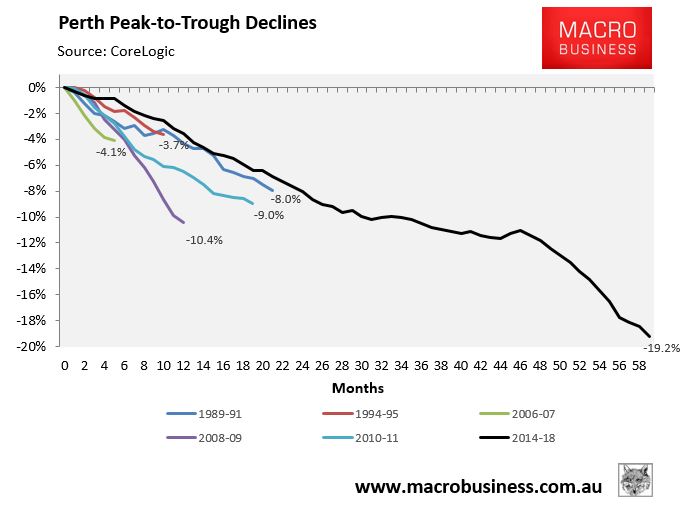
Finally we have Perth where values have fallen for over 59 months with cumulative losses of 19.2%, blowing away prior corrections:
Finally, here’s how the current corrections across Sydney, Melbourne and Perth compare:
As you can see, the pace of losses has been swift, although it slowed in the second half of May.
Given rate cuts and policy stimulus across multiple fronts – i.e. APRA’s interest rate buffer and lower smaller ADI mortgage capital requirements, as well as announced first home buyer subsides – we expect the housing market to bottom in the second half.
unconventionaleconomist@hotmail.com