By Gareth Aird, Senior Economist at CBA:
Key Points:
- Employment growth has been much stronger for females than for males over the past year.
- Strong growth in the services sector, particularly health, is behind the big lift in female employment.
- The rise in female employment has been accompanied by a lift in participation.
- There are structural and cyclical forces at work behind the lift in female employment.
Overview:
The labour force data can be sliced up and analysed in a number of ways. It is common to cut it up by industry, region or employment type. More recently we had a look at it from a public/private sector perspective. In this short note, we take a different approach and observe the data from a male/female split. The results are interesting. Employment growth has been materially stronger for females relative to males since 2011. And female participation has been rising at a phenomenal rate. As a result, females now make up 47% of workers and men 53%. By comparison, back in 1980, women made up 36% of workers and men 64%. Clearly, there are both structural and cyclical forces in play. Here, we explore a few of the more recent trends.
Latest trends in the data
One of the positive features of the Australian economy since late-2016 has been very strong growth in jobs. The rate of job creation has eased a little over the past three months. But the broader picture has been one of strength. Employment growth was 2.7%pa in April 2018, having averaged a pace of 3.3%pa over the prior six months. This is significantly stronger than population growth (1.6%pa). And it means that the total number of people in paid employment has risen by 332k over the year. What has flown under the radar, however, is the composition of that employment growth when looking at the split between men and women.
Over the year to April 2018, employment growth for males was 1.8%. But for females it was more than twice that at 3.9% (chart 1). Put another way, of the 332k rise in total jobs over the year to April 2018, the number of men in paid employment rose by 114k while for women it was 218k.
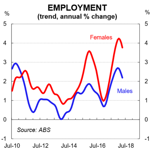
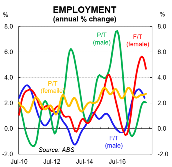
We can drill down further to look at the male and female split by employment type (i.e. the full-time/part-time split). The trend data, which smooths out the monthly volatility, shows that growth in full time jobs for females has been remarkable over the past year at 4.7%pa (chart 2). Over the same period, growth in the number of males in full-time employment was 2.2%.
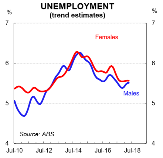
Despite the large divergence between the rates of growth in jobs for males and females, movements in the unemployment rate for both groups have been more consistent. Over the year to April 2018, the trend unemployment rate for males fell by 0.1ppt to 5.5% while it fell 0.3ppts for women to 5.6%.
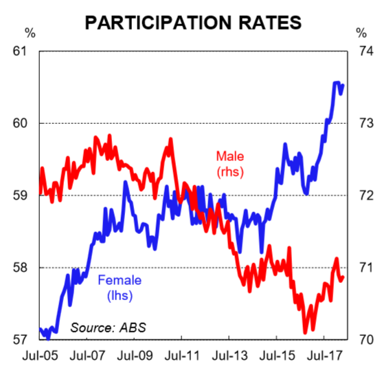
Changes in the participation rates of men and women reconciles the disparity between the magnitudes of growth in employment against movements in the unemployment rate. The overall participation rate has risen by 0.6ppts to a record high of 65.6% over the past year. The lift has been driven by female participation. In trend terms, the participation rate for women has risen by 1.1ppts over the past year to a record high of 60.7%. For men, it’s lifted by 0.3ppts to 70.8% (chart 4).
Why such strong growth in employment for females?
The starting point to better understand why female employment growth has been so strong is to look at the change in headcount on an industry basis. Chart 5 shows the details. And chart 6 shows the overall share of female employment in each sector.
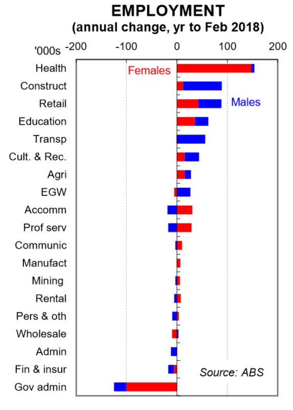
In the year to February 2018 (latest available), the health sector put on the biggest lift in headcount (+154k). Within that, female employment rose by 148k while it rose for males by just 6k. This big rise in headcount in the health sector has been an ongoing trend due to the ageing of the population. But it has been amplified more recently by the NDIS. The construction sector was in second place on the job creation list reflecting the record levels of residential construction and the infrastructure boom (+89k). Males accounted for 77k of the increase while female employment rose by 12k. Unsurprisingly, this is a sector that has a big proportion of men employed. The retail sector, almost in equal second spot, had roughly an even split in the lift in headcount of men and women over the past year. The education sector rounded out the top four with women accounting for 57% of the lift in jobs. We could go on, but as the data is granular, there can be a lot of volatility in the employment data by industry, particularly when split by gender. So without getting too bogged down on the detail, there a few key points to note.
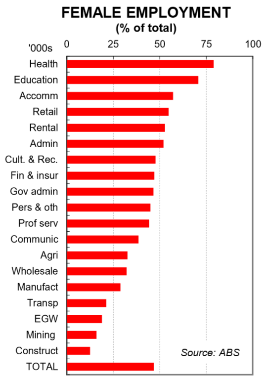
First, women have an above average share of representation in the sectors that are currently putting on headcount at the fastest rate. Health, education and retail all have a higher proportion of females in employment than men. As such, when these sectors are growing faster than the average of all industries, growth in employment of females is likely to be stronger than males.
Second, the lift in demand for workers, particularly in the services sector, has been accompanied by a rise in supply. This has meant that female participation in the workforce has been growing at a faster rate than male participation. This doesn’t necessarily explain why two thirds of the jobs created over the past year have been filled by females. But it does explain why the growth rates in employment have been stronger for women relative to men.
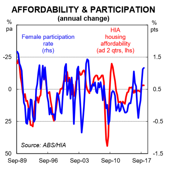
Third, in many industries, there has been a conscious attempt by employers to lift the female share of their workforce. This both encourages female participation while also increases the likelihood that female employment growth rises relative to men. We suspect that female participation and employment has also risen because real wages growth is flat. Many of the prices of essential goods and services that households must consume, like electricity, fuel, health and education, have been increasing a lot faster than wages. In addition, dwelling price growth has far outstripped income growth for a long period of time. This means that for many households, two incomes are now necessary. As the chart below shows, female participation tends to rise as housing affordability worsens. Of course there is a circularity there because an increase in the proportion of two-income households puts upward pressure on dwelling prices. But it’s only one small factor and a story for another day!