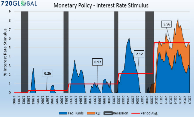
Federal Reserve (Fed) stimulus comes in two forms as shown above. First in the form of targeting the Fed Funds interest rate at a rate below the nominal rate of economic growth (blue). Second, it stems from the large scale asset purchases (Quantitative Easing -QE) by the Fed (orange). When these two metrics are quantified, it yields an estimate of the average amount of stimulus (red) applied during each post-recession period since 1980. It has been almost ten years since the 2008 financial crisis and the Fed is applying the equivalent of 5.25% of interest rate stimulus to the economy, dwarfing that of prior periods.
Basically it suggests that each period of post-crisis stimulus has seen a much higher level of stimulus than before, for the same result. That implies a broken system of positive feedback loops between asset bubbles and the largesse in central bank support that follows.