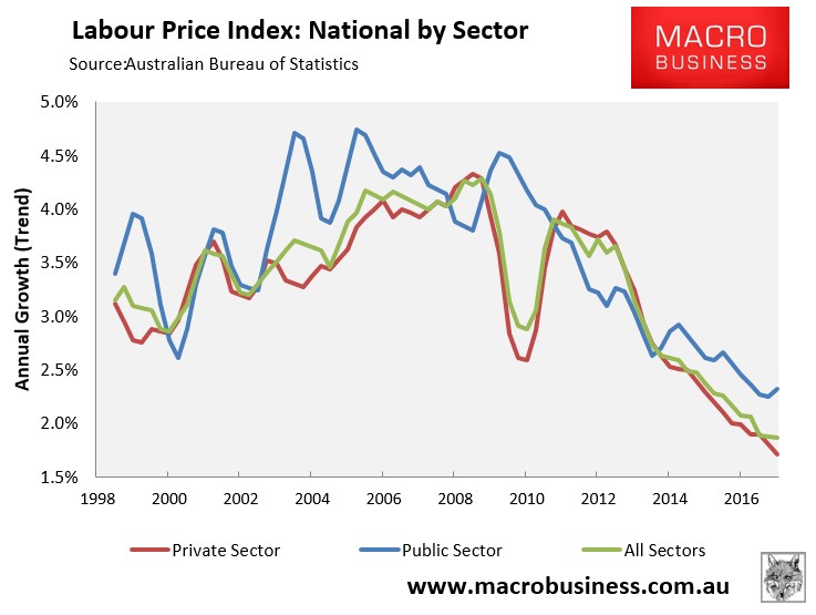
The March quarter wages price index, released last month by the ABS, revealed that wages growth across the nation hit another all-time low 1.88%, with private sector workers (1.71% growth) faring much worse than their public sector counterparts (+2.32%):
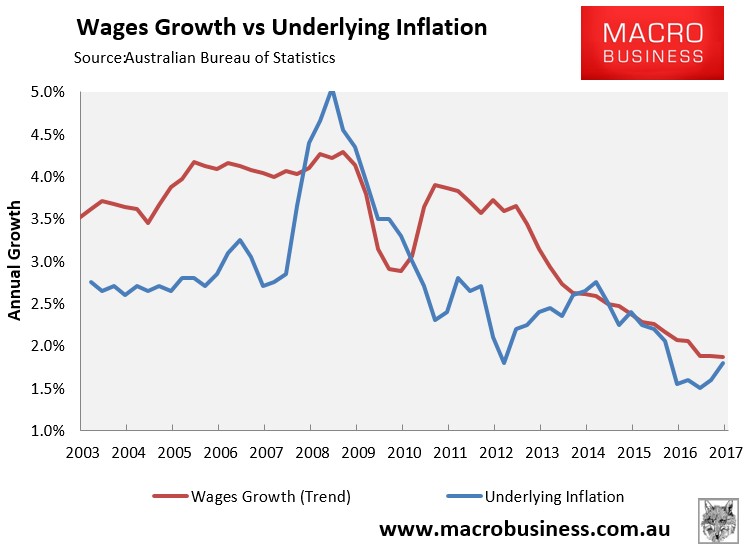
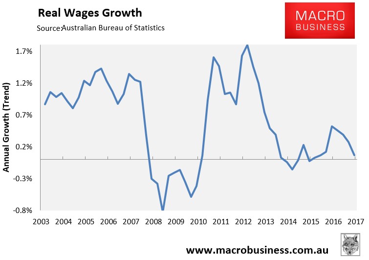
The news was better when adjusted for underlying (core) inflation, with annual wages growth rising 0.1% in the year to March in trend terms, courtesy of weak inflation:
One major drawback of the wage price index is that it is a measurement of wages inflation, not what workers across Australia are actually being paid. That is, it measures wage pressures across the various industries, but makes no account of the shift in composition of jobs that has taken place from higher paid jobs (e.g. in the mining sector) to lower paid jobs (e.g. in the services sector).
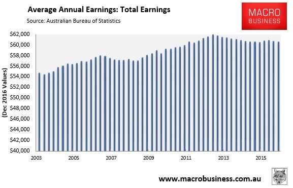
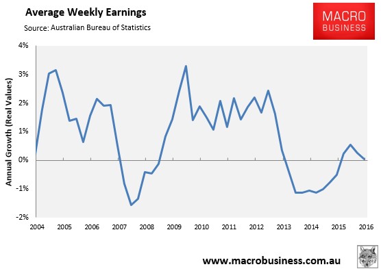
The Average Weekly Earnings (AWE) survey from the ABS is better in that it measures what workers are actually being paid. But its major drawback is that this survey is only produced bi-annually, with the latest data only current to end-November 2016.
Still, this series revealed that real inflation-adjusted earnings were flat (0% change) in the year to November 2016 and have fallen by 2.1% since May 2013 (see below charts).
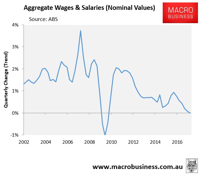
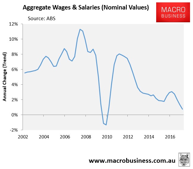
Another useful series for gauging the strength in workers’ earnings is the aggregate salaries and wages data, which feeds into the national accounts. This data was released yesterday and is presented below.
Total wages and salaries across the economy registered zero growth in the March quarter in trend terms – the lowest quarterly rate of growth in the post-GFC period:
Whereas wages and salaries grew by just 0.7% in the year to March 2017 – the lowest annual growth recorded in the post-GFC period:
The below charts show aggregate annual wages and salaries growth across Australia’s states and territories:
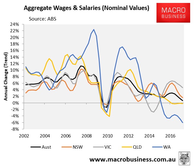
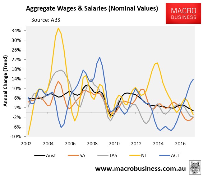
As you can see, total wages and salaries growth was positive in 2017 in the ACT (+13.7%), VIC (+4.7%) and NSW (+1.6%) and negative in WA (-6.0%), SA (-2.0%), TAS (-1.9%), the NT (-1.0%), and QLD (-0.2%).
One significant shortcoming of this release is that it only presents total wages and salaries in nominal (current dollar) terms.
In the next chart, I have deflated the aggregate series first by both population growth only and then also by CPI, thus giving wages and salaries growth in real per capita terms:
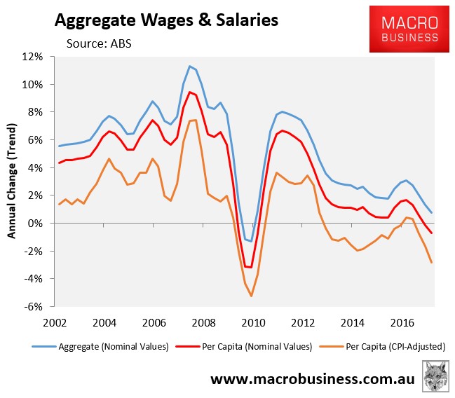
As shown above, nominal wages and salaries fell by 0.7% in per capita terms in the year to March 2017, whereas they fell by 2.8% in real per capita terms.
The below charts plot real per capita wages and salaries across Australian jurisdictions:
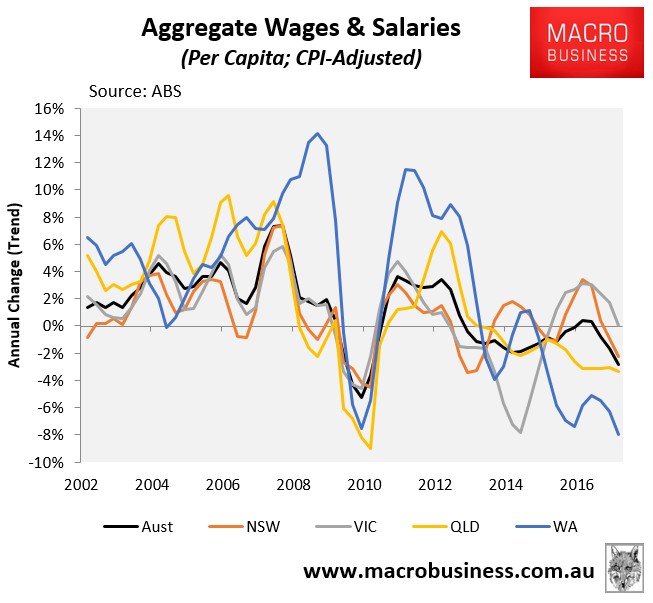
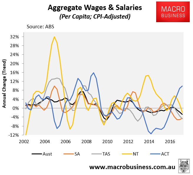
As you can see, real per capita wages went backwards in the year to March everywhere except the ACT (+10.0%) and VIC (no change). The situation is worst in WA, where wages and salaries fell by 8% in real per capita terms.
While the boost in commodity prices may have driven a strong rebound in national disposable income in the March quarter, this unfortunately has not been felt by the typical Australian worker, whose remuneration continues to slide backwards when adjusted for inflation.
In fact, the only workers that are enjoying strong wages growth are politicians, public servants and lobbyists in Canberra, who are seemingly making out like bandits.
unconventionaleconomist@hotmail.com
