Unemployment in detail: VIC ponzi economy the sole driver of jobs
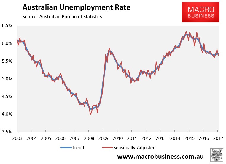
As summarised earlier, the Australian Bureau of Statistics (ABS) today released its labour force report for January, which registered a 13,500 increase in total employment and a decrease in the headline unemployment rate to 5.7%.
In trend terms, the unemployment rate rose marginally to 5.71%:
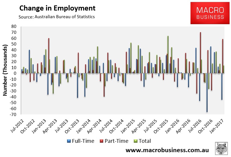
Again, total employment rose by a seasonally adjusted 13,500 to 11,998,200. Full-time jobs fell by 44,800, whereas part-time employment rose by 58,300:
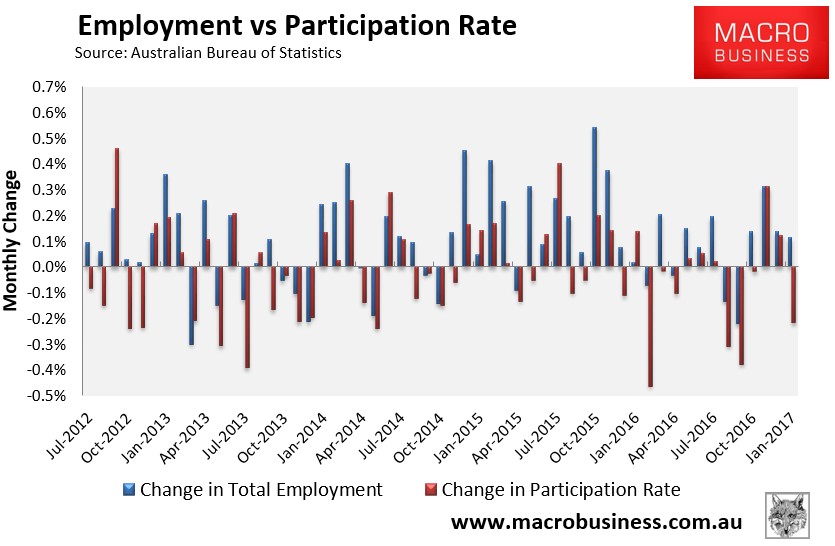
The participation rate fell by 0.1% to 64.6% over the month:
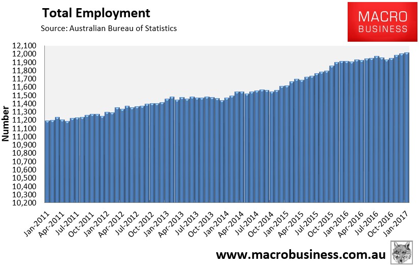
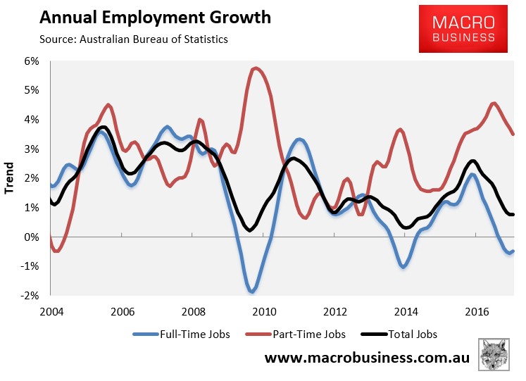
The trend in total employment remains weak:
Trend annual employment growth has stabilised (+0.8%) but is still being driven exclusively by part-time employment (+3.5%), with full-time jobs still contracting (-0.5%), albeit with an improving trend:
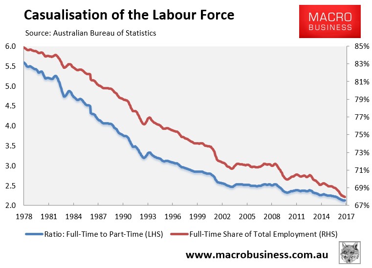
The proportion of the population in full-time work remains at an equal all-time low:
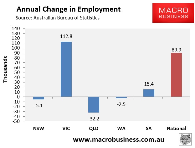
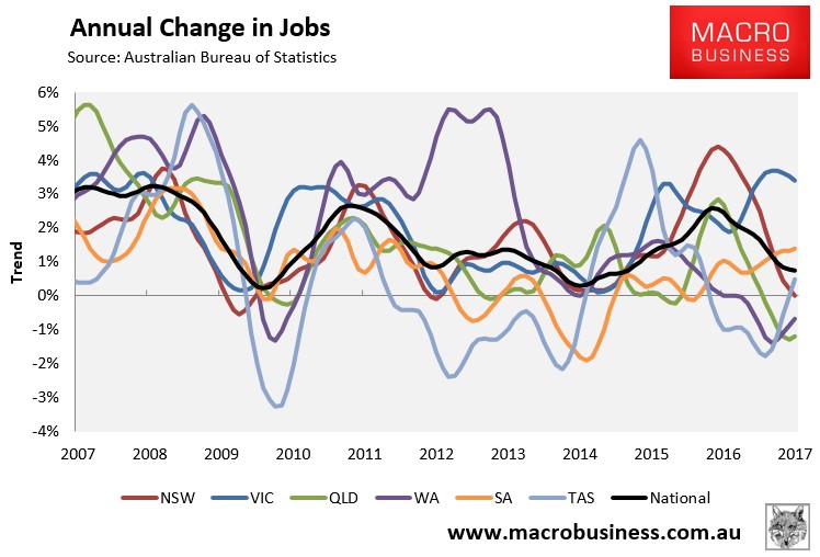
In January, the Melbourne housing/population ponzi economy drove all of the jobs growth over the past year, accounting for 126% of national jobs growth in seasonally adjusted terms, with the rest of Australia going backwards:
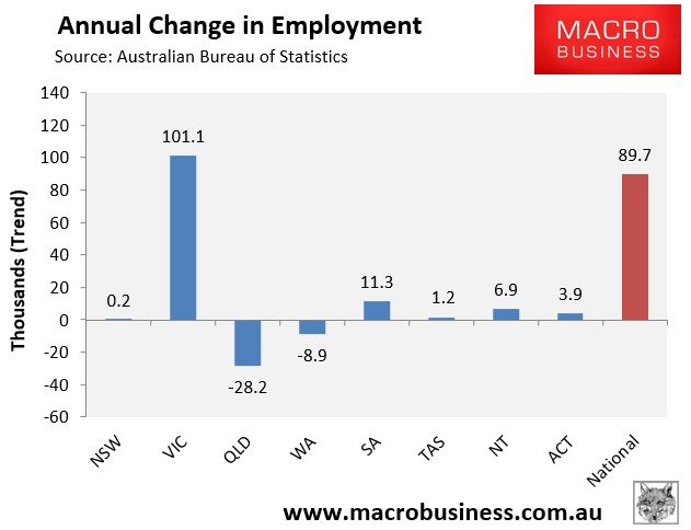
The state seasonally-adjusted figures are notoriously volatile and subject to a big margin of error. As such, the below chart tracks state jobs growth in trend terms. Again, Melbourne has driven all of the nation’s jobs growth over the past year, whereas the rest of Australia has collectively shed jobs:
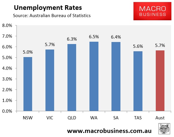
In a complete reversal of fortunes from the mining boom days, Western Australia now has the highest seasonally adjusted unemployment, whereas the bubble epicentres of New South Wales and Victoria have the lowest, along with Tasmania:
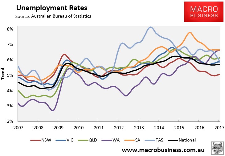
The below chart shows the ABS’ trend unemployment rates, which again shows the bubble epicentre of New South Wales with by far the lowest unemployment, South Australia and Western Australia with the highest, and Victoria, Queensland and Tasmania with above-average unemployment:
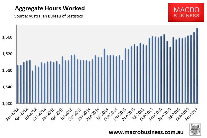
The aggregate number of hours worked rose in seasonally adjusted terms, up 10.2 million hours or 0.61% in January. However, hours worked have risen by just 0.7% over the past year:
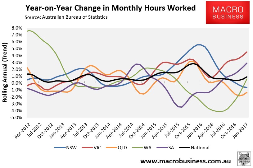
The below chart, which tracks the annual change in hours worked on a trend basis, paints an improving picture. It shows that Victoria (Melbourne) has driven the lion’s share of growth in hours worked, followed by South Australia and Western Australia. Growth in hours worked remains negative in New South Wales and Queensland, whereas it has improved to 0.9% at the national level:
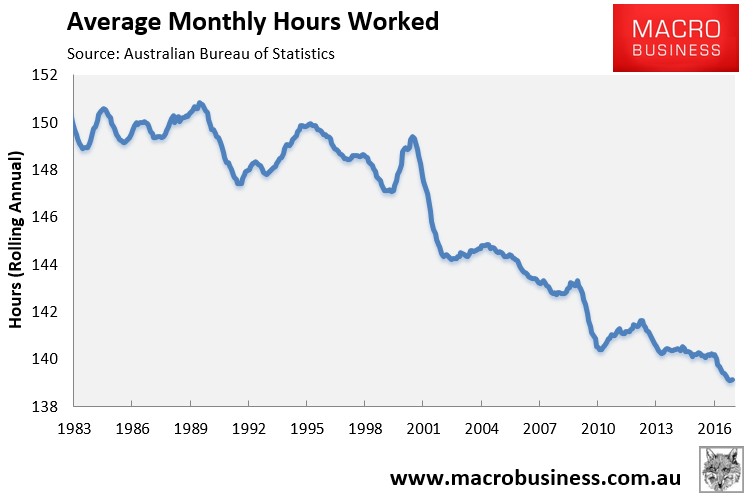
Average hours worked has also rebounded slightly from last month’s all-time low:
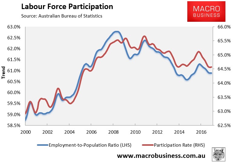
Workforce participation also looks to have found a bottom:
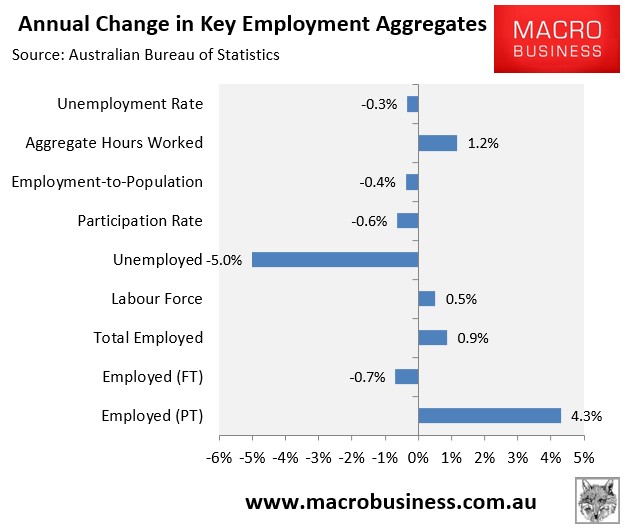
Finally, to round things out, the next chart summarises the annual change in the key employment aggregates on a seasonally-adjusted basis, which paints a mostly sombre picture:
Overall, this is another fairly crappy release, but with some green shoots showing.
All of the trend jobs growth is coming from the Melbourne housing/population ponzi. Trend growth in full-time jobs remains negative; albeit improving slightly. And trend growth in hours worked remains weak, as does labour force participation, but again with some improvements showing.
While the labour market will probably improve at a sluggish pace in the months ahead, clouds continue to build on the horizon in the form of peaking dwelling construction and the closure of the car industry. What can realistically rise up to fill the employment void in 2018?
