To once again add some perspective on why MB believes the Australian economy is so fragile, and why living standards are falling, I have once again deflated three measures of the domestic economy, as provided in the March quarter national accounts (released yesterday), by the ABS’ population data, in order to ascertain the underlying strength of the domestic economy in per capita trend terms.
The three measures chosen are:
- National Disposable Income (NDI), which is “considered a good measure of progress for living standards because it is an indicator of Australians’ capacity to purchase goods and services for consumption” (see ABS explanation here).
- Gross national expenditure (GNE), which is “the total expenditure within a given period by Australian residents on final goods and services (i.e. excluding goods and services used up during the period in the process of production). It is equivalent to gross domestic product plus imports of goods and services less exports of goods and services”.
- Domestic final demand (DFD), which is the sum of “government final consumption expenditure, household final consumption expenditure, private gross fixed capital formation and the gross fixed capital formation of public corporations and general government”.
First, let’s consider real per capita NDI. As shown below, this measure fell another 0.3% in the March quarter in trend terms, and has fallen by 6.2% since December 2011, suggesting falling living standards:
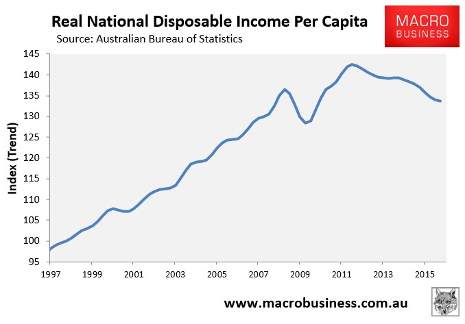
Per capita NDI is also just 0.9% higher than March 2008 – that’s eight years with virtually no growth.
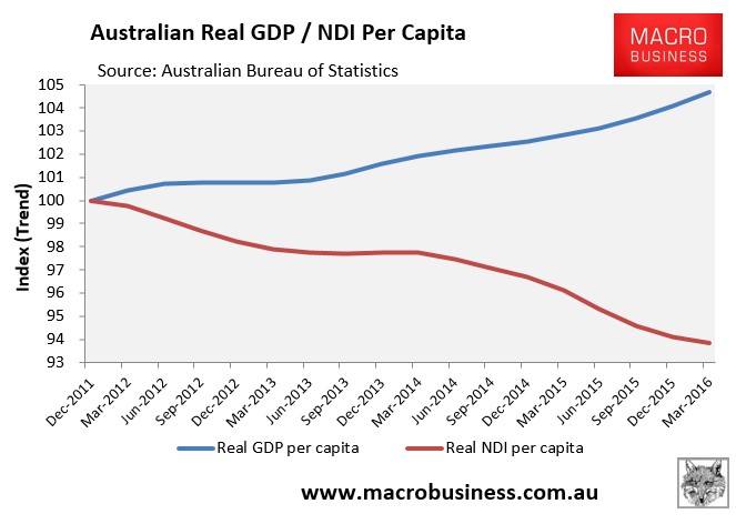
The divergence between per capita NDI and GDP is particularly stark:
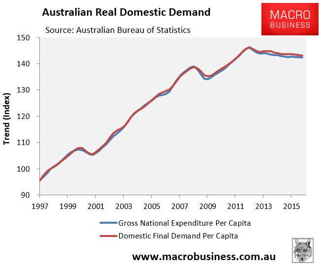
Similar trends are evident with GNE and DFD, which have also been falling since June 2012, albeit less severely:
The big expansion in commodity export volumes that has occurred in recent years has supporting headline GDP but hidden the fact that the domestic economy remains weak, propped-up by elevated immigration. And because export prices are falling, national income and demand are going backwards, and the domestic economy is essentially experiencing a recession in per capita terms. We are selling more, but receiving less income in return.
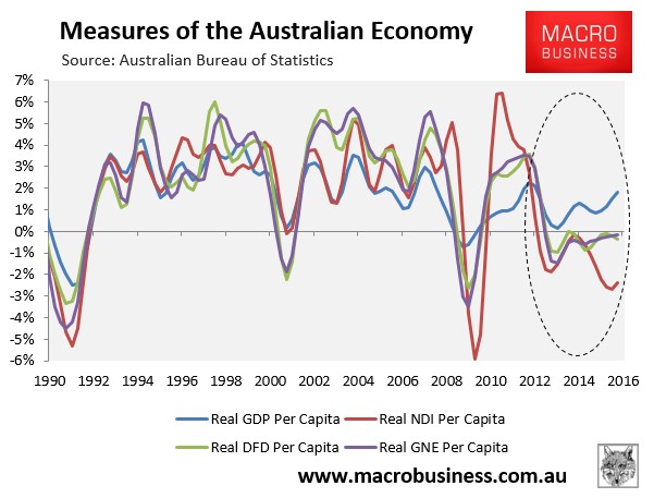
The below chart plots the above measures against real GDP growth. Spot the odd one out – GDP – which just happens to also be the measure that wrongly receives the most attention from economists, commentators and politicians, and not even in per capita terms:
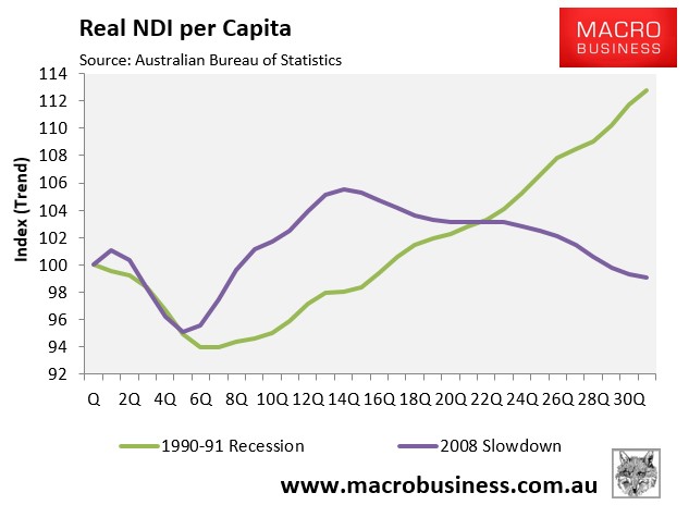
An examination of the national accounts data also shows that real per capita NDI since the onset of the GFC has grown far more slowly than at the same time after the early-1990s recession. Real per capita NDI has actually fallen by 1.0% since June 2008 versus 12.8% growth at the same point after the early-1990s recession – with obvious diverging trends (see next chart).
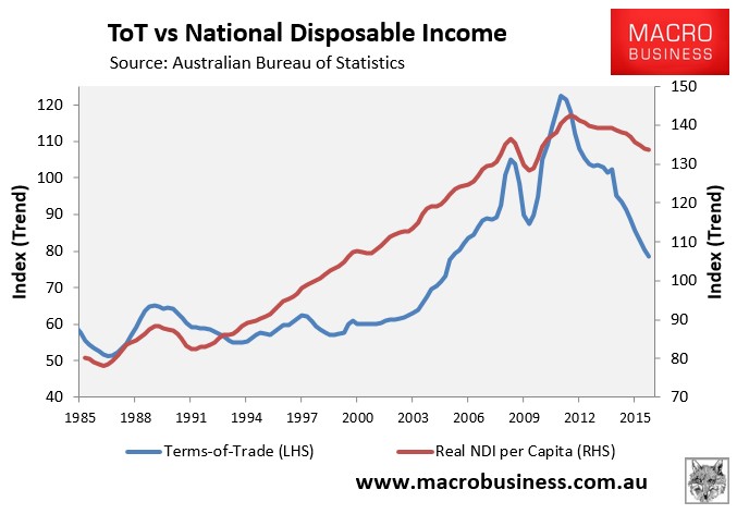
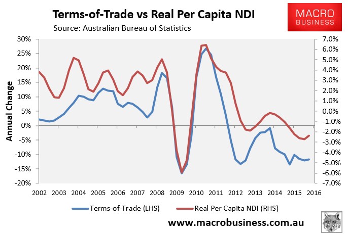
As explained many times before, the reason for the recent decline in real per capita income is the sharp rise and then fall in the terms-of-trade, which after rising by 39% in the two years to September 2011 has since fallen by 35% (see below charts).
Even Australia’s GDP growth has been poor despite the record mining investment followed by surging export volumes, along with the stimulatory effects of the housing bubble. Once we subtract population growth, Australia’s performance since the GFC has been worse than the 1970s, 1980s and 1990s recessions:
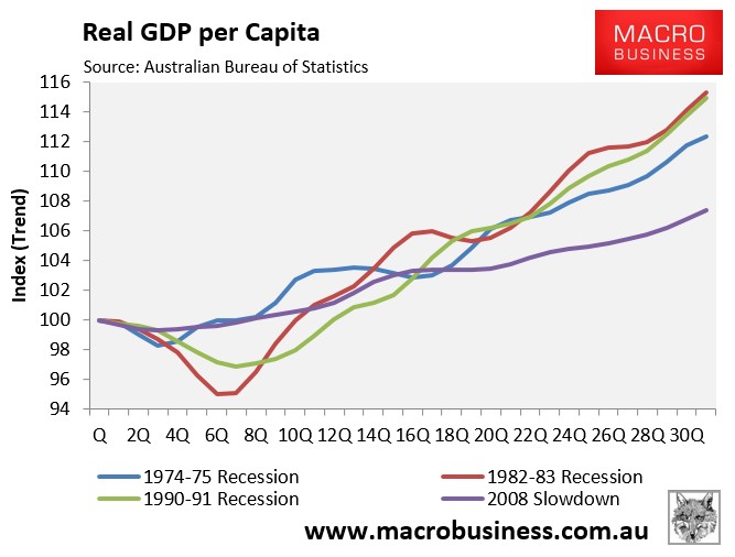
31 quarters after the onset of the GFC (June 2008), GDP per capita has only risen by 7.4%. The trends also are likely to widen the gaps further as the once-in-a-century mining investment boom continues to unwind over coming years, the boom in house prices and construction begins to reverse, and the car industry closes, offset only partly by rising export volumes.
Those headwinds, combined with falling per capita income, is why Australia is experiencing its own “lost decade”.
unconventionaleconomist@hotmail.com