
As the loon pond disappears into that good night, Prime Minister Turnbull is seeing polls converge around an election winning lead. Roy Morgan and Ipsos have been strongly in favour of PMT but Newspoll has lagged. Not any more, from The Australian:
The latest Newspoll, taken exclusively for The Australian, reveals the Coalition leads Labor by 52 per cent to 48 per cent in two-party terms, having regained its lead after the parties were deadlocked at 50-50 a fortnight ago.
…The Coalition’s primary vote rose two points to 45 per cent over the past fortnight to be at its highest since November 2013 and almost back at the 45.6 per cent achieved in its 2013 election victory. It is up six points since Mr Turnbull replaced Tony Abbott as Prime Minister last month.
Labor’s primary vote is 10 points lower than the government at 35 per cent.
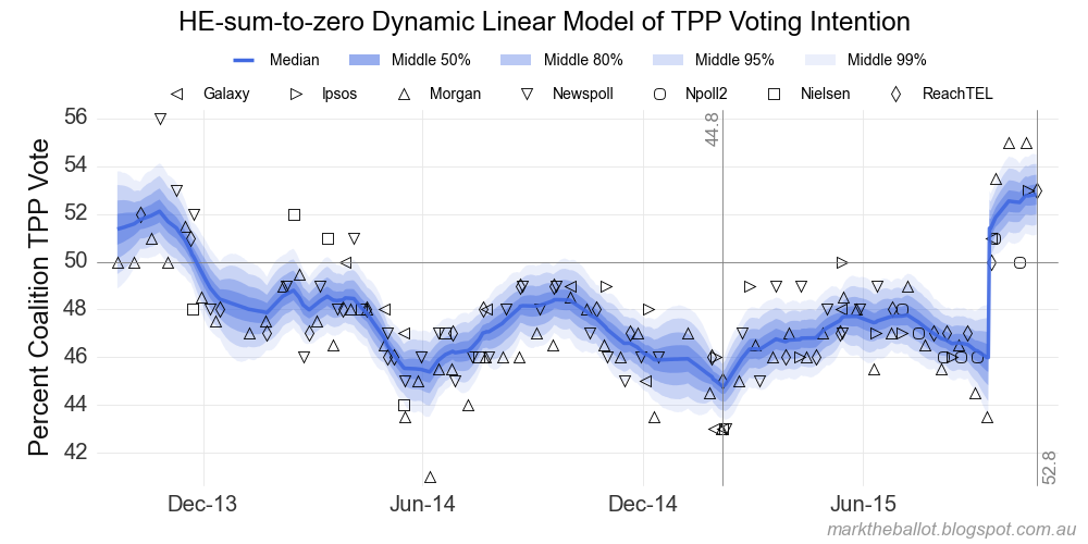
Mark the Ballot’s model’s are clear:
I have spent a little time refreshing and updating the statistical models I use on this site. I have also updated the Bayesian Aggregation information page, with the current version of the JAGS model code for each of the four models I run.
What’s changed:
- With all of the models, I have changed the way in which I code a discontinuity associated with a change of leadership.
- With the anchored models, I have added a discontinuity for the Gillard to Rudd change of leadership and for the Rudd to Shorten change.
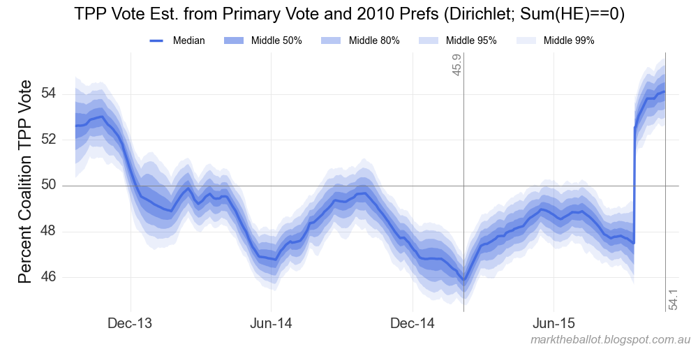
- Finally, with the sum-to-zero, primary-vote model I have added a two-party preferred (TPP) estimate based on preference flows in 2010.
The annotated TPP results follow. We will start with the sum-to-zero TPP model. This chart uses the TPP estimates from the polling houses. This is the simplest model, and the one I regularly report.
The next chart is the anchored TPP model. It should be noted that prior to the 2013 election, the pollsters would have made their TPP estimate based on preference flows in 2010. Since the 2013 election, the pollsters would have used preference flows at the 2013 election.
The next charts are derived from the primary vote estimates from the polling houses. The first chart is based on the 2013 preference flows. The second chart is based on the 2010 preference flows. There is a percentage point in the different preference flows.
Year From the Greens (%) From other Parties(%) 2010 21.16 58.26 2013 16.97 53.30
The final chart is derived from the primary votes, anchored to the 2013 election result (using 2013 preference flows).
The four charts based on 2013 preference flows can be seen side-by-side as follows:
As an aside, the two anchored charts suggest that the 2013 change from Gillard to Rudd may have saved Labor up to 3.5 percentage points at the 2013 election. It would have saved quite a bit of the furniture.




I have personally been quite disappointed in PMT too date. He has yet to outline any kind of economic vision and has been very low profile. That is perhaps understandable given he has spent time undoing the Abbottalypse and rebuilding the party. But, given it’s increasingly obvious that PMT is going to romp home in the next election, we are not far from that point when we will need to know what he intends to spend his political capital upon.
