By Philip Soos and Paul D. Egan
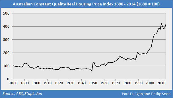
This chart pack presents the latest statistics for 2014, updating the dataset provided earlier last year. When adjusted for inflation and quality, housing prices have boomed nationwide since 1996, hitting a peak in 2010, before undergoing a slight fall and rise. On current trends, a new, higher peak is likely to be set in 2015.
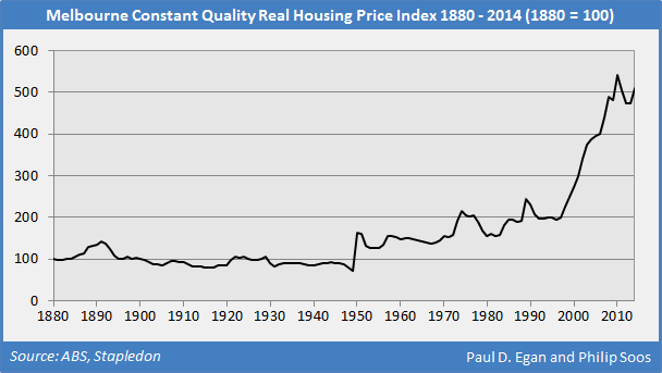
Melbourne has been the epicentre of a number of historical real estate bubbles, with the latest iteration being no different. Compared to the other capital cities, Melbourne has experienced the largest escalation in housing prices, causing the gross yield to fall from around 9 to 3.5 per cent between 1996 and 2014.
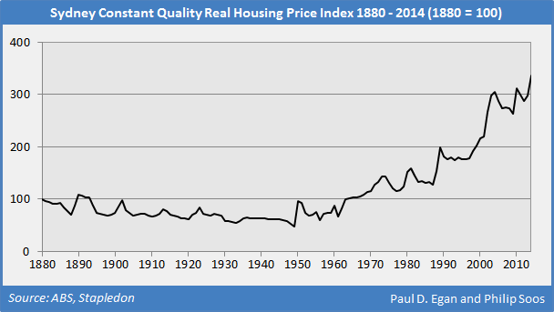
The latest boom in Sydney has resulted in prices surging to a new peak in 2014, surpassing the previous peak set in 2010, with yields similarly compressing. It is probable the boom will continue into 2015, given the recent exponential rise in investor-related mortgage debt.
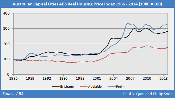
The other capital cities have not tracked the trend in real housing prices of Melbourne and Sydney in the post-GFC era; for instance, Perth has yet to regain the peak reached in early 2007. It should be noted that the ABS measure of housing prices is not quality-adjusted, so the indexes overstate the trend.
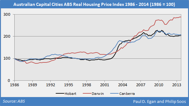
Hobart experienced a boom in 2004, with nominal annualised growth reaching 60 per cent, the single greatest rise of any capital city in recent times. Only the steep growth in Darwin’s housing prices may be somewhat justified, due to the strong rise in rents, alongside the highest gross yield of any capital city.
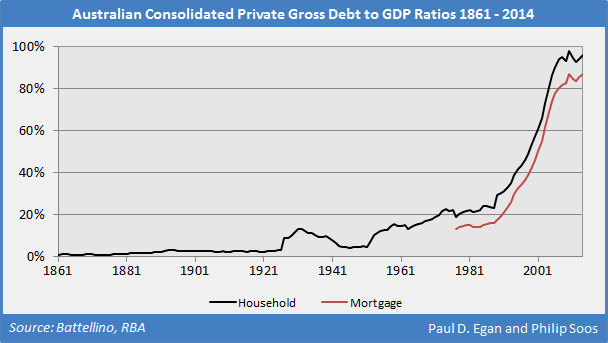
The household and mortgage debt to GDP ratios have boomed exponentially over the last two decades, driving the largest housing and land market bubble in post-WW2 history. A new peak was set in 2014 for the mortgage debt ratio. The complete history of public, private and external debts from 1850 to 2014 can be found here.
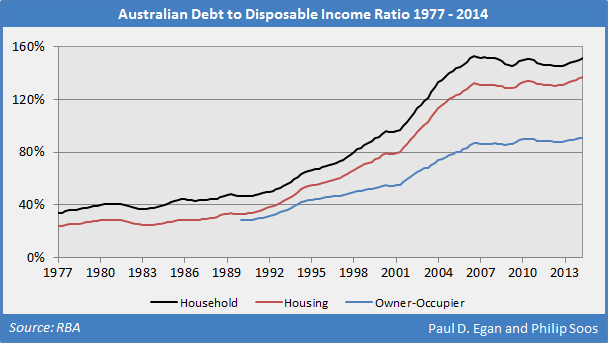
As debts have risen, so too has the debt to disposable income ratios. The overall household ratio peaked in 2006, remaining steady on the back of strong household income growth and conservative personal debt habits. In contrast, the housing and owner-occupier ratios reached a new peak in 2014 as Australians accumulated further mortgage debt amid slowing wage growth.
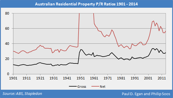
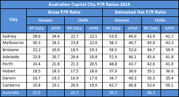
The best indicator of a bubble (bubble, what bubble? say the government and FIRE sector) is the divergence between prices and rents (price to earnings), which cannot be explained by any fundamental factor. Every asset bubble is evidenced by a rising P/R ratio.
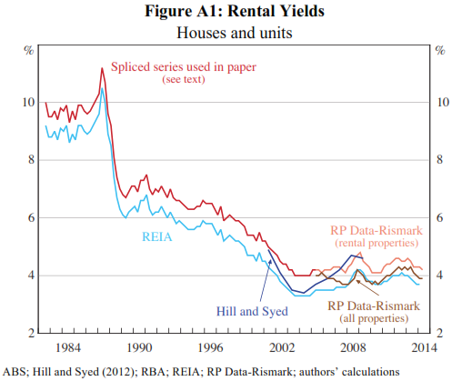
Regardless of the source and methodology, gross yields have plunged dramatically nationwide. Expenses for investment properties constitute around 50 per cent of gross rental income, meaning net yields are half that of gross yields. The yield for owner-occupied housing is lower than for investment properties, probably reflecting tax advantages and quality for the former.
Put another way, the P/E or P/R ratio represents the inverted yield, demonstrating how much an investor is willing to pay for each dollar in earnings. Australians are paying considerable premiums for residential property.
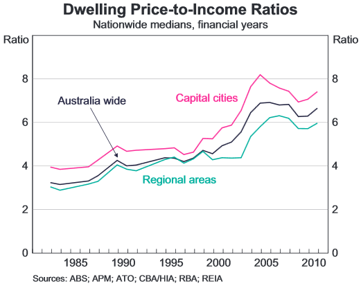
Numerous price to income ratios exist, with the most accurate measure provided by the RBA. In general, too much attention is given to the P/I ratio, considering it is a rather vacuous measure of affordability. The popularity of P/I ratios does not discount the marked absence of mainstream or heterodox research support to confirm its validity; nevertheless, the nationwide ratio has climbed since the mid-1990s.
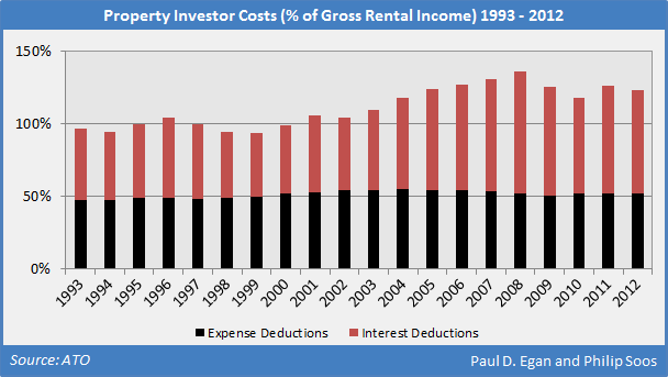
Net rental income losses have mounted for investors, as rents have generally tracked the rate of inflation while housing prices and mortgage debt have simultaneously boomed. The losses are larger than indicated because the ATO does not record data on principal payments, as it is not a legal deduction. Two-thirds of investors were negatively-geared in 2012, a significant rise from the 1990s when only half of this cohort were in the same position.
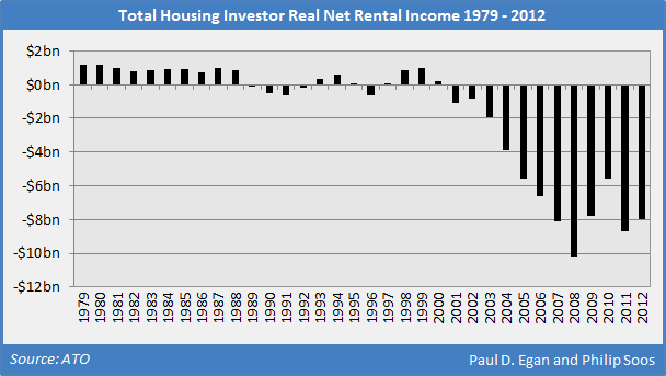
The reason why property investors are negatively geared, on aggregate, is the rising interest payment burden on the exponentially-growing stock of mortgage debt. Housing-related expenses have remained steady at around 50 per cent of gross rental income.
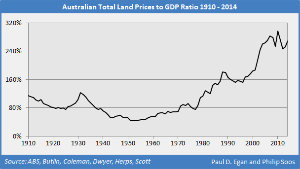
The housing boom is driven by escalating land prices, reaching a peak in 2010 at 298 per cent of GDP. The land market bubbles of 1974, 1989 and today are clearly demonstrated in the figure below.
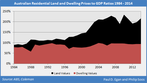
The cost of construction has remained steady for the last quarter century; the entire housing price boom has been in the land component.
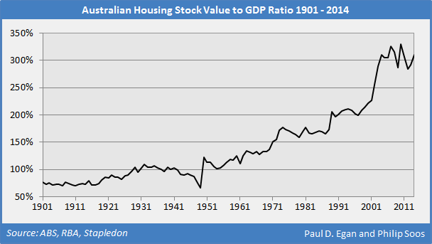
As land prices have boomed, so too has the value of the total housing stock relative to GDP.
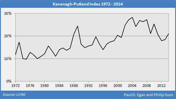
The Kavanagh-Putland Index compares the ratio of the total value of property sales to GDP, experiencing an exceptional rise since 1996. The fall in turnover after the GFC has caused the KPI to trend downwards, though the latest boom has led to a recent uptick.
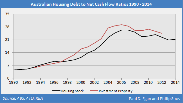
The debt to cash flow ratio indicates how many dollars of debt an investor holds relative to net cash flows. Steady rents and the rapid growth in mortgage debt have caused these ratios to significantly increase, suggesting the total housing and property investment stocks are dangerously overleveraged.
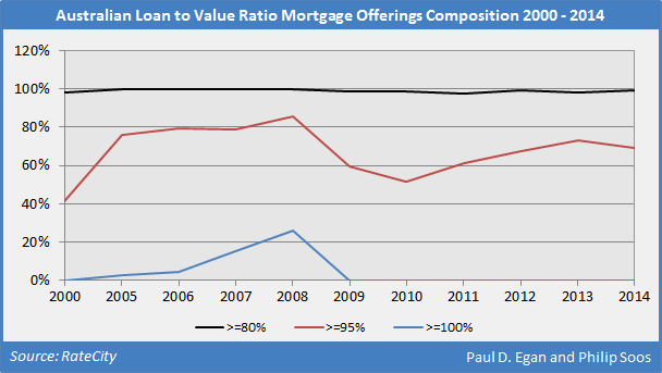
Since 2000, almost all mortgages from both bank and non-bank lenders have allowed for a loan to value ratio (LVR) equal to or more than 80 per cent; in 2008, 26 per cent of mortgage offerings had LVRs equal to or more than 100 per cent. Loan offerings should not be confused with loan approvals.
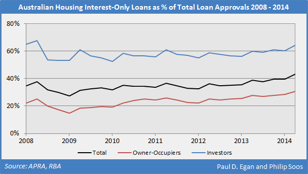
Interest-only loans have reached new heights for owner-occupiers, and if the current housing boom maintains its strength, the ratio for investors may soon eclipse the peak set in 2008. IO loans are predicated on constantly rising prices, comprising a useful tool in every Ponzi speculator’s arsenal and thus should be banned.
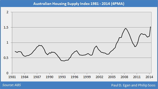
The housing supply index compares the flow of new net dwellings to population, adjusted for replacements and demographic change. A value of one indicates balanced supply, while a lower or higher value indicates oversupply and undersupply, respectively. Almost three quarters (71 per cent) of the housing price rise between 1996 and 2014 occurred during the period of rampant oversupply between 1996 and 2006.
The recent period of undersupply may not be overly problematic if new households soak up some of the previous years’ oversupply. Rents are falling in Perth, Darwin and Canberra, and holding steady in the other capital cities (except for Sydney), suggesting a structural shortage is implausible.
The trends emerging in a host of housing-related indexes and ratios are symptoms of Australia’s largest housing bubble on record. A rupturing of the bubble was prevented in 2008, following radical intervention by the Rudd government to bailout the banking and financial system, including the provision of generous FHOB grants that reinflated the land market.
Previous governments may be excused for overlooking bubbles in both the stock and land markets which were obvious in retrospect. The current administration, however, is acutely aware of the risk in the residential property market, even though it predictably claims prices are rational due to a fabled shortage. Consequently, the government stubbornly refuses to implement policies that materially reduce housing prices, despite the oft-repeated recommendations of government inquiries.
The claims made by government and FIRE sector economists that there is no bubble should be dismissed on the grounds their assertions are predictable and therefore tells us no new information. The economics profession has never warned the public about any asset bubble in Australia’s history, so this should come as no surprise. In the US, only 15 out of 15,000 professional economists were competent enough to identify their bubble; in Ireland, it was only three.
What is the outlook for the housing market from here? Unless investors experience a ‘Minsky moment’ or a black swan event takes place within global markets, further housing price inflation is possible throughout 2015 and even into 2016, especially considering the possibility of a further interest rate cut. Any significant falls in housing prices will invoke the RBA’s use of the backdoor bailout mechanism (the Committed Liquidity Facility) to prevent lender failure, while the government could implement a new FHOB under the pretext of helping first home buyers.
Another reason for expecting further price rises is that the mortgage interest rate has fallen significantly since 2008. To measure the degree to which prices reflect expectations of capital gains, the ratio of the mortgage interest rate to the residential gross yield is a useful indicator. When the ratio is relatively high, prices are mostly reflecting expectations of capital gains; conversely, when the ratio is low, prices mostly reflect rental yields.
The end of the largest mining boom since the gold rushes of the mid-19th century (falling commodity prices, terms of trade and capital expenditure), rising unemployment and underemployment, and negative real wage growth will make further increases in the stock of mortgage debt difficult. As a result, Australians should expect the government to more aggressively court foreign investment: importing irrational exuberance to further inflate the bubble when domestic demand begins to ebb.
If history teaches us one thing, it is that history is rarely learnt from. Given the government, FIRE sector, academia, home owners and property investors have no interest in acknowledging the obvious, the bursting of the largest housing and land market bubble in post-WW2 history will result in immense economic and social chaos.
