
From our Adam today:
Readers will already be aware that Australia is now gripped by an income recession. What’s interesting about this is the fact that we’re actually not in such a recession at all.
The chart below shows Australia’s national income growth over the last 14 years and as you can see, it is very much around trend. Indeed, the idea that we’re in some sort of income recession is, quite simply, a lie.
Chart 1: National income growth is at trend
The reason is simple. The measures widely used to point to recession don’t actually measure income. The one shown in the chart above does though, as it’s the sum of what business and households etc actually earn. That is, what their income is, in real terms.
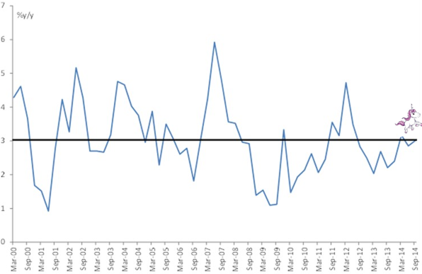
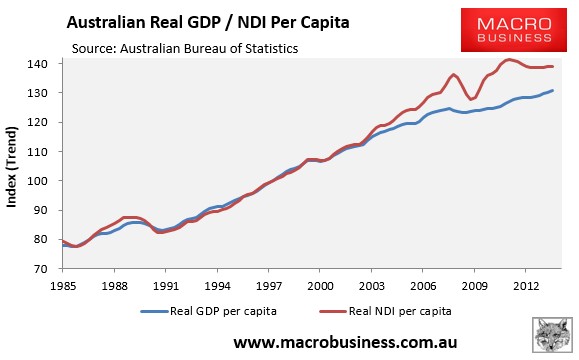
The chart is impressive (unicorn added) but what is it? Here’s the tier one stuff, National Disposable Income per capita is falling (versus GDP):
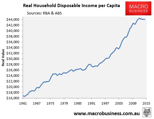
Here’s Real Household Disposable Income per capita which is falling:
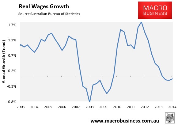
Here’s real wages which are falling:
Here’s Nominal GDP per capita which isn’t quite falling yet but sure ain’t near trend:
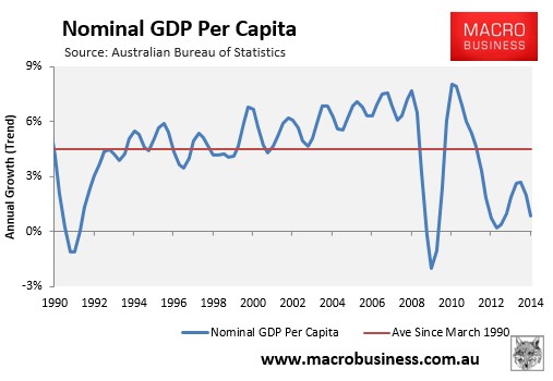
Nominal GDP is the dollar value of what’s produced and earned. The ongoing falls in commodity prices and the terms-of-trade has more than offset the increase in export volumes. So in effect, Australia is producing more, but receiving far less in return – exactly what us doomsayers have been warning about for several years now.
Our Adam’s chart is a mystery to me.
