Cross-posted from Martin North’s DFA Blog.
DFA has updated our core household models to incorporate the latest results from our surveys. One interesting element is the household savings ratio, which the RBA often cites as one reason why households are doing well currently. We asked specific questions in the survey about savings behaviour, by segment, and today we present some of our findings. Later we will talk about the saver’s quest for yield, but lets start with the savings ratio.
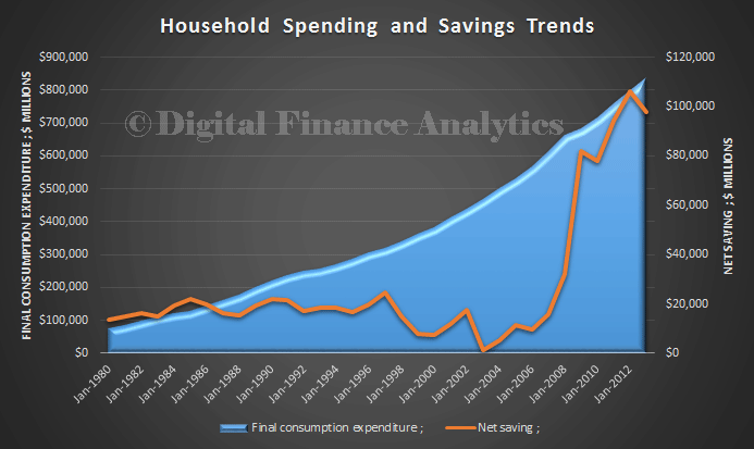
We start by looking at the ABS National Accounts data to June 2013, data released in November 2013, and which forms the basis for the current reported savings ratio. This is the plot of total household consumption expenditure, compared with savings from 1980 to June 2013. We see a steady decline in savings to 2004, then a significant rise, then a drop in the last few months. This data has been corrected for depreciation. You can read about the ABS assumptions for the System of National Accounts (the full document runs to over 700 pages!)
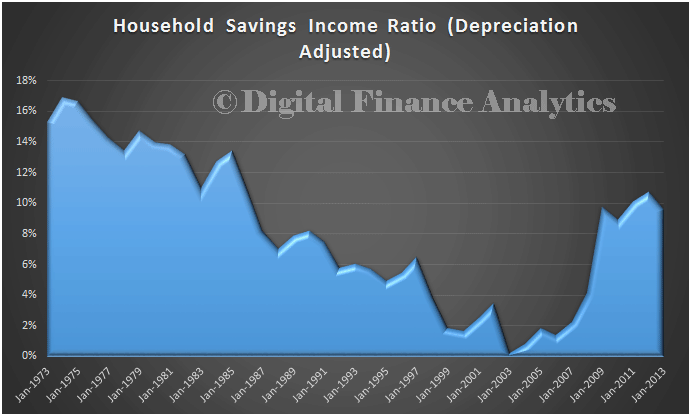
Next, we can examine the savings to income ratio. We went right back to 1973, to show the significant fall in savings ratios up to Jan 2003, where households were not saving at all (apart from statutory superannuation). We also see a rebound, the ratio was 9.6% in June 2013 (in current terms). Clearly the GFC had a significant impact.
Now, using our survey data, we look at current savings ratios, by segments. In fact we cut the data a number of ways. We also calculated the current savings ratio, based on our survey returns, using the same method as in the National Accounts. The ratio has dropped, on average from 9.6% to around 8.2% (plus or minus 0.4%, allowing for survey skew).
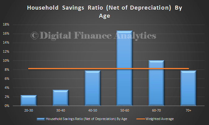
The first cut is by age bands. No surprise to find that younger households are saving less, and those aged 50-60 savings the most. The red line is the average.
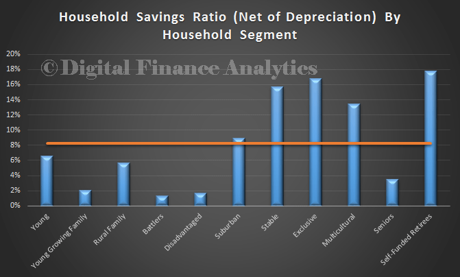
Next we look by segment. Our first view is by the DFA household segmentation, details of which are described in theSegmentation Cookbook. We see that the more stable households and self-funded retirees are saving the most. Younger family are not saving as much, and the disadvantaged groups even less.
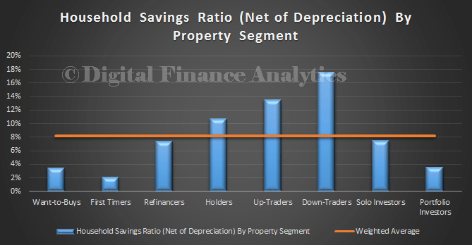
Another cut is to look at property segments, as defined in our Property Imperative reports. Down-traders are saving the hardest. First time buyers are saving the least.
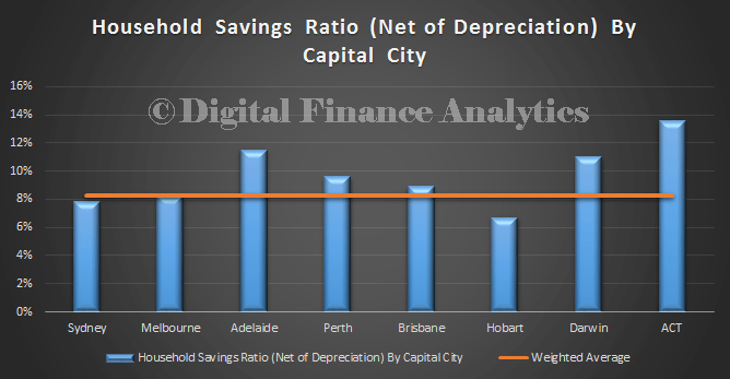
We can also cut the data by capital city. The ACT and Adelaide have the highest savings ratios. Hobart was the lowest.
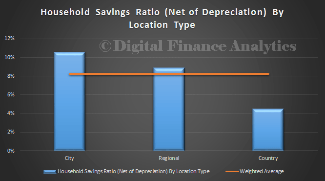
Looking at region type, those in the Cities have the highest savings rations. Country Australia has the lowest ratio.
So, overall, the average savings ratio is unhelpful in seeing what is going on amongst households. There is a need to drill into the details, to get a true handle on what is happening. We find that some segments are saving hard, whilst others are not. Overall savings ratios are falling, and are still significant lower than in 1975. Its a matter of perspective.